Visiting my mom, waxing a friend’s Acura, InstantShot! update, Democracy gets a name change to Miro, irreverant James teaches me about slideshow in Finder, X vs. XP at xvsxp.com, Path Finder from cocoatech.com, Google Part 15 with Froogle Mobile from wml.froogle.com and Google Groups from groups.google.com, and VisualHub from techspansion.com/visualhub.
Subscribe to the Podcast –> 
Listen to the Podcast Once (37 min 20 sec)
I had a GREAT weekend – Friday I drove down to San Diego to see Lindsay, and while i was down there we took my mom out to dinner. I’ve mentioned my mom before, but I have to brag about how cool she is. She’s 86 years old and blind, but she gets around town on her own, taking the bus, walks briskly (which is not the brightest idea when you’re blind, but she’s pretty good with the cane), and has 100% of her wits about her. She’s a real hoot, very interested in things I do in technology, and has her own computer.
I should explain that the computer she uses is an IBM 386 running DOS with Word Perfect! You might think I’m a horrible daughter for letting her go on with this setup, but she’s perfectly happy! it’s basically just a typewriter for her, but it gets the job done. Remember our premise on the NosillaCast – only use products that solve a problem for you! She tried using Jaws, even took a class over at Braille, but it didn’t really fit her needs. Here’s a pic of her with her HP 500C printer!
I put a picture of her and one of the 3 of us about to eat a mountainous mud pie in the shownotes, so go check it out.


As if that weren’t exciting enough, I also got to wax someone’s car today! It was wonderful – it’s a 1997 Acura RL with a BEAUTIFUL original paint job that was sorely neglected. It took me 5 and a half hours, but when I was done it was spectacular! It’s the car of a friend of my son’s, and it was great fun showing it off to the family when I got done. Of course I put a couple of photos in the shownotes for your viewing pleasure! it’s time for tech now though, quit goofing around!
My friend Dave before I waxed the Acura:

My friend Dave AFTER I waxed his car!

I couldn’t resist one more picture showing how awesome this 1997 Accord looks now!

InstantShot!
Last week I did a review of InstantShot!, the great screen snapshot tool. I got an email from the developer that I thought you might like to hear:
Hello Allison,
we’ve just listened to your last podcast (#86) and were delighted to hear how much you liked InstantShot!. Thank you very much for the review.
We’d also like to let you know that we’ve released a new version just yesterday with a better working timed/multiple capture of rectangles and that we’d be delighted to hear from you if you have any suggestion regarding the application.
As for your question about the uses of the multiple shots, we’ve found some interesting uses for them, for example:
– to record your activity every 3-5 minutes to let you remember what you were doing – that can be funny;
– to quickly save multiple steps to show an application or some other operation: for example all the screenshots for InstantShot! on our site were made in a single session, with like 10 shots taken out of the 100+ made in about two minutes;
– to make a screencast from shots taken every second or so in iMovie or similar application…
I especially liked the idea of taking a screen snapshot every 5 minutes throughout the day – that WOULD be funny. It would sure be telling how we waste time, wouldn’t it? I’m not sure I really want to know…In any case, I’m going to check out their latest version, hard to believe it could be any better i twas so great already!
Democracy gets a name change to Miro
Of all the luck, the day after I do a review of Democracy, the freeware Windows/Linux/OSX iTunes improvement, they decided to change their name! I guess they spent most of their time explaining that their player had nothing to do with politics, so they decided they needed to change it. They’re going to rename it Miro, but for now they’re asking for people to tell them first if by any chance it means anything bad in their language! They don’t want to have to change it again. The next release will still be called Democracy, but the release after that they plan to call Miro 1.0. I wish them luck whatever they call it! getdemocracy.com/news/2007/03/a-name-change/
Listener Feedback – Listener James
I’m taking a chance reading you the email I received from listener James. You see, he has some valuable feedback, but he happens to have a slightly irreverent way of speaking to me. I don’t want any of you to think you can take such liberties. I think I tolerate it from him because I think maybe he’s a mental case. You’ll see what I mean, here’s the letter:
Yo Woman
ok, right there, see what I mean? he takes such LIBERTIES! Anyway, here’s the rest of it:
1. On show #85, you reviewed Xee for quickly viewing images without having to open Preview. Why not just use the Slideshow feature built into OS X? It’s as easy as right-clicking the files you want to look at and selecting “Slideshow” from the pop-up menu. Even if you have a bunch of files selected (including non-image files) Slideshow will only show you the image files. Once in Slideshow, you can see an individual image, see all images in a contact sheet, view images at full screen or actual size, and even import them into iPhoto (cool animation goes along with the import). The only drawback I have found is that when you view PSD files that have alpha channels saved in them, the image gets masked by the alpha channel.
Now, in spite of James’ irreverent attitude, he turned me onto something I’d NEVER seen before! How could I have never run across slideshow in the Finder? I use slideshow all the time in Mail – when someone sends me pictures I always view that way, but I had no idea I could do it in the finder. i feel like such a doofus! Thanks for the tip James! As a reward, I sent him an awesome photo I took of this big hairy spider named Rupert that lives in our front entry way. I didn’t want you to be jealous, so I put the picture in the shownotes.

In his second paragraph of his diatribe, he said this:
2. For weeks now I’ve been anxiously awaiting your review of Google SMS since I use it all the time. Finally on Show #86 you mentioned it… but that’s all you did… no review, just a mention. You also mentioned something about not having any buddies on Google SMS which led me to believe that you don’t fully understand what Google SMS actually is. IT’S AMAZING!!! You really need to learn more about it. It’s not a chat/buddy thing AT ALL. Head over to http://www.google.com/intl/en_us/mobile/sms/ and learn more about it. Go. NOW! HURRY UP WOMAN!!! I HAVEN’T GOT ALL DAY!!!
Poor James, he REALLY hasn’t been paying attention, because the reason I didn’t say much about Google SMS on show #86 is because i wrote a bunch of slop about it on show # 51! remember I’ve been doing this for over a half of a year! I think when I saw it in the list the other day, I knew I’d done it before but didn’t remember what it was. Now that I reread my notes, I remember that it’s a way of using a cell phone to text Google to give you information and Google texts you back the answer. I’m not sure I’d go as far as “amazing” for Google SMS anyway! I played with it a bit, but I have a Blackberry so using the web interface is easier for me. I can’t remember all those codes, anyway! how can you remember how to ask for zip codes? or stock quotes are tqt? I was sorry to crush his little spirits, but it wasn’t the thrill for me that it was for him.
X vs. XP
If you’ve been curious about the differences between Windows XP and Mac OSX, there’s an interesting site that looks what I think is objectively about the different features and compares them side by side. From what I read, X vs. XP at xvsxp.com, it’s not inflammatory and religiously zealous, instead it just talks through the features as though this were NOT an emaotional issue! there are six major categories they compare – Applications, Files & Folders, Graphic User Interface, System, Power User, and Miscellaneous. to give you an idea of the depth of these comparisons, just within Applications there are 22 separate reviews, from Installing and Uninstalling applciations, to launching applications, to photo management and more.
You know how I’m always searching for the perfect tool for OSX that would allow me to flip through photos like you can in XP without launching Photoshop Elements or iPhoto? the folks at X vs. XP seem to agree with me, they gave XP a 6 and OSX a 4, because “Microsoft has chosen to integrate photo management directly into Windows, eliminating the need for a separate application.” Before I get a bunch of flaming emails, this isn’t to be confused with photo manipulation, and since iPhoto is part of iLife, they didn’t consider it part of the operating system anyway. As I poked around, I found a lot of places where OSX wins, and a lot where XP wins. They also noted that they’re getting started on their Vista comparison, so that will be fun to see as they develop it. Check out X vs. XP, it’s a really interesting place to really learn a lot about both operating systems from people who seem to be able to stay objective.
Path Finder
In my quest for finding applications that fix a problem I have, I’ve never found a reason to be annoyed by the Finder in OSX so as I heard about tools that were better than the finder, I ignored them. That’s until this week when on Mac Break Weekly at twit.tv/mbw I saw Merlin Mann demonstrate the $35 shareware program Path Finder from cocoatech.com. Merlin is very compelling (and funny) and it looked like it might be really helpful. At $35 it better be good – but they give you a free 21 day trial so that’s enough time to find out if it’s really that good.
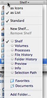
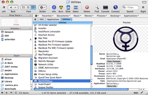 Path Finder runs like a regular application, but it gives you a finder-ish interface with a lot more capability. This is one of those tools I could talk about for hours as I discover new things it can do, so I’ll try to stick with basics. Where the Finder sidebar would be, you have more flexibility in what to show. it comes standard with Volumes and the Shelf which is what shows normally in your sidebar. you can drag folders in and out of there easily, but you can also collapse and size it so it’s not in your way. If you don’t want to see the volumes or shelf, you can use a pull down to change it to show Processes, file history, folder history, preview, info or selection path.
right above the directory you’re looking at, there’s a bunch of tabs showing the path to the folder or file you’re viewing. This makes it very easy to just go back a folder or two to navigate to other places. Speaking of Back, there’s a back and forward button in the upper left just like in the finder.
 The most useful thing I’ve found so far in Path Finder is the drop stack. You know how you’ve navigated all the way down to some obscure file, and you want to move it to another folder (perhaps equally as arcanely down in the bowels of your system. You have to open another finder window, navigate down there and drag the file from one finder window to another. i don’t know about you, but invariably my windows aren’t in the right place for the drag and drop so i spend a bunch of time moving the folders around to get the drop right. I also find that by the end of the day I have an awful lot of finder windows floating around distracting me. With Path Finder the drop stack completely eliminates the problem. you find the buried item, drag it to the drop stack area (a small rectangle in the upper left that says “empty” unless you’ve dropped something there, and then you navigate to the new arcane location, and drag the file from the drop stack to the new location. you can do this with multiple files – it’s much easier and cleaner than the Finder method.
Across the top of Path Finder there are a whole slew of menu items, like info, burn, idisk, Select, Delete, find, console and connect. Connect is interesting, it gives you a quickly accessible interface to the Go-Connect to Server tool. faster than going up to the menu bar and dragging down and over for that functionality. You also have essentially something that works like a bookmarks bar across the top where you can drag favorite folders and files for quick access.
To address the finder windows laying around all over the desktop cluttering things up, Path Finder uses tabs just like a browser. if you go to one of the folders you put in the bookmarks bar, you can pull down to “open in tab”, or just hitting command-tab (like in a browser) opens a new tab for you starting at your home directory. I really like this method of low-clutter, in a week of using Path Finder i found that I still had only one window open by the end of each day, when I used to have 5 or 6 with the Finder.
So remember the slideshow feature that nutty listener James talked about that’s built into the finder? Well, for some reason it’s not in Path Finder, when I right click I get a LOT more options but sideshow isn’t one of them, kind of a downside since I just discovered that cool tool. One feature that IS available when you right click on a file or folder is an option to email the item, and one to compress and then email. That’s REALLY cool. The very same listener James is the brilliant mind behind the automator tutorial on podfeet, which allows you to email a file right from the finder. Luckily he did that for us, and as much as it pains me to give him any positive reinforcement, I admit that I use it all the time, so this is a great feature to have built into Path Finder.
The capabilities of Path Finder are pretty broad, and get even broader when you open what Merlin affectionately referred to as “bat wings”. there’s a right, left, and 3 bottom bat wings you can open which provide even MORE information and capabilities. You’ll see these little icons in the locations I mentioned that show a black bar and white bar coming out of it. the bat wings allow you to add more of those shelfy kind of things, so if you like seeing the traditional finder side bar, but you wish you could see your currently running processes in an application-ish view, and have the ability to kill them with a stroke of your cursor, open the left bat wing to see them. The Trash is right there too which is very handy. Bart was just asking me if I knew of a way to get the trash can into the sidebar – well here it is.
The right bat wing has been defaulted to show you the selection path – identifying for you where you are in your directory structure, and they’ve also included a folder history – that is what folders you’ve visited recently. now that we have both left and right bat wings open, it’s time to explore the bottom bat wings (or would those be bat tails?) Bart will be bought over hook line and sinker when he finds out that the bottom bat tail opens the terminal right there, not as a separate window! That’s REALLY cool!
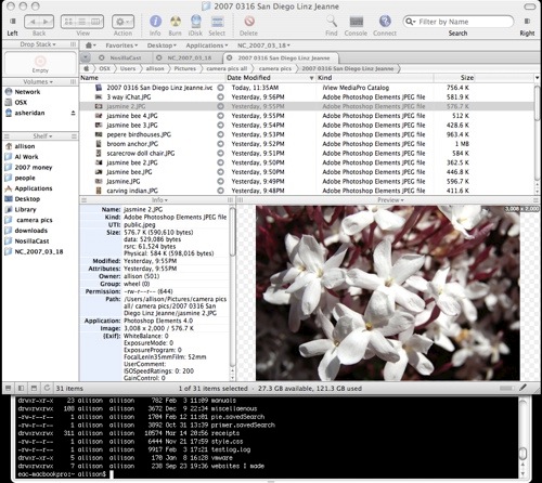
the other two bat wing icons don’t actually open more wings or tails, one of them toggles on and off the left side bar, the other opens two panes below the directory list you’re viewing, one doing a get info, and the other showing a preview. The preview is awesome if you’re looking for an image – as you click on different files, the images pop right into that preview pane. Again another way to show me my pictures without opening photoshop and going to the mall while I wait for it to open!
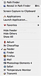 And guess what else it can do? it can take screen snapshots! I’m going to end up with about 68 ways to do this when i’m done! I found this in an odd place though, if you DON’T have Path Finder as the front app, in the menu bar you’ll see a Path Finder icon, and one of the choice under it is to take a screen snapshot. it defaults to the option to capture a portion of the screen by giving you cross hairs as an indicator of it’s intentions. Other things you can do from the menu bar icon is switch to one of your open applications from a handy list, hide different applications, launch applications (it opens up a list of your available apps if you ask for that).
There’s only one thing that irritates me about Path Finder so far. frequently I know what folder to look in, but I pile a LOT in each folder so when i get to the right folder, instead of scrolling through all of it, I like to hit the first couple of letters to reveal and select what I’m looking for. let me explain using an example. Using the column view which is my preference, lets say I ask for my home directory, scroll down to and click on the Pictures folder, and then in the list within that folder, if I wanted to go into the iPhoto library, I’d simply hit the letter i rather than selecting with my mouse (way faster). that would work in the Finder, but in Path Finder it assumes you’re still in the level above, so when I hit the letter “i” it goes to my installers folder. I’m not sure this is easy to picture in your head, but basically Path Finder keeps you a level above where you are in the Finder, which I think is less useful for me and would require me to do more clicking and less key stroking. Not a HUGE deal, but definitely an annoyance.
After that cranky note, I do think that Path Finder has enough cool capabilities that I might just buy it. A little steep at $35 but maybe I’ll find more features I can’t live without before my 21 day trial ends. Check it out, at cocoatech.com.
Google Part 15
Froogle Mobile
Mashups are all the rage these days, so why shouldn’t Google get into the mix (pun intended). I reviewed the Google shopping tool called Froogle a while back, and of course they have a bunch of mobile tools, enter Froogle Mobile. the idea is to be able to do price comparisons while you’re shopping on the go. On your browser-enabled mobile device, go to wml.froogle.com. Now let’s say you’re looking at a stack of 100 writable DVDs over at Best Buy, and you want to see if you’re getting a good price. In the search window, type in the search term, and hit search Froogle.
I tested with our example, first going to the Best buy website and doing a search on 100 pack DVD-R. currently they’re running at $50 from Fuji, $60 from Sony, and $45 from Dynex, or $50 from Memorex. Then I popped open Froogle Mobile on my Blackberry browser, and was thrilled with how amazingly simple the interface was. The name Froogle at the top is just text, not even the google colors, then there’s a search field and finally the words (not a cute graphical button) for search Froogle. On web-enabled cell phones this is a wonderful thing because they traditionally don’t have the best performance.
I typed in our search for 100 pack DVD-Rs and Froogle Mobile returned 5 results – $47 for Ritek from eBay, $237 for Archival Gold from shop.com (guess I won’t be buying THOSE any time soon), $45 for Memorex from john@neato.com (just from a guy?), $28 for HPs from Tigerdirect.com, and $54 for Optical Quantums from supermediastore. Not sure you kept all those prices in your head, but with the exception of the HP disks from Tiger Direct, the prices at Best Buy looked pretty good. I would probably have bought the ones at BestBuy because I was probably almost out of them, or maybe I would even buy a small stack and then head on over to Tiger Direct and buy the big stack.
Froogle Mobile is a fast, easy way to check prices on your mobile handheld, and I liked it enough to bookmark it!
Google Groups
You know how I have a poor memory and can’t remember what I’ve talked about before? To make sure I don’t repeat myself, I’ll frequently use the search feature on podfeet.com. I wanted to talk about google groups, but it rang a bell that I might have covered it already. Here’s the problem though, the search I get from WordPress won’t let me narrow my search to be for both words together. If I type in Google Groups, it finds every instance of Google and every time I typed groups! I tried putting it in quotes, no joy. then i tried putting a plus sign between the words, still nothing. Then I got a great idea, I’ll use a little Google trick instead! in Google search, i typed in “google groups” site:podfeet.com and it immediately showed me the two times I referred to it, but in neither case was I actually reviewing Google Groups. So, I think I’ll review it now!
Google Groups is a way to discuss online over email whatever subject you’re interested in, create “rich custom pages” according to the propaganda page, and to customize your look and graphics. To create a group, all you have to do is create an account (your gmail or google account), setup the group, and invite people. you can search for groups of interest, or drill down through the top five categories – people, business, home, computers, or suggested for you, whatever that is! Oddly the computers section showed mac.advocacy as one of the two I might be interested in! How did they know? Probably just pulled it from my computer information by hitting their website. Anyway, they also have a link to browse all group categories.
I’ve been in a Yahoo Group for a long time (about Macintoshes of course), but on google groups they point out how you can make a group for anything – like a family group, or one for your softball team. this is a great idea! in fact, my son’s track team arrangements are all done through email, this might be a much easier way to go. With Google groups, you can choose to read the messages on line, or to use email. You can make your group look really nice, by using the editing features to customize the pages with fancy text, images, and links, and you can also give it your own look and feel by adding your own logo to the group. Anyone in the group can upload files and share with the other members of the group. this would be especially cool with photos of the track team, since lots of people take pictures of each other’s kids.
I created a google group called NosillaCast (duh) and invited Bart to join. Tried to invite Leo too but he has it blocked for some reason! Gotta give him a hard time for that. Once I created the group and invited the members (or member in this case). Now i’m in the group, and I can add pages, invite more members and tune my group’s settings. I added a page, was able to easily add an image to the page and throw in some text and style it up a bit. After I saved the page, I get asked to email the group about the page. the “to” field says it will come from nosillacast@googlegroups.com and suggests a subject of telling them to visit the page. I skipped it since the page was pretty dorky.
I posted a message in discussions, and then I played with customizing the look of the site. not a LOT I could do, but I was able to put the NosillaCast square logo on it, and modify the color scheme to make it more my style. Google groups allows you to edit your membership to receive the info one of 4 ways – no email, meaning you’ll read it on the web, abridged email which is only 1 email a day with a summary of new activity each day, digest email which gives you up to 25 full new messages bundled into one, and then regular email which sends each message to you as it arrives.
Bart played around in it a little bit, but found it to be clunky – he said even clunkier than Yahoo groups he played with a long time ago. I decided to poke around in the Yahoo Group of which i’m a member (I only get the emails, hadn’t poked around in the group before.) It looks a little bit cleaner I think, and had a calendar and poll function that Google groups lacks. I found it a bit harder to find the place to edit my membership information – it was a TEENY text field up above the group banner, and while I could change how I received emails just like in Google groups, it didn’t have as many options as Google Groups. Oddly when I went in to edit, it actually changed my preference when I didn’t ask it to – it changed me to web only and I like to get the individual emails. the trip wasn’t wasted though, I had been meaning to change the email address on this group for a long time and didn’t realize I could do it online.
I tried to post some messages and told it to put myself on distribution, but I never seemed to get the emails, and neither did Bart. I tried replying directly to author on one of Bart’s posts, and he did get that one, but we never got the group emails, which seems kinda dorky. I tried sending an email to the group to see if maybe THAT’s what gets sent out as emails, and that worked fine. I think the posts online aren’t supposed to be emailed out, but that seems just silly as I said. Overall Google Groups was fun for me to play with, but I don’t think I have the energy to run one of these. It might just suit your needs though, so go check it out at groups.google.com.
Tim Verpoorten from MacReviewCast.com asked me to do a review of an application called VisualHub, here’s that review:
VisualHub
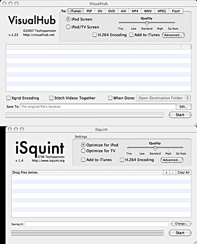
Hey Tim, thanks for the invite to review VisualHub. I’ve been using iSquint for a long time to convert videos from my camcorder and digital camera over to my iPod. I’m sure a lot of you know about it, and heard the reviews ages ago when I was all excited about it. It works perfectly, so I was intrigued when you asked me to review Visual Hub which looks a lot like iSquint. I wondered how anyone could improve on it, and then I figured out that it’s by the same people! Let’s see whether it’s a compelling upgrade from iSquint which is free, to VisualHub which is $23.32 shareware. Not $23, not $24, $23.32. VisualHub is available at techspansion.com/visualhub and iSquint is available at isquint.org.
 On the isquint.org website they have one of those comparative checklists for iSquint vs. VisualHub, and it’s pretty funny how they did it. the first line is “convert for iPod”, and both applications get a nice blue check mark. but for all the other items, iSquint gets a big red X while VisualHub gets the happy blue check marks. one of the things they list is “Fit 18 hours on one DVD” and under iSquint it says “wha?”.
The things it lists as forte’s of VisualHub are dynamic preview, autocrop, two-pas encoding, stitch/comgine videos, amplify volume, and a whole slew of conversion formats – DVD, PSP, DV, AVI, WMV, MPEG, TiVo, HDTV, and Flash. iSquint is sort of a one-trick pony – it converts movies to your iPod, and that’s it, but sometimes it’s nice to have a tool that does one thing and does it really well. That’s what Tim’s always talking about!
I popped open both VisualHub and iSquint and right away I could see what they meant – iSquint has one section only and it has optimize for iPod and optimize for TV, and nothing else. VisualHub in contrast has 9 tabs for the 9 formats I mentioned above. I decided to test out the conversion to Flash, so I dragged a movie file from my digital camera into the center section, and clicked on the Flash tab. I had choices of quality, which ranged from tiny to go nuts, which is a fun way to think about it. More fun came when I clicked on the advanced tab, and I was faced with a gazillion different things I could change, but the window was titled “don’t go screw it all up!” Needless to say, I decided to go with the defaults!
I took a 5 second quicktime movie of me jumping off of the Black Rock in Maui in 2002, which was 1.2MB in QT. VisualHub converted it to Flash in under 15 seconds, and the resulting file was 289kb. Pretty good! I of course put the flash movie into the website for your viewing pleasure! Al jumps off Black Rock in Maui
Ok, that worked perfectly, but it’s a pretty lightweight example, let’s take it up a notch! I took 4 videos of Kyle and decided to see if it could string them together, about 50MB of movies. it failed on two movies with the error titled “inadequacy”. While entertaining, it didn’t tell me much. I tried playing the movies outside of VisualHub and they didn’t work in QT, so I forgave the developers of VisualHub. When I set it to just 2 movies, it appeared to work.
Here’s the confusing part – I don’t know where it put the movie when it was done. The default location in the preferences was to the location of the original file, but since I pulled movies from 4 different folders, I don’t know where it put it, especially since I don’t know what it called it! I figured it out eventually – it wasn’t making them into one long movie like I thought it would, it made them into individual movies so they were each with their parent’s location. Before you start a conversion you can easily define the location of the output file, so that’s a better way to go anyway. The two files I did this time were 50MB combined, and it only took 31 seconds to convert to flash (for a total of 5.4MB in file size). Pretty darn good – that’s about 100MB per minute you could convert.
I took the same two files of 50MB total and asked it to author a DVD, and that only took 40 seconds. I had an option to burn when done, but I left that alone and it created an iso image called VisualHub_DVD. I’m going to trust them that it would work as a DVD for now, but I think later on I’ll probably gather up a bunch of old home videos I’ve taken over the years and see if I can put them on a DVD that will actually play in a DVD player. Should be a fun experiment for later.
VisualHub from techspansion.com is a snappy little program with a ton of capabilities, a good sense of humor, and a sensible price at $23.32. I think I’ll keep this one around! Thanks for the chance to review this one, Tim, it’s a keeper!
That’s going to rap up the NosillaCast for this busy and fun weekend, be sure to keep the emails coming to allison@podfeet.com, or drop me a voice recording (everyone but James, that is) at nosillacast@gmail.com. Don’t forget to join the forums over at podfeet.com/forums_bbpress. Thanks for listening, and stay subscribed.

We are a group of volunteers and starting a new scheme in our community. Your website provided us with valuable info to work on. You’ve done an impressive job and our entire community will be thankful to you.
Can I simply say what a aid to seek out somebody who truly is aware of what theyre talking about on the internet. You definitely know how to carry a difficulty to mild and make it important. Extra individuals have to read this and understand this facet of the story. I cant imagine youre no more common because you positively have the gift.
I discovered your blog web site on google and verify a number of of your early posts. Proceed to keep up the very good operate. I just extra up your RSS feed to my MSN Information Reader. Seeking forward to studying extra from you in a while!…
One thing is one of the most typical incentives for making use of your credit cards is a cash-back or rebate present. Generally, you’ll receive 1-5% back in various acquisitions. Depending on the card, you may get 1% back again on most purchases, and 5% back again on expenses made at convenience stores, filling stations, grocery stores plus ‘member merchants’.