 If you’re looking for the silver bullet that will make you instantly productive, then you should just move along now. But if you’ve tried a lot of different apps to manage the various projects you have in your life and none have really seemed to click with the way you think, then DayMap from whetstoneapps.com might be the app to help you get moving on that ever-growing task list of yours.
I got an email from Todd Cothran about why he invented DayMap. He said, “DayMap came about because I couldn’t find a digital version of a personal productivity app that worked the way I think. I like to see everything ‘at-a-glance’ and I could not find anything that was set up in that way.” He wanted an app that would visually map out what he had to get done for each project he had going on in his life. He teamed up with a programmer and a designer to create DayMap for both OSX and iPhone. I took a look at the screenshots on the Mac App Store and I immediately saw how different DayMap is from “normal” project planning software.
First of all think of projects as logical groupings of what you have to get done, not necessarily giant projects. When I started looking at DayMap, I realized that projects to me would be reviews for the show, website tasks, home stuff, ScreenCasts Online tasks and my daughter’s wedding and shower. Your projects would likely be completely different and might include projects for work or home or church, anything you want to pile together.
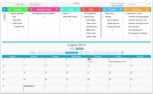
I mentioned at the beginning that DayMap is visual. The top half of the OSX window has a column for each of your projects with each column brightly colored so they stand out. You can set the colors yourself but I found the ones it automatically chose were perfect to make them distinct. Under the colorful column headings, there’s a plus sign. Tap it to add a new task. One of the basic tenants of the Getting Things Done theory is to break down tasks into each of the constituent tasks to make them less overwhelming. Under Reviews I put Review DayMap. That’s kind of overwhelming as a single task, so I created subtasks using a keystroke to break it down to Install on OSX, Install on iOS, Watch tutorial videos, Play with it, Take Notes and finally Write review. It’s more fun when you create subtasks because you really feel like you’re getting things done when you can check them off quickly. That feeling of accomplishment helps you keep momentum going.
 DayMap is equally useful to those who like to point and click with the mouse and those who love a keystroke. For example, I can tap on a task and hit the space bar to complete it, and it turns grey and gets a line through it. I could also select a task, then go to the Task menu and select complete and get the same result. I think as you get better with DayMap you’ll find the keystrokes to be a great boon to getting the tool out of your way and actually accomplishing your tasks.
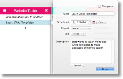
I’ve talked a lot about the top half of the window with your projects and all their tasks. The bottom half of the window is a calendar view. If you’re good at assigning tasks to specific due dates, you’ll love this. Simply drag a task from its project column onto the calendar to set its due date. As soon as you do that, the task becomes italicized in the project view so you know it has a due date. Like everything else in DayMap, there’s a second way to do it. You can assign due dates by double clicking the task and using a calendar picker from the open window. You can have repeated tasks too.
The calendar view on the bottom is very flexible. You can view a week or a month, scroll to move around or use keystrokes to move around. You can choose to view your Apple Calendar events too which really helps to make sure you’re not assigning takes to when you already have a busy day planned. DayMap politely asks you when you first open it whether it can have permission to view your calendar so if you don’t want this feature it’s not forced upon you. Personally I’m not good at date assigning on tasks, I like to keep a task list but perhaps I’m not as accountable to times as some more structured folks. If I HAVE to get something done by a certain date, I’ll do it but like I said, I’m more of a hippy about the timing if it truly doesn’t have a constraint. For example, it was Thursday when I wrote this but I could have written it on Sunday and it would have been almost as good. I bring this up because I like that DayMap allows you to hide the calendar view if you don’t want to see it (using the View menu or a keystroke to toggle the view on and off).
Back to the Project outline view on the top – you get those little hamburger icons on every project name heading, which allow you to drag the projects to reorder them. You can also change the width of the columns easily, and with an option-click on a project all of the other projects collapse into tight vertical columns with just the project showing. A simple tap on any of the other hamburger icons and the projects come back into full view. I like to be able to focus on one subject at a time (cuts down on the ADD) so this works really well.
I love the drag and drop features of DayMap. Like I said you can drag a task to the calendar but you can also drag a task to a different project and you can drag tasks to make them subtasks. I mentioned that hitting the space bar shows a task as complete, but what happens to the completed tasks? I personally like to see a big list of completed items so I can feel good about my productivity but after a while that gets to be pretty cluttered. In the upper right of the window you get a slider to choose when to hide completed tasks, anywhere from immediately to never, with 0-90 days of granularity in-between.
How often are you working on one thing when you suddenly remember something you need to do on a totally different subject? If you drop what you’re doing to write it down somewhere, you lose track of what you were doing and easily get sucked into the wormhole of the other task. With DayMap you can assign a keystroke that enters a task into a project entitled “Inbox”. As long as DayMap is running in the background, it will drop the task into the Inbox where you can drag it to the right project later when you’re not trying to focus. It does move DayMap to the front window but it’s easy enough to command-tab back to what you’re doing. It would be even cooler if there was a DayMap helper menubar app that could collect your tasks with a little less interruption, but this is pretty useful as it is.
I could go on and on with what I learned to do in DayMap but Todd has four great videos showing off how to use DayMap that really helped me hit the ground running so I’ll let you learn more on your own. All of this is well and good but how well does DayMap support the road warrior on iOS?
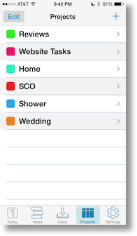
I have to say that while there is an iOS app, it’s designed for iPhone only. The beautiful layout of DayMap cries out for an iPad app. With the iPhone app they had to abandon the visual element they went to such work to produce for the OSX app. The iPhone app works great, don’t get me wrong. My favorite part is how seamlessly the iCloud syncing works between OSX and iOS. I can’t say it was instantaneous but I was unable to measure how long it took for each side to update, it was that fast. I can clearly see my projects in list form and by tapping on each one I can see a view with my tasks (completed and uncompleted).
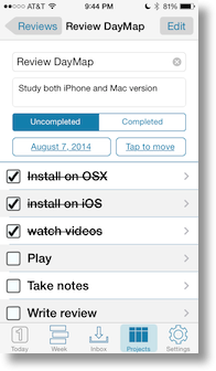
I can easily tap to show a task as complete. The interface is clean and uncluttered and gives you the mobile interface you need to add new tasks and subtasks. While I was on my daily walk, I remembered something I needed to do. I opened DayMap, opened the right project, tapped to enter a new task, and used my iPhone headphones to dictate the tasks. Took me maybe 15 seconds to record that task and continue on my walk. When I got home, sure enough it was on my Mac’s version of DayMap. I contacted Todd and he assured me they’re working on an iPad version of DayMap and improvements to the iPhone app to bring more of the OSX style to iOS.
DayMap is available from whetstoneapps.com, and there you’ll find links to the Mac App Store version which is $9.99 and the iPhone version for only $0.99. You can download a free trial of the Mac version at Whetstone Apps and give it a spin to find out if it works for you. I have to say after using it for some real work this week, DayMap represents my tasks for me visually in a way that really makes sense. I like that Todd designed an application that scratched his own itch and made it available to the rest of us!

[…] Task Management in a Visual Way with DayMap […]
Tried Day Map and agree that it is easier to use and allows the kind of flexibility I think I need to actually use it. Thanks for the review
This looks like exactly what I’ve been looking for but I need something that can seemlessly sync across PC, iphone, ipad…is there a cloud-based PC option? Also – is there integration with Evernote/gmail available?
Thanks!