Send in your recordings for the 500th episode next week, if you’re doing holiday shopping at Amazon, please use the search box on podfeet.com to get us a little love. Slau’s “If Every Day Were Christmas” is coming out on iTunes any minute now, watch my Twitter/G+/FaceBook accounts for the announcement when it goes live. Bart’s secure, random and memorable password generator Version 2 has gone live at xkpasswd.net. Should I Sleep review from Leon Sargent. Why you do want notifications on your wrist. New sponsor – Hover at Hover.com listen to the show (or look at the sidebar) for a 10% off coupon code for new customers. Why you need to know how your VPN works. In Chit Chat Across the Pond, Donald Burr of Otaku no Podcast teaches us how Apple’s development tools are helping developers deal with the plethora of screen sizes we have now.
Hi this is Allison Sheridan of the NosillaCast Mac Podcast, hosted at Podfeet.com, a technology geek podcast with an EVER so slight Macintosh bias. Today is Sunday November 30, 2014 and this is show number 499. We’re almost there guys, just one more week till we hit 500 episodes together! This week Steve posted a letter to the NosillaCastaways in our Google Plus community and asked me to send out a letter to those subscribed to the NosillaCast News inviting you to send in any thoughts you’d like to share about the show in commemoration of this momentous event. I made a wee typo and said the 500th show was on December 6th, but it should have been December 7th (since that’s a Sunday). If you’ve thought about sending in an audio recording in the past and never got around to it or if you’re a regular contributor, now might be a lovely time to send something in. Heck, you could re-use the text and put it an iTunes review too! Double the fun.
As you dig into your holiday shopping, please consider using the Amazon search box on podfeet.com in the left sidebar. If you start your search there, anything you buy during that Amazon session will send a small percentage over to the show to help us cover costs. I really appreciate it, as it makes a huge difference in my ability to be able to afford to bring you the show each week. And as always it doesn’t cost you a dime!
Correction
On Last week’s show, Bart and I talked about the insecurity of using a hotel computer, even to print out your boarding pass. Both Rod Simmons and Bruce Wilson let us know that you can print your boarding pass out without actually logging in. Evidently just using your confirmation number, the 6 digit record locator number, you can print your boarding pass. Both Bruce and Rod travel a LOT and they avoid the hotel computer like the plague so they know what they’re talking about! Thanks guys, I had no idea this would work.
Slau – If Every Day Were Christmas
Remember last week I told you how awesome it was to meet up with Slau and learn how he makes music by watching him mix audio real time? The song he was preparing is called If Every Day Were Christmas, and it’s actually finished! He has submitted it to CD Baby which feeds into the iTunes store, so it should be up in iTunes any minute now. I want to encourage everyone go check it out and if you like it buy it. Slau gave us a copy of the song and agreed that I could play you the first 30 seconds of it so let’s have a listen:
insert 30 seconds
Isn’t that beautiful? I’ll be posting about it on Twitter and Google Plus and maybe even Facebook when it gets into iTunes so keep an eye out for that.
xkpasswd.net
 Ok, ONE more thing about last week’s show. Bart had in the shownotes that he has finished the new version of his secure, memorable, and typable password generator over at https://xkpasswd.net/s/. We talked a lot a while back about how it works, and if you’re in the Google Plus community (at podfeet.com/googleplus) you even got to be a beta tester for the interface. I have become a huge fan of this service, especially for those times where you have to type a password because you’re looking at it on the iPhone but you need to type it somewhere else. Anyway, go check out all of the enhancements to how you pick the padding and separators and enjoy all the good math behind it. Again, it’s at xkpasswd.net – and if you like it, push that donate button and throw Bart a little bit of love!
Leon sent in a review last week but I had so much content I couldn’t squeeze it in, so let’s start out with his review now.
Leon Reviews Should I Sleep
 What problem does this application solve for me?
Having energy saver set to 15 minutes for screen and 30 minutes for system sleep works fine while I am on the Mac and actively interacting with trackpad and keyboard.
Where does this app come in handy?
Lets say I am reading something on my Mac that pertains to fixing a problem on my iPad and I am switching my attention between the two. I happen to look back at my Mac to continue reading and the screen is asleep or the Mac has gone to sleep. Though not an earth shattering situation having to do this many times is ANNOYING. Using the Face Detection Sensor checks for movement with the FaceTime camera and keeps the screen and Mac awake until there is no further movement and then lets energy saver pref take over.
Other points:
Link to Should I Sleep in the Mac Appstore.
Price $1.99 included two sensors with additional sensors as in app purchases individually for .99 each or all sensors for $2.99.
==============================
Well thanks Leon! Your audio sounds great and Should I Sleep sounds like a great application. I know a lot of people swear by Caffeine but it simply sleep or no sleep, which can only waste power if you forget to turn it off. Should I Sleep sounds like exactly what we need in the Sheridan household. By the way you mentioned your microphone, the Audio-Technica AT2005 USB microphone. I’m a member of the Podcasting Technology Resources Google plus group and people in there are ALWAYS singing the praises of these Audio-Technica mics. The cool part about the mic Leon bought is that it IS a USB mic so you can just plug it right into your Mac or PC, but it also has an XLR connection which means you can plug it into a big girl mixer if you ever grow into that. The AT2005USB mic is only $50 so I put an Amazon link in the shownotes if anyone is in the market for a really good but inexpensive microphone.
By the way, Leon, I gave up my mixer years ago. The complexity vs. the audio quality for me was not worth all the trouble it gave me. Fun from a geek’s perspective but a lot of work. Thanks again Leon, hope you do more reviews for us now!
Blog Posts
Why You Do Want Notifications On Your Wrist
Why You Need to Know How Your VPN Works
Hover
 We have a new sponsor for the show, a company called Hover that sells domain names. You may be thinking, “why would someone need a domain name?” Want to start a photography site or a blog? You need a domain name for that. If you have a baby, you could buy them their own domain now so that when they grow up they’ll be all set. If you have an idea now for a product you might like to build later, you can buy the domain name now before it gets scooped up. Domain names used to cost a fortune but now they’re really inexpensive so they’re just fun to collect!
I bought podfeet.com from another company and later added nosillacast.com just in case people got confused on the name of the website they’d still find the content they wanted. This other company sells domain names for super low prices, but the upsell that follows your initial request would make your eyes bleed. They barrage you wit so many other offers, you just want to take a shower afterwards. One of the dumbest things they offer, is that for extra money, they’ll keep your home address a secret! Yes, you pay EXTRA for the service of privacy. At Hover, you do not pay extra to stay private, the cost is built into the price.
A few months ago I decided to buy nozillacast.com, again because people get the name wrong. I thought I’d give these Hover folks a try (and no, they weren’t sponsors when I decided to do this.) I went to hover.com, typed in the address I wanted to buy, it was available, so I clicked buy…and that was it. Entered my credit card info and I was done. In the six months or so since then, I have not received a single email from them, not a peep of spam.
I’m really excited about working with Hover because over the next few weeks I’m going to actually MOVE all my domains from the other guys over to Hover. I’ll let you know how this works, whether their free concierge service (I call it hand holding) works or not. I feel like I’m flying without a net of Bart helping me but if I’m going to recommend the service, I’d better use it myself first! Wish me luck.
In the mean time if you’re ready to pull the trigger on buying a domain name, please go to hover.com and when you go to buy, put in the coupon code XXXXXXXXX to receive 10% off for new customers on your domain name purchase.
Clarify
I sure hope you’re listening to this show on Monday because Clarify 2 is half off through Monday! That means for $15 you can get a tool that makes you look like a doggone genius. Go. Right now, don’t delay. Go over to clarify-it.com OR you can even get it half off through the Mac App Store if you’d like. If you buy through the website, you’ll have to listen to the show to get the coupon code! This is an incredible deal. I even bought a copy for Dorothy at this price as a reward for all of the cool scripting she does for us. And because I wanted her to enjoy the new annotations options, numbered steps, substeps, combined images and more output options. So if I’m willing to buy it (when you know they would have given me one for free), you can go get one too! Let me know what you think of it when you make your first masterpiece!
Chit Chat Across the Pond – Time: 24:22
Donald Burr of Otaku No Podcast explains how Apple’s dev tools help developers deal with the plethora of screen sizes we have today.
First, some background information
- There are two ways of creating a user interface for an app
- Create it programmatically (in code).
- Create it graphically using a tool built into Xcode called Interface Builder.
- Design your interface graphically, and Xcode creates a file that encapsulates it
- These files are called “XIBs” (XML Interface Builder, because they’re XML files)
- Each “screen” of your app (technically called a “view controller”) gets its own XIB file
- Starting with iOS 5, you can now create “Storyboards” that are basically a single file that contains all your XIBs all in one file, instead of having each in its own separate file (there’s a bit more to it than that, this is just a simplification since we don’t need that much detail in today’s discussion)
The Original iPhone (and iPod touch)
- Only one screen size to deal with (3.5 inches) but you had to deal with rotation
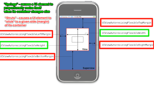
- OS provides “springs and struts” (aka Auto Resizing Mask) a primitive system for telling the OS how you want your UI to change when screen orientation changes
- lets you “stick” UI elements to a particular side of the screen
- also lets you proportionally grow/shrink UI elements as needed
- can be set up graphically in Interface Builder, or through code (or both)
- OS notifies your app when a screen orientation change has occurred, and you explicitly move/resize your UI in code as needed
- Offers the most flexibility, but at a high cost (lots of code to debug and maintain)
Enter the iPad!
- Now we have not only a new screen size, but also a new “user interface idiom”
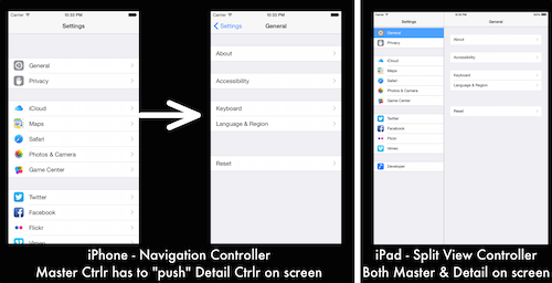
- iPad supports different types of UI (because of the larger screen size) that the iPhone does not (Example: Navigation Controller vs. Split View Controller, see below)
- XIBs/storyboards are now device-specific (i.e. one set for iPhone, and another for iPad)
- In code, you can query what type of device you’re running on, and do different things based on that information (i.e. put up a Nav Con vs. a Split View Con)
- Two sets of XIBs/storyboards to maintain
- Two different branches of code to maintain and debug
Enter the iPhone 5!
- A whole new ball game, now we have three screen sizes. The old springs and struts system is really not suited for this.
- Enter Auto Layout
- Debuted in OS X 10.7 Lion, came to iOS as of iOS 6
- “Auto Layout is a constraint-based, descriptive layout system.”
- It allows us to specify the way UI elements should be laid out with respect to each other in the way we humans think about them
- “Button A should always be centered horizontally in its superview.”
- “Button A should be a fixed distance of X from the bottom of the superview.”
- “Button A and Button B should be at least X spaced apart from each other.”
Enter the iPhone 6 and 6+!
- We now have 6 different screen sizes (3.5, 4, 4.8, 5.5, 7.9, and 9.7 inches)
- Auto Layout is still very helpful to handle all these screen sizes, but there are ways to improve it still
- Also we still have the problem of separate UI (Storyboards/XIBs and/or code) for iPhone and iPad, as well as different types of UI (popover and split view on the iPad)
- Also, what if you want to add UI elements on bigger-screened phones (or remove certain UI elements for the smaller phones)?
- Apple pulled yet another rabbit out of its hat to help us with this – Size Classes!
- No more separate Storyboards for iPhone and iPad, one storyboard to rule them all
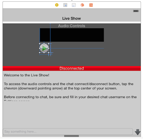
- Storyboards now no longer show an iPhone sized screen; instead you get a square canvas
- Think of this as an abstraction (a “generic mobile device” instead of a specifically-sized iPhone or iPad) – you lay out your UI, and Auto Layout will take care of sizing it properly for whatever device your app runs on
- But you may still want to change things (add/remove/change UI elements) based on screen size
- For that Apple has introduced the concept of “size classes” (see table below)
- By default you are working in the “Width Any, Height Any” size class. Lay out your UI, etc.
- But if you need to override it for a particular class of device, you can!
- This also means we no longer need to think about device rotation as a separate concept – when a device rotates, just think of it as changing its width and height size classes
- They went even further with the introduction of Adaptive View Controllers
- iPhone’s Navigation Controller and iPad’s Split View Controller are very similar (they both have a “master” and a “detail” side – it’s just that on the iPhone you can only have one on screen at a time)
- Previously you had to check what “user interface idiom” you were on (iPad or iPhone) then put up a Nav Con or Split View depending on which = two separate code paths = more places to get things wrong/introduce bugs
- Now all you have to do is just use a Split View Controller – if your app is running on an iPhone, the OS will automatically turn it into a Navigation Controller for you! (And if you’re running on an iPhone 6 Plus, which has plenty of real estate even when in landscape mode, it’ll go ahead and use a split view controller anyway!)
| Compact Width | Regular Width | |
| Compact Height | iPhone 6 and earlier in landscape orientation | iPhone 6 Plus in landscape orientation |
| Regular Height | All iPhones in portrait orientation | All iPads in any orientation |
Click to see larger image
Click to see larger image
The Apple Watch is coming!
- Many people (myself included) assumed that they’d just use Auto Layout to handle the watch UI, it should work, right?
- Yeah, it would, but Apple took the KISS approach – with such a small screen, you don’t need a whole bunch of fancy constraint calculation maths
- The way UI layout on the Apple Watch works is that the UI as a whole is organized either horizontally (things line up next to each other) or vertically (things are stacked on top of each other), and UI elements automatically “stick” to their neighbors (either horizontally or vertically.)
- But what if you want both? Well then you can add a Group. Within a Group you can have the interface elements “stick” in a different orientation
- With this simple system you can put together some remarkably good UI – perhaps not as complex as what you can do on an iPhone, but you don’t really want that level of complexity on a small watch screen anyway!
- I think of it as “Auto Layout Lite”
- I’m guessing Apple created this new system because the Apple Watch is going to have a less powerful processor in it (can’t do all the real-time maths that full-strength Auto Layout requires)
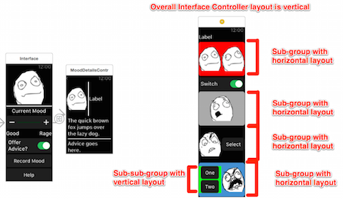
(in the above picture, I have given each Group a different background color, so that you can easily tell them apart on screen.)
The future?
- The system we have now is quite flexible and should last us a long time, and can always be extended/modified/tweaked if needed to accommodate new devices, screen sizes, etc.
- Example: if the rumored 12″ iPad Pro turns out to be real, it can still work as a “width regular, height regular” device like the current iPad, but maybe because you’ll have so much screen real estate on it, Apple can create a new size class that will let developers add more UI to it (say a “Large” size class?)
- But Apple I’m sure are always looking out for ways to improve it… so who knows?
Interesting Links
Explaining the view hierarchy:
http://www.techotopia.com/index.php/Understanding_iPhone_iOS_4_Views,_Windows_and_the_View_Hierarchy
Springs and struts:
http://www.binpress.com/tutorial/learn-objectivec-rotation/96
http://www.techpaa.com/2012/05/understanding-uiview-autoresizing.html
Auto Layout:
- WWDC sessions about Auto Layout:
- WWDC 2012 Session 202, “Introduction to Auto Layout”
- Video: https://developer.apple.com/videos/wwdc/2012/?id=202
- Text transcript: http://asciiwwdc.com/2012/sessions/202
- Video: https://developer.apple.com/videos/wwdc/2012/?id=232
- Text transcript: http://asciiwwdc.com/2012/sessions/232
- http://constraints.cs.washington.edu/cassowary/
- http://www.bignerdranch.com/blog/ios-autolayout-fun-facts-and-tips/
Size Classes:
http://www.imore.com/adaptive-ui-ios-8-explained
Apple Watch:
http://www.raywenderlich.com/89562/watchkit-tutorial-with-swift-getting-started
Some blatant self-promotion
My website – http://DonaldBurr.com/
My apps – http://DonaldBurr.com/apps/
The fine NosillaCast app – https://itunes.apple.com/us/app/nosillacast/id561466798?mt=8&uo=4&at=10lrq4 (new version currently in development – want to be a beta tester? Contact me on my website or via Twitter)
My Twitter – http://twitter.com/dburr
Otaku no Podcast – http://otakunopodcast.com/
That’s going to wind this up for this week, many thanks to our sponsor for helping to pay the bills, the makers of Clarify over at clarify-it.com and Hover for all your domain name needs over at hover.com. Don’t forget to send in your Dumb Questions, comments and suggestions and recordings for the 500th show by emailing me at [email protected], follow me on twitter and app.net @podfeet. Check out the NosillaCast Google Plus Community too – lots of fun over there! If you want to join in the fun of the live show, head on over to podfeet.com/live on Sunday nights at 5pm Pacific Time and join the friendly and enthusiastic NosillaCastaways. Thanks for listening, and stay subscribed.

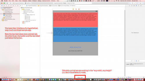
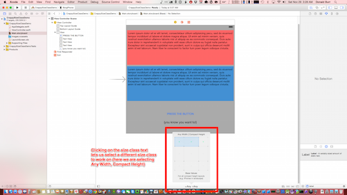
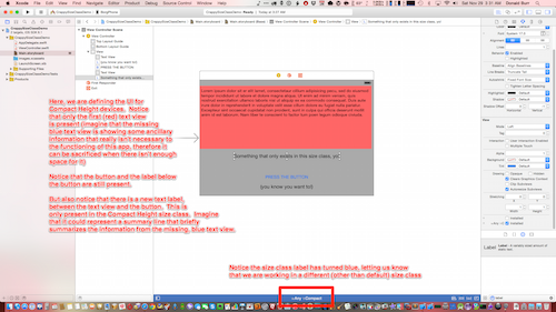
Mea culpa time. I think I got springs and struts transposed in my mind. Springs are the things that cause views to “stick” to a given side of the screen (makes sense, if something were attached by a spring to something else, it would cause it to “spring” toward the other thing) and struts are the things that cause views to resize proportionally when the screen dimensions change (think of struts holding up a platform or something, you lengthen or shorten the struts when you need to change the position of the thing that the struts are holding up. Or something like that.