 It occurred to me that many of you might not know that I’m open to improvement ideas for the podcast and website. I get suggestions from time to time and quite often implement them. My favorite emails and tweets are telling me about typos. I can see a typo on someone ELSE’S writing from across the room when the document is upside down, but for the life of me I can’t see it on my own text. I hate it when I have typos on my blog because it makes me look like a moron who can’t spell or who has poor grammar, so if you see a mistake, PLEASE let me know!
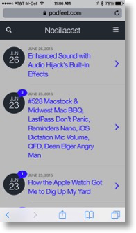
Two weeks ago, a fan of the show who has poor vision explained that the mobile version of podfeet.com had so little contrast it was blinding for him. I use a WordPress plugin to generate the mobile version so I went poking around and discovered that I have a lot more control over the look than I realized. Before he wrote to me, the background was bright white, and the link text was a light blue. Now I’ve got a muted grey background with dark blue links (like nature intended) and it’s a lot easier to view.
This week Helma tried to watch the live show when I had it during Europe-friendly hours but she couldn’t the chatroom on podfeet.com/live. We chatted back and forth and eventually found out she was viewing on an iPad. I have a left and right side bar that narrows the center column where the video and live chat blocks are side by side. The result is that the live chat block slid under the right column and was unusable. I went poking around in my theme and figured out how to suppress the right column on just that page so now it works on the iPad!
I’m telling you all this so you notice and maybe appreciate the changes, but mostly to encourage you to give me feedback on things you like or would like to see changed, and especially to encourage you to point out typos! I certainly don’t promise to implement every idea you have but you never know – if it’s easy and I agree, I’ll probably do it!

Yay! Thanks so much — I had no idea you’d be able to suppress that right-hand column on the page for the live chat! On my 15″ rMBP those photos, while wonderful, were covering up parts of the chat column. I could still type and read, so it was a minor inconvenience, but this is much better!