 I know we’re all supposed to love Evernote, but I just don’t. So many people tell me how they record everything in Evernote. I get the appeal of having a single place to record everything you want to remember, but there was something holding me back. I’ll get to that in a moment
I did start to use Evernote more when the folks that invented Clarify gave you hooks to store tutorials inside Evernote. It’s essentially a database with easy tagging and categories for Clarify. I love that function but I still didn’t like Evernote.
I do use it for one other very specific thing. We go to a sushi bar near our house and we can never decide how much food is enough food, so one time I typed in the “perfect order” and now I just open up that note on my phone and order straight from that. Pretty limited use, that’s for sure!
What has held me back all this time is how UGLY the interface is. To start with it was green, and I simply don’t like green. Recently they changed it to a lovely muted grey and white interface which is much nicer, but I had already moved away from Evernote by the time they improved the look. But even the green wasn’t what really made me push away from Evernote.
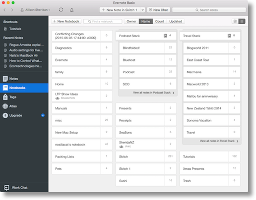
 What bugs the heck out of me is the way your items are organized. They use Notebooks as the metaphor which is fine. Notebooks can then be organized into stacks. I have a bunch of stacks and a bunch of notebooks inside those stacks. And that would be ok but the way they display the stacks and notebooks drives me nuts.
Instead of a nice list of your stacks with little disclosure triangles next to them for easy navigation, you get a giant grid with all of your notebooks splattered all over the screen. I find it very difficult to scan and see the one I’m looking for. Recently they’ve added some nice animations so as you flip between sorting the grid by Owner, Name, Count and Updated, they move fluidly around on screen but I still find it a very annoying way to find things.
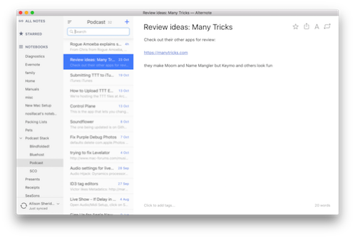
![]() The question becomes “how can I still have all of the power of Evernote with the database functionality, the syncing, the free storage…but not have too look at Evernote?” The answer is an application called Alternote. Alternote does not replace Evernote, it’s simply a different GUI front end to your Evernote database. It’s $7 in the Mac App Store and for me that $7 was a game changer.
The question becomes “how can I still have all of the power of Evernote with the database functionality, the syncing, the free storage…but not have too look at Evernote?” The answer is an application called Alternote. Alternote does not replace Evernote, it’s simply a different GUI front end to your Evernote database. It’s $7 in the Mac App Store and for me that $7 was a game changer.
Alternote has a dark grey background, a left column with my podcast stacks and nice little disclosure triangles showing me the notebooks inside the stacks. Search is fast and easy, adding new notes is a click of a button, you can star notebooks so you can easily find the ones you use all the time, there’s a share button in case you want to share a link to a note, and there’s a distraction-free button so you get just the note in front of you and nothing else. There’s a word count at the bottom of every note (if you write for a living you’ll care about that) and also at the bottom you can click to add tags. Sorting is easy, changing the look and feel is easy…it’s all easy and pretty with Alternote.
There’s one thing Alternote can’t do and that’s add attachments. That’s a pretty big big deal for a lot of people. I wrote to them and they said it’s coming but not there yet. You can always open Evernote briefly to add an attachment and go back to Alternote and you’ll be able to view it but if that’s your main use, then Alternote is not for you.
I know it sounds silly to pay just to have it look different, but it really made a difference to me. I’m using Evernote through Alternote a lot more than I ever did before. Now if they just made an iOS app… Check out Alternote in the Mac App Store if you hate the way Evernote looks but you want the functionality.

Same here, Evernote is a solid app that works great but every time I open it I get confused with the layout.
Thanks for the tip Allison