 This week I was in the process of ordering a metal print of one of my turtle photos from my vacation. The instigator of this is photographer Mark from Twin Lakes Images, the artist formerly known as Switcher Mark. He’s a big believer in printing photographs and he convinced me this would be fun.
Printing the photo meant making a lot of decisions, including not just the medium (I wanted to try metallic because it looked cool in a gallery I visited recently) but also the size and proportion of the print.
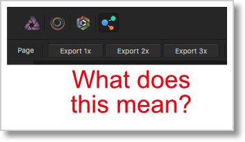
While this photo was taken on a GoPro and was a 10MP image, the resolution was a bit low for the size print I wanted to do. In Affinity Photo in the Export Persona (they call the different modules personas for some reason) they have options for 1x, 2x, and 3x. Mark and I inferred that the latter two buttons would up-sample the image. Up-sampling an image means to add pixels to an image.
I suggested that this was fake, cheating, misleading or at the very best silly, because the pixels don’t exist so the software has to make them up. I told Mark that the software would have to interpolate to figure out where those extra pixels were supposed to be. (At the end of this story I’ll tell you that I figured out it’s not interpolation but we can’t get there yet!)Little did Mark know that his offer to help me get an image printed would turn into a trigonometry lesson. I asked him if he took Trigonometry in school and he said he did not, he took a Debate class. It won’t come as a shock to you to learn that in addition to being a photographer, he’s also a judge.
I explained to him that back in MY day, we didn’t have these fancy calculators so we had to do math the hard way. In the snow. Uphill both ways.
Trigonometry gets a bad name but I thought it was great fun. It will come as no shock to you to learn that in addition to being a podcaster, I am also a mechanical engineer.
Let me give you a basic trig lesson and then I’ll explain why interpolation was so important.
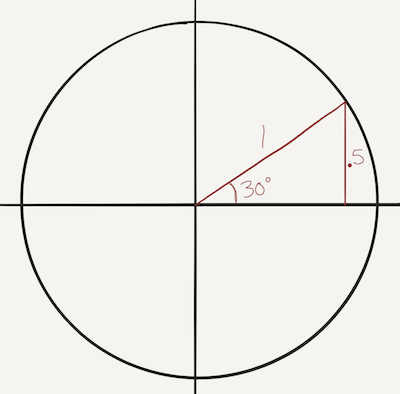 If you have a right triangle, meaning one angle is 90 degrees, and you know the lengths of two of the three sides, you can actually figure out the interior angles using the sine function.
The sine of an angle is simply the length of the opposite side from the angle divided by the length of the hypotenuse (that’s the slanty one). Easy peasy, just remember sine is the opposite over the hypotenuse, which is only hard if you try to spell hypotenuse.
This starts to make more sense if you draw it out. First draw a circle with a radius of one. Draw a line from the center to the edge of the circle at 30 degrees from horizontal. Drop a line down from where it hits to the horizontal line. Now we have a right triangle with a 30 angle and the hypotenuse is 1. We can simply measure the height of the line we dropped and we’ll find out that it is .5. From this we know that sin(30) = .5.
Luckily, with today’s calculators you don’t have to draw circles and lines and measure, you just type in the numbers and the calculator spit it out for you. But what about when I was in high school back in the dark ages?
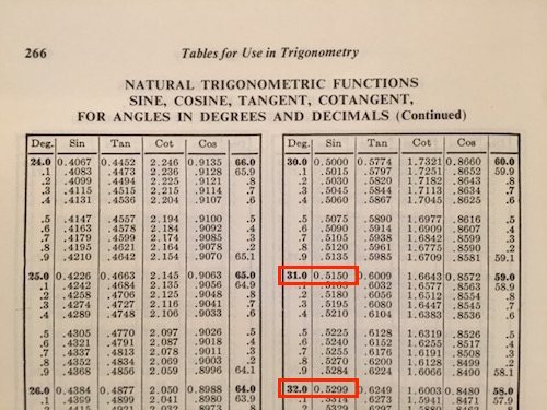 Well back in MY day, they had tables of the values for sine. We had books made of paper that enclosed these tables. The one I still have is called the CRC Math Tables, published in 1971 by the Chemical Rubber Company. There’s a screenshot from my CRC Math Tables book in the shownotes but let me give you a simplified example of how we used them.
The CRC can’t tell you the sine of every single angle because there’s an infinite number of them, right? So they give you some and you have to calculate the one you want. This is where interpolation comes in.
Let’s say we need to know the sine of 31.8 degrees. We can look in the CRC math tables and see find the sine of 31 and the sine of 32. Now remember how we started with a circle to figure out the sin(30), right? Well what if we were to approximate a circle by making it out of 360 little lines instead of a perfect circle? If we assumed that between 31 and 32 degrees, we had a straight line instead of an arc, we could approximate sin(31.8) as being 80% of the way along that line between 31 and 32.
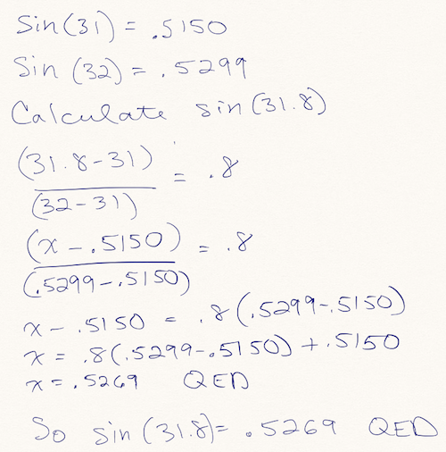
I did the math on this and put it in the shownotes, but let’s walk through the logic if not all the numbers. I said that 31.8 is 80% of the way between 31 and 32 degrees. We get that by calculating 31.8 – 31 divided by 32-31, It turns out that you can substitute in the sines of all those angles and it has to also be 0.8. So sin(31.8) – sin(31) divided by sin(32) – sin(31). That’s a tough one to hear in your head to follow, I know.
In the equation I just described, we know the value for everything except sin(31.8) so the arithmetic is to solve for sin(31.8). When I did that, I got that the sin(31.8) is .5269. I gave this example because the CRC math tables do give us the value for sin(31.8) and instead of 0.5269 as we just calculated, it’s actually 0.5270 according to the CRC Math Tables. Remember we said that assuming it’s a straight line between the two points was an approximation? You can see that in the fourth decimal place we are inaccurate, but that’s pretty darn close!
Believe it or not, that’s how we calculated the trigonometric functions when I was in high school. Except it was one tiny bit harder than that. When I took trig, there were no calculators for the common person. We did the arithmetic part of these calculations using a slide rule. To four significant digits! Now do you see why Mark took Debate instead of Trigonometry?
So what were we talking about? Oh right, photography! By this time in the conversation Mark had died of boredom but I was still thinking about the original problem. When we up-sampled the photo using Affinity Photo’s 2X feature, was it actually doing interpolation? Was it looking at the pixels on either side of it and figuring out something in-between? If it was, then there could be a perceived improvement to the photo. Edges that might look jagged when zoomed up close, might be smoother after this up-sampling.
I 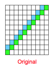 drew up a diagram in Excel to think this out. I created a 10×10 grid, and made a diagonal line of green and one of blue right next to it. Then I drew a grid of 20×20 representing the 2x example from Affinity, and populated the grid again. Now we have a smoother-looking line. This is essentially what anti-aliasing does in text, which is how we ended up with smoother looking text than the old days.
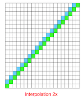 Now is that actually a better photo? In my opinion, it depends on the algorithm to create the pixels. If poorly done, it could create a terrible-looking image with all kinds of fake looking edges and artifacts. Or if done brilliantly, it could create an image which when blown up looked much crisper than the original. If they were using interpolation, did they use linear interpolation like in our trig example, or did they using a polynomial interpolation? How much math were they going they do?
I ran the 2x export on Affinity Photo on an image, zoomed way up…and I couldn’t tell the difference! So I started searching around for more wisdom on what this 2x and 3x thing might be. I started to find a pattern online that when people talked about 2x, they also said HiDPI and retina screen in the same sentence. I watched the video tutorial from Serif on the subject and they said the same kinds of words.
![]() So what does this mean? Let’s go back to our simplistic example of our original 10×10 grid with diagonal green and blue jagged lines. What if instead of interpolating, they’re actually just putting 4 pixels where every original pixel was. Instead of one green pixel in the bottom left, we have 4 green pixels. The image, entitled 2X would then become a 20×20 pixel image.
So what does this mean? Let’s go back to our simplistic example of our original 10×10 grid with diagonal green and blue jagged lines. What if instead of interpolating, they’re actually just putting 4 pixels where every original pixel was. Instead of one green pixel in the bottom left, we have 4 green pixels. The image, entitled 2X would then become a 20×20 pixel image.
This sounds dumb, but remember people use HiDPI and Retina in this context. Imagine that you have two laptops, say a 13″ MacBook Air which has a normal resolution screen and a 13″ MacBook Pro that has a new Retina screen, which is just a fancy marketing term from Apple that means higher resolution with lots of dots per inch, also known as HiDPI. For the sake of simplicity, let’s imagine that the retina screen has twice as many dots per inch as the normal screen.
If we took our original 10×10 pixel image with the diagonal line and opened it on both screens, the image on the retina display would be half the size of the one on the normal screen. Does that make sense? Let me say it another way. If the normal screen was 10 pixels per inch, our 10×10 pixel image would be 1 inch across. If our retina screen was 20 pixels per inch, the 10×10 pixel image would only be 1/2 inch across. With me?
So, back to our 2x export. If they give us 4 pixels for each 1 in the image, then that image, then our 20×20 pixel image would look 1 inch across on the retina screen!
You might be thinking this would make things look dumb on the normal screens but I think I know the use case for this. When you surf to a website, the site can tell what kind of computer you’re coming from, it knows what browser you’re using and it even knows the resolution of your display. This means that webmasters can store multiple versions of the same image and if you come with a low res screen, serve you the normal version but if you come with a higher res screen, it can serve you the 2x (or 3x) version.
I know this was a long way around to get there but I had fun talking about interpolation and the old days and I’m delighted that I put the pieces together to understand what’s really going on in Affinity Photo when they offer the 2x and 3x options on export. It’s not making your image any better looking, it’s just changing how big it looks on screen when you’re served it from the web.
Maybe I should have a Disclaimer on my podfeet.com warning people that I’m an engineer.

Loved the trig lesson. I don’t recall using tables for trig, but we definitely had log tables. We also had calculators in class – though weren’t always allowed to use them. Apart from basic algebra, I think trigonometry has been the most useful mathematics my entire life.
On the HiDPI front, you’re sort of right. Affinity’s documentation (both in the video you mentioned and in their help) is a little light on how the 2x and 3x export works and, from what I can tell from experimentation, it’s not incredibly useful, except in perhaps one situation.
It does indeed do interpolation on the image to double or triple the dimensions and you can choose the algorithm it uses for this in the Export Options panel. Some methods are better for enlarging, others for shrinking and some give more smooth results while some are sharper, so it depends on your desired outcome which you should use. Photoshop used to label its methods with “best for reduction” etc though I note it now lists the options as “enlarge, sharper” etc and there is less emphasis on the name of the algorithm.
Your “Interpolation 2x” image is not actually a likely interpolation of the original image. What you’ve done is rendered the idea of your two lines with a higher resolution. Interpolation of an image has no implicit knowledge of the nature of the image – which is why it’s such a complex process with crazy names like bicubic and bilinear. It must look at each pixel and decide, usually based on the pixel’s neighbours, what colour each of the 4 (or 9) pixels in the resulting image will be. At the most basic you get 4 (or 9) pixels exactly the same as the original and it looks just lie your pixels grew. More complex algorithms attempt to infer structure in the image and try to enhance edges, for example.
The scenario where I expect Affinity will do something more useful is if you have placed documents in your image. Placed documents can have a higher resolution than the main image and in this case I would expect Affinity to make use of that higher resolution in the output image, giving you a truly more accurate result on HiDPI images. The more useful situation for creating a set of standard and HiDPI images is to have at least enough real resolution for the highest DPI you want to output and use the opposite of interpolation – let’s call it downsampling – to generate the lower resolutions, meaning you have the best result for all resolutions. I had expected Affinity’s Export Persona would have a scaling option for output but this appears not to be the case.
If I were creating an icon for my iPhone app, the largest version I would need is 1400×1400 for iTunes. So I would design my image to be at least that big and then downsample that to all of the smaller sizes including the 3x, 2x and standard sizes for the icon on phone screens. The smallest is, I think, about 60 pixels across. Upsizing (interpolation) should generally be a method of last resort when you have no higher resolution and require the higher resolution.
In terms of providing 2x and 3x images on websites, if the site does not serve up a 2x (or 3x) image then the browser will automatically create an interpolated image to suit. So the only reason to provide your own interpolation is if you believe you (Affinity) can do a better job than the browser. I suspect it would depend on the image as to whether it’s worth it. Also, your website software has to know how to serve HiDPI images – it’s not just a case of having them on your server. WordPress plugins are available to manage this although I’ve had very hit-and-miss success with those I’ve tried.
One more thing – antialiasing is a bit different to interpolation. It’s more like approximation. It’s actually a bit closer to your 2x example above because the fonts are defined with the intent of the shape and not with pixels. So a letter L will be described most likely with six line segments bounding the shape of the letter. At small font sizes the thickness of the “stroke” of the letter approaches the size of a single pixel and it starts getting tricky to know which pixels to turn on and which to turn off to make that L look like an L and not have some occurrences look thinner or fatter than others because one is 1 pixel wide and 1 is 2 pixels wide when really the letter should be 1.5 pixels wide in all cases.
To combat this problem, antialiasing says that rather than turning a pixel “on” or “off” it will use a colour shade to approximate “less than a pixel.” Imagine black text on a white background. The vertical stroke of the L should be 1.5 pixels wide and this could end up as one column of pixels at 50% grey to represent “half on,” next to a column of black pixels. Or it could be one of 25% grey, one of black and another of 25% grey. The net effect of this approach is smoother text when viewed from a suitable distance, however it can look “fuzzy” when viewed up close. In the early days with relatively low resolution screens using CRT technology, things were never too sharp anyway and antialiasing, while looking a wee bit fuzzy, actually dramatically improved the readability of smaller text which in turn meant you could fit more (readable) text on a screen.
I think you read the CRC trig table entry for sin(30.8) as 0.5120 instead of the sin(31.8) as 0.5270 which is only a difference of 0.0001 from your calculation…
Thanks Ian – just a typo on my part. My words say that it’s wrong in the 4th decimal point – will fix now!