Turns out the Theta S software works great on the iPhone, IF you have the right version. We’ll have a nice Trigonometry lesson as I try to explain what interpolation means and why you might care about it if you’re editing images. We have an interview with FoxFury Lighting and Audio-Technica from NAB.
Hi this is Allison Sheridan of the NosillaCast Mac Podcast, hosted at Podfeet.com, a technology geek podcast with an EVER so slight Macintosh bias. Today is Sunday May 22, 2016 and this is show number 576.
Update on the Ricoh Theta S
 Last week I told you about the cool, new Ricoh Theta S camera I bought Steve for Father’s Day that takes 360 videos and photos. I talked in the review about the fact that while Steve could connect his iPhone to the camera, I could not using their Theta application. I said at the end of the review that I hoped I’d come back next week with an “I am such a moron” ending to the story.
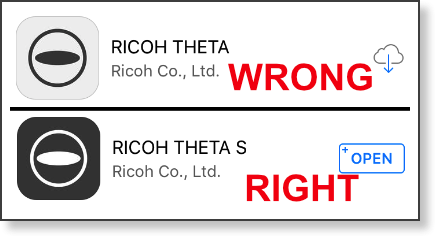
I called Ricoh tech support and it turns out they have TWO apps in the App Store. One is called Theta, and the other is called Theta S. When you’re inside the two apps, they look identical, which explains why I didn’t realize it was the wrong app. The Theta app does not work with the Theta S! The two icons are the same too, but one is black and white, the other is white and black. As soon as I opened the Theta S app on my iPhone, the camera worked brilliantly!
So I’m not going to call myself a moron but I can now declare the Theta S as a fabulous camera. Steve and I have been having a blast with it and it’s a lot of fun to show to people.
Chit Chat Across the Pond
This week’s Chit Chat Across the Pond was with Antonio Rosario of the Switch to Manual podcast. You may have also heard him on Bart’s excellent Let’s Talk Photography podcast. He helps me try to wrap my brain around the difference between filters and adjustments in imaging editing applications such as Photoshop and Affinity Photo. He also teaches me about light meters and why you might want one, and we talk about how to prevent going out and shooting with your camera set up all wrong from the night before. Check it out by subscribing to Chit Chat Across the Pond in your podcatcher of choice.
Blog Posts
HiDPI Images or “Fun With Trigonometry”
You can tell that I had a great deal of fun with the discovery on this little project, and you can tell that I was quite proud of my little self for definitively determining that Affinity Photo was only giving me four pixels for every one I had originally and not doing interpolation.
That glee and pride in my diagnostics skills lasted just until Allister Jenks read my post and wrote a long comment on the blog in response. In typical Allister fashion, he didn’t write, “hey moron…” and tell me that my methodology was flawed. Instead he studied it himself, observed things I’d missed and ran a much better experiment than I had run. We did a screenshare later to look at it from what he’d learned and now I’m convinced that my conclusion was completely wrong, Affinity Photo is actually doing interpolation when it creates the 2x and 3x versions.
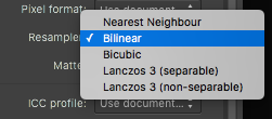
 the most important thing Allister noticed in Affinity Photo was that when you hit the 2x or 3x export from their Export Persona, way over on the right hand side, there’s a pulldown to choose between Bilinear, Bicubic, Lanczos and Nearest Neighbor. It’s obvious that since they’re offering resampling methods, they are doing interpolation. In my defense, when we looked at Affinity Photo on my screen, those options weren’t showing. One problem with Affinity Photo is that the little palettes seem to somewhat randomly move around and cover each other up. The second row of palettes was covering up this option. When I pulled them down, those interpolation options were available to me.
Ok, now we’re getting somewhere, we do know that it’s interpolating. But why couldn’t I see the interpolation when I zoomed way up on my turtle photos? The sad answer is that I didn’t zoom up enough. Allister goto around this problem by making a geometric design at the single pixel level, and running it through the bilinear interpolation of Affinity Photo. The cool thing is that he figured out you could actually build images pixel by pixel using Affinity Photo itself! Next time I need to build an 8-bit icon I won’t need Regedit any more! (Kids, ask your parents what Regedit was.)
I didn’t mention in my original description that Bart and I had gotten into a debate on whether interpolation was fake, or just a bad idea. The answer that Allister and I came to was that it depends on your objective. The main reason you might want to up sample an image would be to make it higher resolution so that the edges would look more precise. Sadly this is not at all what happens.
In Allister’s example, he built a horizontal black line, a vertical black line and three diagonal black lines on a white background. The “lines” are the definition of pixelated, they’re just 4 pixels long, so they’re very clear stair steps.
 After he ran it through the 2x up sample from Affinity Photo, the tool very clearly increased the pixel density by a factor of two in the horizontal and vertical directions. In addition, it modified all of the pixels, including the original ones (that are now, indeed 2×2 pixels). It made all of them shades of grey with diminishing brightness as they came near the white. As a result, the line is no longer black at all, it’s grey and fuzzy. So rather than sharpening the image edges, this interpolation technique will make your image less sharp.
But then I got to thinking… Remember I said there are different interpolation methods available? I created my own little bit of pixel art with a diagonal line, one horizontal and one vertical, and I ran all of the algorithms against it. While bilinear made the diagonal black line decidedly lighter by averaging in the white around it, the Lanczos non separable algorithm produced a much darker, sharp diagonal line. However it added significant ghosting around the line. I figure I’ve managed to lose 98% of the audience by now so that’s probably enough on the topic. For the two percent of you left, I zipped up my experimental files so you can download them from the shownotes to see them. Remember you have to zoom way way way up on them to see the effect because we’re looking at individual pixels here.
The main lesson is, of course, to take your photos at the highest resolution possible for the size image you’d like to print, pay attention to all the lessons on focusing and exposure to get the best possible image, and don’t try to up sample them using any of these techniques. However, if you find yourself in a bind, it’s possible that one of these up sampling algorithms would make your image just the slightest bit sharper. Possible, but not likely.
NAB 2016: FoxFury Lighting Solutions
Two weeks ago you might have noticed that the show was a bit shorter than usual. That was because we had a really interesting problem with one of the recordings from NAB. When we’re at the shows, Steve records the video with his Canon video camera. We have an Audio-Technica wireless mic for me, with a wireless receiver mounted on top of his camcorder. Normally he records in mono format, but for some reason it made this one recording in stereo. That shouldn’t be a big deal, but the two channels were out of phase by 180 deg so that if I combined them into a mono track for the podcast, they nearly zeroed each other out!
Our first hint that something was amiss with the audio for this interview was when Lorddrachrnblut commented on Youtube that there was no audio at all. He’s a geek so he did some experiments with us and determined that if he listened to it via a mono format it was gone but with stereo headphones on he could hear it.
Luckily we figured this out during the live show so I simply cut the segment, hence the shorter show. The better news is that I figured out that I could split the stereo track into two mono tracks, delete one of them, and I had a perfectly good mono recording. With that big buildup, here’s our interview with FoxFury Lighting Solutions from NAB 2016.
NAB 2016: Audio-Technica AT2020USBi Microphone
 Ironically right after talking about Audio-Technica, here’s an interview with them from NAB (where we had no operator error on the audio). In this interview with Gary Boss, you’ll hear me incorrectly say that the price of the AT2020USBI mic he’s talking about is $129. That was the old model, the one he’s talking about is actually $199. Gary heard me say it wrong but was too darn polite to call me on it during the interview!
That’s going to wind this up for this week. Don’t forget to send in your Dumb Questions, comments and suggestions by emailing me at [email protected], follow me on twitter @podfeet. Check out the NosillaCast Google Plus Community and our Facebook group at podfeet.com/facebook. If you want to join in the fun of the live show, head on over to podfeet.com/live on Sunday nights at 5pm Pacific Time and join the friendly and enthusiastic NosillaCastaways. Thanks for listening, and stay subscribed.

Allison, I just got around to hearing #576 and the trig discussion. Although it’s a long time ago now, I was a math major in college. Although it pegged the dweeb meter, I really liked your discussion of trigonometry and pixel interpolation. I even followed what you were saying. Actually, to make that topic understandable with audio only is really, really difficult. I thought you did a great job. Thanks.
Awe, thanks George! You made my day!