 I’ve been using iThoughts X, the awesome mind mapping software from toketaware.com/… to map out how to attack the video screencasts I do for Don McAllister’s ScreenCasts Online. It really helps me when I’m figuring out my plan of attack to just throw a bunch of disorganized bubbles all over the screen as I think up different things I want to teach about an application.
After it becomes enough of a mess, I start dragging the bubbles around to lump them together and try to make a cohesive story for the tutorial. As I record each bit of the tutorial, I pause and color code the appropriate bubbles to mark them complete and close up the branches so it’s easier to focus.
I thought I had the perfect workflow going until I saw David Sparks talking at Macworld a few years ago explaining his workflow for writing books. Like my process, he starts with a mind map but then he takes an interesting turn. He exports his mind maps using the OPML format (Outline Processor Markup Language) and pulls them into OmniOutliner from omnigroup.com/…. He even showed how he can round trip his thoughts, exporting again in OPML and back into his mind mapping tool.
I had no idea you could pass mind maps to outlining programs and back using the OPML format until David explained it on stage. That got me to thinking maybe this kind of workflow would help me in planning my tutorials. While bubbles are ideal for dragging around to organize bursts of ideas, they’re limited in how much you can write and keep the map manageable.
I’m sure Omni Outliner is a terrific program, but I don’t need a lot of crazy awesome features in an outlining program. At $50 for the non-pro Mac App Store version it’s too expensive for my very limited needs. I’m not writing a complex novel, I’m outlining a 45 minute video.
I went on a hunt for a tool that would fit my needs, and after trying some pretty janky free outlining programs I found the right one for me. It’s called Tree from topoftree.jp/…. Tree is $12 in the Mac App Store which for me hits the sweet spot between freeware and real money.
Tree is so named because it has two different views. It has the traditional outline view where child items are indented under their parent, and then the tree-style view where the child items are in columns to the right of their parents. Personally I make too many sub-levels in my outlines to make the tree-style view practical but I’m sure that’s a view that will help others.
I think my favorite thing about working in Tree is that it’s so fast to write an outline using keystrokes you already know. Type a line, hit Enter to make a new item. If you want the next item to be a child item, you can hit ?-K. Want the next line indented? Hit tab. Oops, want it back out a level? Shift-tab to bring it back out. I won’t go through all of the options but just about everything you’d want to do is available as a keystroke.
If you dislike using keystrokes, there’s big bold buttons for Add Item, Add Child, Indent, Outdent and even Delete item(s). There are also buttons to add labels to items which changes their bullet color, and buttons to change the color and font of the text. Once an item has at least one child, the bullet changes to a disclosure triangle, allowing you to hide and reveal the child items. Tree also allows you to drag and drop items to move them around. I do that a lot when I’m organizing my thoughts. It’s almost as easy as dragging bubbles in iThoughts.
You can toggle on/off checkboxes for the entire outline, and then check items off after you’ve dealt with them. I tend to need something a bit more visually obvious than the light grey check boxes, so I change the entire line of text to a new color instead.
I might start just making lines bold when I’m done because that stands out just as well but is easier to do with a keystroke than changing the color. Label colors are easy too but just like the checkboxes, having that teeny bullet or disclosure triangle change color isn’t obvious enough for me. The one thing I wish was easier in Tree is to select an entire Family (the parent and the children) so that I could mark the entire thing as complete. It might be in there somewhere but I haven’t found it yet. It’s not THAT hard to shift select, but everything else is so intuitive I keep thinking maybe there’s an easier way.
If your outline is getting complex and you want to focus on one section, you can open a Family in a new tab. You can do this through the menus, or with ?-shift-O. It lets you work in a clean area with lots of room, and when you close that tab, any changes you made are reflected in the main document. If you close the main document, the Family tab will close as well, and when you reopen the main document it remembers to open both tabs. Very cool way to stay organized and simplify your view at the same time.
My most recent video for Don is on Affinity Photo, and it’s such a complex application that I really had to be organized. I decided to work in Tree this time and it definitely helped. My notes when exported to a rich text document are ELEVEN PAGES long! Tree may have created a monster.
I was able to put in more information so I could glance over at Tree and back at Affinity Photo and keep recording the tutorial. I’ll always use a combination of iThoughts mind maps and Tree outlines from now on for my video tutorials.
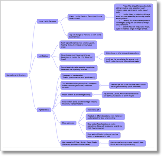
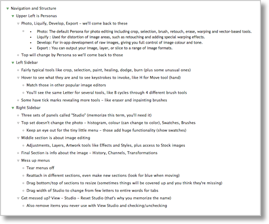
For grins and giggles I sent my outline from Tree back to iThoughts and took a screenshot in both applications of just one small section of the tutorial notes so you can see the same information in two forms.


Throwing ideas up into bubbles in iThoughts is still easier for me, especially since it runs on iOS and OS X, so I always have a device with me where I can throw in ideas. But after doing the final organization and fleshing out of my thoughts in Tree, it was much easier to stay on task while making my video. I should mention that I’ve been using Tree 1 (at version 1.97) and just discovered that Tree 2 is out, but in reading the feature list I couldn’t find any significant differences.
I really think Tree from topoftree.jp/… and available in the Mac App Store for $12US hits the perfect sweet spot of light and easy along with just enough capability to help me work quickly when organizing my thoughts.

One of the things that makes Tree powerful is the horizontal outlining. It is useful when each column has a connection with the previous column. Linear outlining tends to spread the connections from a top down manner and you lose the sense of flow from broader to smaller topics. Using the horizontal view was not very intuitive for me but once it clicked it really made sense. I do not use it for most outlining, but in those cases where I need to see the flow of things (Ie: procedure, story flow) it is useful.
Seconded. Tree really shines if you learn to appreciate outlining horizontally instead of vertically. It makes it easier to see child and parent elements, and you can also open a “family” (parents, siblings, aunts and all) in a new tab or window, similar to the “hoist” feature in Omnifocus
i know this is an older thread but it seems “Tree” is no longer available. Anyone have any ideas why and/or any alternatives?
Hi EricP-
Funny you should notice this right now, I just put the finishing touches on a video for ScreenCasts Online on an awesome alternative. It’s called Cloud Outliner. Available in the Mac App Store or through Setapp, AND there are iOS apps as well. $10 for the Mac app, $3 for iOS. The version in the Mac App Store supports iCloud syncing (Apple restricts iCloud to Mac App Store) but the Setapp one will still sync if you choose their Cloud Outliner server for syncing. It’s a lovely and intuitive program. Let me know if you check it out and what you think of it.
I should mention it doesn’t do the tree-style outlines, just regular outlines.
Awwwww, that stinks. Loved the “tree-style” outlines. Thank you so much for the alternative, Cloud Outliner. I will definitely check this out as a replacement and the SceenCasts Online video. You ROCK!
And you made my day! Ironically I never used the tree-style until last week when I made my giant mind map of all iOS 11 settings. It was a very cool way of visualizing the madness. The video won’t be out for a little while, just submitting the first cut to Don now.