 I entitled this segment “Activity Tracking is Really Improved with watchOS 3 and iOS 10” but I’ll leave it up to you whether are all are of these are truly improvements.
Activity Sharing
One of the reasons that Fitbit has been so successful has been because of the ability to share your activity with your friends. Peer pressure or encouragement, whichever works for you, you get it from sharing exercise with your friends. When I left Fitbit for the Apple Watch, I really missed smack talking with my friends on Fitbit. Now, with IOS 10 and watchOS 3, activity sharing has come to the Apple Watch.
On the iPhone, in the Activity app, tap the Sharing button on the bottom. Next you’ll see a plus button in the upper right where you can add friends. It only lists those in your contacts list who have Apple Watch’s. If you try to add someone who has an iPhone but no Apple Watch, it will tell you that you cannot share activity with them. That seems kind of shortsighted to me since many people track their activity with the phone. Maybe they’ll explain that later.
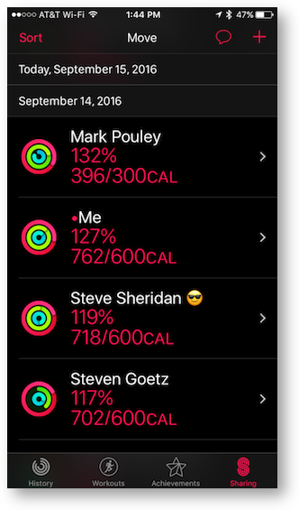
Sharing with someone causes several things. The coolest part is that in the Sharing tab on Activity you can see their active calories burned against their goals. The list isn’t sorted by the most calories burned, it’s by percentage of each person’s goal. I think that’s actually a better way to do it, otherwise I’d have no friends at all!You can change the sort from the default of active calories to by name, exercise, steps or workouts. Sharing even shows on the Apple Watch itself. If you tap on the Activity app on the watch the default is to show you your own activity. But if you swipe to the left, you can see your friends’ activity as well. If you press and hold, you can change the sort order there as well.
You can tap on each person’s name in your Sharing list, and see a full list of their exercise, stand, steps, distance, and workouts. I can just hear people like Dorothy saying to themselves, “well that’s just creepy.” To that I say, one woman’s creepy is another woman’s awesome.
There’s another thing that comes along with sharing, and that’s notifications. So let’s say you’re friends with me. I go to the beach and start a workout a third-of-a-mile walk from the car to the beach (we’re cheap and don’t like to pay for the close parking when we’re going to exercise anyway!) I finish that workout, and start a new one for my speed walk. That’s another 3.63 miles to go up and back on the beach strand in 46 minutes. Stop that workout and start another one to walk the third-of-a-mile back to the car. Finish that workout. Then about 4 in the afternoon I take Tesla out for a walk, never less than a half hour and often for a full hour. That means in a single day, you’ll get FOUR notifications from me on your Apple Watch.
Here’s the good news. In the Sharing part of Activity on the iPhone, when you look at the details of someone’s activity, if you scroll down you can an option to mute just that person’s notifications. Today when I got back from a 10 mile bike ride after three walking workouts this afternoon, Steven Goetz, Allister Jenks, and Mark Pouley were all giving me a hard time about it! How long do you think before they’re going to mute me? I give them two days, tops.
If you have a friend that’s giving you a hard time about your activity level, you can actually choose to hide your activity from just that friend. And of course, there’s also a button to remove that friend. I think Apple made some good choices when they gave us this granular level of control over our sharing preferences by person.
Changes to the Apple Watch Workout Interface
The Apple Watch interface for workouts has been an adventure in swiping and tapping and swiping and long pressing and tapping yet again. Early on it was really hard to remember what to do, and after the muscle memory kicked in, the Apple Watch seemed to become less responsive to my presses and taps and swipes. Steve said he was experiencing the same thing.
Now with watchOS 3, the entire interface has changed. I’ll start with the best change. On watchOS 2, to finish a workout you had to long press and hold, which would trigger a new screen with pause and stop as options. It would usually take 2-3 times to get this to work. With watchOS 3, you simple swipe from left to right and there’s the stop/pause screen.
One of the reasons they can do this is that they got rid of a whole lot of other swiping. With the old interface, you were often swiping and tapping to change what you saw on screen. Let’s say the workout app was showing you your pace and your elapsed time, but you wanted heart rate. You would have to give up one of those to switch it to heart rate. There were so many options, it was a normal practice to spend 30 seconds fiddling with it to get it right.
The good news is that you only have two screens now, the workout screen and the finish/pause screen. The bad news is that as far as I can figure, you’re locked into whatever Apple decides you want to see for the type of workout you’re doing.
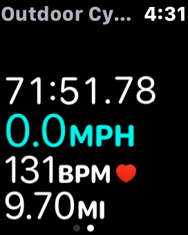
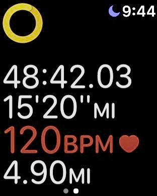
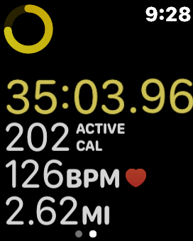
When you do an outdoor walk, you’ll see elapsed time, speed in distance per hour, heart rate, and total distance. If you run, the speed is replaced with pace, as in minutes and seconds for a mile or km. But if you walk, the pace is replaced with active calories.
I’m kind of bummed about this because on my speed walks, when I’m really pushing myself, I need to see that pace to see if I can break my personal record. Since you asked, that personal record was a 12 minute mile, also known as walking 5 mph. In the last year since I started walking instead of running (stupid toe), I have never been passed by another walker, but I have passed three “runners”.


Cycling, running and walking from left to right
While I wish I had the pace on my walks, the lack of swiping and stabbing and swearing is worth the sacrifice. At least it does still tell me my pace at the end of the workout.
THIS JUST IN: After I wrote this up, both Bart and Giles Croft explained to me that you can change the information you see in your workouts. They instructed me to open the Apple Watch app on the iPhone, scroll down to Workout, tap on Workout View. Now with Multiple Metric selected at the top, you can see all of the Workout options below, like Outdoor Walk, Indoor Run, etc. Tap on the one you want to modify. You’ll see the list of metics in the default at the top, and “do not include” down below. Tap the Edit button and add/delete at will. You can even change the order up and down.
Now I have zero to complain about on the new Activity tracking options in iOS 10 and watchOS 3!
Before the new operating systems, when you were done with a workout you could see your split times when you looked in the Activity app on iOS. Now though with watchOS 3, there’s an added feature to workouts.
If you double tap the screen while you’re working out, it registers what it calls a segment and it puts a little number in a circle in the top left. So let’s say you ride your bike 3 miles on flat ground, and then you’re going to climb a huge hill for 2 miles, and then you get to go downhill all the way home. You could double tap at each major change and record them as segments. When you look at your activity on the iPhone, you’ll be able to see your pace for each mile (or km if you are of that persuasion) and you’ll see your segment distances, elapsed time and average pace.
After all this coolness, there’s one more thing I wanted to tell you about. The first time you launch a workout on the Apple Watch in watchOS 3, it will ask you if it’s ok if it tracks your location during workouts. If you say yes, when you finish your workout and go into the Activity app to look at it, at the very bottom of the detail section below your split times and segment times, you’ll see a Route map.
It’s so cool! I’m afraid both Map My Walk and Map My Ride have been Sherlocked for me, because that’s the only thing I wanted out of those apps. The route map will show your pace by green, yellow and red segments along the path. Not sure what they use to define the colors though, because while my cycle today had a lot of green segments, my outdoor walk was yellow, orange and a bit of red! I’d like to take the engineer and UI designer for this feature on my outdoor walk and see if THEY think 5 mph walks are only “yellow”!
I only have one real problem with the workout app on the new watchOS 3. In order to make this review interesting, and to help myself remember what the watch was doing, I had to take screenshots. On watchOS 2, you did this by holding down the two physical buttons at the same time. That didn’t work on the new OS. Luckily, my daughter Lindsay is a geek too, and she told me that you had to turn that feature on, because evidently people were taking screenshots accidentally with their watches. She explained that you open the Apple Watch app on the iPhone, go to My Watch, General, and scroll all the way to the bottom and toggle the slider to enable screenshots.
But that’s not the problem with the Workout app. The problem is that I found out the hard way that if you take a screen snapshot during a workout on the Apple Watch, it actually pauses the workout! I lost 10 precious minutes of my speed walk because of that. I hope you realize the sacrifices I make for you.
Overall, I think the updates to the Activity features of the Apple Watch and the iPhone are fantastic.

I need to go on record that Allison hurried to capture the Sharing screenshot on her watch JUST (I mean a second or two) before I completed my last workout of the day, conveniently putting her ahead of me.