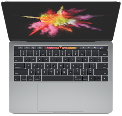
As I’m sure you’ve all heard, Apple updated the MacBook Pro line this week. The big excitement is that they’ve replaced the function keys with an OLED touch screen they’ve called Touch Bar. They added Touch ID to the right side of the Touch Bar. They got rid of the mechanical trackpad, replacing it with a force touch trackpad that’s twice as big as the old one. The list goes on and on of the improvements they’ve made.

I’d like to walk through these improvements, specifically targeting the 15″ model, and give you my take on them. I’d like to start with the price because I’m hearing a lot of complaints about that. I dug out my receipt for my late 2013 MacBook Pro (that I keep in Home Inventory from Binary Formations) to do a comparison.
My philosophy with computers has always been to buy the second to the top of the line. That last little boost you get of maybe 1-2 tenths of a GHz and a smidge more in graphics always costs way more than I think it’s worth. So in 2013, I bought the 2.3GHz Intel Core i7. I could have gone for 2.6GHz, but instead I bumped the RAM up to 16GB and the SSD to 1TB. This second to the top of the line MacBook Pro cost me $3099 before tip and tax and AppleCare.
Three years later, the 2016 MacBook Pro in the second to the top of the line configuration, configured with 16GB of RAM and a 1TB SSD, is $2999 before tip and tax and AppleCare. So this model is $100 cheaper than the same configuration in 2013.
Now don’t think I’m implying that this is an inexpensive computer by any means. You’re talking to a woman who paid $2800 for her first car! It IS an expensive computer, but it’s less expensive than it was 3 years ago, and that’s without taking inflation into account.
But here’s the problem. They offered a 2TB disk option. And Steve said I should go for it. Remember my long, drawn out saga of how I moved my Photos library off disk onto an external SSD because they no longer fit on my 1TB internal drive? Well they’re coming back on board now!
 But enough about the price, lets talk about what this Mac has to offer and see if it’s something you might want.
People love to talk about ports. If there’s one, they want two. If they get two, they say it’s the wrong two. It makes sense though, what you need is what you need, right? In the older MacBook Pros we had a plethora of ports. The 2013 had two Thunderbolt ports, two USB, one Magsafe power port, an HDMI port, a headphone jack and an SD card slot.
The new MacBook Pro has four Thunderbolt 3 ports (that are the size and shape of USB-C) and a headphone jack and that’s it. That might sound bad to you but let’s think about this. On the 2013, I never once used the HDMI port, and in fact never even noticed it was there for over a year until someone else pointed it out. It took up space internally and in thickness and never provided me any value. But maybe you really needed HDMI and it was the most valuable port on the Mac.
With the four Thunderbolt 3 ports on the new model, you can make them into anything you want. If you want four USB-A ports, you can do that. If you want power on the right instead of the left, these ports can do that. If you want a USB hub, an SD card reader , a Thunderbolt display and Ethernet you can do that. It’s completely configurable to what you need and want.
This comes at a price of course, and that’s in the purchase and use of dongles. At $25-30 each, this can certainly add up. But let’s say today you need the configuration we just described, and tomorrow you need all four to be USB-A, with enough dongles you can make that happen. I think the flexibility outweighs the dongle tax.
Let’s talk about the trackpad. I am a huge fan of the force touch trackpad in the MacBook. On the traditional trackpads, clicking on them really bugged me. I don’t know if it’s because I felt like that mechanical switch was going to wear out (like it did on one of my external Apple trackpads) or if it was just the sound, but I hated it. The first thing I would do with a new Mac was to turn on two fingered tap to select.
But with the force touch trackpad on the MacBook I bought last year, it’s a delight to click. If you haven’t played with it, it’s pretty magical. One of my favorite party tricks is to let someone click away on it while I power down the Mac. They’re always astonished when the power finally goes off and the trackpad stops clicking, because it’s unbelievable that it’s not actually a mechanical click. It’s amazing really.
Here’s another big seller for the force touch trackpad. A classic failure of the Mac notebooks is the trackpad if the battery starts to swell. I had seen it happen to other people and it happened to mine just last month. Maybe it’s a good thing as an early warning system about the battery now that I think about it.
I’m not sure why the trackpads are so much bigger now. The external Magic Trackpad from Apple is huge compared to the older mechanical one and I love it, so I guess having a bigger trackpad in the MacBook Pro will be good too, I’m just not sure why!
One thing I never liked about the 2013 MacBook Pro was the distance from the keys to the edge of the laptop where your wrist rests. It was just short enough that my watch always caught on the edge, or scratched around on the surface. With my traditional elegant watches, I always had to take them off to use the MacBook Pro in my lap. The MacBook is small enough that it never bugged me, even with the much bigger Apple Watch. I’m curious about the dimensions on the new MacBook Pro. Sure hope it’s smaller so my watch doesn’t scratch on it. Maybe this is just me though?
The keyboard on the new MacBook Pro is the second generation of the butterfly keys. I have kind of a love/hate relationship with the first gen butterfly keys on the MacBook. It’s part of why the MacBook is so thin and light, and the keys are low stress on my hands so that’s all good. But I definitely have more typos with the MacBook than with the Magic Keyboard I use with my MacBook Pro when it’s on my desk. The Magic Keyboard is my favorite keyboard of all time. Let’s hope the second generation butterfly keys will be more accurate for touch typists.
The only thing you interact with more on a laptop than the keyboard is the display. The new MacBook Pro display is supposed to be 67% brighter, have a 67% higher contrast ratio and have a color depth increase of 25%. I don’t know that I’ll be able to notice the last two, but brighter is always better for me. The brighter a display, the more your pupils contract, and the smaller your pupils are, the deeper the depth of field of your vision, which means it’s easier to focus. If you’re in your 20s or 30s this will be meaningless to you but as your close vision declines in your 40s and beyond this is a big deal! I only needed reading glasses at work at first, because I was using a really cruddy HP laptop plugged into a 10 year old Apple Display that was well past its prime.
I’m very happy about the reduced size of the new MacBook Pro. It’s 14% thinner, has 20% less volume and is 1/2 pound lighter at 4 lbs (11% lighter). My MacBook is only 2 lbs so it will still feel like a beast, but every little bit helps. Heck, Steve’s MacBook Air feels really heavy compared to the MacBook.
I like that there’s a new form factor as well, for no other reason that it’s new! You know how they change a perfectly functional car external design, just so it’s different than the previous year? Same thing applies to computers. Everyone has grey? We’ll make them black and charge extra. Black is common? How about white? White is hard to make? Let’s call the new color Space Grey to get them to buy it. Yup, take my money.
And finally there’s the Touch Bar. Or I’m sure it’s “Touch Bar”, not “the Touch Bar”, right? In the demos they showed how developers could create contextual functionality in Touch Bar, which looked pretty cool. I was really glad to see a demo of Photoshop with Touch Bar, even though I’m not a Photoshop user myself. I heard them say Affinity Designer was going to have Touch Bar support, but didn’t hear Affinity Photo for some reason.
Demos are great, but what are the developers saying about Touch Bar? Agilebits, makers of 1Password are super excited about Touch Bar and the integrated Touch ID. They did a blog post with video showing how Touch ID on a laptop could open your vaults just like on an iPhone. That’s magic right there. I actually use my iPhone for banking because it’s SO much faster to use TouchID than to type in my long password. Agilebits also created some screenshots of their first ideas of how Touch Bar could mutate while you’re using 1Password. Imagine being able to flip vaults or drag a slider on that OLED screen to change generated password lengths. I’ll let you read the article yourself but their enthusiasm got me even more excited.
One question a few people have asked on Twitter, including Buddy Brannon, is how will Touch Bar be accessible to the blind? It’s not a big leap to see that Apple could make it as accessible as the iPhone and iPad screens. But there’s one problem. In order to turn on VoiceOver on a Mac to make it accessible, you have to hit command-F5. Well if F5 is a visual button and non-physical, how do you find it without sight?
A great resource for the bind is the website AppleVis and of course they had the answer. They reported that Apple has confirmed that Touch Bar will be accessible, and to enable or disable VoiceOver on Touch Bar-equipped MacBook Pro devices, hold down the Command key and triple-tap the Touch ID button.
Bottom line is that I think there’s a lot to be excited about in the new MacBook Pros and I’m super excited to try it out in November when they get into our hot little hands.

You are not alone in the watch versus laptop edge wars. I had the same problem with my old 15″ MBP and steel watch.
On trackpad clicking, I always have tap-to-click and double-tap-hold for dragging enabled, but I have noticed I am frequently clicking the trackpad on my MacBook lately. I still cannot cope with a physical click for drag, however.
I use three-fingered drag on trackpads, Allister. Tricky to find though: http://www.podfeet.com/blog/tutorials-5/how-to-enable-three-finger-drag-on-12-macbook/
Great insight, thanks for sharing really good advice that people can actually take away with them.