 I’ve been using a late 2013 MacBook Pro to produce the podcast for the last three years, and an early 2011 MacBook Pro before that. I decided to upgrade to the 2016 Touch Bar-enabled MacBook Pro. I chose 15″ quad-core 2.6GHz i7, 16GB of RAM, with a 2TB SSD. It’s not quite top of the line, just one button click short. For another several hundred dollars I could have gotten a 0.1GHz uptick in processor and a bump in the discrete graphics. I’m trying to prove to you that I have self control.
People have been losing their ever-loving minds about several things on this new design. The keyboard, the 16GB memory limitation and the ports. I already talked about the ports last week and I think they’re pretty awesome. Let’s talk first about the keyboard.
Keyboard
When Apple came out with the 12″ MacBook, they announced a new butterfly switch design to the keyboard. Many people hated it because it doesn’t have a lot of travel. I don’t love it but I bought the MacBook because of how thin and light it is, and the sacrifice of a good keyboard was worth it to me. I find that I do make more typos on it but I still love the device.
When Apple announced the new MacBook Pros they said it was version two of the butterfly switch design. I can say categorically that it is a significant design improvement. I can’t say whether you’ll like it or not but it feels like a real keyboard to me. The one thing I don’t like about it is that it’s kind of loud. It’s not clicky sound it’s a lower frequency kind of thumpy sound. It’s not enough to bother someone in a normal environment but it makes it really hard to stealthily type while recording a podcast. I may have to start paying attention instead.
Speed
Let’s switch gears and talk about speed. My previous MacBook Pro was the late 2013 with a 2.2GHz i7 Haswell with 16GB while the new one is a 2.6GHz i7 Skylake processor with 16GB of RAM. I’m not a chip junkie (except for the potato variety) but I figure Skylake should be better than Haswell, and it has that extra .4GHz in clock speed.
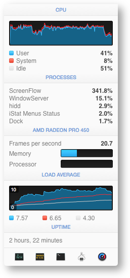
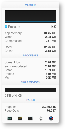 The most processor intensive activity I do is create videos for Don McAllister using ScreenFlow. While creating the video it doesn’t demand too much of the processor. In fact, using ScreenFlow on the 12″ MacBook isn’t bad at all. The longer and bigger the file gets, it will start to slow down though. But the big time is what it takes to render a file when the production is completed. For example, the 12″ MacBook takes about twice as long with it’s little Core-M processor than the 2013 MacBook Pro.
I opened a 17GB, 45 minute ScreenFlow project on the 2013 and 2016 MacBook Pros (or is it MacBooks Pro?). I made sure no other applications were running and I asked them both to render an iPad m4v version of the video. The new Mac finished in 10 min and 38 seconds, and the old Mac finished in 11 min and 22 seconds. While the 2016 Mac is about 7% faster, that’s only 44 seconds difference.
I took a look at the memory and cpu usage while the test was running, and the new MacBook Pro was definitely not hard pressed on this task. The task was using 10.5GB of app memory, didn’t swap to disk at all, and the processor was running at 350% so I still had 50% left out of the four cores. I could have done other things and probably not slowed the test down at all.
I know this isn’t a full length feature film I’m working on here, but it was really interesting to me that the new machine wasn’t really much faster than the old.
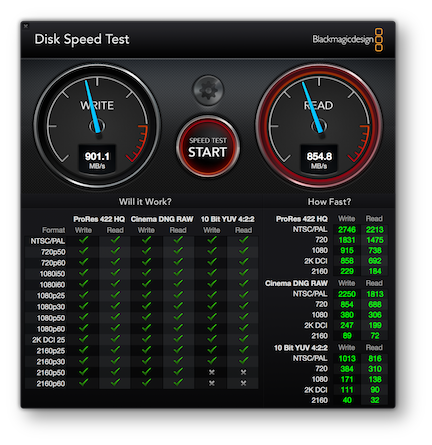
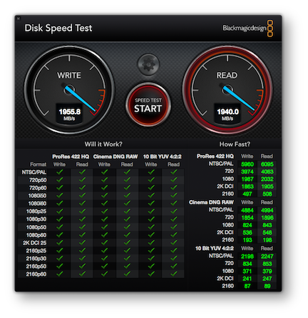
Next I ran the Blackmagic speed test app on the SSDs on the two machines. Apple claims the new SSD is twice as fast, and at least with this speed test, that is absolutely true. While both SSDs met all of the video encoding standards, both read and write speeds on the 2016 were more than double the speed of the 2013 MacBook Pro. On reads it was 2.27 times as fast. I think it could even be faster, because it pegged the meters. I got 1955MB/s write and 1940MB/s read in the screenshot but I definitely saw the read hit 2000 which is the highest their meter goes!
Late 2013 MacBook Pro
Late 2016 MacBook Pro
I plan to do more speed tests over time, so if you think of some you’d like me to try let me know. I’m going to install Final Cut Pro X on the new machine and have Steve do some speed tests between the MacBook Pro and his 2012 27″ iMac. Should be fun!
Touch Bar
Let’s cleanse our palette and talk about the Touch Bar. I think it’s worth getting if ONLY for Touch ID. It’s magical to unlock your Mac with a fingerprint. Whenever it’s available as an option, Touch Bar lights up with a bouncing arrow pointing at it to tell you it’s waiting for you. It’s magical to open 1Password with your finger. It’s magical to unlock system prefs with the tap of your finger. It’s positively awesome.
There’s a new System Pref just for Touch ID. In there, much like with iOS, you can add fingerprints. You also get a check box to decide whether to use it to unlock your Mac, use it for Apple Pay, and whether to enable ti for iTunes and the App Store. So remember how I’m having to reenter a lot of app information because of how I migrated my machine? Oddly every single app from the Mac App Store is making me re-authenticate, and it’s NOT letting me use Touch ID for it, even though I have that checkbox ticked. I know that will stop after a while but still, it ticks me off. See what I did there?
If you’re an emoji fan, Touch Bar is going to delight you. Whenever you’re typing there’s a little smiley face waiting for you. Tap that and then you can slide right and left through all the emojis. By default it shows you the most recently used, but there’s a button so you can toggle through the types of emojis, like faces, animals, food, sports and more. They’re bright and colorful and make it super fun and easy to choose.
My main use of the function keys was to turn volume up and down and change the screen brightness. Those work well on Touch Bar but it’s two taps to do each of those. By default even in the Finder, Apple chose to collapse the functions way over on the right, often leaving the middle of Touch Bar blank. If you tap the chevron, the normal functions slide out and then you can tap tap tap to go up and down on the controls. If you don’t tap the chevron and tap on the audio or screen brightness button, you get a slider that’s pretty nice for exact control. Either way it’s two taps at least where it used to be one. A minor nit, but the good news is that they could change this if they want to. I put apple.com/feedback as a bookmark in Safari so it’s easy for me to suggest improvements right when I think of them. I’m SURE they appreciate it!
Touch ID is on the far right of Touch Bar and just a smidge to the left of it is the Siri button. I hit Siri ALL THE TIME when I’m trying to hit the delete key that’s right below it. Again they could move it over a bit so it’s not accidentally hit. On the left side is the escape key and oddly they slid it over to the right a bit. I think it’s to make it look symmetrical with the right side which is kind of silly. The good news is that if you only slightly catch the edge of the escape key it triggers, so they must have known peoples’ muscle memory would make them miss the key.
The Safari integration with Touch Bar is interesting. If you have multiple tabs open, you can see the tabs in Touch Bar. They’re wee tiny and if the top bar of the site isn’t very colorful, they’re pretty hard to tell apart. Luckily the NosillaCast logo is super easy to see in Touch Bar. If you put your cursor in the url field (I use command-l) Touch Bar knows you want to go to a new site, so it offers you buttons for your Bookmark Bar favorites. If your favorites have good fav icons (the little image to the left of the url), like, say an adorable pair of bare feet, it’s very easy to tap and go right in. Not sure it’s any easier than tapping with the trackpad on the screen but it’s kind of fun, So far Google hasn’t implemented Touch Bar support but I bet they’ll have some fun with it when they do.
Photos brings up a slider in Touch Bar so you can flip through your photos. If you edit a photo, you can dive down into the menus for light, color, cropping, etc. Again, not sure it’s easier than looking on screen while you mess around. Might be a novelty item.
On iOS when you’re typing, you get a little bar with word suggestions. If you’re not a speed typist, these can come in really handy. If you like them, then you’ll be glad to know that you get them with Touch Bar on the new MacBook Pros too. I taught myself to touch type when I was a little kid, so I have to actually slow down to use it on Touch Bar on the Mac, but I sure like it on iOS. I type fast enough that Touch Bar doesn’t even update most of the time I’m typing.
I also might put Touch Bar in the beta category. I had my Touch Bar get stuck with a Photos logo on it, with a slider for a video, and yet I was in Safari at the time. I’m sure they’ll get that sorted out over time.
Trackpad
I’m looking forward to more discovery with Touch Bar over time, but let’s move on to the new trackpad. I’m a huge fan of the external Force Touch Magic Trackpad, and the one in the 15″ MacBook Pro is only slightly smaller. I love the non-mechanical click of the trackpad, but it’s got some little bugs to be worked out. I like to enable three-finger drag on my trackpad, but it doesn’t work all the time on the new Touch Bar Mac. If you’re confused about this three-finger drag thing, they’ve really hidden it ever since El Capitan. It’s in System Preferences > Accessibility > Mouse & Trackpad > Trackpad Options > Enable dragging and then pull down to three finger drag. You have to really want to do it to work that hard!
I’m also having some errant trackpad clicks from time to time. It’s not super often like in the old days with early trackpads but they need to do a bit more work on their palm rejection with this model. Since it’s all fake clicking I suspect this is a software fix.
Size and Weight
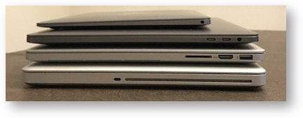 I care a lot about the size and weight of my devices. The 15″ 2016 MacBook Pro weighs in at only 4.02 lbs or 1.82kg. That’s a .44 lighter than my 2013, and 1.58lbs less than my 2011. That makes the 2016 weigh 80% of what the 2011 weighed and 90% of what the 2013 weighed. If I hold the 2016 and the 2011 at the same time, you can TOTALLY tell the difference, but that little drop between the 2013 and 2011 isn’t at all noticeable.
But the volume is REALLY noticeable. The 2016 is only 81% the volume of my 2013, and 73% the value of the 2011. I know that’s a lot of numbers to hear thrown about, so sorry about that. Leave it to say that the new MacBook Pro is really thin and svelte. That is, until I pick up my 12″ MacBook and then it feels like a tank. That sweet little Mac weighs a diminutive 2.03 lbs. I think once the novelty wears off, the 12″ MacBook will continue to be my traveling Mac.
One thing I was hoping for with the new MacBook Pro was that the distance from the front edge of the laptop to the beginning of the keys would be just a bit farther. I didn’t get my wish. With the older MacBook Pros and the new 15″ that distance is just far enough that my watchband rests either on top of the case leaving me hearing it scratching around, or it’s just barely off the case which means it’s pulling on my wrist. With my old laptop I got in the habit of simply taking off my watch any time I was typing. One of my favorite things about the 12″ MacBook was that it was small enough I didn’t have to take off my watch. Oh well, it was a nice dream.
Bottom Line
I usually like to end reviews with a bottom line, but I think it’s too soon for that. I think I can say that if you have a fairly recent MacBook Pro with an SSD, and you’re not rolling in extra cash, put more money into your retirement savings and wait a while until Intel (or maybe Apple?) come up with some faster chips that really make a big difference in speed. I’m sure I’ll have more thoughts next week on the new Touch Bar MacBook Pros. Or is it MacBooks Pro?

Thanks for the review of the good, the bad, and the so-so about the new Mac. It’s helpful to read a review that comes from the heart, as it were, rather than newspeak.
Here in the UK I am waiting for the 2016 Touch Bar models to come into the stores.
I have tried a non-touch-bar 13″ model in the local Apple shop and I agree about the clacking sound when typing. It feels like the strokes travel all the way through the machine to the desk below and come right back. No reverberation, which is good, but definitely less absorbent than the earlier model.
I like the bigger trackpad.
I have been using a mid-2010 15″ model since mid 2010 (haha) and waiting this year to decided about the 2016 model. And my instincts tell me to hold off on the trackpad 15″ model and go for the 2015 model. But it’s decision time and those shiny touch bar lights beckon.
I love everything about mine except the intrusive Siri. I don’t want her to do anything for me because she tells the whole world about it, but she keeps butting in when I am trying to delete something. go away Siri. like over to the other end of the toucher.
AGREED Anonymous! I got rid of her. She’s banished from my Touch Bar.
Open System Preferences, Keyboard and on the keyboard tab you can click on Customize Control Strip…
From there you can drag Siri off of your Touch Bar and she’ll stop irritating you. You can slide things around too. Hope this helps!