In last week’s show, I said that iPhone X actually has a bigger screen than iPhone 8 Plus, even though the phone’s physical size is closer to iPhone 8. In the live chatroom for the show, George from Tulsa called me on that statement. He pointed to an article on phonearena.com/… where Victor H had determined that iPhone 8 Plus actually has the bigger screen.
Now I could have gone over and just read what Victor had written but what fun would that be? You know where this is going, right? I had to prove (or disprove) this myself.I’m glad I did my own work because while Victor H did come to the correct conclusion, he had a pretty major mistake in the intro (he shows the screen resolution of iPhone 8 Plus completely wrong) and he does some unnecessary calculations along the way as well (using points instead of pixels). Victor also references someone else’s assumptions in drawing the device, while I decided to make my own drawings.
Before we proceed, let’s address what you might be thinking, “how could a phone with a larger diagonal dimension ever have a smaller area?” When two engineers marry, this is the kind of discussions that happen over dinner. Steve pointed out a way to “get” how the X’s screen could have a bigger diagonal but a smaller area is to imagine a super LONG diagonal but a very narrow screen, like 10 inches diagonal but .25 inches wide. That would have very little square area even though it has a huge diagonal dimension. Hopefully, you can visualize this extreme but illustrative case. Now, let’s have some fun with geometry!
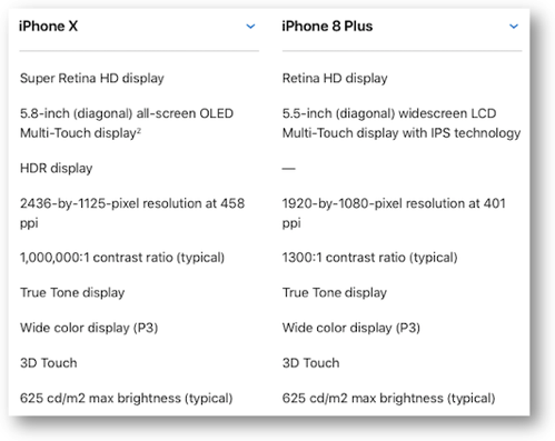 Let’s set one metric first which doesn’t take much to figure out. iPhone X has significantly more pixels of information on screen than iPhone 8 Plus. From Apple’s iPhone Comparison Page, we can see the number of pixels of the two phones:
- iPhone X: 2436 x 1125 pixels at 458 ppi (pixels per inch)
- iPhone 8+: 1920 x 1080 pixels at 401 ppi(pixels per inch)
Simply multiplying the pixels, we can see:
- iPhone X: 2436 x 1125 = 2,740,500 px2
- iPhone 8+: 1920 x 1080 = 2,073,600 px2
If we divide the two square pixel numbers, we find that iPhone X has 32% more pixels displayed than iPhone 8 Plus.
But the argument was about the physical size of the display, not the number of pixels.
We can start at a coarse level and compare the two phones by dividing each of the square pixel numbers we just calculated by the square of the linear pixel density that we know. We have to square that pixel density because it’s in pixels per inch which is one-dimensional.
- iPhone X: (2436 px x 1125 px) ÷ (458 px/inch) 2 =13.065 inch2
- iPhone 8+: (1920 px x 1080 px) ÷ (401 px/inch) 2 = 12.895 inch2
This coarse calculation tells us that iPhone X has a screen that’s 1.3% larger than the 8 Plus. You are all yelling into your devices right now, “But what about the NOTCH, Allison???” Well, of course, we must account for that because the NosillaCast is known for its thoroughness and attention to detail. Let’s take this up a notch (see what I did there?)
The problem though is that Apple doesn’t give us the dimensions of the notch in an easy to find its area. I discovered the Human Interface Guidelines for iPhone X over at developer.apple.com to see if I could learn a little bit more. We’ll come back to some important points in these guidelines in a bit.
While Apple still didn’t give any exact dimensions in the guidelines, they did provide us with a scalable vector graphic of the face of the phone. Scalable is good because that meant I could take the image and open it in Affinity Designer, a vector-based tool, and start measuring it. I had to make a leap of faith that Apple created this drawing to scale. If they haven’t, I’ve lost all faith in what is right in this world. Remind me to tell you a story some time of Lindsay’s 5th grade Mission project and drawing things to scale.
The tricky bit is that the drawing is scalable, so how do I make it the exact right size? I created a document in Affinity Designer first that was exactly the dimensions of iPhone X screen, 2436 x 1125 pixels. Then I added the screen outline onto the document and scaled it until the screen size lined up perfectly with the document edges. Then I locked that layer.
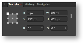 Unfortunately, I can’t determine the size of the notch directly using Affinity Designer but I can draw new shapes on top of their geometry and Affinity Designer will tell me my dimensions over in the transform panel.
I started by drawing a rectangle over the notch. It measured at 89 x 624 pixels = 55,536 pixels2. If we divide that by our pixel density (squared) of 458 ppi, we need to subtract 0.265 inches2 from iPhone X screen. That brings iPhone X down to 12.8 inch2 vs 12.895 inch2 for iPhone 8 Plus. The 8 pulls ahead now by 0.7%! Now we’re getting somewhere.
Now our little friend Victor H had taken someone else’s drawing where they did more than measure the size of the notch. Oh no, these people make me look like a normal, sane person. They removed the rounded corners of not just the four corners of the display but took into account the rounded corners of the notch itself!
Accounting for the four corner rounds is a reasonable thing to do, but I wasn’t going to be out-nerded so I did them all.
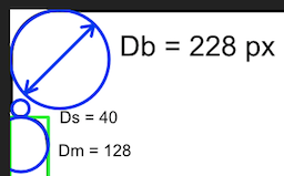
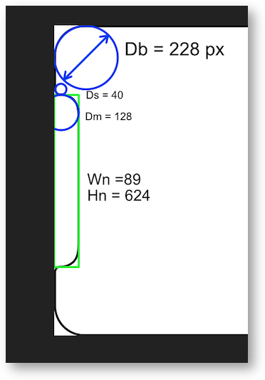 There are three rounded corner sizes for which we must (or at least I must) account. I designated the diameter with the letter b for the biggest (the four corners of the display), the letter m for the medium-sized interior corner of the notch, and finally the letter s for the teeny tiny curve where the notch meets the top edge of the phone. We’ll be using Db, Dm and Ds as my three corner diameters.
So we have the entire screen rectangle which is W x H for width x height. Then we’ve got to subtract Wn x Hn for the notch width and height. Then we have to subtract out the area of the four rounded corners.
The easiest way to calculate these areas is to subtract the area of a circle (whose arc defines the rounded corner) from the area of the square circumscribing that circle. If it were only one corner, we’d have to divide that difference by 4, but since we have 4 external corners on the display, the 4s cancel out.
The area of the square circumscribing the circle is simply Db2, and the area of the circle is πDb. So to remove the area of the four rounded corners, we subtract (Db2 – πDb) .
Is anyone still following this? It’s ok, it entertains me and that’s enough some days.
Now that we have the basic idea down of how to deal with the rounded corners, it gets faster. The middle-sized radius on the inside of the notch actually adds to the available area, while the teeny tiny small rounded corner where the notch meets the top edge of the phone again subtracts. Oh, and don’t forget there are 2 each of the small and medium roundy bits on the notch, not 4 like on the display’s main corners. So for the ones where there’s 2, the formula becomes:
- subtract out (Ds2 – πDs)/2
- add back in (Dm2 – πDm)/2
So here’s our formula in all its glory:
iPhone X screen area = (W x H) – (Wn x Hn) – (Db2 – πDb) – (Dm2 – πDm)/2 + (Dm2 – πDm)/2
Correction: More accurate measurements so some values have changed:
- W = 2436
- H = 1125
- Wn = 86
- Hn = 627
- Db = 211
- Ds = 38
- Dm = 125
Plugging in all the numbers, iPhone X screen is 2,678,545 pixels2
Dividing by the iPhone X’s pixel density of 458 ppi squared, and the iPhone 8 Plus by it’s pixel density of 401 we get a grand final screen size of…
iPhone X: 12.77 inches2
iPhone 8+: 12.90 inches2
And we have it, iPhone 8 Plus screen is bigger than iPhone X screen by 1%. As much as it pains me to admit it, George was right.
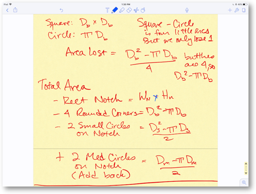 I typed all of these equations into the blog post, but that’s not how I actually developed the formulas. I grabbed my trusty 12.9″ iPad Pro with Apple Pencil and the Notability app and went to town drawing circles and squares and scribbling away to create the equations. I suppose I could have used a pencil and paper, but I love using the Pencil and having the document already digital instead of having to scan in if I want to save it.
Safe area
Now that we have that settled, I promised I’d talk a little bit more about the Human Interface Guidelines for iPhone X.
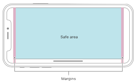
The guidelines explain that developers should provide a full-screen experience, extending backgrounds to the edges of the display both vertically and horizontally. But then they go on to explain that content should be centered and symmetrically inset so nothing gets obscured by the following things:
- Clipping on those rounded corners
- Obscured by the indicator for accessing the Home screen
- Underlapping the status bar, navigation bar, toolbar, and tab bar
That’s a lot of stuff to avoid! They also point out that the status bar is taller on iPhone X than on other iPhones, so developers might be in trouble who assumed a fixed size for the status bar.
The guidelines show a Safe area with margins all over the place, leaving a much smaller rectangle than we’ve calculated!
 That got me thinking that I really should compare Apples to Apples (if you’ll forgive the obvious pun) and look at the Human Interface Guidelines for iPhone 8 Plus. Well guess what? To the best of my Google Fu, they don’t exist. I would have been willing to settle for guidelines for 7 or 6 Plus, but I couldn’t find those either!
I can only imagine that iPhone 8 Plus has safe areas too, but I can’t compare them. I saw a note in the guidelines for iPhone X that referred to information inside UIKit, so I downloaded Xcode (a 9.93GB download) to see if I could find some templates in there, but guess what? They don’t have iPhone 8 Plus listed as an option! I complained about this in Facebook and Claus Wolfe suggested it’s in the beta for XCode, but I was kind of exhausted by this time and never pursued how to go through the developer program to find the beta of Xcode.
In conclusion, George was right. By the way, after my post about NIST and now this, it has been suggested that I need to get out more…

It’s not just how many pixels you have, but how you use them. There is one major difference between the 8 Plus and the X which you threw out right at the beginning.
Everything* drawn on the display is measured in points, not pixels. Fonts are ‘so many’ points in size, lines are ‘so many’ points in thickness, and in length. The iPhone X uses 3 pixels per point in each dimension, whereas the iPhone 8 Plus (like its predecessors back to the 6 Plus) uses approximately 2.6087 pixels per point. The odd pixels-per-point value for the Plus models is because iOS internally works with a 1242 x 2208 pixel screen on these phones and this is then down-sampled to 1080 x 1920 for the actual display. You can see the effect of this when you scroll standard table views (like in Mail’s inbox) and watch the hairline horizontal cell dividers “wobble” as you scroll.
Pre-retina iPhones had one pixel per point. All retina iPhones since, excepting the Plus models and now the X, had two pixels per point. The Plus models had their down-sampled 2.6 and now the iPhone X will be the first device to have a true 3 pixels per point. This, of course, does not count the use of zoom modes available in all phones (except X) since the 6/6 Plus.
The reason there is no specific HIG for the Plus phones is because the three different screen sizes (SE, standard, Plus) are all treated with “size classes” for standard app layout. All phone sizes are deemed “compact width” and “standard height” when in portrait orientation. When in landscape, however, all phones except the Plus models are deemed “compact” in both width and height. The Plus models are deemed “standard” width, which is why you get a sidebar in apps like Mail on a Plus phone, but not on the others.
The layout of apps should** not fundamentally alter between all three phone sizes except on a Plus in landscape versus the others in landscape.
*I said everything renders in points. That’s true of all standard interface elements and drawing methods. It’s not necessarily true in the case of video. It was, I think, proven that 1080p video played on a Plus phone is not up-then-downscaled, but rather rendered directly, pixel for pixel. I’m also unfamiliar with what Metal allows a developer to do.
**Apple’s HIG say how you should design your apps – that doesn’t mean some developers don’t go outside these guidelines.
Interesting points (see what I did there?) Allister. Victor H on Phone Arena talks about the points to pixels thing but he implied that they are both 3x. That’s also where he has the wrong pixel dimensions for the iPhone 8 Plus. this has me wondering if I divided his end condition by 2.6 if I’d back into the right dimensions for the 8 Plus?
The point (again with the jokes) of asking for the HIG was I was hoping to compare Safe areas. I presume if they had an HIG for the other phones, I could then use that to calculate how much _useful_ area there was on each phone. Since I couldn’t find it for the 8 Plus I abandoned that path.
Standard margins on all phone models today (and iPads too, I think) is 20 points in from the screen edges. The iPhone X alters those margins due to its non-rectangular screen. On an 8 Plus, 20 points is about 52 pixels. So the 1080 x 1920 screen effectively shrinks to 976 x 1816.
But to truly determine which screen is “bigger” you need to define what you mean by that. Bigger in physical area, bigger in number of pixels, or bigger in ‘effective pixels’ (i.e. points, which dictate what size displayed content is)?
Measured in physical dimensions the X is between the 8 and 8 Plus in width (about 9% narrower than the 8 Plus) and 11% taller than the 8 Plus. Measured in pixels, the X is wider than the Plus by about 4% and taller by about 27%. Measured in points, the X is about 10% taller than the 8 Plus but the same width as the 8. Subtract all the margins and the X gets complicated.
At this point I’d say the iPhone X screen is different to the iPhone 8 Plus screen.
This was a fun read. I think that whoever told Allison she should get out more may be on to something (for both Allison and Allister). On the other hand, I saw a poster online recently that said, English is important, but math is importanter.
I was lucky to marry a mathematician because all that calculating just hurts my head.
That said, a story from my past. I was acting as “principal” on a construction project. Tulsa had some terrible floods caused by over-building, over-paving, and no regional storm water policies. The good result is a very aggressive and effective storm water policy.
The construction project for which I was responsible involved a 25,000 sq. ft. building and parking. The storm water retention requirement was in acre feet over time. Meaning a really large bucket and very small drain.
The civil engineers on the job designed the parking lot to store water in time of downpour.
I had visions of customers’ Mercedes-Benz sinking in 5 ft of water, and sharks feasting on swimming children.
Bought an auto cad program. Learned out to use it enough to confirm the engineers had indeed designed at worst-case a five foot deep pool in part of the parking lot. They had not provided shark cages.
Over in Google Plus I posted some links. One to AutoCAD for the iPad. Another to 10 iPad Programs for Engineers.
My point isn’t to deprive Allison and Allister of mathematical fun with points. What would be the point of that? More to the point, it would be interesting if a CAD program is an accessible tool for this task. Can’t imagine CAD isn’t better suited than Affinity Designer, but right at the top I did say all that calculating hurts my head –
George, thanks for the information. I admit to laughing out loud when you brought up sharks. As an aside, I actually finished my course work for a PhD in theoretical mathematics (that was 47 years ago), but I got bit very early by the software engineering bug and dropped out of the math program to pursue programming computers. That caused my career to eventually migrate to management. Now I think I’m a jack of some number of trades but probably not a master in any of them. I’ve really enjoyed your interactions with Allison over the years. You seem like a very erudite and engaging person. Thanks for all of your writing.
Thanks, George Conant, my wife’s career followed a similar trajectory. She realized that Ph.D in theoretical mathematics she was so close to finishing (daunting dissertation, however) wasn’t likely to get her that tenure track university position, so she took up computers, working most of her career as a Systems Architect – I’d have never gotten started with micro-computers at all had she not been at hand to connect the Okidata printer to my Osborne 1 with the required hexadecimal codes – still have no idea what those are!
My maths is rusty… but I thought the area of a circle is pii * radius (squared) and not pii * diameter, which is what you used here.
I’m going to kill myself.
a) because I made such a dumb mistake
b) because Steve checked this VERY carefully and missed it
c) one of the advantages of blogging before podcasting is that people find mistakes BEFORE I made an idiot of myself on the air.
And no one caught it.
Thanks Quazim- you and Jill are the only ones who ① (D catch it!
So, Allison, after having your “maths perfected,” how about seeing if any of those CAD programs might help with “work” like this? Or even with laying out that new tile floor? Look to me like a very good use of a big iPad Pro with Apple Pencil?
Thanks for sharing an informative post.Each point explained in the post is crystal clear.You have cleared all my doubt regarding screen size.Thanks once again.Keep posting!!!
If you want more information related to cellphone case then visit – https://www.thecasesstore.com/
It appears in my testing that the corners are likely squircles and not simple rounded corners.