
I take a lot os screenshots for quite a few different uses. I like to use them in my blog posts when I’m reviewing applications. I like to include them when doing tech support in emails to my friends and family and also to listeners who write in with questions. I also use screenshots to demonstrate problem areas when communicating with software developers about their products. I’d like to tell you about a menu bar app called Teampaper Snap that might be a better tool for you than some of the built-in capabilities of macOS. But first, let’s set up some problems to be solved.
I do so many screenshots that I’m pretty comfortable using the keystrokes built into macOS to capture a specific area, an application window, or even full screen. For some (many) people, remembering those keystrokes is a pain so they just don’t do it. Apple has the built in Grab application (you’ll find it in Applications/Utilities) which might be easier for you. It’s a pretty useful tool with timed screenshots that’s handy for capturing a pulldown window.
But once a screen capture has been acquired, it’s often desirable to add some annotations. You know I’m a huge fan of Clarify from clarify-it.com for doing a series of screenshots and annotating them. Most of the time, though, I only need one to get my point across. and that’s a bit of a sledge hammer for the single-shot need.
For my one-shot annotation needs, I usually do the command-control-shift-4 keystroke dance to capture an area to the clipboard, and then open Preview and hit ?-N for new window from clipboard and my screenshot opens. Sometimes, if I’m feely frisky, I tap on the Touch Bar and select open in Preview first instead of doing ?-N.
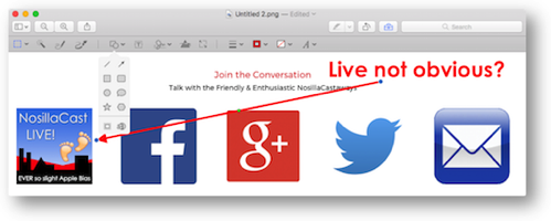
Once in Preview, I tap on the toolbox to reveal the tools to annotate the image. In recent versions of macOS, you can also paste a screenshot directly into an email and hit the little disclosure triangle to open in Markup and annotate the image as required with shapes and text. It’s the same features that are available in Preview if you hit the little toolbox. It works but it’s got some drawbacks.
The main thing I don’t like about annotating in Preview/Markup is how you don’t get to just draw the shapes where you want them. When you hit the box icon, it just plops a box on the screenshot immediately. Then you have to drag the top, bottom, left and right independently to get it where you want it. Same thing with an arrow, you have to drag the start and end points around. So much more efficient to just draw a box, or click and drag an arrow. I do like the flexibility of colors and line thicknesses and font size though.
Now let’s talk about Teampaper Snap from teampaper.me, a free menubar app. One tap on take screenshot and you’ve got crosshairs ready to capture a portion of the screen. Hit the space bar to select an entire window (just like with the built-in screen capture tools) and then click to capture. Of you like keystrokes, you have the option to set one in the Preferences.
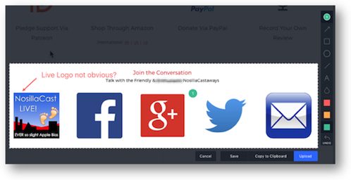
Once you capture an area of your screen, the screenshot immediately opens in a floating heads-up kind of window. It’s ready to be annotated immediately, rather than having to run over to Preview for that part of your workflow. No requirement to remember those pesky keystrokes, and already faster to get to the annotations.
Remember how I am always annoyed at how Preview plops annotations in the middle of the screen instead of allowing you to draw them in place? Teampaper Snap let you draw arrows, lines, boxes, circles, and text at a location and direction/size of your choosing. This is a much more efficient method of annotating images.
You can choose different colors for your annotations, but your choices are a pale red, pale orange/yellow, and pale green. Want another color, or a brighter, more bold color? Nope! That’s what you get. Want the line thicknesses of the arrows and boxes to be thicker at times? Nope! That’s the line thickness you get.
Teampaper Snap has several cool tools that make it really useful. It has a blur tool (designated by a water droplet in the toolbar) which is invaluable for obscuring that home address or phone number that’s in your screenshot. In Preview/Markup you can only plop a rectangular blob of color on top of your personal information. I really wish Preview had a blur tool!
Probably one of the most unusual features of Teampaper Snap is the ability to add numbered bubbles on your screenshots and add comments on the side of the shot to explain them. You tap a red circle with a 1 in it to start putting in comments. Tap on the area where you want the bubble to be, and then a comment field comes up where you can type some text.
When you save the annotated image, the comments appear on the right side of the annotated image. Pretty slick and reminds me a bit of the way Clarify does the same thing.
Once you’ve captured your screenshot and annotate it, you have several options of what to do with it. If you choose to save the image locally, the name of the resultant file will include the name of the app you were capturing along with the date and time of the capture. I like that they include the name of the app, and of course you can rename it in the standard dialog box if you prefer.
Alternatively, you can copy your screenshot directly to the clipboard which is perfect for the quick shot you don’t want cluttering up your “delete me” folder but just want to paste into an email or message.
Finally you can save your screenshot to a free online account hosted by Teampaper Snap. The advantage of that last option becomes obvious when you need to share an image with someone when a simply paste into an email or message isn’t an option. I’ve run into this on discussion forums and also when posting a bug report or feature request to a software developer. As soon as you hit upload, you’ll see a message that the link to the screenshot is on your clipboard. Could not be an easier way to share a screenshot. Reminds me of lot of Skitch that was eventually bought by Evernote.
Once you create a free account for Teampaper Snap and do your first upload, you’ll see a change to the pulldown menu. You can now go to My Gallery which contains all of your uploaded images at tppr.me. They also allow you to drag and drop any image into your gallery, so it’s not restricted to images taken with Teampaper Snap. From there you can grab a link or delete your uploaded images (one by one). Keep in mind these are public images so don’t upload anything you don’t want discovered.
In a real “meta” moment, you’ll notice also that your uploaded images can have annotations added after the fact within the web interface. Simply click and drag on an area and a comment box will be revealed. They’ve set this up to allow collaboration even with people who don’t have Teampaper Snap accounts. I sent a link to an image to Pat Dengler, and she was able to add a second comment on one I’d made to the image, and create a unique comment. These comments are designated by again the red bubbles with numbers in them.
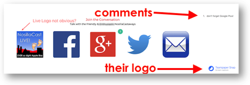 I said up front that Teampaper Snap is free. If you put annotations on a screenshot, they embed their logo in the bottom right. They have an in-app purchase of $20 that allows you to put your own logo in the bottom right instead of theirs. I like they way they offer this – they say, “App will always be FREE. Think of it as a special way of supporting our feature work.” I think they meant future work, but in any case it’s a good way to explain their business model.
If you’re looking for a way to take quick screenshots, do a few annotations in an easier way than Markup with Preview, and wish Preview had a blur feature, or want to be able to post your screenshots online, check out the free Teampaper Snap in the Mac App Store or at teampaper.me.
