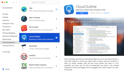
 A while back a new app model came out called Setapp from setapp.com. You probably heard about it back then, but to refresh your memory, it’s a subscription service for $10/month that gives you full access to a ton of apps.
At the time, without looking at it myself, I declared it a dumb idea and I didn’t want any part of it. But then I met Mark Fawcett of MacMen at MacStock Expo and he told me he thought it was really cool. I still didn’t look into it. Then Steven Goetz, my research assistant, told me it was cool. But I still didn’t look into it.Then Setapp approached me about doing ads for them and offered me a free membership. I have a firm belief that when I get things for free (that cost a lot of money) it makes it harder for me to truly say whether they’re worth the money. Don’t get me wrong, I do reviews of products that I receive at no cost to me, but it does make it harder to be unbiased.
I told the Setapp folks that I’d like to pay for it myself for a few months before deciding if I’d do ads for them. I’ve ultimately decided not to do the ads, but not because I don’t like the product, it’s because as I’ve mentioned before, I like that you guys get to choose how the show is funded from Patreon, PayPal and Amazon Affiliate Links.
After using Setapp for a few months, I have to say that I think I’m getting the $10/month value out of it, but not for the reasons you might think. The theory of this design is that you don’t have to buy apps because you get the cool ones all from this one subscription price.
In reality, I’m finding that the $10/month is the fee I pay to test drive apps. If I don’t like them, I haven’t wasted my money, but if I do like them, I buy them outright. One stop shopping for try before you buy.
App discovery is easy in Setapp because they send occasional email notices showing off new apps they’ve added. They also have nice categories that are easy to peruse. There are enough apps in Setapp to make it interesting, and yet not so many that you can’t find anything. Their curation team is really good because I’m not finding cruddy little apps but rather many of the best apps.
Let’s talk about my new favorite outlining program that I found through Setapp.
You may remember a blog post back in June of 2016 where I told you I had chosen Tree as my inexpensive outlining tool, but Tree has always had some rough edges that bugged me. It also had no cloud syncing so I could only use my outlines on my Mac. Their website has also stopped functioning, so I’m not sure they’re even in business any longer.
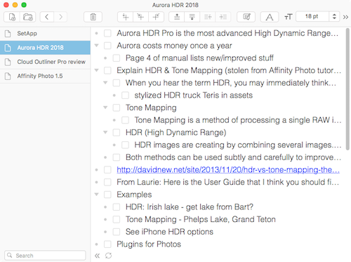
 In perusing the offerings from Setapp, I came across Cloud Outliner from xwavesoft.com. I knew almost immediately that the look and feel of this app was far and above better than Tree. The design is clean and uncluttered, and they have a default text size that I can actually read (you can make it smaller if you have better vision than me). If the bright white view is disturbing to you, there’s a dark mode that might be more to your liking.
One of the main things I need in an outline program is a way to check off items as I’ve completed them in whatever project I am outlining. I use iThoughts from Toketaware as my mind mapping tool of choice where I fling up random thoughts on a project, then organize them, then I export to an outlining program to continue refining and use during the actual project execution. The way this is accomplished is via export/import using OPML, a trick I learned from MacSparky himself, David Sparks.
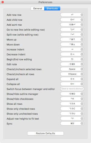
 Cloud Outliner makes it really easy with buttons in its menubar to move items up and down, to add new rows or new child rows, and to indent/outdent rows to change their child status. But if you’re a keyboard junkie, they’ve got keystrokes for all of the functions you need. If you don’t like the keystrokes they’ve assigned, they have a keyboard mapping section in Cloud Outliner’s preferences so you can set them to whatever you like.
I love that Cloud Outliner includes a collapse all/expand all options, and it also has the option to show only unchecked or only checked rows. Since I use the checkboxes to denote what’s already been completed, this will be a great way to see just what I have left to do.
I did a quick test of Cloud Outliner and it’s not accessible to screen readers. I don’t think it would be a huge effort for them to implement it though because I can navigate through all of it just fine, it’s that they simply haven’t labeled anything. For example, all of the menu bar buttons read out as “button” which is SUPER helpful. Navigation through the rows works and actually does read out most of what you need, but every single row is a separate table element so you have to hit VO-shift-down arrow to interact with it, tab across to read it the bullet, then the checkbox and then to read the actual content. Then you have to VO-shift-up-arrow to stop interacting, and rinse and repeat to go down to the next row. You really should be able to just move from row to row and hear what the row says! They also don’t label the checkboxes as checked or unchecked. Other than that, really works great with VoiceOver.
Moving on, sometimes you’ve got an outline that gets unwieldy with too much in it. With Cloud Outliner you can extract a selection with the click of a button and create a new outline from it. Be careful though, it actually removes that segment from the current outline when it does the extraction.
Outlines can be put into folders, which is lovely for those of us of the OCD persuasion. If you’re more of the search-type, you can search globally or within an outline to find what you need. If you’re a tagging fanatic, there’s nothing for you here.
You can choose to have your rows numbered where indented children have the 1.1, 1.1.1 type of numbering. Not something I use much but could come in handy. If you like to have notes attached to yours, you can do that too.
Now that you’ve heard how much I like Cloud Outliner and that I found it through Setapp, you’re probably wondering why I bought it instead of just using it within my $10/month Setapp subscription.
One of the things I really wanted in an outlining program was access to my outlines across the Mac AND iOS. Ideas come to me when I’m out and about so I need my outlines on my iPhone and iPad too. The website for Cloud Outliner said that it supported iCloud syncing but for the life of me I couldn’t find it in the app. In Preferences for Cloud Outliner, there’s a synchronization section, but it didn’t have iCloud syncing. It only showed Evernote (which I don’t use) and their own Outliner Server for syncing.
I wrote to the developers of Cloud Outliner and they explained quite quickly that Apple only allows iCloud syncing on apps in the Mac App Store. I think I’d heard that before but had forgotten all about it. So this makes the Setapp experience not quite as valuable if the app you like needs iCloud syncing.
I was happy enough with Cloud Outliner that I ponied up the grand sum of $10 for Cloud Outliner Pro my Mac and $3 for both the iPad and iPhone. Once I had Cloud Outliner Pro, I could see the iCloud syncing option and it worked beautifully to bring my outlines into sync between my devices.
On the iPad, Cloud Outliner works pretty well, with much of the same functionality. On one occasion I found that dragging rows up and down was pretty jerky, which made it very difficult to be precise in where to drop the row. But when I went back in later, the rows slid gently up and down and were easy to place. Not sure what went wrong the first time. On the Mac version there are buttons to move a row up and down, which would be a perfect solution for the jerky dragging on the iPad, but sadly those buttons aren’t on the iOS version. Would be a welcome enhancement.
I am running into one problem I need to talk to the Setapp people about. If I own a full license of an app, like now how I own Cloud Outliner, when I use Spotlight to launch the app, it often finds the Setapp version first. Oddly it even finds apps inside Setapp that I have not even installed. For example, Setapp has the awesome iThoughts mind mapping app I mentioned earlier, but since I already own it, I didn’t install it in Setapp. But still, when I try to launch iThoughts using Spotlight if I’m not alert it will try to open the one in Setapp instead which launches Setapp itself since it’s not installed.
Another reason Setapp is kind of limited is if you have a family for whom you buy apps. Setapp is $10/month per user, so there’s no sharing of apps. When Steven Goetz told me that the new version of iStat Menus was on Setapp, I didn’t even try it there. I bought the upgrade to my family license instead because I knew Steve would want it too.
I know this might not sound like it, but this is actually an endorsement of Setapp. For app discovery and for test driving apps, it’s been really great. If you don’t need or want iCloud syncing in your apps or you don’t have a family to support who want access to your apps, then Setapp might be even better for you. The nice thing is that Setapp makes it super easy to dip in and out. You can pay for a month, play with a bunch of tools, figure out if you need anything and then turn it off for a while. You’re in control of how much it costs you, which is a critical thing in a subscription service.

