CES was a complete blast this year. We got to hang out with Dave Hamilton, John F. Braun, and Jeff Gamet. Oh, and Chuck Joiner was there too. We stayed at the same hotel, and traveled to the special press events together but then we pretty much scattered to do our own thing. We also got to hang out with Joe Dugandzic from Smarter Home Life. We dragged him along (kicking and screaming) to a DTNS meetup where we met a bunch of fun people. You’ve already heard Joe on Chit Chat Across the Pond from this week where we talked about his journey from Youtuber to full-time employee at Lynky, a smart home device company.
Then NosillaCastaway Joe LaGreca came out on Wednesday and we did the actual Convention Center walk. Steve and I did 28 interviews, 25 of which were at press events, and only 3 of which were at the Convention Center halls. The press events are 1-200 vendors, while the actual Convention Center is so darn huge it’s overwhelming. Plus by that time we’ve been there for three days and we’re kind of burned out!
Steve and I enjoy the evolution of products and the clever combination of ideas and don’t expect the world to change overnight at CES. But all of our friends seemed to be disappointed that there wasn’t some huge sea change that came out of the show. Maybe some years there’s a gigantic change but it wasn’t this year.
HomeKit Isn’t a Thing
 If there was one big thing at CES, it was Amazon voice services in everything. Overhead kitchen light from GE? A-Lady is in there. Lightswitch from iDevices? A-Lady is there too. Aromatherapy device from iHome? You got it, it’s an echo device too. Steve and I walked to the convention center one morning, and we met a woman from Amazon. Steve asked her where their booth was, and she looked at him funny. That’s when I realized they don’t have to have a booth, because they’re in all of the booths.
Google seemed to capture a lot of mindshare, but not so much because it was in all the things, but rather because of their marketing blitz. They had massive banners, the monorail was covered in Google Assistant colors, and they had little men running around in white jumpsuits with the Google-colored circles on them with Google Assistant written on the back. I’m not saying there wasn’t Google Assistant in a lot of devices, but I didn’t sense quite the market penetration of Amazon.
One thing was made abundantly clear though, HomeKit is not a thing. No one was talking about it. I took photos of both of the booths I saw that had HomeKit in their artwork. Yep, I saw two. I think it really struck home when we were talking to a woman from iDevices, who even have an “I” in their name and she said they have Amazon and Google built in. Steve said, “what about HomeKit?” and she replied, “Yeah, it’s got that too.” The point is that even though they had it built in, it wasn’t even part of her pitch.
I really wanted to push for HomeKit everywhere in my home but I don’t think it’s going to happen and that makes me sad.
Facil’iti for the Accessible Web
We visited a booth of a company called Facil’iti which sounded promising but really struck the wrong chord with me. Their intention is to help enhance web accessibility but they’re going about it in the weirdest way.
Yves Cornu explained that the web developer puts the Facil’iti tool on their web server. Then the person with accessibility needs puts software on their own computer. With this software the user configures their own profile to include their own accessibility needs in the categories of vision, motor control, and cognitive difficulties the can choose from options like Parkinson’s disease, Cataracts, Tritanopia, color blindness and more.
The Facil’iti tool, creates a custom CSS, or Cascading Style Sheet that gets applied when visiting websites running the Facil’iti tool. That means it’s only changing visually what you can see, which could include making buttons bigger and changing contrast, colors, and size of the text.
Here’s the kicker. It’s $500 PER MONTH for the web developer to have this software on their website. When I suggested that perhaps that’s a wee bit steep, he gleefully said that banks will pay that much. Sigh.
Energrid Accessible Charging
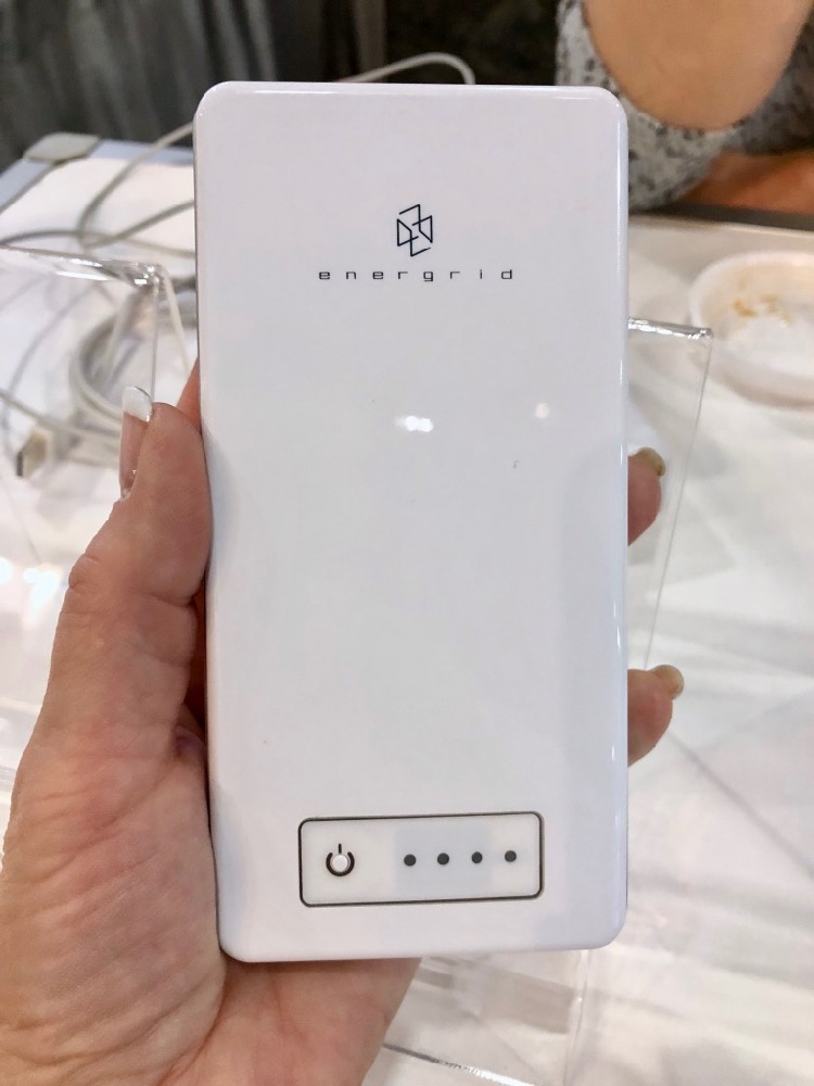
 In the much more immediately useful category, we saw the Energrid accessible chargers. Here’s the problem to be solved. Close your eyes and tell me how much battery charge is left on your portable power bank. With Energrid’s VS150X Power Bank you get four dots you can feel and when you push the button they make noise. If you hear 3 tones, you know you’ve got 75% charge left.
The VS150X power bank is $75, which is around double what you’d pay for a well-known company’s power bank like Anker. For the blind, that’s an amazingly small markup.
Energrid also demonstrated an accessible USB charger block but I don’t see that on their website just yet.
Here’s another problem Energrid has solved. Have you ever plugged a Micro-USB cable in the right way the first time? I don’t know about you but for some reason, it takes me 3 tries, which makes no sense at all. Now if you’re visually impaired, even the USB-A end of the cable is a crap shoot to figure out which way to flip it. Energrid sells a separate USB-A to Micro USB cable called the R24HS where both the USB-A and Micro-USB ends can be inserted either way; there is no right side up or upside down on them. It’s only $15, which might just be worth your sanity, sighted or not.
j5create
We visited the j5create booth but didn’t do an interview there. However, I really hope to test out some of their products for future shows. They make display adapters, type-C adapters, networking adapters and more, and all with truly beautiful industrial design.
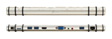
 They had a couple of docks that were amazing. One looked like a flute! It had two rubber bands around the cylinder, and the idea is you lay your laptop down on the flute and it props it up for heat flow and easier typing, and the connector ports are hidden facing out the back. The official name is the JUD531 Mini Station, but they said they call it a flute too.
They also had one that looked like a boomerang with the same prop it up on rubber gaskets idea. Both were in beautiful brushed aluminum.
The design of the devices was what really caught my eye so I got the contact info for the marketing person and we are definitely going to have some fun together. For now you can check out what they have over at en.j5create.com/…

