 What follows will be a review for some and a propeller-beanie story for others. In true NosillaCast fashion, there is a problem to be solved, but that will become apparent as the story unfolds.
PaintCode is a macOS app with a very specific audience: macOS and iOS developers, although other developers should hang in until the end. If you’re not a developer then this review may not offer you an insight into purchasing, however, if you’re just interested in knowing “how stuff works,” this is a pretty cool story. For this reason, I have aimed this review at a less knowledgeable audience, which should also serve to explain to hobbyist developers, like myself, what value this tool can bring.
Even more specific than PaintCode’s audience is the basic principle of its operation. It is, without question, a graphic design tool. Its output, however, is program source code. “Say what?” I hear you ask.
PaintCode looks like many other vector illustration apps. You have canvases on which you can draw rectangles, circles, polygons, Bézier curves, and text. You can use colours, gradients and transparency, change fills and strokes, choose fonts, and transform and manipulate everything to your heart’s content.

Once you have your designs, the final output is not what you’d expect from most design tools. PaintCode can export images of your designs, but if that’s all you’re wanting to do, there are better and more capable tools, such as Affinity Designer. What PaintCode does that no other tool does is produce code that, when executed, will recreate your designs by drawing the same shapes.

You might wonder why this is a desirable thing. I will focus on iOS from here on in, but most of what I say will apply to macOS, perhaps in different measure.
Historically, if you wanted a button in your app that, say, had a clock icon on it, you would draw the icon in a graphics program and export an image which would be included in your app. On early iPhones, a button icon was typically 20 or 30 pixels square depending on where it was used. The iPhone 4 came along with a Retina display that doubled pixel density, meaning those same icons needed 40 or 60-pixel square images, as well as the original sizes. The Plus iPhones, along with the iPhone X, use a Super Retina display with triple the original density so even more pixels, and versions, are needed.
While it is not likely we’ll see quad-density displays any time soon, there is another aspect to consider. While a simple button icon should likely always be the same size, what if the size of your graphic does need to change depending on the device it is displayed on, say iPhone versus iPad, or the orientation of the device? What about all the different sizes introduced by the iPad’s multitasking split views? Even beyond device attributes, what if you want to use the same graphic at multiple sizes within your app even on a single device? You can imagine the total number of sizes required can balloon quickly.
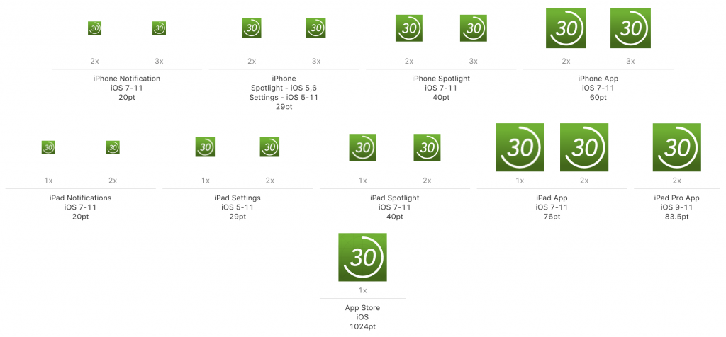 As an aside to illustrate this point, although PaintCode cannot solve this particular problem, an iOS app icon has 15 different sizes. These cover different devices as well as different uses like the home screen, notifications, and Settings screen.
A vector-based design program is desirable, otherwise, you’d have to design your graphic at the largest size and then hope it would scale down well to the required smaller sizes, as well as hoping you’d never need a bigger one in the future. But rather than predetermining all the required sizes, and burdening your app with all those image files, wouldn’t it be great if you could generate any required size on the fly in your app?
Recent versions of Xcode have offered the ability to use PDF files containing vector artwork as graphics within applications. Initially, Xcode would rasterise these at build time, so their use was somewhat limited. The latest version of Xcode allows the vector data to be retained so they can be rendered as the app runs.
So this seems like the ultimate solution to avoid producing multiple versions of your single graphic, right? What about if your app has a dark mode? You’d need to provide two versions of each graphic, one in each colour scheme. Some apps even offer multiple themes or colour schemes.
PaintCode solves all of this and goes further still. Reproducing a single graphic at different sizes is simple in PaintCode. The source code it generates can easily calculate the scale of everything it does at runtime. For something as simple as a button, a single line of code in your app will render the graphic suitably scaled to the size of the button. Button size changes? Simply redraw and PaintCode’s code adapts. But PaintCode can do far more than simple scaling.
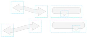 Imagine a “chat bubble” graphic. You might need different sized bubbles to hold different messages. But if you scale up a simple bubble image, it changes the shape. What started as a rounded rectangle with consistent corners begins to look stretched and squashed. The callout (the little bit that sticks out making it recognisable as a chat bubble) would similarly be squeezed out of shape. PaintCode has tools to address this. You can make it so that only the straight sides expand and contract while the corners stay perfectly round. You can keep that callout centred, or a fixed distance from one side, and never squash or stretch it.
If you want that dark mode, PaintCode has you covered. You can define named colours in one place, then attach them to multiple elements of your design (even across multiple independent graphics) and this helps to maintain a consistent colour scheme, but for runtime variation PaintCode has variables.
At its simplest, you could define a variable that represents a colour and then your app just needs to pass a colour for PaintCode to use at runtime for all the elements that refer to it. But you can make PaintCode do more of the work. Define four colours: light foreground, light background, dark foreground, dark background. Define a Boolean variable called “dark mode” and finally two expression variables. Foreground colour is dark foreground if dark mode is on, otherwise, it’s light foreground. Same for the background. Assign the calculated colours to the elements of your graphics. Now, in your code, you simply pass the boolean that says whether to use dark mode or not and all of your graphics automatically draw in the correct, and consistent, colours! Best of all, change your mind about what the actual colours are and you do not need to change a single line of your own code. It’s all handled in PaintCode’s.
It’s not just colours that can use variables. Most attributes of any element on your canvas can take their value from a variable, including position, rotation, size, and even text content. There are a huge number of possibilities for using variables. A volume bar whose length is set by a variable along with a numeric display of the volume level. A completely functioning clock by simply passing in the current time (in hours, minutes, and seconds). A robot arm that functions as a real one would, given the angle of each joint.
A while ago, I created a rudimentary app for my iPad which would act as a timer suitable for muscle stretches. I’d set the time to hold the stretch, the rest time, and the number of repetitions. Tap go, and it would count in, then count off each stretch and rest with a coloured arc that swept around a full circle in the allotted time. It took me many hours to work out all the drawing methods for iOS, plus more than a few hours to get all the trigonometry correct. I also had a lot of code to handle the different phases of the process – count in, stretch, rest, repeat, stop.
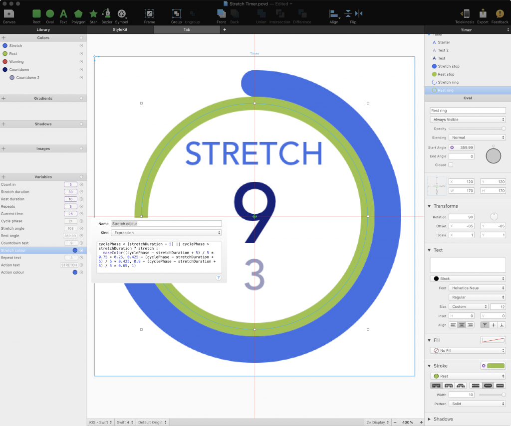
In the space of a few hours, I created an improved version of the display entirely in PaintCode. There are two, independent arcs for stretch and rest, a countdown in seconds for the current phase, plus one for repetitions, and a “ready, set, stretch, rest” message. I got it to work from a single variable that runs from zero to the total number of seconds for the count in, stretches and rests. The next day I spent about 90 minutes retrofitting the PaintCode code into the app, which mostly entailed removing large chunks of my original code.
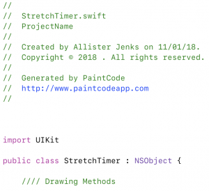 The final great feature of PaintCode that I will mention is the StyleKit. Absent from the original version of PaintCode, this is now the main strength of the tool. The code that is generated is completely self-contained in its own class and this means you can very quickly iterate in PaintCode and then re-export the StyleKit into your Xcode project. While running your app in the simulator you notice a tweak needed in PaintCode. Stop the app, switch to PaintCode, make the tweak, Command-R to re-export, switch back to Xcode and Command-R to restart the app in the simulator and see if it worked. It takes only seconds.
There are a few downsides to PaintCode. First, it is not cheap at USD$99. But it does a lot of work for you, including work you may need to do in the future, and allows you to design and iterate very quickly. Second, the flexibility of the graphics is dictated by Apple’s Core Graphics framework. For one task I wanted to use a conical gradient, but as Core Graphics does not have such a thing, I was out of luck. Finally, I’ve found the user interface somewhat unfamiliar compared to “ordinary” vector design tools. Things like editing Bézier curves are a little clumsy, though with practice it is easy enough to do most tasks.
There is a final twist to PaintCode that I have deliberately left out of the review so far because it is a fairly recent development and I have had zero experience with it. PaintCode now also supports Android (i.e. Java) and web (both SVG and Javascript) as output options. After designing that awesome graphic you can, with a few clicks, export it to all of these platforms. This gives PaintCode more of an audience and, perhaps most impressively, provides a “build once, run anywhere” solution for modern, cross-platform development.
PaintCode 3 is available from PixelCut for USD$99.

