 As you know, I’m a big fan of Keep It from Reinvented Software. I’ve talked about this notebook/scrapbook app for iOS and Mac several times and recently published a video tutorial on Keep It for ScreenCasts Online.
But I’ve always felt like this was a hidden gem only I knew about and that made me sad. I like to see good apps by responsive developers get the community love they deserve. Last week, David Roth forwarded to me a MacStories newsletter put out by Federico Viticci, available to Club MacStories members. In this newsletter, he talked about how he’s organizing the reference material for his extensive iOS 12 review.
His explanation of his organization process is actually a giant, and very complimentary review, of Keep It! He goes on for 21 (large) paragraphs with screenshots explaining how awesome it is. He does have one section on what he’d like to see improved which is good too.
That kind of exposure for Keep It is getting the app recognized, because this week David sent me a link to a website called The Sweet Setup with an article about three apps they tried out this week that they felt needed more exposure because they’re awesome. And the first app was Keep It. Again, I was super happy to see this. And no, Steve doesn’t pay me to say nice things about his apps.
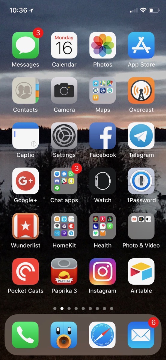
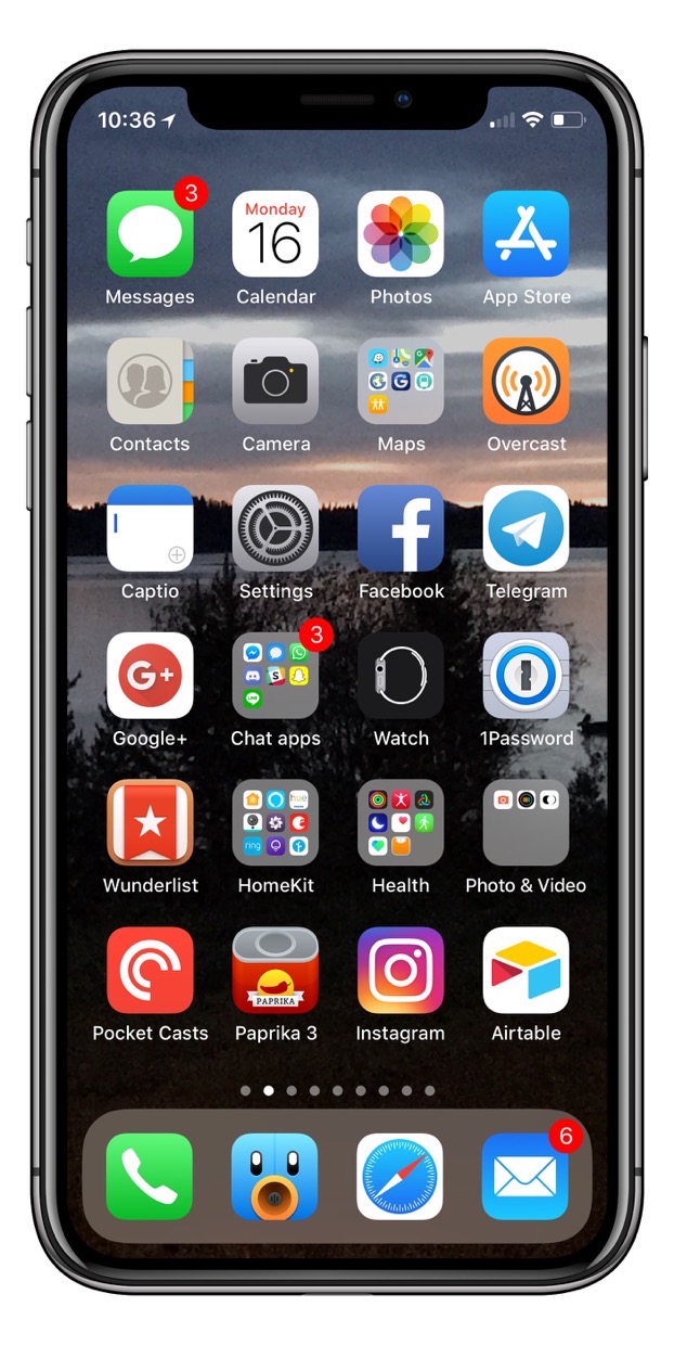
The second app they listed is actually a workflow, and it’s the first workflow I’ve seen that actually solves a problem I have. I take a LOT of screenshots for podfeet.com, as you might just have noticed. The iPhone X’s screen though is really long and skinny and the screenshots look kind of stupid. Maybe I’ll get used to it eventually but I haven’t yet.

 The workflow highlighted by The Sweet Setup is called Frameshot X. This workflow takes a screenshot of an iPhone X screen, and puts the frame around it to make it look like a photo of an actual phone. When you do this, it looks far less dumb.
