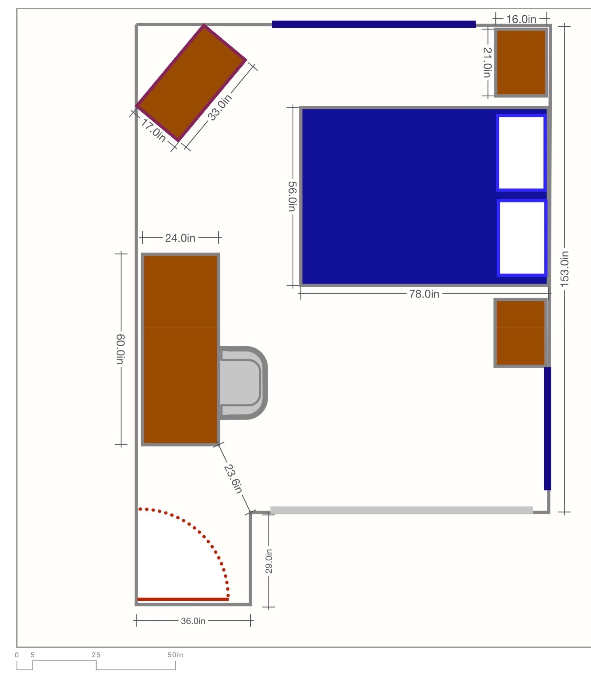
 As I’ve mentioned a few times, Steve and I are having our bathrooms gutted and remodeled. It’s a pretty stressful thing to live with. There are workers arriving at random intervals during the day, and of course, there are the days we’re ready for them and they don’t show up which is even more stressful.
Because of the demo of the downstairs bathroom, laundry room and entryway tile, they sealed off the front of the house with plastic walls. It’s like living in Dexter’s kill room.
The stairs going up to the guest bath are covered in plastic stuck to the carpet, so that’s nice too. We did discover that if one of your animals barfs on plastic carpet, it’s pretty easy to clean up.
Speaking of animals, our cats have to live in our bedroom with their cat litter in the master bathtub. I think that’s my favorite part of this whole thing.
I swear there’s a tech angle buried in here, but the story has to be told to understand the problem I needed to solve.
All of this adds up to some severe annoyance, as you can imagine. But things are going to get much worse soon. When they’re done with the guest bath upstairs, they’re going to start on our master bath. Obviously, we won’t be able to use the master bath during this time, but it also means that they will have to plastic coat our master bedroom too. The amount of dust they create during demolition is pretty epic; we had to disconnect our smoke detectors it was so bad!
Now let me pull the curtain back on the podcast for a moment here. If you haven’t seen the live show, you might not know that my podcast studio is actually in our master bedroom. We have a giant long room, so my desk and all my monitors and mic stands and such are along one wall, and I have a fireplace behind me for a nice background.
It the master is going to be full of dust, there’s no way I can keep all of this equipment in its current location. The good news is that we have a four bedroom home with only Steve and me living in it. He converted one room to his den with his computer, we have Lindsay’s old bedroom set up as a pretty nice guest room. And then there’s Kyle’s room, or as I like to call it, “The Room of Crap”. Obviously, the Room of Crap will have to become my temporary studio.
One of the challenges in life is getting your kids to get their crap out of your house after they grow up and move out. While my children are both perfect angels and never do anything to torture their mother, this has even been a challenge for me. Lindsay would have taken her crap but for many years had been living in a 1001-square-foot, 2-bedroom house with a 70lb black lab and a baby (and a husband), so I couldn’t, in good conscience, ask her to take her stuff. Now that she has a giant house (bigger than mine), we packed up her room and we’re transferring it all to her now. She asked to keep just about everything in the her old bedroom.
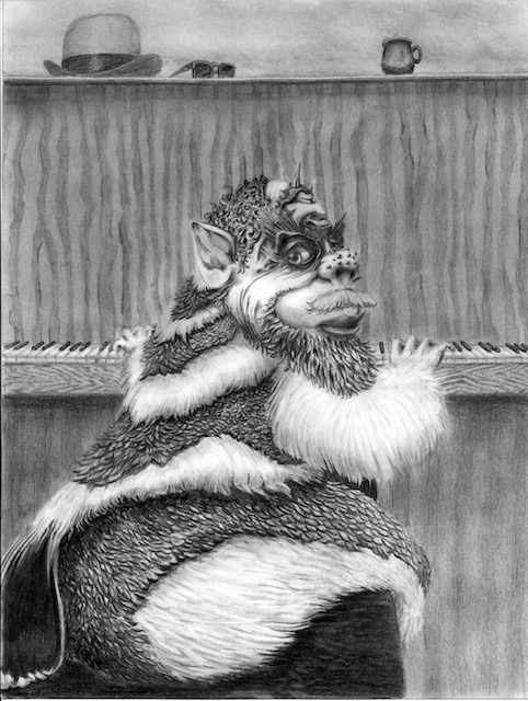 Now let’s talk about Kyle and The Room of Crap. Kyle hasn’t taken much of anything with him, and when I asked him to come and deal with it, his answer was, “Throw it all away.” Well, of course, I wasn’t going to do that! Now that we finally had a forcing function with my imminent move into this room, we dragged him up and the three of us emptied the room. Just as a side note that has nothing to do with this, he really did throw about 95% of the stuff away, walking out with a half-filled shoebox and one hand-drawn drawing from my friend John Zellner.
Once we had all of the crap out, we really needed to rearrange the room (I swear, the tech angle is coming soon). There’s a desk, a bed, a tall dresser and a really crappy side table. They were arranged in probably the worst way possible when Kyle was young to make a room feel comfortable and useful. Feng shui was not harmonized.
If I was going to work in this room for a month or more, I needed to rearrange it. I had lots of people look at the room to suggest ways to arrange it, but nothing seemed to work. Finally, our friend Logan suggested a plan that looked like it had promise. But now I needed to draw it out to see if things would actually fit!
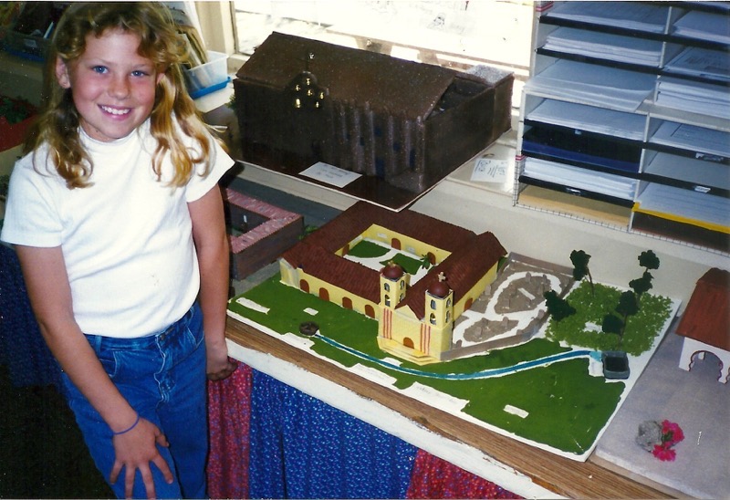 Being an engineer, you know I had to do a drawing to scale, right? I don’t understand how anyone does things not to scale. I remember Lindsay getting an A+ on her fourth-grade Mission Project, with the + being because the model she built was to scale. Um, how ELSE would you do it?
I could have used some of my graph paper, but I figured there was a more modern technical solution. I was under the impression that there were lots of cool web services to help you lay out a room, most of which are connected to someone trying to sell you furniture. That would be fine since the desk and the table are both beyond keeping.
But for the life of me, I wasn’t able to find a site that would meet my requirements to put in exact dimensions and then see how the room would look. I found one site that let me put in the dimensions, which I painstakingly did, even choosing new side tables from their inventory that I would consider buying. But after hours of putting the room together, I found out you couldn’t spin around the room to see how it looked! I couldn’t even see a nice plan view to measure to make sure there was room between the desk chair and the bed, or the corner of the desk and the entry to the room.
Ok, fine, let’s go look at iPad apps. I’m not at all against paying for an app to do this, with the threshold probably as high as $10 (more than that and I’m pulling out the graph paper). Finding an app for this was harder than I thought – again the room design software I looked at failed to meet my criteria.
Enter Archisketch
But then I changed my search to “drafting” and found Archisketch from archisketch.eu. Archisketch works on the freemium model so I was able to see if it would meet my needs before plunking down my hard-earned hoonyackers (™️Kaylee). For free, you can create two drawings in one project, and each project is limited to 40 objects. Luckily, with all of Kyle’s stuff out of his room, I didn’t have anywhere near 40 objects so I was able to lay out his room within the free portion of the software. The paid version of Archisketch is only $13 so that’s close enough to my price range anyway. There are also some upgrade packs for other features if you really get into using Archisketch.
Archisketch has a lot of capabilities but I wanted to tell you first about the features I used.
As one would hope, Archisketch opens with a graph paper background. If you’re alert (as I was not when I started) you’ll see the scale on the left hand side. I didn’t notice it initially and while I thought I was entering inches, I was actually entering feet, so some of my carefully crafted measurements are a bit of nonsense now that I look closely. Armed with the one thing I wish I’d noticed before starting, let’s draw.
Shapes
Across the bottom of the screen are your drawing tools which through trial and error are pretty easy to figure out. Tapping on the icons at the bottom replaces them with the features of what you’ve selected. For example, the first icon is for text and arrows while the second icon is to draw shapes. Tapping on the shapes icon replaces all of the bottom icons with options for creating and manipulating shapes.
You’ll find a shape picker with the usual suspects of rectangles, ovals, circles, polygons, and squiggly lines, along with one that’s perfect to show an opening door, a triangle, and oddly the selection rectangle is buried in here as well. Not sure why they buried it in there, I’m sure I won’t remember that and have to hunt for it each time. Across the bottom with the shape icon selected you can change the stroke and fill colors along with the thickness of the stroke as well as toggle that stroke from solid to dashed. Pretty much the usual suspects.
With a shape or shapes selected, the bottom right will give you more things to do with the objects you’re creating. There’s a handy duplicate button which came in handy for me when I drew my first side table and wanted another one. The next icon is an arrow in a circle, which I assumed was undo, but instead it’s a rotate button. This will give the selected object(s) a center point and a rotate angle that you move with your finger or stylus. Very intuitive use of the touch interface.
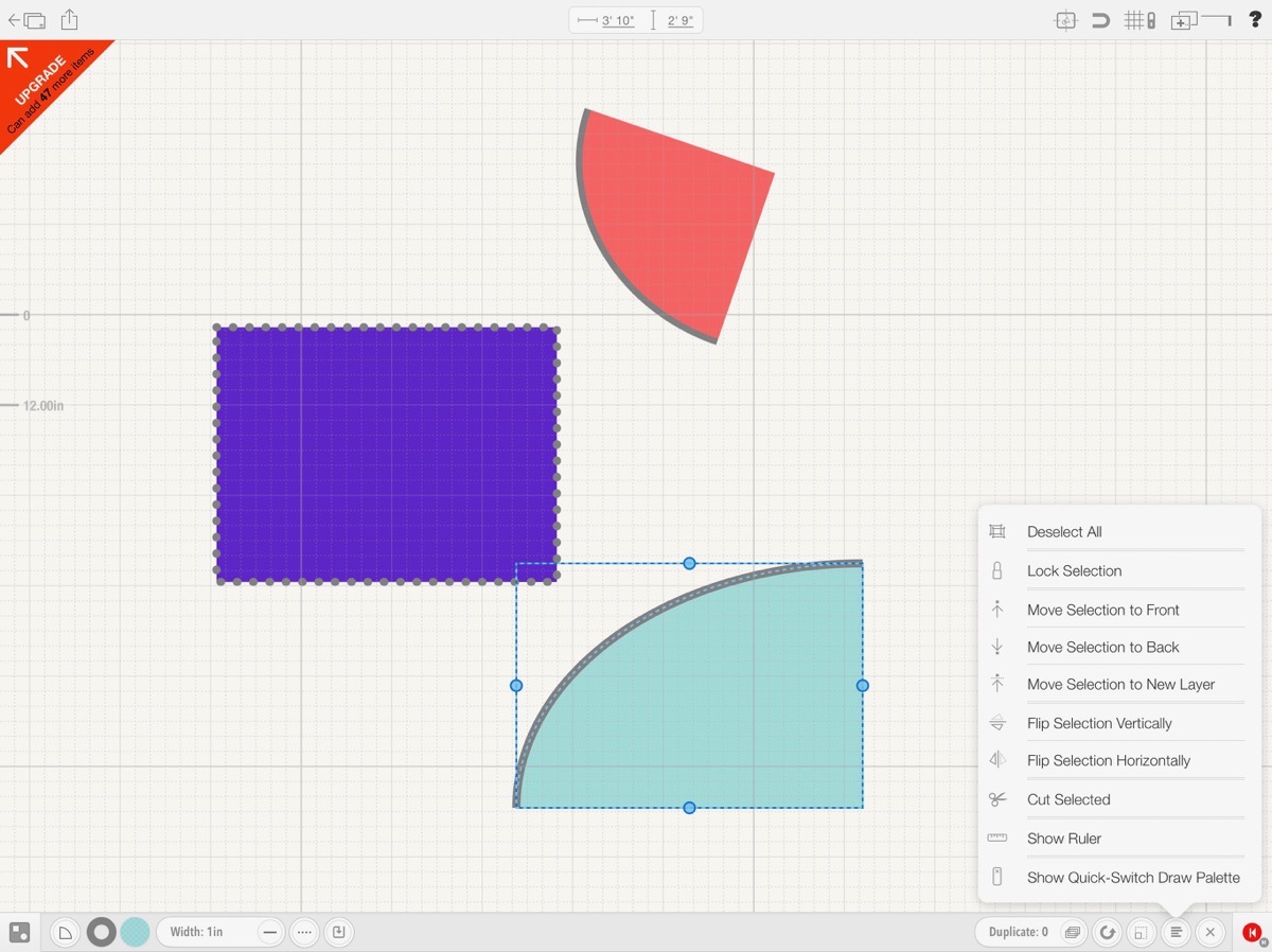 The next icon over lets you increase the size of an object about its center point with an obvious drag indicator to do so. Without using this resizing icon, your shapes will not stay locked to their original aspect ratio.
Archisketch has ordering within a layer (and it has layers but we’ll get to that in a minute). The next icon on the right lets you deselect all, lock selection and move selections forward and back and between layers. You can flip selections, cut them, and oddly under this icon you can show the ruler. Again why bury a tool like this in what is more of an ordering menu?
The ruler jumps up on screen showing the length and you can drag the ruler endpoints to your heart’s desire. This was a critical feature for Steve and me to be able to see whether we’d have a comfortable distance between the corner of the desk and the entrance to the room.
Again buried in an odd place inside the ordering menu, is the option to enable the Show Quick-Switch Draw Palette. This turns on a little floating palette that lets you quickly switch between drawing shapes, lines and using the eraser. You can drag it around on screen which is cool, so if it’s ever in your way it’s easy to move. A tap of the red X and it disappears again.
 I should mention that if no objects are selected on screen, that ordering menu mutates into only having the ruler and quick-draw palette. With an object or objects selected, you’ll see a very tiny x which deletes the selected object(s). I wish it was a trash can because my brain is trained to look for that, and I keep glancing right past the x. I know why they didn’t make it a trash can though. It’s because that button doubles as a cancel button, say if you partially rotated an object and changed your mind, you can back out with the little x.
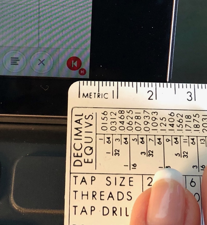
Another icon that doesn’t look like what it does is the last one in the bottom right. It’s a red circle with what looks like a “back up one chapter” button. It’s the undo icon. Below and to the right of that red icon is a teeny tiny red icon. I’m not exaggerating when I say it’s small. I took a photo of it with a ruler to prove it; it’s less than 2mm in diameter! Zooming in on my photo I can see that it’s a forward button, so evidently it’s the redo button. I wish you the best of luck tapping that button.
Polygons
I mentioned that the shapes tool has polygons, but this isn’t your grandfather’s polygons. This is really a vector tool. You can create complex shapes, and every corner you make is a node which can later be dragged to change the shape. They can be made into rounded corners by dragging a slider for the radius, you can even add and delete nodes after the polygon has been created. Think about designing that fancy pool shape you’ve had in your head all these years.
Exact Dimensions
I’ll get to the other features but remember the problem we’re trying to solve. I want to create a to-scale drawing. When you select a shape, like let’s say a rectangle to represent the bed, as you tap and drag on screen, you’ll see two changing numbers at the top of the screen. I haven’t cracked the code yet on what causes this behavior, but sometimes the two dimensions say for a rectangle, are the width and height, but other times (also drawing a rectangle) it showed me length and area. Obviously, length and width are preferable.
The one thing I found difficult in using Archisketch to draw up Kyle’s room was to get my shapes and wall dimensions to be exact. I’d painstakingly drag an edge and it would fly past the number I wanted and then I’d miss it coming back the other way. When going through Archisketch to explain it to you, I discovered if you tap on those dimensions at the top of the screen you could type in exact values! That’s half the battle right there.
The other problem was accidentally moving shapes when I was trying to adjust something else close by. I was hoping that the Lock Shapes option in the ordering menu would lock the dimensions but still let me drag them around, but it actually locks both the dimensions and location.
Snap Points
In the upper right menu that we haven’t explored yet, there’s a little magnet to enable snap points. Enabling this feature allows your shapes to snap and align with each other. This is good, but I really had hoped it was a snap to grid option. At one point in my discovery phase on Archisketch, I did find a snap to grid option but its location eludes me now when I look for it!
Selections
I mentioned earlier that in the shapes menus you’ll find a selection rectangle. Tap and drag across a series of shapes and any shape partially inside the rectangle will be selected. There’s another way to select multiple objects and I pretty much only do it by accident.
Tap on an object, and then tap on a second object and they’ll both be selected. I don’t think I’ve ever used a drawing tool where this is the default. I’m sure I’ll get used to it someday, but I can’t tell you how many times I was carefully moving one object when another object I’d had perfectly placed earlier was trailing along with my movements, unbeknownst to me!
Erase Tools
A really interesting feature of Archisketch is the erase tools. Every shape you have available to you under the shape tool is available as an erase tool. For example, you can draw a complex polygon with rounded corners as an erase tool. Whatever it’s above will be erased, but only in the shape you’ve selected. From what I can figure out in my testing, the erase tools don’t obey any of the layering or order commands, so they’re always on top.
Dimensions
If you’re a retired engineer like me, or think like one, you’ll want to put dimensions on your drawings. I love the way Archisketch does dimensions. A simple tap of the dimension tool allows you to tap and drag along in open space, or on an object where it will snap to the snap points, and then you can let go and your dimensions appear on screen.
You can then tap and drag on the number to make the dimension location easier to the eye. Oddly you can drag these dimensions around, which happened to me a few times. Can you guess what caused it? Yep, leaving one selected when I tapped and dragged something else!
You can also lie and change the dimension by tapping on the number and entering a new value. It will show you’re a cheater though, the hand-typed dimension will be in italics.
With Archisketch’s dimensions tool, I was able to determine that I would have just under 24 inches to walk through the door, even with the desk where I wanted it.
Images
If you have a photo or another drawing you want to use as the basis for your drawing, especially if you’re drawing in 3D, there’s a button to import images and then fade them so it’s easier to draw on top.
Symbols
Under the star menu, you’ll find a few floor plan symbols to help you get started. For example, there are a conference room table, a couch and maybe a dozen more symbols like that. You can create your own symbols and store them in the symbols library to use across your projects. I tried using the double bed symbol they provided and it didn’t fit well in the room at all. I checked and it was much wider than the double bed I own. I tried to change the dimensions of the symbol-created bed and couldn’t do that. Just be wary if you’re laying something out to use real dimensions!
Upper right menus
I’ve only got a few more things to tell you about in Archisketch before I let you loose with it. In the upper right there’s layer menu where you can easily add new layers, switch layers on which you want to work, delete layers, and change whether a layer is visible. The add layers button is pretty obvious, it’s a plus button on top of two rectangles. The edit layers button is a bit less obvious, it’s a horizontal line with a vertical line down on the right edge. Weird choice but at least it works well!
The best menu option in the upper right is the question mark. I wish I’d noticed this when I first used Archisketch to draw out Kyle’s room. It is filled with several lovely 1-2 minute-long videos to teach you how to use the tool. I learned so many things in watching the first 3 or 4 that kept me from sounding like an idiot in this review. Remember when I said at the beginning I didn’t do the scale correctly the first time I used Archisketch? Well, one of those little videos taught me how to set up the scale properly.
After viewing the help videos I was able to recreate Kyle’s room in about 1/10th the time that I did it the first time, so the help is well worth watching.
Bottom Line
 The bottom line is that I could have drawn this far easier and more quickly using graph paper and a pencil. But having learned to use Archisketch (at least the basics) I know I’ll be able to rely on it for future layouts. I don’t want you to think I’ve explained all that Archisketch can do, because I haven’t watched all the little videos. I encourage you to download the app and watch and learn yourself.
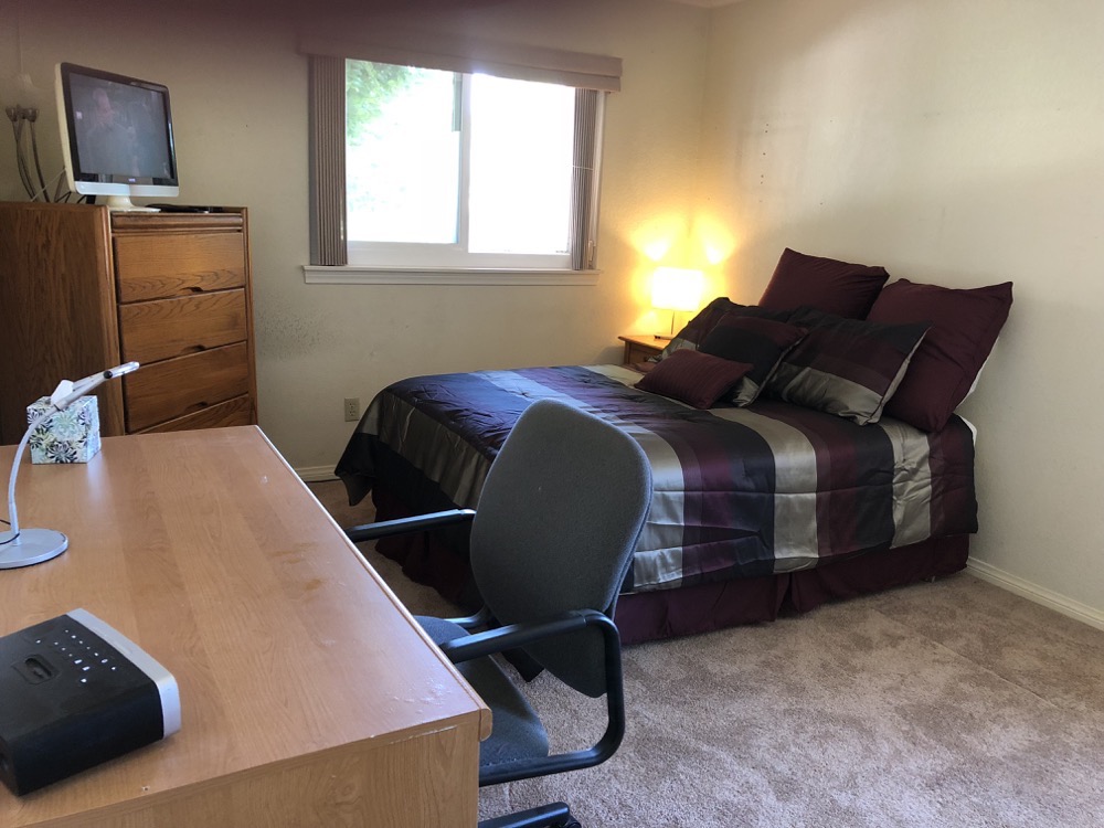
The even better news is that through using Archisketch we discovered that Logan’s idea did fit, we reorganized the room and it is officially no longer the Room of Crap. I’m looking forward to moving my studio in there and who knows, maybe I’ll like it in there and keep it for good. I told Steve he has to get me a green screen to recreate my mantle of toys in there though.
Check out Archisketch at archisketch.eu/… and in the iOS App Store.


You have people doing construction in the house – how hard could it be to have them add a fireplace?! 😉
It would only another couple of months, more dust, and oh yeah, you’d have to move all your stuff out of the no-longer-Room-of-Crap-room.
Or what about a fake fireplace? You know, one of those that has Santa’s feet dangling inside? 😉