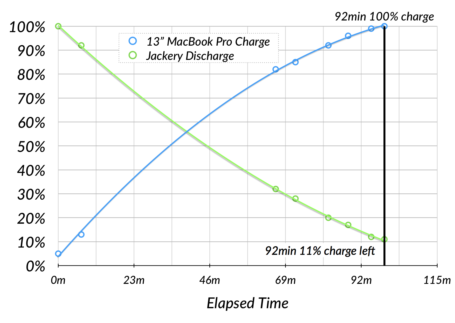
 You all know that I’m a huge fan of Excel. Nothing is as fun as getting a pivot table to turn a giant pile of data into actionable information or creating a graph that tells a story about your data. Heck, just this week, Michael Woerner was stuck on a tricky Excel problem and came to me for help, and I spent half a day working on it just for the fun of it! I cracked the code, and was quite proud of my little self.
But I feel compelled to admit haven’t really enjoyed the Office 365 version of Excel. It’s slow and clumsy to me. Every time I open Excel, a few minutes after I open a file, or even start an empty file, I get a spinning beach ball for about 15 seconds. No idea why or how to stop it. It isn’t triggered by the same event, but rather the same time frame after I open a new file. So I’ve been looking over at Numbers wondering if I’d be happy there.
I feel like I should like Numbers, so I keep giving it a try. Every time I do though, I find things I don’t like about it. Some of it is just not being familiar with the interface, but some of it is just plain poor design, in my opinion. Let’s see if you agree with my opinion.
Excel Can’t Calculate Elapsed Time
When I was working on the data I collected for my battery tests, I figured I’d give Numbers another whirl. I had a good reason, there’s something Numbers can do easily that seems to confound Excel, and that’s calculating elapsed time.
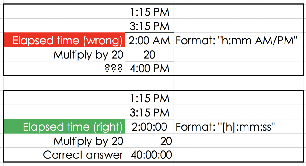
For example, let’s say you have a time stamp at 1:15 PM and one at 3:15 PM. The elapsed time between them is 2 hours. In Excel, if you subtract the two values, you get 2:00 AM instead of 2 hours. In a way, it makes a bit of sense. Excel assumes the same format for the calculated value as the cells it’s referencing. Instead of setting the calculated value to be formatted as an integer, it sets it as a time value. A 12 hour clock starts time 0 at midnight, so 2 hours after that is 2:00 AM.
Let’s take this a bit further to make sure you understand why just saying 2:00 AM is a bad thing. If I wanted to multiply the elapsed time by 20, I’d get 2 x 20 = 40 hours, right? But if I take this elapsed time calculated by Excel of 2:00 AM and multiply it by 20, I get 4:00 PM. That’s because 40 o’clock is 40 – 24 = 16, otherwise known as 4pm.
 While possibly there’s some logic to this, it doesn’t make it useful at all for calculating elapsed time. In my battery charge work, I wanted to know how much time had elapsed between when I started the test at 6:38 AM and when it ended at 8:17 AM. I could have counted on my little fingers, but that’s wrought with danger because elementary arithmetic is my downfall. Look up New Math in Wikipedia to understand why.
I also wanted to graph the shape of the curve of the charging percentages, and since I didn’t take data points at precise intervals, I was going to need the time between each data point to be calculated for me.
Numbers Can Calculate Elapsed Time
Turns out Numbers does this without any problem at all. If you ask it the time between 6:38 AM and 8:17 AM, it will return 99 min, easy peasy. (Excel thinks it’s 1:39 AM which is super helpful). So far Numbers is looking like the way to go for this task.
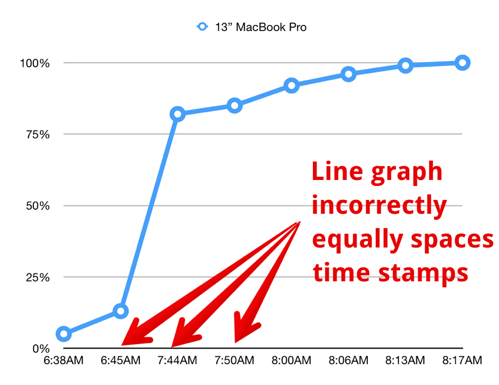 Before trying to graph data like this, It’s important to consider what kind of chart you will need. If I’d been rigorous and taken data points at exactly 5 minute intervals for an hour and a half, I could have chosen a regular line graph. But since my data points are at random intervals, a regular line graph would put each data point the same distance apart along the X-axis. That would be a graph with big discontinuities instead of making a nice curve that represents the reality of a battery as it charges..
A better chart format for this kind of data is called a scatter chart. A scatter chart, in any spreadsheet application, will make sure that the charted points on the graph are at representative distances along the X-axis. For example, my first two data points were nearly an hour apart, but the second and third data points were only 6 minutes apart. On the x-axis the first two data points should be ten times as far apart as the second two, and on a scatter chart they are.
It’s pretty easy to create a scatter chart in Numbers (it’s easy in Excel too). It’s important to format your titles and lines properly or it will be hard to tell the story you’re trying to tell. In my battery charging example with the Jackery, I wanted to graph not just the increasing charge level of the Mac, but also the discharge rate of the Jackery. Plotting them both on the same graph was pretty simple, but making that’s where things started to go awry.
Formatting Time Elapsed
First of all, after being so excited about how Numbers could calculate elapsed time, I then noticed that instead of giving me a column of purely minutes, some of the higher values had both hours and minutes. This required a trip to the format panel which is the thing I hate most about Numbers. One of it’s greatest strengths is how this panel is contextual, meaning that what it offers you changes depending on the cells you have selected. That is also one of it’s greatest challenges. I find myself hunting for panels I swear I’ve seen before but they seem to have disappeared from the interface.
For example, if you click in a cell formatted for regular time, the Cell panel within Format will show pulldowns for Data Format, followed by fill color and borders. But if you select one of these cells that shows hours and minutes of elapsed time, the Cell panel will now reveal Data Format set to Duration, but right under that are two entirely new options: Automatic Units and Custom Units.
If you choose Custom Units, instead of writing out a super geeky formula to explain the units like in Excel you’ll see a series of what turn out to be toggle buttons, for week, day, hour, min, sec, and ms. I was able to toggle off the hour button and immediately my column of elapsed time was all in minutes like I wanted.
I’m not saying this is a bad way to do the panels, it’s just very confusing that menu items appear and disappear depending on what values you’ve got selected. One of the reasons I wrote this up is because I’m certain that a few months from now I’ll be staring at this panel thinking, “I swear there used to be buttons to turn off the hours…” And now I have this handy reference blog post!
Now that we have the data in the right format, let’s get back to our chart.
Formatting the Chart
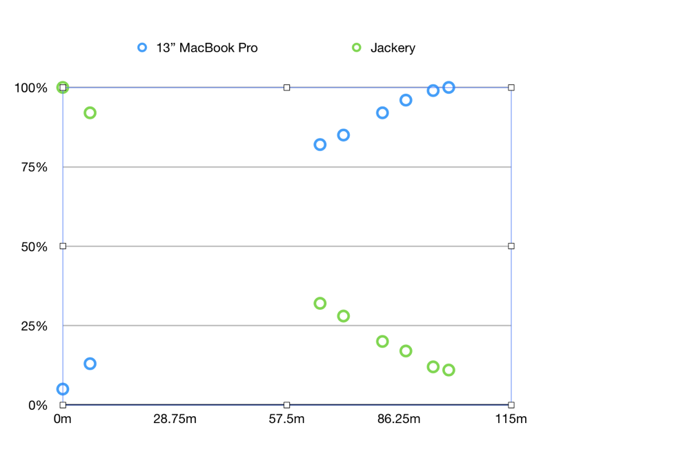 When we first drop in the scatter chart, it looks just like they promised on the tin, it’s a scatter of dots in a rectangle, telling hardly any story at all. My data points are so far apart at the beginning of the test, I actually thought something was wrong with my data.
To improve comprehension of the data by the viewer we need to add what’s called a trendline. In Numbers, you click on a data point, and then select the Series tab in Format. Next, you choose the type of trendline. I’m a fan of a second order polynomial trendlines but that might just be me.
So far, most of the interface things I’ve described aren’t that bad, they’re just unfamiliar to me. But let’s get down to the bad parts, shall we?
Stupid Way Numbers Formats Chart Axes
The real idiocy of this program comes into play when you try to modify the axes on a chart. I think I complained about this years ago but it’s worth a revisit it’s so stupid. I’ll do it by example.
My data goes from 0 min to 99 min on the x-axis for time. I think it’s reasonable to have the maximum tick mark to be at 100 minutes and have tick marks every 10 minutes. This is not possible.
When Numbers first plotted my data, the x-axis went from 0 to 115m with numbers along the axis at 28.75m, 57.5m and 86.25m. Yeah, that’s not really going to work for me. To try to find the underlying logic of this, let’s take a quick trip to the Axis tab in Format, with the Value (X) tab selected. We see the Axis Scale is set to Linear. I like a logarithmic scale as much as the next girl, but let’s keep this at Linear. Below that we have two columns of options.
Trying to Change Scale in Numbers
I could, in theory, change the max scale value for the X-axis to 100. It said “Auto” in grey, but I assumed it would accept a new value. I happily typed in 100 for the Max, but when I hit the tab key, I was treated to the macOS sound effect “Funk”, that annoying bonk that tells you that you have in some way misbehaved. Thinking I must have accidentally hit a comma or some invalid value, I typed in 100 yet again. Bonk. WHY?. I never got the answer to that question, I had to leave the max scale value at 115 min which looked super dumb and confusing.
Ok, let’s move along and try to solve the second problem. The tick values along that X-axis were very odd, 28.75m, 57.5m and 86.25m. In the second column under Axis Scale, we can set the number of steps on the axis. Steps was defaulted to 4, and the arbitrary max it wouldn’t let me change was 115, so 115/4 = 28.75. That explains the stupid numbers along the scale!
In a program written by sane people, you would not define the number of steps, you would set the values for the major and minor tick marks, as in every 10 min. But noooo. I have to do actual arithmetic in order to figure out how to make this scale make any sense at all. I didn’t want to do arithmetic, so instead I used the up arrow they provided to make it 5 steps. 115 min max divided by 5 = 23 m. Ok that isn’t quite as bad as having several decimal places showing.
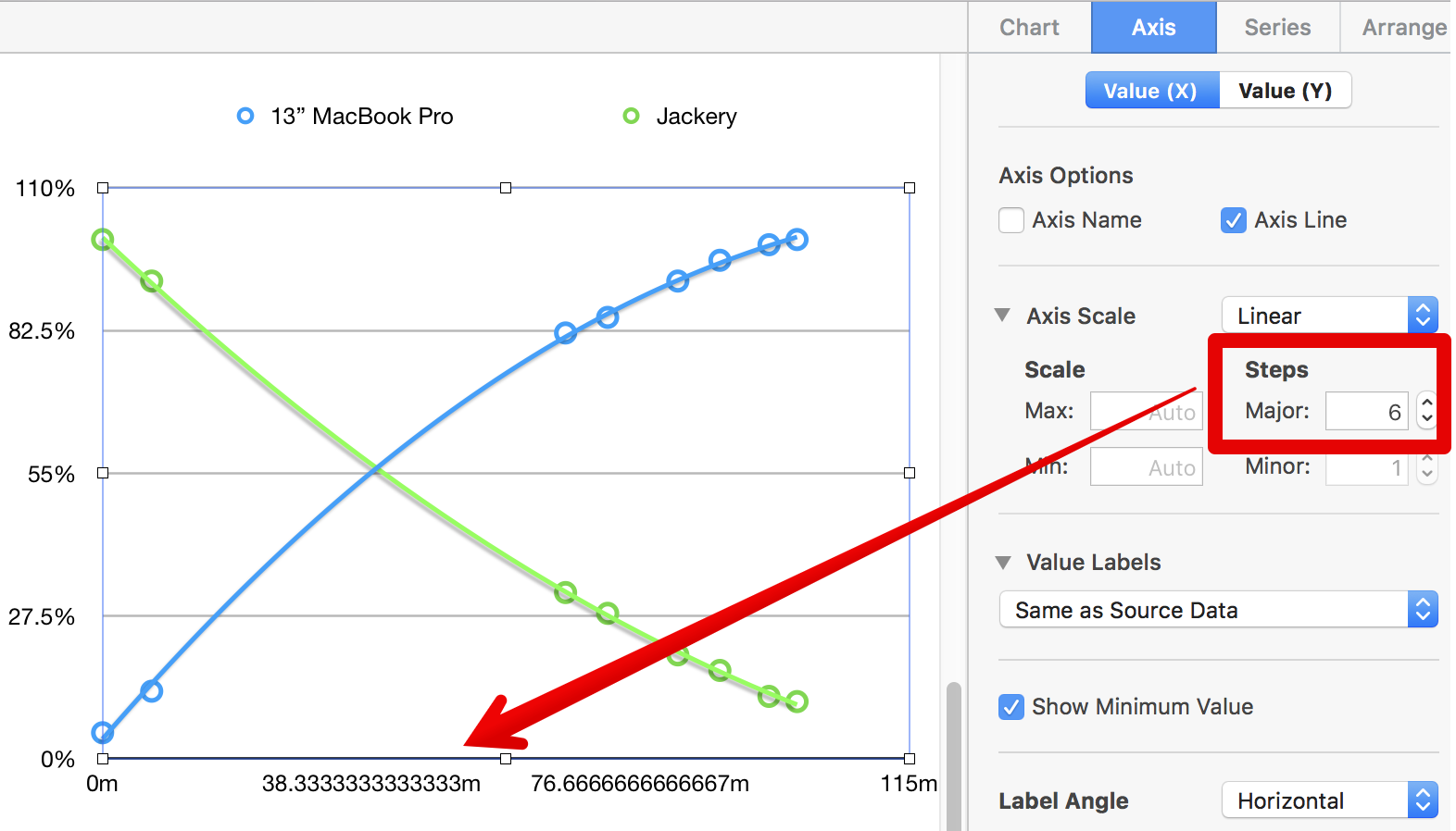 Next I tried 6 steps. 6 into 115 turns out to be a repeating decimal (19.1666666667). But instead of displaying 6 numbers along the axis, it only showed me 3. It took me a long time to figure out what was going wrong here. Because of the repeating decimal in the numbers, instead of truncating them say to 2 digits, they showed a ton of digits and just didn’t display every other one! It was so stupid I recorded it so I could show Steven Goetz. Again, this is idiotic.
I finally resorted to doing the math. I really wanted steps every 10 min but since 115 isn’t divisible by 10, I divided by 5 which gives me 23 steps. Luckily my font only allowed every other value to show, so I achieved my goal of getting a value on the x-axis every 10 minutes. Does that seem like a good use of my time?
I still couldn’t figure out how to get that darn axis to stop at 100 the way I wanted but I did find that I could add what Numbers calls a Reference Line. You can choose from several different values for your reference, such as average, or median, but you can also choose Maximum. That didn’t give me an end at 100 min but at least it would show at 99.
It’s frustrating to work with an application that gets so close to usable but then fails like Numbers inevitably does for me. I’d love it if anyone knows how to override the automatic setting for the scale of the axes, and prove me wrong that this program is not idiotic.
Excel Can Calculate Elapsed Time
After I was done with my battery blog posts and had written up my rant about Numbers, it kept nagging at me that Excel couldn’t do elapsed time. I had a vague memory in the back of my mind that there was an elaborate workaround method to do it. I figured that for completeness sake I should find that workaround to include it in this article. My vague memory was that it was something like getting the numerical value for the date (all dates have a long-digit number on which you can calculate). But in researching and testing I didn’t find any way to calculate elapsed time with that number.
 Finally I stumbled across a relatively easy way to get Excel to calculate elapsed time. My stumbling was inspired by the way Numbers lets you change the units from hours and minutes to just minutes with that unfamiliar interface I described.
Let’s revisit our really simple example from the beginning. We tried to find the time elapsed between 1:15 PM and 3:15 PM. While Numbers knows that’s 2 hours, or 120 minutes, Excel says it’s 2:00 AM.
Here’s the trick. Select the field that says 2:00 AM and then choose Format ? Cells … from the menubar (or right click to get to the contextual menu). This will bring up the typical number format options under Number, but with Custom as the chosen Category. Since you’re in a time field, it will default to something like “h:mm AM/PM”. In the list of other Custom formats, you’ll see more of the usual suspects such as m/d/yy and h:mm.
But if you keep scrolling down to nearly the bottom of the Custom formats, you’ll see hours with square brackets around it followed by minutes and seconds: [h]:mm:ss. Those square brackets around the “h” are magical! If you change the format to [h]:mm:ss, the calculated value will change from an absolute time of 2:00 AM to say 2:00:00, otherwise known as 2 hours. If you change it to [mm] it will say 120m just like we wanted!
I double-checked to make sure this formatting change really is giving the right answer. I multiplied the 2:00:00 by 20 and I got the expected value of 40:00:00 instead of 4:00 PM like we had before.
Bottom Line
As much as I slammed Numbers for being weird and hard to follow by logic, I think it’s just as bad that the format of a number changes the inherent value of that same number in Excel. I’m delighted that I finally cracked the code, but I think this is as idiotic as anything Numbers has done!

Allison, looking at Excel’s calculation, here’s what’s going on. Dates in Excel are stored as the number of days since Jan 1, 1900. When you put, say, 3:30 PM in cell A1 and 1:00 PM in cell A2 and =A1-A2 in cell A3, the number that’s put in there is 0.10417…. 2.5 hours is that fraction of 24 hours. If you display that as a time only, it looks like 2:30 AM. If you display it as a complete date and time, it displays as January 1, 1900 at 2:30 AM.
If you want to display this difference in text as hour and minutes, the following formula would do the trick.
=TEXT(INT((A1-A2)*24),”0″) & ” hr, ” & TEXT(((A1-A2)*24-INT((A1-A2)*24))*60,”0″) & ” min”
If the two times were not on the same day, and you’d want to display the difference in days, hours, and minutes, it would take a longer formula. Getting a difference in years, months, days, hours and minutes would probably require a PhD
Ok, George, that’s awesome in it’s nerdiness!