 As you’re well aware, I’m a fan of the Affinity products from a company called Serif. They first came out with Affinity Photo as a challenger to Adobe’s Photoshop. Later they developed Affinity Designer as a challenger to Adobe Illustrator to compete in the vector-design arena. They’re at it again, this time with a beta for a product called Affinity Publisher as a competitor to Adobe InDesign. Like their other products, Affinity Publisher beta is available for both Mac and Windows at affinity.serif.com/….
You know I’m no artist, and I’m only a passable photographer if you squint and round up. And yet I’ve been able to do some pretty cool stuff with Affinity Photo and Affinity Designer. I’d never even used a vector-design program before Affinity Designer. I’ve spent $50 on each app, and $20 on their iPad versions, so I’m out $120, which is about 1 year of Photoshop plus Lightroom.
Affinity Publisher, as I mentioned, is only out in beta, but that means you can play with it for free like I am. You can download it from affinity.serif.com/… Affinity Publisher beta is a layout program that you would use to lay out magazines and brochures and online advertising type things. You know those cool layouts they have on the better car websites where the text smoothly swoops around the shape of the car, and it’s got neato reflections and such? Affinity Publisher is the kind of app you use to make those neato layouts.
Disclaimer – This is not a review of Affinity Publisher. It’s in beta so that wouldn’t be fair, and I’ve never used a layout program before in my life so I’m not at all qualified to do it when the product is released. I’m just trying to give you enough information to maybe give the beta a try yourself if you think it sounds fun or useful to you.
Problem to be Solved
I haven’t exactly been planning my next car ad, but I do have a problem to be solved. Some of you know about this but every year when we go on vacation, I write a daily travelogue to my family and friends. I like to think that it’s entertaining (it is definitely silly) and people even ask me to get on distribution. There are actually 100 people on distribution and every year I give them the option to get off.
Anyway, these letters are a bit of text with a lot of photos that help tell the story. One year Wally Cherwinski suggested I make each one into an iBook so I’d have them for posterity, not saved in a bunch of emails. I’ve been trying to get around to doing this for years now.
Back in March of this year, I told you about the trials and tribulations I encountered attempting to use iBooks Author to create an iBook from my travelogue emails. It was an utter failure. In the same story, I told you how it was even harder to use the recently-announced book features in Apple’s Pages.
My goal is to have my story laid out with the photos placed artfully within the text, much like my blog posts. It didn’t seem all that much to ask.
When Affinity Publisher went into beta, just for grins and giggles I decided to see if it would allow me to create the book the way I wanted it.
I have to say that after a few days of messing around, with no knowledge at all about how layout programs are supposed to work, I’ve already got my travelogue looking better than in iBooks Author or Pages.
Fundamentally Apple’s applications are designed to do the layout for you, and you’re not supposed to worry your pretty little head about its decisions. I found its layout decisions unpredictable at best and baffling at worst. You can override the layouts iBooks Author chooses, but I found that even more problematic.
Affinity Publisher operates on the opposite premise. You have complete control at all times about how your document is laid out. It may be too much freedom if anything. With great freedom comes great responsibility, right?
Affinity Publisher Interface
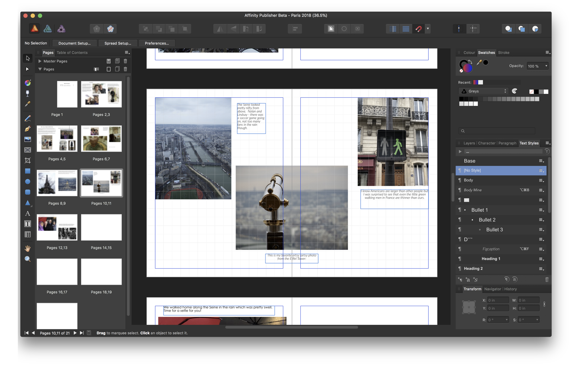
The Affinity Publisher interface is very comfortable if you’re familiar at all with Affinity Photo and Affinity Designer. The right side is full of tabs like Layers and Colors and Styles, while the left sidebar is a column of small icons for the different tools. Some of the tools are familiar, like a pen tool for drawing vectors and a pencil for drawing lines and some geometric objects.
Across the top, you’ve got what Serif calls the Context Toolbar. Basically it means that the options up above change depending on what you’re doing. If you have a text box selected, the Context Toolbar will show you the font and character and paragraph options available, but if you select an image it will change to things like fill and stroke and corner radius options. In the middle is a giant area where you lay out your pages.

Layout
I watched a couple of the Affinity Publisher Beta video tutorials, just enough to get me started, and learned that you start by deciding whether you want a single page layout or two facing pages. For the latter, think of a two-page magazine spread with images flowing across the staple area. I started experimenting with my Paris Travelogue from earlier this year, and it felt really restrictive to work in 8.5″ x 11″, so I switched over to facing pages and now I’m coloring way outside the lines. It’s fantastic fun!
In my case, I have these snippets of text (not too much or people get bored) with lots of images. In Affinity Publisher I learned to drop in a Picture Frame first before plopping in an image. Picture Frames are cool. You paste your images into them by right-clicking (can’t ⌘-V unfortunately) and then as you drag the corners, the image is “intelligently” resized. The image isn’t distorted as you change the Picture Frame’s dimensions, rather it’s cropped real time as you stretch and shrink the frame.
I tested Picture Frames with an image of a walk/don’t walk person sign that I thought was funny at the time (because the French ones show a skinnier person than the ones in the US). In my original email, it was this huge image taking up the full width of the letter which was attention way beyond what it deserved. With the image as a Picture Frame, I could essentially live crop it to fit nicely on the page with the other images.
My favorite thing about putting in the images is that the context toolbar gets a Text Wrap option that lets me force text to wrap around an image. You can change the margin around each image in the same Text Wrap interface, so if you want to nudge the text away just a bit more on the left side you can just tap the little up/down buttons to adjust it. The tutorial video showed the text floating around a cutout of a car and it looked really cool.
I’m still experimenting with how to do text. I’ve just pasted it in and I’ve also used the Frame Text tool which seems to be important but I don’t know why just yet. I successfully created a style that I called “figcaption”. I couldn’t figure out how to modify that style once I’d created it, so I went back to the tutorial videos and figured out the trick. (If you’re wondering, update paragraph style is a tiny little button under the list of Text Styles on the right side.) Easy peasy once you know how to do it.
Integration of Other Serif Tools
You can draw with the vector tool on a layout, adding gradients and doing some other image-type stuff with the tools in the left sidebar. In the beta at the top left there are icons to activate the Vector Persona and a Photo Persona, but those haven’t been activated yet in the version of the beta that I’m using right now (1.70.58).
Bottom Line
I’m having a complete blast playing with Affinity Publisher beta, and that’s a lot more than I could ever say about iBooks Author! I said a lot of non-Girlscout-safe words when I tried to make a book with iBooks Author, but not once have I sworn at Affinity Publisher beta. It does crash from time to time and it does have unpredictable behaviors on occasion. For example, I was reading the help files and following the directions to find Document Setup under File in the menubar, but it wasn’t there. I found out in the great community forum for Affinity Publisher beta that this is a known issue, and that quitting and going back in will sort it back out.
If you’re even a little bit curious about how to use a page layout program and are willing to take a risk on a beta product I highly recommend you go to the link in the shownotes and download a copy of the beta for Affinity Publisher. Have I mentioned to you that this is a beta?

