 Now that we take so many of our photos with our mobile devices, it’s even more important that we have good editing tools that fit the interface of a mobile operating system. You know I’m wild about Affinity Photo for iPad but it’s a sledgehammer of an app.
Sometimes you just need to fix a small problem in a photo, not create artwork. The darling of photo editing on iOS and Android is Snapseed but for some reason, it just doesn’t fit the way that my brain works.
Let’s lay out a few problems to be solved. Have you ever taken a photo of a gorgeous sunset, only to look at the photo later and realize there’s a power line in the photo? Or maybe you’ve got a great shot of your child playing in the sand on the beach but you didn’t notice there’s a trash can prominently showing in the background. How about a favorite teenager going through a difficult skin year and you want them to look their best?
The app I turn to for these kinds of edits on iOS is called TouchRetouch from Adva-Soft.
TouchRetouch is $1.99 for iPad and another $1.99 for iPhone/iPod Touch. There’s even a more advanced version for the Mac for $15, but that won’t be the subject of this review – perhaps for another day.
When you open TouchRetouch you’ll see two big round buttons in the middle of the screen: one takes you to your albums in Photos, the other is tutorials on how to use the app. The tutorials are excellent; they’re short videos that demonstrate each feature so that in just a few minutes you can get the hang of how to use TouchRetouch.
Albums
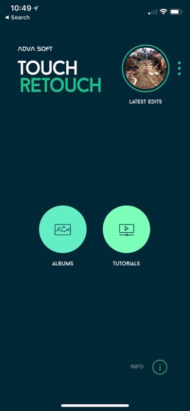 If you tap on Albums, TouchRetouch will ask for permission to access your photos. I have an elaborate folder and album structure for my 70K+ Photos library and the entire structure was accessible inside TouchRetouch.
You can also navigate your Photos library via Apple-created smart albums, like Moments, Favorites, Selfies, Live Photos, Portrait, Panoramas, Bursts, and Screenshots (why do I have 2300 of those do you think?)
You can also see your shared albums including images shared by other people. I presume if you edit them you won’t be able to save back into the shared album, especially if you didn’t originally own the photo.
Top-Level Menus
When you first open an image in TouchRetouch, you’ll see four icons across the bottom of the screen:
- Object Removal
- Quick Repair
- Line Removal
- Clone Stamp
The icons are pretty easily recognizable for their functions, which is a good thing because the font for the names is 1 mm tall. To put that in perspective, the smallest text I could see on my 5K display at its default resolution at Amazon was triple that size. I know I’m getting old, but even with my glasses that font is small!
Ok, enough whining about apps that have fonts that are too small. Let’s go through each of these options and see how well they perform and how easy they are to use.
Object Removal
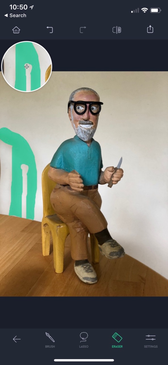 Once you tap the Object Removal icon, you’ll get five new icons across the bottom. Highlighted will be an icon that says “brush” underneath (in 1 mm tall letters). With brush, you smear around on the screen with your finger over unwanted objects, like that trashcan in the background of your beach photo. As you drag your finger, TouchRetouch will display a green overlay showing you where you’ve selected.
If you want to select more on screen, you can lift your finger and drag over more of the area. If you covered something unintended, one of the icons across the bottom is the eraser. With the eraser selected you can remove some of the green to change your selection. In addition, there’s an icon for a lasso, and with that, you can simply encircle another area. All of these actions are taken before your image is modified.
Once you’re happy with your selection, you can tap a green GO button that appeared on the bottom right as soon as you started selecting anything on screen. TouchRetouch removes the selected area and replaces it with the best match from the surrounding area.
On a nearly 2-year-old 12.9″ iPad Pro, the changes to the image happen nearly instantaneously. I mention the speed because I was watching an older video on YouTube about TouchRetouch and there was a significant pause where the user had to wait until they could see the effect of their selection. I don’t know if it was a super slow phone, or if the software is much faster these days. But I sure don’t have to wait at all to see whether the removal worked or not.
There’s a Settings icon at the bottom with a single purpose, and that’s to give you a slider to change the size of the area selected as you drag around on screen. This is handy on both ends. It’s nice to make it more precise for smaller selections and ginormous when you want to remove something larger.
While you’re dragging your finger around, in the upper left you get a magnified circle showing exactly what you’re selecting.
If you’ve ever worked with any kind of retouching application like this, you know that your success will be highly dependent on what you’re trying to remove and the complexity of the area from which you’re removing it.
In demos, we always like to remove a tiny bird from a nice smooth blue sky. I’ve never used a tool that would fail in that test! Another great demo is when you’ve got something on top of a nicely random surface. I tried to remove some leaves from a grungy cement driveway and it was a cake walk for TouchRetouch.
Overall I’d say TouchRetouch was on par with the better tools I’ve used (like Affinity Photo’s Inpainting tool). It struggled in certain conditions and worked well in others. If this was the only toolset you had in TouchRetouch, it would be of mild use. But when you add in the other tools it gets significantly more useful.
Undo
At the top of the screen we have undo and redo buttons. They don’t work exactly like what I expected but they might work the way we actually would want them to. Let’s say I smeared around on one spot with my finger, then used the eraser to remove where my fat finger grabbed something unintended, and then I hit the GO button.
When I hit undo once, it goes back to showing me in green the area I had selected (minus the part I’d erased). If I hit undo again, the erasure of the selection is undone. Undo a third time and the original selection is removed. I expected the entire change to be removed on one undo but this ability to go back step by step is even better because you can experiment with refining a selection without having to start over each time.
Also in the top menubar (available on all tools) is a before and after button. If you tap and hold you’ll see the original image, and when you let go you’ll see the retouched version.
Quick Repair
Along the bottom menus, there’s a back arrow which takes you to the top level menu again. The second icon (with teeny letters) is for Quick Repair. Remember how in Object Removal we did a lot of different selections and erasures and then had to hit GO? With quick repair, you simply select something to remove and when you let go it’s gone.
Quick Repair has two tools, a brush just like we had before that when dragged around on screen selects everything under your fat finger and erases it. The second icon though is called Blemish Removal (if I’m reading the teeny text correctly).
Blemish Removal is designed to fix those unfortunate blemishes we talked about earlier that plague our teenage faces. The trick of good blemish removal is to match the skin tone and texture. I tried it on a few spots on some peoples’ skin and it worked beautifully. I should mention that the Blemish Removal tool isn’t a brush, you simply tap on the blemish and it vanishes instantly.
Like the Object Removal tools, Quick Repair also has a Settings icon that lets you change the size of the Quick Brush and the Blemish Removal tool.
While you’re working in TouchRetouch, you may find that you want to zoom in. A simple pinch to zoom in and out will remove the menus along the top of the screen and briefly display the current zoom level instead. After about 1 second the zoom level will disappear and your menu icons will return.
Line Removal
Where I live, overhead power lines are a constant problem for my photography. Maybe you’re like Mark Pouley and can just throw your kayak out onto the lake and peacefully photograph eagles in their natural habitat, but living in Los Angeles introduces different challenges.
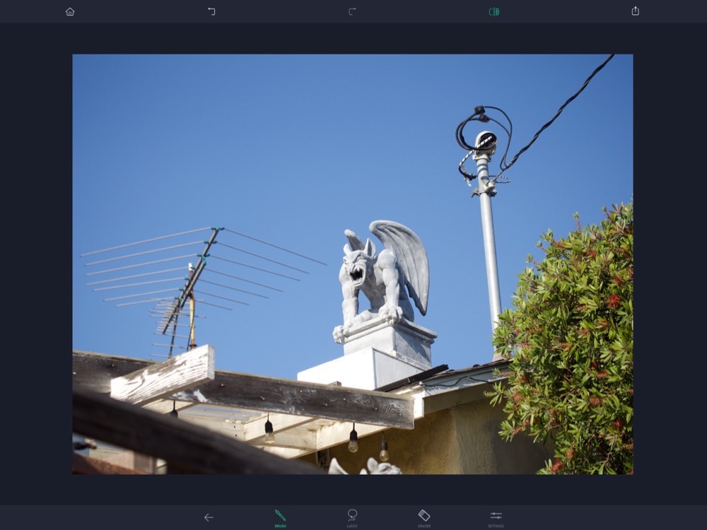
On one of my walks around the neighborhood, I realized that one of my more playful neighbors had put a giant, winged gargoyle on top of their chimney. I had my iPhone with me so I snapped a photo. When I see these things I simply don’t notice all of the other distractions. But when I got home I realized that they had a pretty nasty looking TV antenna on their roof, and a really ugly power line coming to a pole on top of the roof as well.
This is where TouchRetouch can really shine. The next tool in our arsenal is called the Line Removal tool. Once selected, there are two options: Line Remover, and Segment Remover. The instructions for these two tools in the help section are a bit confusing so I’ll try to help with my own description.
The problem with removing lines is that it gets really hard to accurately select just the line when you select the endpoints. TouchRetouch has a fabulous solution to this. You let the application do the tricky parts of the selection. To remove an entire line, you simply drag across a portion of it, say in an area where it’s easy to select.
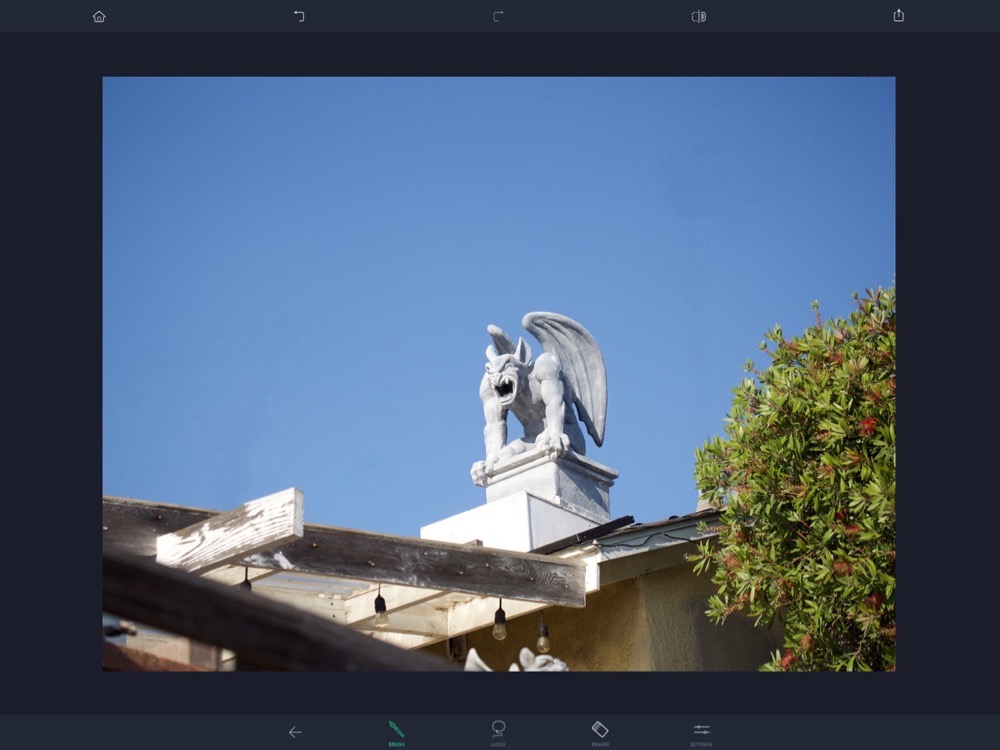
When the Line Remover works, it’s magical. As with everything else in retouching photos like this though, sometimes it doesn’t work as you would hope. On my antenna problem, it had a series of rods to the right and an identical set to the left. In both cases, the rods were against a pure blue sky. I used the Line Remover tool to drag across a portion of each rod on the right and they all disappeared in their entirety leaving no trace of themselves on the sky.
But when I dragged across the ones on the left, most of the rods left remnants on screen. Some left their tips on one end (the easy end that wasn’t near anything) and some left a dark line on the sky and some left both. I can’t see why really the rods on the left were failed by TouchRetouch and the ones on the right worked perfectly.
The power line was this large, twisted pair of different colored wires, and it erased easily in just a couple of swipes. Go figure!
The second tool inside the Line Removal set of tools is called Segment Remover. Remember the first was called Line Remover and you select a small section of a line to get rid of the whole line.
Segment Remover is oddly named. To use Segment Remover, you have to select the entire line you want to remove. You’d think it would be the other way around. When I tried to select just a segment of my ugly power line, the behavior was completely unpredictable. Sometimes it would erase what I’d drawn over, sometimes it would erase way more of the line, and one time it selected the line on either side of my selection but not my selection. However, when I dragged across the entire power line using Segment Remover, it did a pretty darn good job of clearing it away (against a solid blue sky.)
The one thing I don’t like about the line removal tool is that when you’re drawing on a line you don’t see a thick green area where your finger has dragged. Instead, you see a very thin white line. The settings option gives you a choice of thin, medium or thick (no slider) and no indication on screen of how big those three sizes are. I’m sure my line thickness has something to do with the accuracy of my removals but it wasn’t clear to me whether making it thicker or thinner should improve my attempted line removals.
In the tutorial section, they do say that the Line Removal tools can be used on facial wrinkles which is cool too. As a grandmother, I can appreciate that!
Clone Stamp
When you’ve done all you can to improve your photo, you’re likely to still have some aberrations either from the original photo or caused by the retouches you’ve made. The last toolset we have is the Clone Stamp.
Inside the Clone Stamp, you have three options and a settings icon. If you select the brush, you get a circle with crosshairs that you drag around on screen to choose the source for your cloning, and then once it’s in place simply drag your finger on screen to execute the clone. With most apps, that’s all she wrote. But with TouchRetouch the Settings allow you to change not only the size of your clone area but also the hardness and the opacity.
I played around with making a ghostly copy of my gargoyle out in the sky by setting the opacity quite low. With most applications, this effect is destructive. But with the Eraser inside the Clone Tool, you can actually remove the cloned area. Not only that but with the opacity set to low, as you brush on the cloning, it becomes more and more opaque as though you’re layering on the effect.
Mirroring
Finally, you have a Mirroring option inside the Clone Stamp that I’ve never seen before. It has four options: no mirroring at all, horizontal, vertical, or diagonal. Horizontal and vertical are pretty obvious, but diagonal is a very odd option. I studied it for a while and tried it with different geometry trying to figure out what it was doing. It appears to be flipping the image upside down and flipping it right to left, a combination of horizontal and vertical mirroring.
I have to say that the eraser in the Clone Stamp toolset is my favorite thing because you can test these things out, making a complete muck up of your image, and then just erase the things you created.
While cloning worked on high contrast items like my gargoyle, I had less success smoothing out my sky where the line removal had left some artifacts. You can still see some smudges in the blue. We see a solid blue sky as the same color, but moving just slightly up or down or right or left does change the hue and saturation of the color, so cloning is more problematic than ever. I think there are other tools that I have in my arsenal that would have done a better job with the sky smudges, to be honest.
Latest Edits
As you’re learning to use TouchRetouch, you’ll be tempted to jump out and go watch the tutorial for the tool you’re trying to learn. They realized this, so when you hit the home button in the top left, you’ll see the original two options (albums and tutorials) but you’ll also have a circle with a tiny version of the image you’re editing and underneath it says “Latest Edits”.
If you watch a tutorial and then tap your latest edits, you’ll be able to keep working on the same image, even if you haven’t saved it. There are also three dots next to Latest Edits which when tapped reveals a button to continue editing or to Clear Edits. Very nice little touch that I’ve never seen before in any app.
Export Options
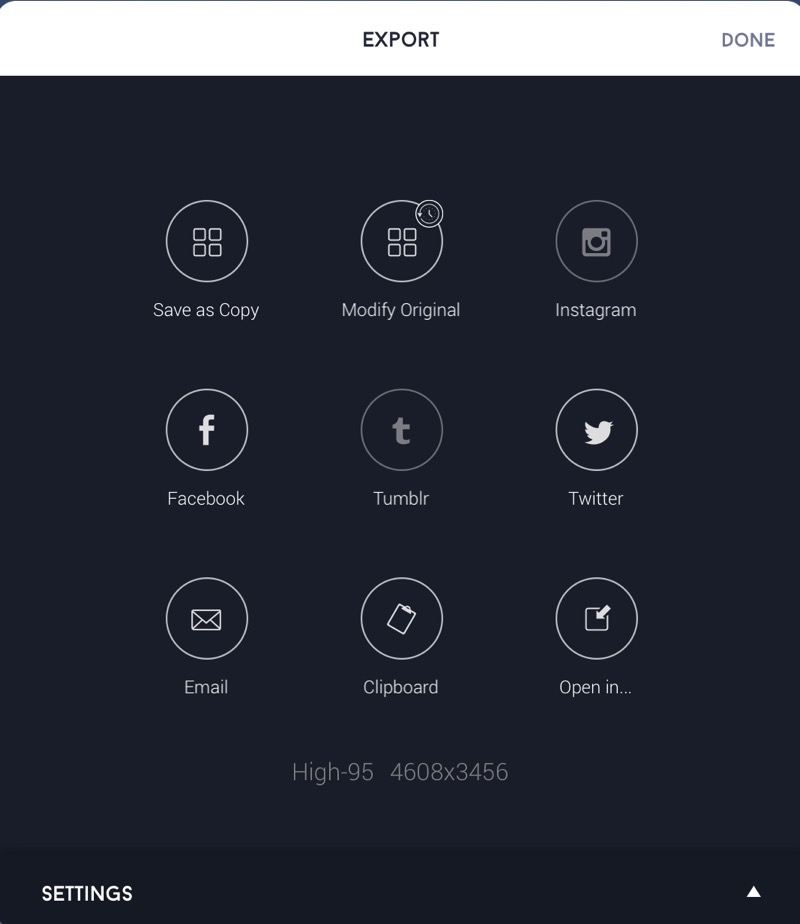 Speaking of saving, the Share button in TouchRetouch allows you to save a copy back into your Photos library, modify the original, or share to social media platforms Instagram, Facebook, Tumblr, and Twitter. You can also Email directly from here, copy the image to the clipboard, or open in another application.
I tested opening the image in Affinity Photo (which is a $20 app for iPad) and using the healing brush in there I was able to really clean up the sky much better than I could with the $2 TouchRetouch. That makes sense though, right? For $2 TouchRetouch is amazing but if you’re really into this stuff, you’ll end up with a lot of tools in your arsenal.
Back on the Export options, at the bottom of that window, you can reveal settings to change from JPEG to PNG or TIFF, and to set the size from the default of Original to small, medium, or large. With JPEG selected you can set the quality of the JPEG as well.
One interesting tidbit when saving a copy of your corrected image back to your Photos library. TouchRetouch saves the corrected version with the same date as your original so it stays sorted together. That’s kinda cool.
Bottom Line
I really like TouchRetouch, especially for the quick fixes that take a good photo and make it great. It is underpriced at $2, so I’ll not listen to any whining about having to pay $2 for the iPhone AND iPad version. I hope it will make you happy too.

Followed your review to a “Line Removal Tutorial” on YouTube. It really is AutoMagical!