 Every year for the last 25 or 30 years, I’ve created a photo calendar for my family. These monthly collages make us all very happy. I can tell they really like it because once or twice I’ve tried to opt people out to save money only to get huge protests and be forced to add them back in.
Nearly every year I’ve used Apple’s services to print my calendars, wavering only once by trying out Shutterfly. While I adore Shutterfly for my annual photo Christmas card, their calendar was definitely not up to the caliber of Apple’s printing services. I switched back to Apple and never tested any other services.
The Project section of iPhoto where I originally created my calendars had layout tools that I would put just above mediocre. When Apple introduced Photos as the replacement for iPhoto, I was optimistic that the layout features would be vastly improved. I was severely disappointed on that front; if anything they went from mediocre to horribly frustrating.
Bart also makes calendars with Apple Photos, so he and I used to get together every year to bemoan how awful the process was. It was kind of an annual ritual.
Apple Ends Photos Projects
Fast forward to this year in September when Apple announced that they were dropping their own tools for making projects like calendars, books, cards and more. But they didn’t leave us high and dry. They created a plugin architecture for Apple Photos so that third-party companies could fill the gap. Apple has a support article that describes how these new extensions are supposed to work from within Apple Photos.
I’m going to focus this article on the extension called Mimeo Photos from mimeophotos.com. Turns out Mimeo Photos is the company that Apple used for all of its print services in the past. In theory with Mimeo Photos we’ll get the same quality of products but with a new interface. The old Apple interface was so aggravating, I was looking forward with optimism to the new Mimeo Photos interface.
I should mention that Mimeo Photos isn’t the only option available. Motif is another good option for creating calendars and other projects. I tested both of them and found that Mimeo Photos was more to my liking but it’s worth taking a look at Motif as well.
You may never make a calendar yourself, but if my experience is anything like how it works for books or cards or other services, you might just want to give Mimeo Photos a try.
Adding Extensions to Photos for Projects
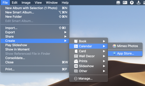 To initiate a project in Apple Photos, you go to File, pull down to Create and there you’ll see choices for Book, Calendar, Card, Wall Decor, Prints, Slideshow and Other. If you choose an option, such as calendar in my example, you’ll see an icon for App Store. When you go to the App Store you’ll see 5 other extensions you can add beyond Motif and Mimeo Photos, so not a whole lot in here yet but it’s a new service. The other services are for wall art, web galleries, and collages.
After you install one or more of these apps from the App Store, you’ll see them in your Applications folder but they don’t actually DO anything in the standalone environment. You access the applications by going back into Photos and into the Create menu where you’ll see your newly installed extensions.
It’s important to remember that they do exist as applications inside your Applications folder, because removing them from that directory is how you uninstall them. You can disable them from within System Preferences, Extensions, Photos Projects, but they’ll just be disabled, not uninstalled. I uninstalled one with AppDelete and it found a half dozen files and folders sprinkled around my system so you might want to use an app removal tool to uninstall.
Making a Calendar with Mimeo Photos
Ok, let’s finally have some fun with Mimeo Photos making a calendar. There are two ways to add photos to a project. You can start by selecting a series of photos and then choosing File/Create, or you can create the project first and then drag the images onto the name of the project in the left sidebar. Either way works fine, but it’s good to know the second option because invariably you’re going to realize later on that you want to add some more photos.
When you first go into the project created by Mimeo Photos you’ll see an option to choose the start date of the calendar. Right here I have my second best recommendation of all time. My tip is to start your calendar in February not January. The problem this solves is how nuts it is at the end of the year. Holiday shopping, too much eggnog, annoying relatives, all the things that fill our lives make it too stressful to work on a calendar.
I used to lose my ever-loving mind working on the calendar in December. Now I peacefully do it in January with a start date of February. It’s also fun to separate the calendar delivery away from the holidays so your recipients have it to look forward to after all the excitement is over. A win across the board.
Choose Your Start Date Carefully
When you start a new calendar project Mimeo Photos defaults to the calendar the following year. Since I waited till January to start working on my project, the year defaulted to 2020. Gosh I wish I’d noticed that before I started laying out my calendar! I laid out 10 of 12 months before I noticed it wasn’t 2019. Near as I can figure, you can’t change the year after the project has been started, so I had to start over.
Mimeo Photos Interface
When you finally get started on your calendar, Mimeo Photos has 5 sections down the far right panel. Events, Photo, Text, Layout and Background. If you select Photo you should see all of your photos in a grid just to the right of the calendar layout itself. You can use the pulldown to choose whether to see all photos, used photos or unused photos. This can be really handy to make sure you don’t use the same photo twice like I did one year!
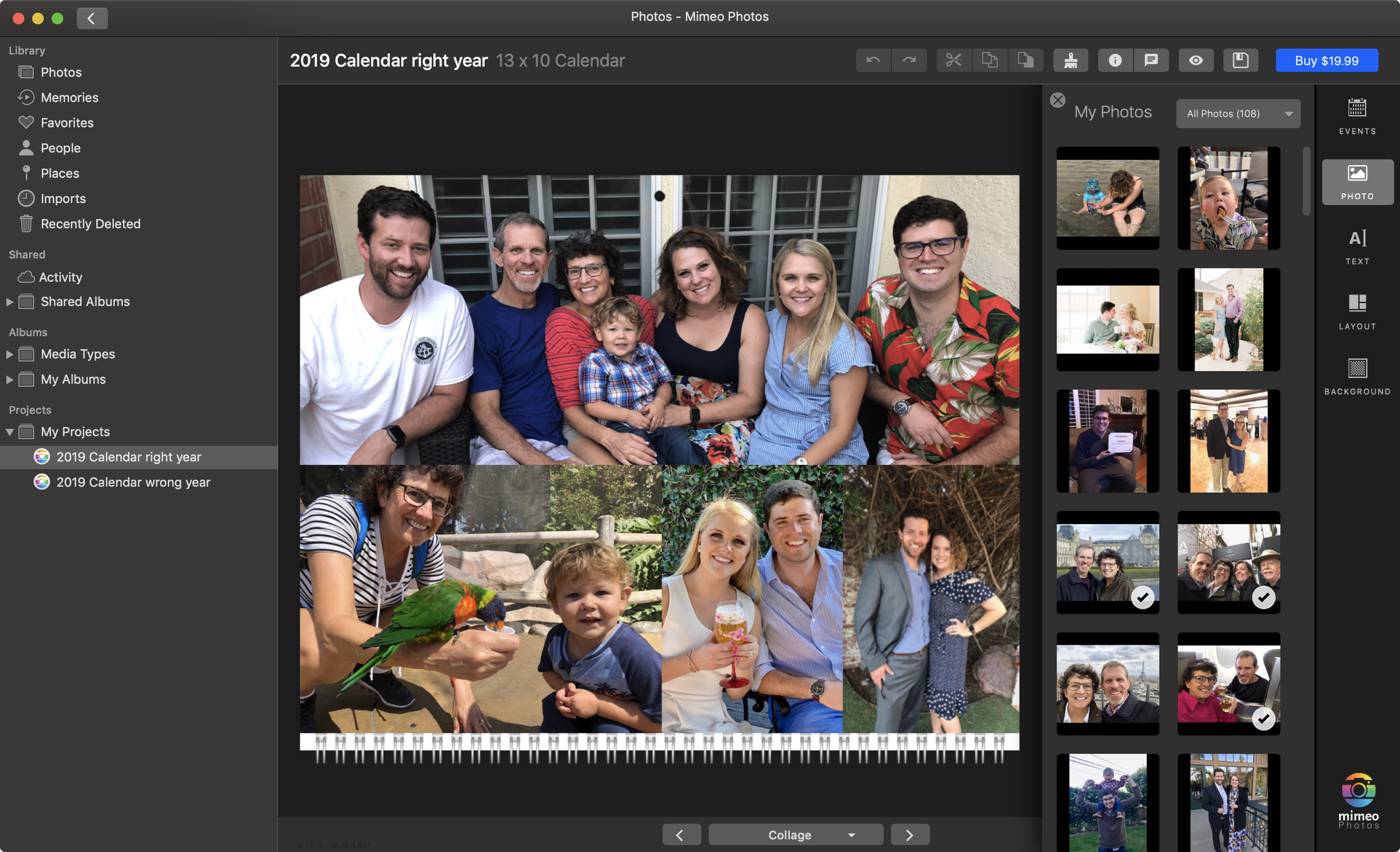
The layout tab is what gives me the most joy in Mimeo Photos. I mentioned how disenchanted I was with Apple Photos layouts. One of the things that bothered me was the lack of flexibility of the layout tools. You got a specific set of options and that was what you had to live with. The layout options were in very tiny thumbnails and were a very light grey on top of white. It was very difficult to see what you were choosing. I would often lay out several months before noticing that the photos didn’t bleed all the way to the bottom because I hadn’t picked my intended layout option.
With Mimeo Photos you get sooo many more layout options, they’re very easy to see, and they really are just a starting point. I’ll describe what I mean by that in just a minute. But first a problem to be solved.
I collect images from my family members for inclusion in the calendar. One set of family members insists on submitting vertical portrait images, not landscape. With Apple Photos, if you chose a layout that had just one photo to in portrait, that meant it dominated half of the entire calendar page, relegating the rest of the images to share the other half. There was no way to change this. It severely limited my ability to equally distribute the photos so everyone was represented.
 Mimeo Photos has way way way more options for layouts and like I said they’re just a starting point. They even have a section for 5+ photos. One of the options is for 5 portrait photos, where the center is tall and skinny and the other four are squatter. That lets me use a bunch of portrait photos and crop some in height, and others in width. Lots of flexibility.
Once you drop in a layout, if you click on one of the little blocks representing a photo you’ll be inserting, Mimeo Photos zooms in on that image. It’s delightful to have it zoom in automatically like that. At this point, simply click on a photo and it will be dropped into that block. By default you’ll be in the pan/zoom mode and your image will be cropped to the shape of the block. You can drag on screen and slide your image around within the cropped block.
Transform
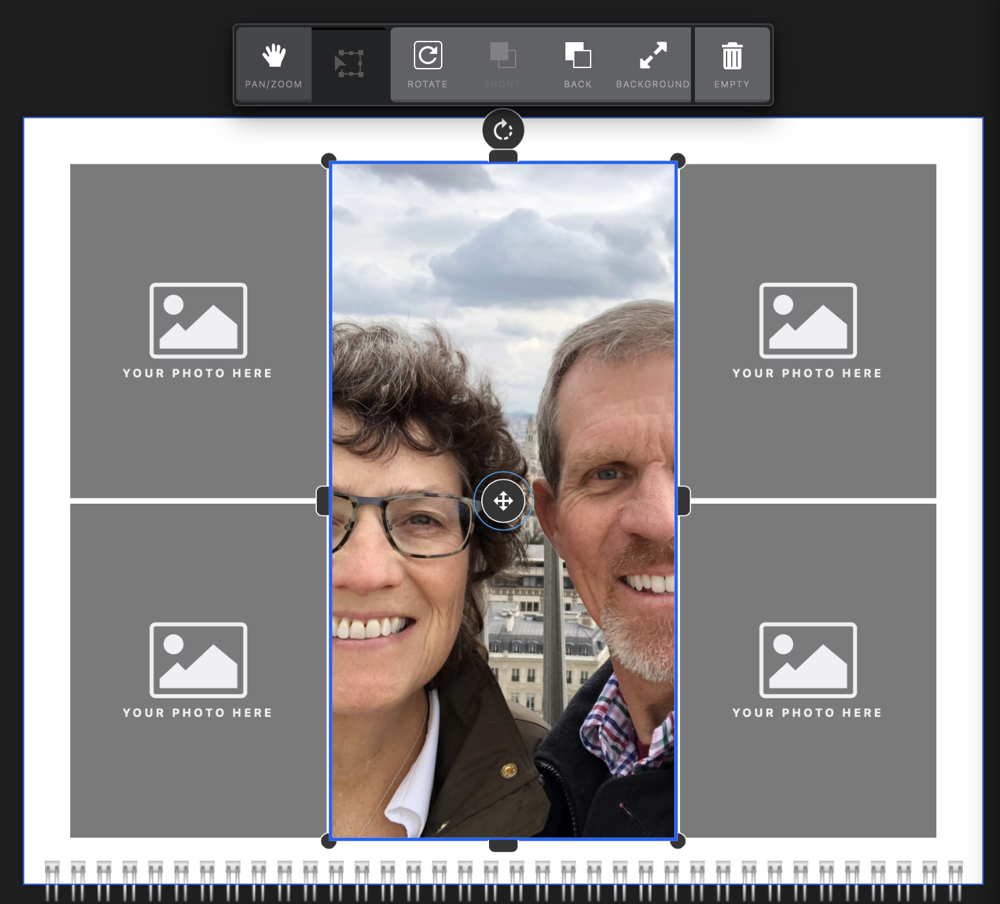 The real fun is to hit the transform button. I mentioned that the layouts are the starting point, and here’s how you move beyond. With transform you get handles on the four sides of the block. These four handles let you expand and contract the sides of the block up to the limit of the image you put in. So lets say that tall skinny crop doesn’t quite work and you need a smidge more width, you can steal it from the other image blocks.
In transform mode you also get handles on the four corners. These handles give you complete freedom to resize and reshape the image block. This came in most handy to me in allowing me to bleed the images all the way to the edge. I like the entire calendar page filled with photos. Some of the layouts do that automatically but some don’t so being able to override is great. Most of the layouts leave a tiny border between images which is pretty nice but sometimes I want to override that too and now I can.
If you do transform your images by dragging them to the edge for a full bleed, you may see a pair of inexplicable orange scissors. I had to dig into the documentation to find out what they were for, because clicking on them did nothing. The scissors are an indication that you’re cropping your photo. You may be fine with that but it’s nice that it notifies you if the cropping was unintended. I think the addition of a little tool tip there would have been nice.
With this great flexibility comes the option to have images overlap each other. There’s a tool to let you push images back to arrange the layers of images to your liking.
If you’re an anarchist and can deal with images that are not orthogonally placed, you’ll enjoy Mimeo Photos’s rotate option. Obviously as a classically trained engineer I cannot endorse such behavior but what you do in the comfort of your own home is your own business.
One of the great pleasures of Mimeo Photos is that when you’re transforming your images on screen, you’ll see little helpful alignment lines. When you get an image edge aligned to another image vertically or horizontally, you’ll see a pink line go between them. You’ll also see a pink line if they’re aligned on center vertically or horizontally. If you move an image to the center of the page in either axis, you’ll see a green alignment line. Very, very helpful!
Undo
You may be disconcerted to realize that command-z does not undo inside Mimeo Photos. That’s because Apple does not expose the undo function within Photos to third parties. I learned that when I first used the Affinity Photo extension and asked Serif about it. No worries though, In Mimeo Photos across the top there’s an undo and redo button, along with cut, copy and paste.
In addition to being able to add images to these blocks and modify the blocks, you can also change a given photo to be the background for the calendar. That’s not something I’d probably do, but I can see the anarchists who think tilting photos off of horizontal liking to put a nice Hawaii beach sunset behind a series of images.
More Layout Options
Here’s another great feature. Let’s say you’ve got five images on screen but you really wanted six. In the old Apple Photos projects, you’d be out of luck. But with Mimeo Photos, just drag another image on screen! You get all of the same features you had with all of the premade image blocks. So in the words of Captain Barbossa, the layouts are “more of a guideline”! You have total and complete freedom of layout.
I started coloring way outside of the lines when I realized this. I could take a wide family shot and drag it all the way across and put a bunch of portrait photos lined up below, or maybe a wide shots on the upper left and lower right, balanced by smaller portrait photos in the opposite corners. My creativity was finally unleashed!
Swapping Images
Often when you’re creating your masterpiece, you realize that it would look better if you could swap two photos. You could click on each one and hit the trash can to empty the block and then put the images back in. You can swap images by dragging one on top of the other, but it’s very difficult to figure out how to do this. I did it once but when I went back to replicate the process so I could write it up, I couldn’t remember how I did it. I dragged with the image in pan/zoom mode and with it in transform mode but neither one swapped the photo.
I did a search of the fairly limited documentation which didn’t reveal the trick. I started wondering whether I’d hallucinated the capability. Then I remembered seeing it in the Quick Start that runs the first time you open a new project in Mimeo Photos. Luckily you can rerun the Quick Start with a menu button at the top. It spoon feeds you a few options at a time so you have to wait for it to decide when it’s going to show you the tip you need.
Finally I was rewarded with the answer. You can’t swap in pan/zoom mode and you can’t swap in transform mode, as I’d discovered. You have to have NO photos selected. Then and only then can you drag one image onto the other and they’ll swap. I’m sure glad I finally found that; I thought I was going crazy!
Another way to put images into the little blocks is to simply drag and drop the images onto the blocks. Not quite as easy as swapping because you’ve got to go find the other image in your list and if you have 149 like I do that might take a while.
Editing Images
Sometimes when you place a bunch of images on a page, you notice that the white balance is completely different between the photos or maybe one was crooked and you never noticed it. If you double click on an image that you’ve placed into Mimeo Photos, it will launch the standard image editing functions of Apple Photos. You can also choose from a list of filters, and you get access to the crop tools where you can rotate the images so they’re straight like nature intended.
Text & Events
If you’d like to add text to your calendar pages you have full flexibility within Mimeo Photos. In the side panel you can add an empty text box, and some of the template layouts come with text boxes. You can easily change the font, size, color and even outline. I’m not big user of this feature but I can see those anarchists with the Hawaii sunset background and jauntily tilted images wanting to write “Aloha!” In nice big script across the page.
You may want to add events to your calendar beyond the standard holidays you can add by default. You might want to add Great Aunt Martha’s birthday so no one forgets it like they did last year. The Events tab lets you edit the existing holidays and add new events. You can even add an image to an event, so a picture of Great Aunt Martha might be a helpful reminder. I changed Columbus Day to Indigenous People’s Day which made me feel like a progressive person.
No Option to Print a Proof
The only big beef I have with Mimeo Photos is that I can’t print a proof of my entire calendar. With the old Apple Photos projects I could print to PDF. This allowed me to send the proof off to my family members for final approval. It wasn’t uncommon for someone to point out that I’d put one photo in twice, or I’d forgotten someone in a place where it would have made sense.
The only way around this I’ve found is to take a series of screenshots using Clarify and then exporting that to a PDF. It’s a very tedious process but I did find some serious mistakes when I did it. If you hit the edit button so it switches from the eyeball to the pencil, it takes you to a mode where you can see the top image collage and the month calendar at the same time, so taking screenshots from this view might be more useful, and would only be half as many screenshots.
If anyone has any ideas for a workaround to this problem I’d sure be interested in hearing about it. I suppose I could do a screen recording while I use the little arrows to flip through the pages one by one….
I wrote to the developer and had a lot of trouble conveying my request. Once they understood me, they said, “Currently we don’t offer a PDF export feature, but this is a very popular feature request.” However when they thought I wanted to actually print, they said the exact same thing, so maybe that’s a stock answer to make me feel valued. I wrote in October and as of January it’s not implemented so it’s evidently not a top priority.
Bottom Line
I haven’t yet completed my calendar so I can’t speak to the quality of the final product from Mimeo Photos but I have no reason to suspect it will be any different from the great quality I’ve come to expect from Apple Photos projects. I’ll certainly let you know if it’s not amazing as always. In any case I’m having great fun working on my calendar so that’s half the battle won right there.

Thank you for sharing this. My wife and I ended up using ifolor Designer for our photo calendar and were less than impressed. Mostly, since my poor wife, who volunteered to do the calendar this year, lost her work twice. I am sure you can imagine the joy 😉
I have tried to edit photos by double clicking on the image and do not get the option to use the round trip editing feature? Why?
Anonymous – great question, but I have no answer for you. I just tested on Photos with Mimeo and double clicking does open the built-in Photos editing tools and then saves back to the calendar. Wish I could be of more help.
Thank you for sharing this. I feel totally suckered by Mimeo photos and its one way treatment of pdf’s. Only an old projet from iPhoto imports into Mimeo in pdf. A project created in Mimeo has no pdf feature. This technology is going backwards.
I’m really irritated…
Mimeo Photo do match the previous apple offering in most areas apart from the ability to add an apple calendar. We have an extensive birthday and event calendar and I can not see a way of add this. Please help!
By the way, PDF export is an option for me using Mimeo Photos.
**EDIT:** PDF export sans watermarks was added on 8 August 2019.