When I retired, I decided that one of my goals was to learn to program. I took Basic in college in 1976, and later Fortran IV with WAT5. when I was in grad school. In 1982, in my Master’s Project in Mechanical Engineering I actually used Fortran. (“The Development of Clearances in a Spacial Revolute Joint” if you’re interested.)
But I hadn’t programmed anything in the ensuing 31 years. Obviously programming has become all the rage and no longer isolated to the dusty back rooms of a mechanical engineering lab using punch cards in a mainframe. I was curious to see if at the ripe age of 55, I could learn to program using modern languages and if I could figure out some problems to solve with it.
I also was highly influenced by Dr. Maryanne Garry who came on Chit Chat Across the Pond several years ago and explained that one of the ways you can increase your odds of staving off Alzheimers is to take on something that is very challenging for you mentally … and master it.
Now all I needed was someone to teach me to code. Luckily Bart Busschots agreed to help me with this quest, and that was the genesis of Programming By Stealth. We started the podcast on October 9th, 2015 and every other week for the last three and a half years, Bart has been slowly but surely building up our programming skills starting with HTML, then CSS, then JavaScript and now into Bootstrap.
I am giving you all of this background just to tell you the story of how incredibly powerful I felt last week when I created something beautiful, and useful to you using those hard-earned programming skills.
Problem to be Solved
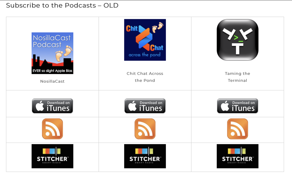 I can finally explain the problem to be solved. You may not have noticed, but on every podfeet.com page there’s a menu bar at the top. The very first link is called Subscribe to the Podcasts. It isn’t a big red button (but maybe it should be), it’s just a quiet little link. In this day and age it may not even be necessary. If I suggest you subscribe to Programming By Stealth, you’re probably just going to open your podcatcher of choice and do a quick search and tap the plus button.
But anyway, the page hadn’t been updated since I did the major redesign a few years ago. I created it using a tool called Layout Builder from my WordPress theme vendor, SiteOrigin. I designed this page, but as my father would have said, the page is “ugly as sin.” The podcast logos are in the first row, and for the life of me I was never able to get them aligned, vertically so the NosillaCast was way below Chit Chat Across the Pond and Taming the Terminal. Chit Chat Across the Pond Lite and Programming By Stealth aren’t even on the page.
The second row was for the logo and link to “download on iTunes.” When’s the last time you used iTunes for a podcast? Then I had the RSS feed logo and link which will probably live on forever. Finally I had Stitcher Radio which was an up and coming service for a few minutes right around the time I created the page. The text is too small and there’s lines around the rows and columns to ensure I keep the “ugly as sin” insult in tact.
And to put the final cherry on top, the page isn’t at all responsive to screen sizes. On a narrow screen like a phone, the icons all jam up together and there’s no way I could add in the two missing podcasts. Other than that, the page looks AWESOME.
Solution One
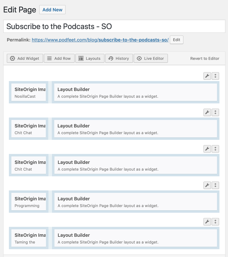 The first path I went down was to recreate the page but still keep using the Page Layout Builder from SiteOrigin. The advantage of this approach is that you drag in little blocks representing rows and columns with graphics and text without needing to do any design of the layout. The tools do all the styling for you with overrides available to modify to your needs.
One of the biggest advantages of using the Page Layout Builder was that if properly designed, it would be responsive to different device sizes. As Bart has taught us in Programming By Stealth, the new mantra is “mobile first” because that’s where most content is consumed these days. A responsive design was critical.
My new design layout idea was to have one row for each podcast, instead of a column. Each row would have three major elements. On the left I wanted a big version of the given podcast’s logo. On the right say 75% of the row would be some brief text describing the podcast. Below the text, I wanted a row of very small podcatcher icons. Each podcatcher icon would have the name of the software right below it.
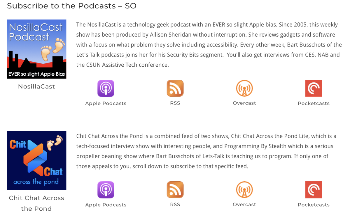 Tapping on the appropriate podcatcher logo on a mobile device should take you right to the podcast in the app. If you clicked on the icon on the desktop, it should open a browser window for that podcatcher pointing to the correct podcast. I wanted the text and the podcatcher icons to take up about the same height as the big podcast logo on the left.
![]() Great news – I was able to mock this idea up very quickly using my SiteOrigin tools. Now I told you we’re supposed to be doing mobile first, but the description and design I just detailed was how it would look on a wide computer screen. The small screens should see something very different. My plan was to have the collapsed version show the big podcast logo at the top, then below that the text, and below that the horizontal row of small podcatcher icons.
Great news – I was able to mock this idea up very quickly using my SiteOrigin tools. Now I told you we’re supposed to be doing mobile first, but the description and design I just detailed was how it would look on a wide computer screen. The small screens should see something very different. My plan was to have the collapsed version show the big podcast logo at the top, then below that the text, and below that the horizontal row of small podcatcher icons.
Well, the SiteOrigin Page Builder tools didn’t do that. Sure it floated the big podcast icon to the top and right below that it nicely put the text, but instead of allowing the four podcatcher icons in a horizontal row where they had plenty of room to fit, it made them all one very long vertical column! It was 3 page swipes on an iPhone to get to the bottom of just one podcast section! No one would ever find the last podcast because they’d be at the surgeons being helped with repetitive stress injuries from scrolling!
Hand Coding it Myself with Bootstrap
I pay for premium support at SiteOrigin because I get great value the theme (which is free), and I with premium support get quick response via email to my queries. I asked SiteOrigin how to make that row of little icons stay horizontal, and my little friend Alex explained that it wasn’t possible with this tool. I’m happy when someone tells me the actual answer, even when it’s not what I wanted to hear.
I explained to Alex that this was frustrating because I knew it could be done in Bootstrap as I’d learned from Bart in Programming By Stealth. Alex said, “Not too sure. It’s definitely possible, it’s just not something I would personally recommend.” I then recalled several months earlier when I’d asked the same question and gotten the same answer. I inferred from what he said that it would do some sort of damage to my site; that there would be unpredictable behavior with my theme. I abandoned that whole path.
But later it occurred to me that he didn’t actually say it would damage anything. I asked him why he wouldn’t recommend it. His answer floored me – he said, “I’ve personally never been a fan of Bootstrap.” Well that’s a horse of a different color now, isn’t it? I was a bit peeved that he’d lead me astray for all this time. I asked him whether he’d used Bootstrap 4, because according to Bart it’s miles and miles better than Bootstrap 3. (Actually he would probably have said “kilometers and kilometers”.). Alex said he had not tried Bootstrap 4, and perhaps he should give it a second look. Of course I told him about Programming By Stealth.
So now I know that no hole in the space-time continuum will occur if I try my hand at designing the page using Bootstrap and good old fashioned HTML. I launched my code editor, the $15 app called CodeRunner by Nikolai Krill and got down to business.
You might be afraid that I’m going to tell you step by step everything I did to program this page, but luckily I’m going to be slightly less verbose than that. I did want to tell you why Bootstrap is so cool. With HTML you can type in what you see on a web browser, like images and links. You then style the web page using CSS, or Cascading Style Sheets. CSS lets you hand-code everything from the color of a link to the size of a drop shadow on an image to the margins around that image.
Bootstrap is a collection of libraries that make it far easier to style a web page. One of the most powerful things it makes easy is creating columns and rows of information. It also has what they call break points, which are for different-sized devices. So xs, or extra small is for phone widths, s, is maybe a landscape phone, m is a small tablet and then there’s l and xl for large tablets and computer screens. Because of these size classes in Bootstrap, you get to define exactly what the layout looks like for every size or group of sizes.
In a few days I had a good working mockup of what I wanted and it looked great! I showed it off to our Slack group in the PBS channel (podfeet.com/slack). I got a lot of fun feedback from Marianne, Allister and Caleb (I hope I haven’t forgotten anyone!) and a few suggestions on how to make it look even better. I set the breakpoints and finally that little row of icons popped below the text and stayed as a row. It brought a tear to my eye.
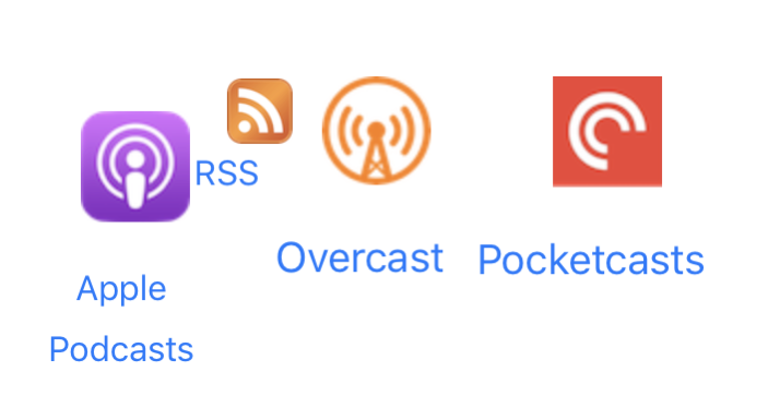 Remember I’ve been working with the code all inside CodeRunner on my desktop. Time to put it on Podfeet.com. I opened up a page inside WordPress, and plopped in the code. I hit preview with breathless excitement…and it looked HORRIBLE. And I mean “ugly as sin” would have been a vast improvement. At all sizes, all of the content was jammed over into a small column on the left, there was a huge gap between the big logo and the text, and the little podcatcher icons were all jumbled up like you tossed them on a table like dice. They were even different sizes!
I tapped Bart on Telegram and he explained that what I was trying to do would never work. I was devastated! But in his next breath he explained a way to make it work. He said that inside the WordPress, I should put a single line that’s called an iframe. This is a container that will point to the raw HTML file that I would then upload to my server. He said that when he had time he’d read the documentation on how to make it actually work properly but I toodled off and read it myself and got it to work! When I was later asking Bart for praise for my amazing programming skills, he said the thing he was most pleased with was that I had “read the fine manual”, or RTFMed, myself. That’s where he’s trying to get us to – because then we can stand on your own two feet.
I was 99% successful at this point. Everything flowed the way I wanted it, except for one thing. When in the narrowest of sizes on a phone, the text under one of the icons would move from centered under its logo to left justified. I should explain the four icons I had chosen. The far left is Apple Podcasts, then the RSS icon, then Overcast and finally Pocketcasts. I chose those three podcatchers because they’re popular and because they support links in a browser.
The misaligned text at small sizes was the word/acronym RSS. Dorothy and I love to noodle programming stuff while we’re exercising on the elliptical, so I described the problem to her and demonstrated how it looked on my phone. She suggested maybe the RSS was getting shoved over to the left because the podcatcher names on the right were too wide.
That was an idea worth pursuing. I did some more RTFMing and I figured out a solution. With Bootstrap you can tell the code to display or display-none depending on size. So I created acronyms for the three podcatchers, e.g. AP, OC, and PC and I told Bootstrap to display the acronyms when the screen was extra small and hide the full names, but from small on up, hide the acronyms and show the full title instead. And guess what? It actually worked!!!
Bottom Line
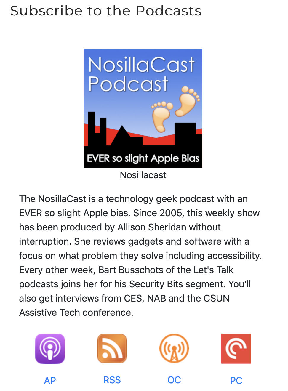 So I am pleased to announce that I have published the most amazing web page of all time, hand coded with my own little hands, with the guidance of Bart, the noodling with Dorothy, the encouragement of the NosillaCastaways in the Slack, and of course the fine manual!
I keep it as my home page now on my phone and my Mac and I constantly rotate my phone from landscape to portrait and shrink and embiggen my browser width just to watch how beautifully the page performs at all of the breakpoints!
You should go do this too. Go to podfeet.com and click on Subscribe to the Podcasts at the top and be amazed. (Or click on this link: www.podfeet.com/… and enjoy the awesomeness. By the way, when I was all finished I sent the link to Alex at SiteOrigin and made him admire it as well!
I have to go rub some Bengay on my shoulder now from patting myself on the back so much about this.
