This week Steve and I attended the CSUN Assistive Tech Conference, and I wanted to tell you a little bit about it. You’ll be hearing the very few interviews we did on the exhibit hall floor but we did more than the exhibit hall this year. I will abbreviate the name to just calling it CSUN, as most people do, even though the name CSUN stands for California State University at Northridge.
Normally we only go to the exhibit hall, but this year we were granted full passes to attend the conference as press. I wish we’d been able to spend the entire week there but we were only there for one day.
WebAIM and WAVE Presentation
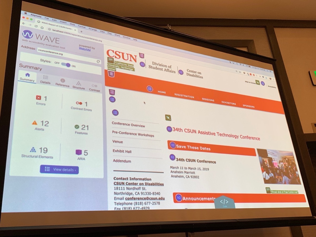
Right as we walked in I noticed on the schedule, there was a presentation all about the WAVE tool from WebAIM. You may remember me talking about WebAIM just last week. They’re the people who wrote the Web 1 Million report about what kind of accessibility problems websites commonly have and provide the WAVE tool to test your own site for accessibility. In case you missed it, the WAVE tool shows little flags on your web page to show you where you’re missing alt tags on images, where your contrast is too low, where you’re missing labels on forms and more.
I had a great time for the last two weeks cleaning up all of the mistakes I’d been making on podfeet.com. I did way more after I told you about it and it’s looking pretty great now. One of the errors it caught was that the search bar input form is missing a label so screen readers can’t tell the user what the input is for. This isn’t something I can control, but I wrote to my theme vendor, Site Origin and they responded immediately that they’d have it fixed in the next version of the theme. Good on them I say.

Anyway, I thought it would be fun to hear the presentation by Jared Smith about it. Most of his charts explained what I’ve already explained to you. He talked about the different panes, and what the explanations mean. He talked a lot about how they’ve worked really hard on the documentation that pops up when you hit the little question marks. He made the point that they tried to be succinct and yet give you enough information to help you understand. I would agree that they hit the mark on everything except explaining the AA vs AAA thing, so I’ll drop him a note to suggest a wee bit more info on it.
Before the presentation started, I went up to Jared to explain that we were there as press and would probably duck out to attend other sessions. I didn’t want him to think I was just rude! The cool thing was when I introduced myself, Jared said he’d seen my work on this. How cool is that? In case he’s reading or listening, hi Jared!
I have been using WebAIM’s manual tools for my own site, but Jared explained that they also have tools for businesses and enterprise. They’ve got something called WAVE Runner. This tool will analyze up to 10,000 web pages for only $500 and create detailed spreadsheet-style reports within 5 days. They also license their WAVE stand-alone API and there’s a third party company called Dinolytics who will do a lot of the heavy lifting for you. I don’t want to spend a lot of time on enterprise but if you work for a big company it might be something to suggest.
The coolest thing Jared showed us was that they’re working on a complete redesign of the interface for the WAVE tool. It is entirely functional right now as is, but to be perfectly frank, it does look a little Windows 95-ish.
He did a shout out to someone named Claudio in the audience who came to them suggesting a redesign. Claudio showed them some mockups and they were sold. Jared showed us a preview of what it will look like and it was beautiful, especially in comparison to what we have now. I think it will be much easier to get the hang of using the WAVE tool with the new interface.
It was kind of sad that during much of the demo he was using the website fcc.gov to demonstrate the tool, and you should have seen how riddled it was with errors!
Lunch
As is always the case for me at events like this, I learn a lot during social events. Steve and I had the delight of having lunch with some old and new friends and of course we had to talk about geeky tools and what we were learning at the show.
Jeff Bishop and I have been online friends forever. He was one of the people who helped me prepare for my Blindfolded presentation at Macworld a hundred years ago. If you haven’t seen that demo, it’s still up on our YouTube channel. I did my entire presentation using an iPhone and a Mac while wearing a blindfold. Without the help of people like Jeff I never could have learned how to use VoiceOver on two devices so quickly.
Jeff is now a Microsoft Program Manager on the Windows Accessibility team, and he also podcasts and blogs over at iaccessibility.net/…
Jeff is the kind of person Steve refers to simply as “good people.” Maybe I like him because he was so complimentary about the podcasts we create? For example at the table we were talking about Programming By Stealth and Jeff jumped in with great praise for the show, especially how Bart folds accessibility into it so naturally.
About a year ago I did a review of an app called Seeing AI from Microsoft.. This is an app that allows the visually impaired to do so many cool things. For example it can detect light, it can read short text, it can read documents out loud, read barcodes and even identify people. I bring it up now because Jeff told us that Seeing AI has been vastly improved and enhanced.
I’m probably going to do a walk through of all the features, but reading from the “what’s new in this version”, now you can explore photos by dragging your finger around on screen and it will tell you where things are. You can now use Seeing AI with an iPad. They’ve enhanced the person channel so you can teach it someone new directly from the main screen. I loved this app before and to see it being enhanced so much by Microsoft is really cool. You can download Seeing AI for free from the iOS App Store.
Last year at CSUN we met Mike Doise for the first time, and this year he joined us for lunch along with his lovely girlfriend Aleeha Dudley. By lovely I don’t just mean that she was funny and engaging, it’s also that she’s a full-time student getting her degree in computer information systems, and she’s a web developer, and she has a seeing eye dog. That’s my kind of people! I’m not exactly sure who’s in charge at iaccessibility.net but I know she and Mike are both heavily involved.
Mike and Aleeha have an interesting side business as well. They pay for a pretty heavy-duty virtual private server, and from there they host WordPress installations for people, specifically tailored for accessibility. They do all of the updates for the users, much like wordpress.com does, so you’re free to just get in and start blogging.
Mike is also an app developer and has created a Braille reference tool for iOS called PocketBraille. It’s like a cheat sheet for learning Braille, with separate tabs for each category of things you’d need to read or type. There’s a tab for alphabet, numbers, punctuation and contractions. It’s pretty advanced stuff, for a novice and especially a sighted novice, it won’t make a lot of sense but for someone with more experience it’s pretty darn cool.
Mike is also a Shortcuts fanatic and plans to write an app for it too. In the mean time he’s created a website called Beyond The Gallery – A website dedicated to all things related to Apple’s Shortcuts. It’s really cool, very visual interestingly enough with fun graphic icons for each shortcut. He’s got shortcuts in categories: Developer, Entertainment, General, Networking, Photography, Social Networking, Travel and Utilities. I’ve been looking for a good place to see shortcuts people actually use, so I plan on poking around in here quite a bit.
I played with his Shortcut called Website Font Size Changer, and it’s pretty cool. You go to a site where the font is made for teen-age eyes, launch the Shortcut and it asks you what font size you want. I like that I can see his JavaScript underneath the request for font size, makes me feel right at home! After you enter the font size, it asks for permission to modify that website’s pages, and boom, the font is increased. It doesn’t work on all websites, but it does on podfeet.com! Go check out Beyond the Gallery at beyondthegallery.app. I love that it’s “dot app”!
Finally during lunch Shelly Brisbin, author of the book iOS Access for All and host of The Parallel Podcast, told us something interesting she’d noticed on the exhibit hall floor. Probably the most common thing you see on the show floor is magnifiers. But what Shelly noticed was that there were companies now using iPads for this. She asked them why and the two or three she talked to said because people have iPads and want iPads. Kind of a cool little nugget to keep in the back of our minds.
I told you I learned a lot at lunch!
Dr. Michele Williams from Pearson
We went to one more session and it was really interesting. It was Dr. Michele Williams, a Senior UX researcher talking about her findings on behalf of the publishing company Pearson about the experiences of US undergraduate and graduate students with disabilities. I wasn’t sure what to expect but it turned out pretty interesting.
She interviewed 17 students to talk to them about their experience as children, from elementary school through college and into graduate school. She didn’t have a specific set of questions to start with, she started by them very general questions such as, “What was it like to go to school?” As she went through these interviews she was able to uncover some interesting perspectives.
Dr. Williams got a wide spread of people with different experiences. She had young college students to returning students. She had male and female interviews. She talked to people who had traumatic brain injuries that affected their memory, to someone in a wheelchair since age 14, to people with anxiety, to someone with Tourettes.
Normally a sample set of only 17 people wouldn’t be considered valid with which to make conclusions but I found her conclusions pretty compelling. I can’t reproduce the depth of what she discovered but she was able to advise Pearson and the schools for which they make the curriculum on some important topics. Like length of absences might need to be modified for someone undergoing cancer treatment, and just having an accessibility office might not be of help to someone who believes it can’t help.
Her slides will be available at http://accessibility.pearson.com but as of right now they’re not yet up there.
She is continuing her research through online studies, and she encourages people to sign up via a survey at Survey Monkey. She didn’t say how much you’d get but these are paid studies, via Amazon gift cards.
Bottom Line
Steve and I always enjoy CSUN’s Assistive Technology Conference, and this year was no different. Being able to go to the sessions was very interesting and I hope our coverage will encourage you to learn more about accessibility and the cool tools being developed.

