We spend an ever increasing amount of time in our web browsers. This trend isn’t going down as even more things become accessible via the web. This means we spend a large amount of time looking and sometimes interacting with the default new tab screen. While this isn’t all bad, the information on these pages can sometimes distract from our intended task. How can we curb this and bring a little mental break into our daily routine? Enter the Tabliss addon from tabliss.io.
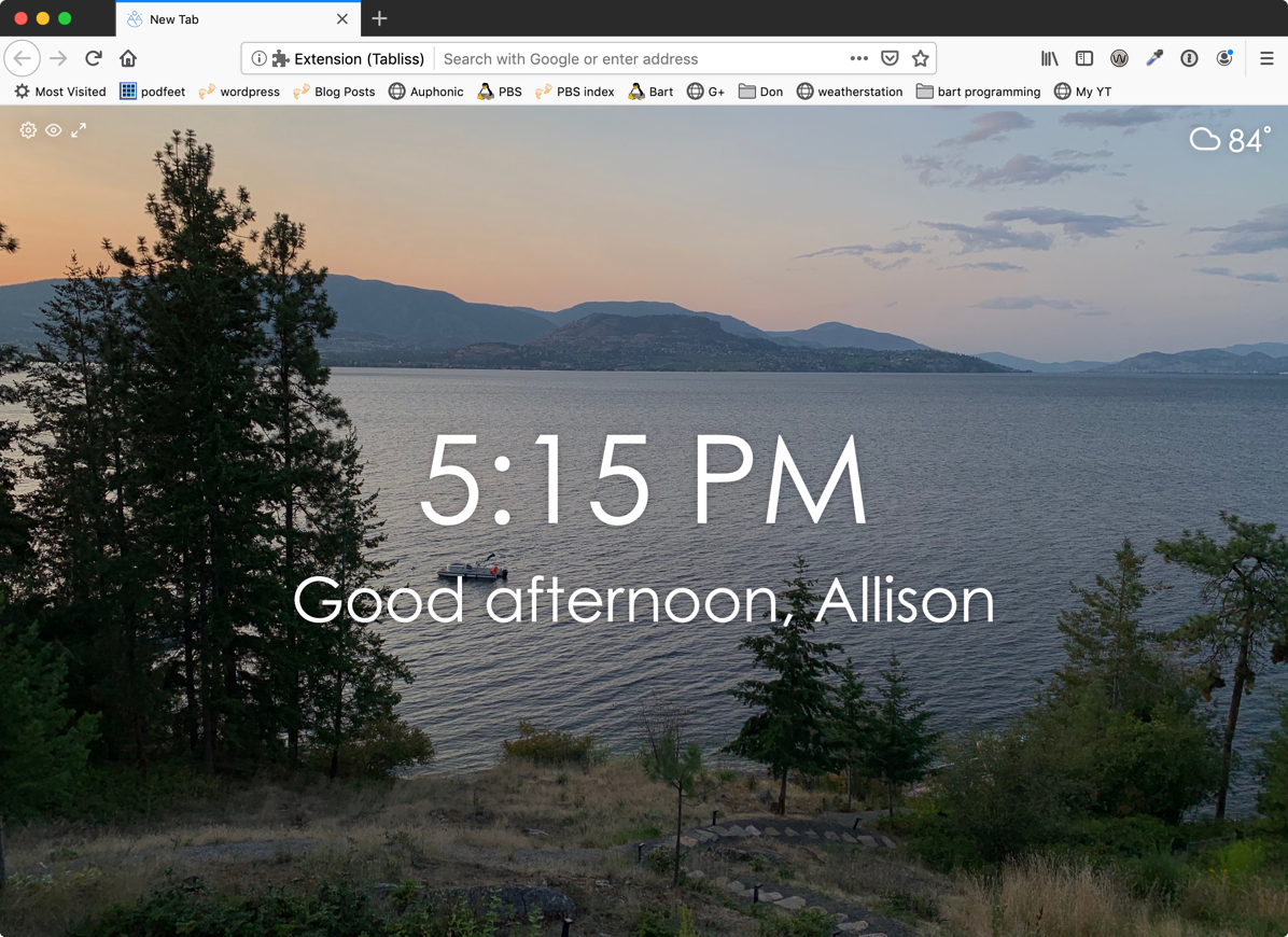
This addon changes the default “new tab” page to one of our choice/design. By default Tabliss will display a full window image from unsplash as the background. On a “layer” above the photo is a clock – set center, middle, a greeting, below the clock, in one of the lower corners is a group of links crediting the photographer, and in the top left are the diminutive menu buttons. The menu buttons are: “Customize Tabliss” (with a gear icon), “Toggle Widgets” (an icon of an eye), and “Full Screen” (an icon of two outward pointing arrows indicating expansion). While this layout is good, it lacks that personal touch.
When we open “Customize Tabliss”, by clicking the gear icon, a sidebar slides into view with the options. At the top, are the background options. From the drop down at the top we can change the source for our background. It can be a solid color, a gradient, a photo from Unsplash, or an image from Giphy – I do not recommend the giphy option, as that could be distracting, but it is a fun choice when you’re in the mood. When using the default Unsplash there are some nice options below the main dropdown. The first is “Show a new photo” and the drop down lets us change the frequency with with the photographs rotate. We can also set the group of photos that are used in rotation by setting a custom collection or custom search (on unsplash). The blur and darken sliders are nice for tweaking how much the image is visible behind the text. As you add more textual elements these settings may be more useful.
 Now we have the “Widgets” these are where you can add lots of functionality. You can add a todo list, an RSS reader, inspirational quotes, and several other prebuilt widgets. When you select them from the drop down they are automatically added. You’ll see them in a list below the drop down. The “plus” button is a little bit of a misnomer, since what I does is open the options for the widget, and once open the “minus” or dash will close the widget. These you can customize as you see fit. And if you’re feeling adventurous and want to stretch your CSS muscles you can add the “custom CSS widget” and have some fun there.
For me I use the base setup with a todo list and weather widget. Ideally I put in the top three things I want to get done on the todo list in the morning. Then through out the day I always bring them up in view. Then the weather widget because my office has no windows, and I have no idea what it’s like unless I actually walk outside.
The main thing is to find a nice arrangement for you. There aren’t too many widgets so it’s hard to get too carried away. So you will generally end up with a useful page that will give you a place to breath, and help you stay focused. Enjoy!


When I close Tabliss and reopen it, all my settings are gone. I have to import tabliss.json every time. What is the fix?