Do You Need another menubar app? Absolutely. You always need another menubar app. Now, do you need another calendar menubar app? Well, maybe.
I’ve been using the calendar menubar app functionality within iStat Menus from bjango.com/… for years, but I may just supplant it with a new favorite called ItsyCal from www.mowglii.com/…. Let’s walk through how iStat Menus provides this functionality and then I’ll tell you about the adorable and useful ItsyCal
iStat Menus

I like the calendar implementation in iStat Menus because it’s configurable to as much (or as little) information in the menubar as you like. I choose to have it say the day and time along with the date. The date is shown as a tiny calendar icon with a red banner across the top and just the number of the date. So right now as I’m writing this up, it says “Sat 06:41 6” where the 6 is in the red and white box. It’s compact and gets me all the information I need in a quick glance.
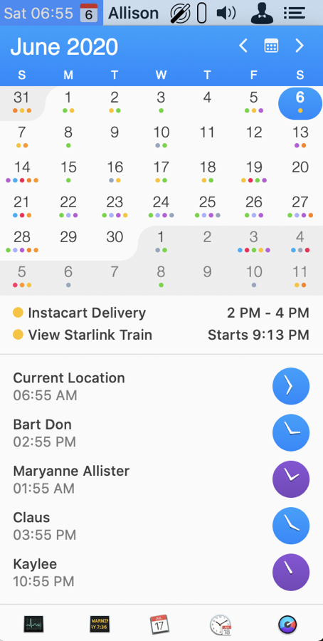
If you tap on the iStat Menus calendar menubar app, it drops down to show you a month at a glance, and any upcoming events from your calendar. Your events for the day can be tailored by choosing which of your calendars you want to display and whether you just want to see today or if you want to see up to the next 7 days worth of events.
The month view of the calendar also allows you to flip month to month, and from there you can click on any day and see events from that day as well.
At the bottom of the dropdown is a handy calendar icon that lets you pop open the full calendar.
The calendar menubar app from iStat Menus can also display a set of usable-configurable world clocks. I have mine set to show Dublin for Bart, along with Wellington for Maryanne and Allister, Berlin for Claus and Kyoto for Kaylee. At a glance, I can see whether pinging any of them with a question will be unnoticed because it’s the middle of the night for them. Doesn’t stop me from bothering them; just allows me to target when I bother them.
Of course iStat Menus is spectacular for way more cool features than just a menubar calendar app. I just realized I’ve never done a full tutorial on all of the features of iStat Menus for the NosillaCast. I must add that to my to do list! I did do an update tutorial on ScreenCastsOnline for iStat Menus 6 if you want to go check that out.
I’m a huge fan of iStat Menus and wouldn’t give it up for anything, but perhaps there’s a better calendar menubar app.
ItsyCal
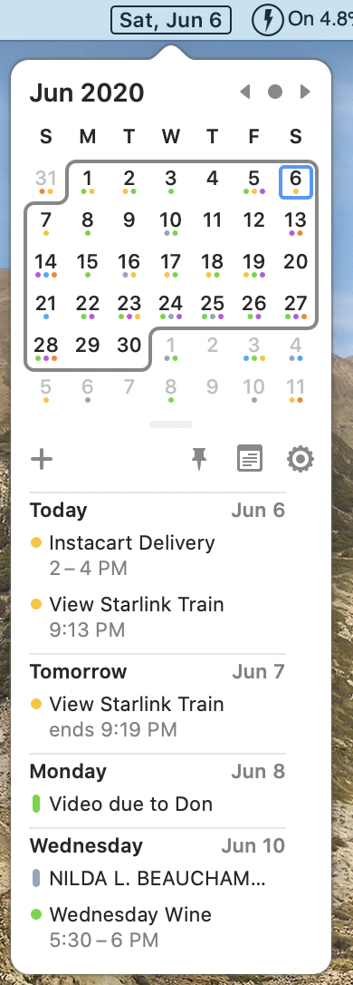
Let’s shift gears now and talk about ItsyCal from www.mowglii.com/…. I love both the name of the app and the website!
When Pat Dengler first told me about ItsyCal, my immediate reaction was that there was no way it could be better than iStat Menus, but I gave it a try because it was donation-ware, and because Pat usually only sends me very cool stuff. At the very least, I figured if I tested it and liked it, maybe those of you who don’t us iStat Menus would find it useful.
I’ll put a spoiler out right here – it is very rare for me to talk about a product and then tell you I don’t like it. It does happen but it’s rare. In other words, I really like ItsyCal!
I am such a menubar app addict (thanks to the late, great Tim Verpoorten), that I have a lot of trouble figuring out which one is which at a glance. I have to use Bartender to hide the ones I don’t use often just to narrow it down to a manageable number! ItsyCal’s unique menubar icon is a huge plus for me.
The developer gives you two options to make it stand out. By default, the icon is a black rounded rectangle with white text. I have zero other menubar app icons that look like this. It’s impossible to miss. In the preferences under Appearance, you can choose to have a lovely rounded rectangle outline around the date. It’s clean and simple and so easy to find out what day it is at a glance. This is especially important for us right now because many of us have been struggling lately to keep track of the day. I heard it called Blursday on the Daily Tech News Show recently.
The dropdown for ItsyCal shows you a similar view to the one I described in iStat Menus. It’s a bit cleaner and more modern-looking to me, but of course, design aesthetic is completely a matter of taste. You know how when you’re viewing a month of a calendar, there are always days spilling into it from the previous and next month? You have to use mental horsepower to avoid thinking about the 31 from May and the 1-4 from July when looking at June. ItsyCal lessens that load by wrapping the days of just the current month with a rounded rectangle. I’ve never seen that done before and my brain needs all the assistance it can get.
I didn’t mention it when I talked about iStat Menus, but both calendar dropdowns show little colored dots under each day to designate if there are events from any of your calendars. With ItsyCal you can use the Appearance Preference to toggle off the dots or make them monochromatic. Not sure why you’d want to do that but evidently someone asked for it. Like iStat Menus, you can flip from month to month and choose different dates to view.
Also in ItsyCal’s preferences, you can choose to show the event location and the calendar week numbers. Financial people really like those week numbers for some reason. In that same Appearance menu, you can make the entire dropdown larger text. As a certified old person, I can vouch for how wonderful that option is!
As I mentioned iStat Menus shows you events on the currently-selected day and allows you to expand that for up to 7 days worth of information. ItsyCal has an option in the General preferences to show anything from 1-7 days, 14 days, or even 31 days of events. Even with my incredibly unbusy schedule, 31 is nuts, but a week’s worth is kind of handy.
ItsyCal Options
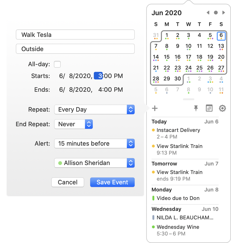
Above the list of of events for the upcoming days is a separator bar with a few icons. The most glorious one is the Plus button. This allows you to make calendar events without opening up the full Apple Calendar.
From that little pop out window you can enter all of the usual things including location, date and time, how to repeat and for how long, choose the calendar to which you want to add the event, and even add an alert. About the only things you can’t do are add multiple alerts (I often set 2 or 3 for important events), add notes, and invite other people to the calendar event. For 90% of our needs though this is a really quick and easy way to create a calendar event.
In that same section, there’s a calendar icon which when clicked simply opens your calendar. Next to it is a pin, which helpfully pins the ItsyCal dropdown calendar on screen so it doesn’t disappear while you maybe flip to another app to check something.
The gear icon in that same row opens ItsyCal preferences, or you can simply use command-comma while you’ve got ItsyCal revealed. By the way, did you know command-comma is the keystroke for preferences in pretty much EVERY macOS app? I noticed Don McAllister do it in a ScreenCastsOnline video once and then in another one and in another one and finally it got through to my thick skull that it’s everywhere.
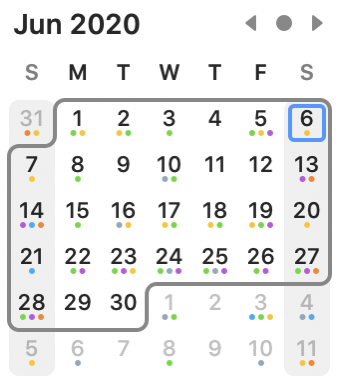
Back in the Appearance Preferences, you can choose to highlight a specific day. For example, if you have weekends off, you may want to have a faint grey bar over the columns for Saturday and Sunday. I think it’s a kind of nice effect, especially for those of us now referring regularly to Blursday. ItsyCal also supports Dark Mode if you’re of that persuasion.
In the General Preferences, you can choose any day to be the start of the week, have ItsyCal launch at login, and choose which calendars to show.
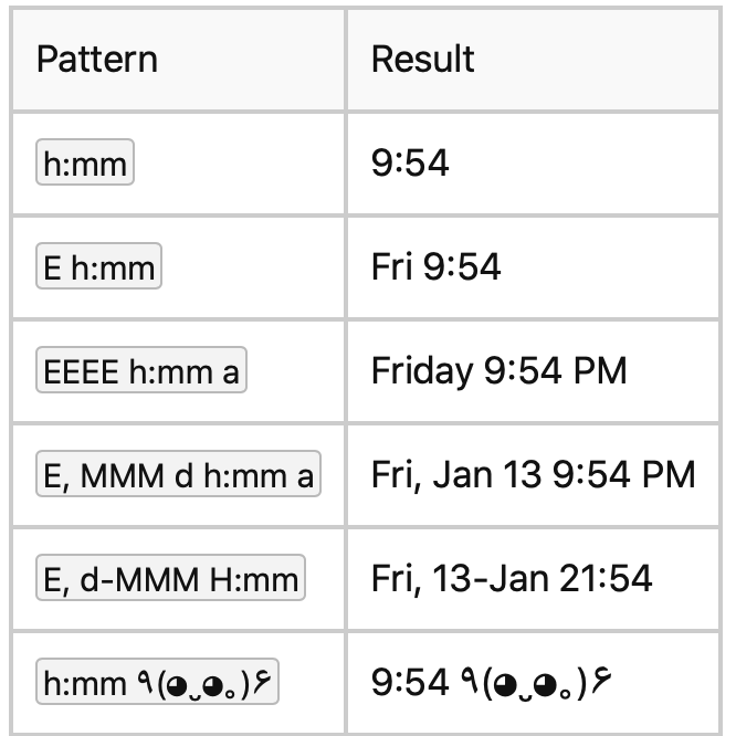
I’m simply addicted to clocks so I have to have the time available to me on my screen. Sure I have a watch on my arm and a clock right behind me when I’m at my desk but I need more! ItsyCal has a very odd implementation of time for its menubar app.
In the Appearance tab of Preferences, there’s a text box where you can enter the “Datetime pattern”. There’s a question mark next to it that links to a long web page explaining all of the options. If you enter something like “h:mm” into the datetime pattern box, the menubar will show the time as 9:54. If you enter “h:mm a” it will add AM/PM to the time. If you change the lower case “h” to capital “H” you’ll get 24-hour time.
I called this an odd implementation of adding time to ItsyCal, but if you’ve been taking Programming By Stealth, it doesn’t look odd at all. You see, the students of Bart’s programming class have been working on building web apps to show the time. This nomenclature used by ItsyCal is exactly what we’ve been using in doing our homework.
But here’s the thing. When you’re done configuring the time you’ll notice that it’s not inside the little black or outlined date created by ItsyCal, it’s just plain old text sitting to the right of it. I turned on the macOS system clock from Time and Date Preferences and it looked exactly the same. I really wish the time was inside the date box so it was easier to spot in my crowded menubar. The only benefit of using the ItsyCal time is that it always stays to the right of the date as you move the menubar app while holding down the ? key and drag your apps around to rearrange them. You did know that ? lets you reorder them, right?
Bottom Line
The bottom line is that I think ItsyCal is a delightful little menubar app that has some very slick features. I’ve disabled the calendar from iStat Menus for the time being to see if I like it better. I will miss not having the time in New Zealand at the tip of my fingers to know whether it’s a good time to interrupt Allister at work with my frivolous questions, but perhaps this will be a benefit to him.
You can find ItsyCal at www.mowglii.com/… and if you like it, be sure to donate to the developer. I’m going to donate $10 to Sanjay for such a fun little app that solves the right problem in a very pretty way.
