In Programming By Stealth with Bart Busschots, our latest assignment has been to create a world clock. Throughout the last few months Bart has been adding challenges to make it more and more useful. For once I got ahead of the class by adding new functionality to mine before Bart ever assigned that challenge to us.
Let me step back a bit and elaborate. These world clocks are web apps, written in JavaScript, HTML, and CSS. At one point the assignment was to create a set of clocks where the user could see the time in two different cities/timezones and where they actually got to choose the zones to view.
I talk to a lot of people in a lot of different timezones so this was a super fun assignment for me. It was useful because I could, say change one zone to New Zealand and see at a glance whether Allister was awake yet. He’s on the other side of the international dateline so I like to find out what’s happening in the world tomorrow.
But I also often need to meet with people in other parts of the world and figuring out what time we will meet is often quite challenging. You’ve heard me before talking about this problem before. It’s not that I need to know what time it is right now in another timezone, it’s that I need to figure out what time it will be in another timezone if I shift forward in time.
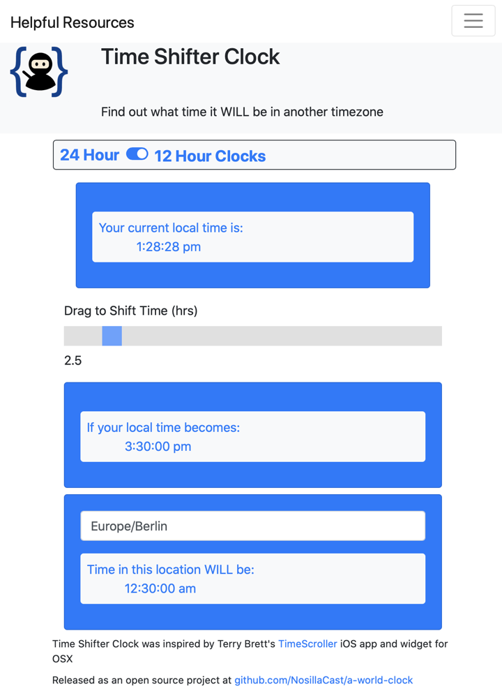
There used to be an amazing Dashboard widget called TimeScroller that solved the problem for me, which I first started talking about in August 2009. Sadly Dashboard widgets were removed with a recent macOS update. But this gave me the idea to add this concept to my world clock. I named it Time Shifter Clock.
I actually put it up at podfeet.com so you could see it. It works great! We’ve been working on even more enhanced capabilities in our clocks but I’m not ready to show those to you yet.
![]() I have, however, continued to annoy my friends and family by showing them every iteration along the way. One of those people I’ve been showing off my clock to is Pat Dengler. This week Pat told me about a really swell menubar app called Clocker that pretty much does exactly what my Time Shifter clock does! Now you would think this would be discouraging to me, but it absolutely is not. It’s AWESOME.
I have, however, continued to annoy my friends and family by showing them every iteration along the way. One of those people I’ve been showing off my clock to is Pat Dengler. This week Pat told me about a really swell menubar app called Clocker that pretty much does exactly what my Time Shifter clock does! Now you would think this would be discouraging to me, but it absolutely is not. It’s AWESOME.
It’s awesome for a couple of reasons. First of all, a web app like my Time Shifter clock is pretty swell, but having this capability in a menubar app is way more useful. Secondly, it’s not discouraging because I don’t know how to write Mac apps so it doesn’t step on my toes. Finally, Clocker is a fantastic app. Let’s take a deep look at Clocker and see if it’s for you.
Adding Cities and Changing Settings
Even though Clocker is a menubar app, it can also be pinned on screen as a floating panel. When you’re figuring out a meeting time across timezones, and your short-term memory is as bad as mine, it’s not very practical to have to keep clicking a menubar icon for each time you need to remember.
On the other hand, most of the time you probably DO want it to disappear. If you’re a dock person, there’s a setting in the Appearance tab of Settings to have it be both dock and menubar app. You can record a shortcut to pop open Clocker if going all the way to the menubar is too hard. If you had it pinned and then closed it, Clocker comes back with the keystroke as a floating panel, but if it was stuck to the menubar it comes back that way. Everyone’s happy.
Speaking of Settings, this is where you add cities you want to have displayed in Clocker. There’s a little plus button in the bottom left that brings up a list of places to add and a search window. You can search for a city, a country, or even a street name (but I don’t see how that last one is very practical.
Clocker also has a list you can scroll through that’s actually not too long. In there I found a funny thing – they list “Anywhere on Earth”. I added it to my list because, well, why wouldn’t you? I’m not sure where this joke started but pretty much all of the online timezone calculators have Anywhere on Earth too. Evidently it’s 12 hours behind UTC if you’re wondering.
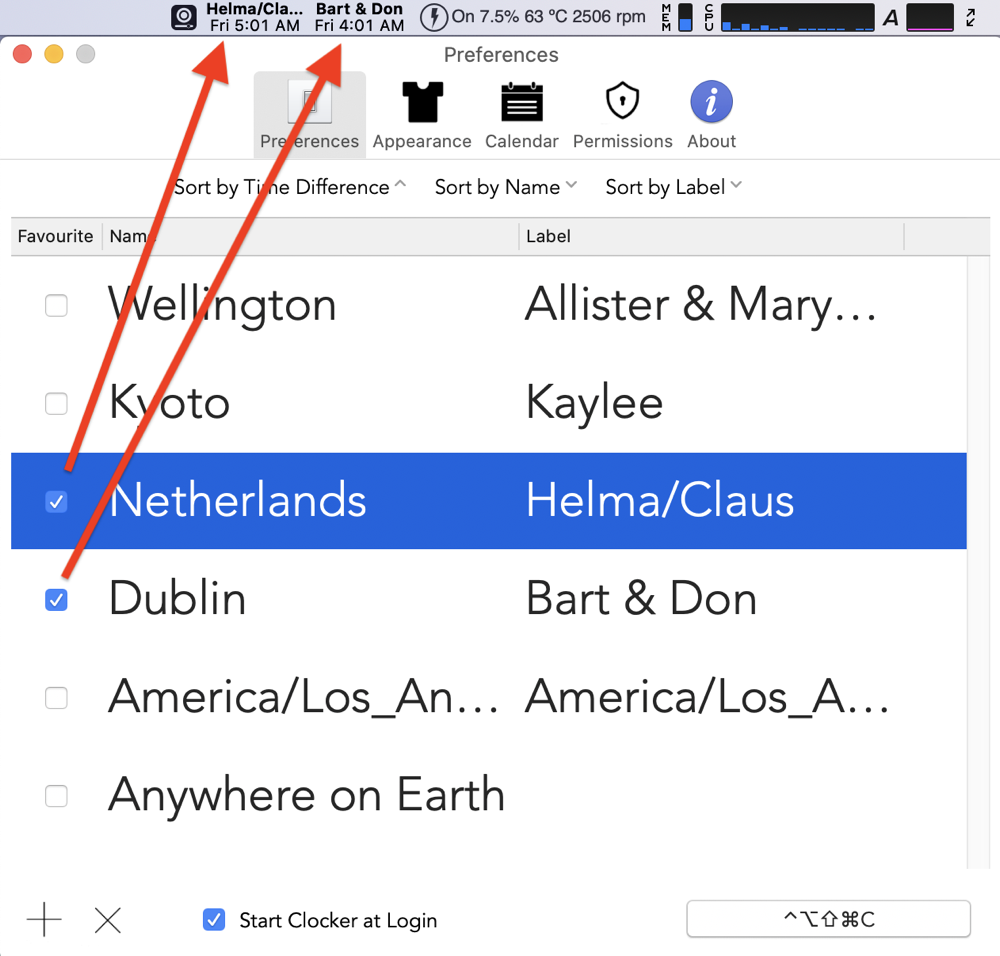
I populated my list with Dublin for Bart, the Netherlands for Helma, Wellington for Allister and Maryanne, Germany for Claus, and Kyoto for Kaylee. Still in Settings, it shows two columns for the zones I’d chosen, one for Name and one for Label. That got me to wondering whether you could change the label. Sure enough, clicking on the label allowed me to change it so it had names of my friends instead of the cities. That allowed me to collapse Helma and Claus together because they’re both 9 hours ahead of me, and add Don McAllister to Bart since England is in the same timezone as Ireland.
I want to make a comment on styling with Clocker. The font is HUGE when you’re creating your list of cities so it’s actually kind of hard to work with. The window for Preferences isn’t resizable horizontally or vertically. As I added Allister & Maryanne to the Wellington label, I could only see Mary… And I had 7 zones in my list so Kaylee in Japan fell off the bottom and I had to scroll to see her. Not quite sure why the font size is so big.
Still in Settings, you can change the viewing order to sort by time difference from you, by name, or by the label you’ve given to the time. You can even drag and drop the timezones to put them in an order of your own choosing.
There’s also a checkbox for favorites. If you designate a timezone as a favorite, the menubar icon will actually change to show the labels and times in the menubar. It’s good to keep the names short or they’ll be truncated. Being able to glance at my menubar and see Bart and the time at his house is terrific. I should mention that this actually replaces the normal Clocker menubar icon so I can click on Bart’s name and I see all of the times in my list.
Interface
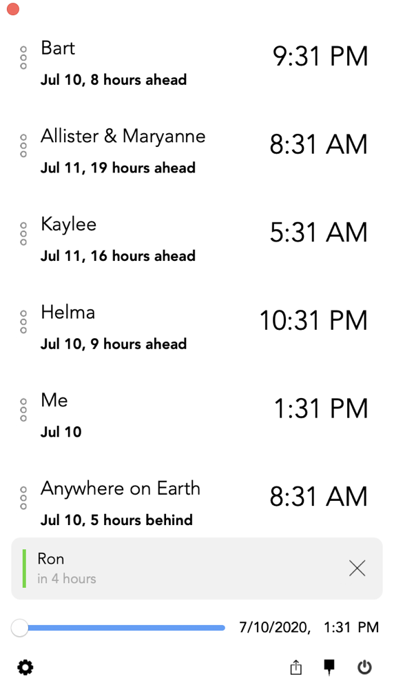
I haven’t actually described what you see when you open Clocker either as a dropdown from the menubar or as a floating panel because there are so many options to how you want to see it. It’s a very clean list of the labels for the time zones/cities/countries you’ve selected along with their current time.
At the bottom of the screen is what the developer calls the Future Slider. Drag the slider to the right and all of the times shift along with it. To the right of the Future Slider is your own time so you can slide to a time you’d find convenient to meet with someone and then look at the list to see if you would be asking Maryanne in New Zealand to get up at 4:30 am if you chose that time. It’s really slick and works quite well.
Under each Label, you also get some information about how that time relates to you. For example, it can say the date and how many hours ahead or behind they are from you. For example, I wrote this up on July 10th, and under Allister & Maryanne it says July 11, 19 hours ahead. I have so much trouble with New Zealand that this will really help. It’s not just that they’re on the other side of the International Dateline from me, they’re also in the Southern Hemisphere so they go in and out of Daylight Saving Time opposite from me, and of course the US is shifted by a few weeks from the rest of the world on DST, so it’s a complete mess trying to figure it out. Now I have it at a glance with no math required.
Appearance
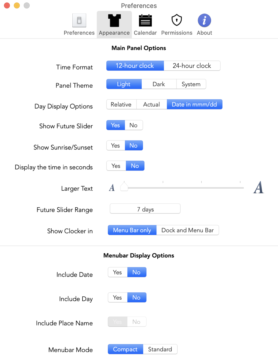
The Appearance tab of settings is where all the options come in. You can have your time format as 12 or 24-hour clocks and choose whether to show seconds. Both of those were challenges Bart gave us for our World clocks in Programming By Stealth which I mastered. I got rid of the seconds toggle on my clock after I proved I could do it because I thought it was distracting to see seconds blinking away after shifting the time. I wanted mine to stay still!
That brings up an improvement suggestion for the developer of Clocker. Noting that it shows seconds, I realized that after you scroll the time, it keeps advancing in all of the timezones. I slid the time to 10am at my house and the scroll bar continues to say 10am, but after 5 minutes of the window being open, even my local time says 10:05am.
It can be very confusing if you leave Clocker open for a long time after sliding the time and then glance at it expecting to see the current times. I left it saying 10am local time on the scroller, and then had dinner, watched some TV, and came back to writing and it said it was 7:31pm at Bart’s house when it was 7:58pm at my house. I was really confused at first. Not a huge deal if you record the times immediately, but I think it makes more sense to freeze the clocks once you’ve engaged the slider.
There’s a lot more to like in the Appearance tab. There are three options on how to see the day for each of the timezones. You can use Relative, which will write today, tomorrow, or yesterday under each time. You can choose Actual which puts the day of the week, such as Friday or Thursday. Or you can have it display the date in mmm/dd. Again, something for everyone in Clocker.
Maybe you don’t need the Future Time Slider. That’s cool, you can turn it off in Appearance. You can have Clocker display sunrise and sunset if you like. This could be useful if you want a quick visual on how far you can push the other person into an annoying time of day. It also tells you what time sunset and sunrise are, based on which one is closer to the time you’ve chosen. It’s a little too much information for me and a little too hard to interpret the icons, so I’m glad I can toggle it off.
You can change the size of the font display of Clocker too. It’s a nice accessibility feature and really helps to see things at a quick glance. If you pump the font size all the way up and have more than say 5 times in your list, you’ll have to scroll to see all of them though, because the Clocker window isn’t resizable.
By default, the Future Slider goes forward just 24 hours but since it actually tells you the day and date and time, the developer lets you extend the Future Slider out to 7 days. I hadn’t thought about going out days on my Time Shifter! Bart is going to love this tool for scheduling Let’s Talk Apple and Let’s Talk Photography guests.
There are some menubar specific options as well. Remember how you can have one or more time zones set as favorites and see them in the menubar? In Appearance, you can toggle on or off the day and date as well.
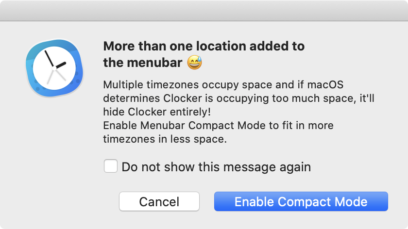
Remember how I said you should keep your labels short so they fit in the menubar if they’re favorites? In Appearance, it shows that by default it’s shown in compact mode, but you can change it to standard mode. It suddenly gets quite a bit bigger and you can see the full text. However, if you put more than one favorite up with the standard size, you’ll get a warning from Clocker that’s pretty interesting:
I did not know that macOS watched out for menubar hogs! I’m sure glad it does because I’ve got soooo many of them they take up all usable space as it is.
There’s one toggle that is greyed out for me and I’m not sure why. It’s called Include Place Name. No idea what it is. I thought maybe it was because I relabeled all of the timezones but I put them back and it was still greyed out.
Calendar
I bet you thought we were done. Nope, Clocker has one more trick up its proverbial sleeve. If you give Clocker the appropriate permissions, it can display upcoming calendar events and notifications of Reminders. There’s a toggle on whether to list your upcoming events at the bottom of your Clocker Window and whether to show all-day meetings. you can even choose which calendars to show in your upcoming events.
There’s also one to show your next meeting title in the menubar 30 minutes before it starts. You can even set how many characters to show in the menubar. I put a fake meeting into my calendar to test these features and while it showed up on the floating window I never saw a notice in the menubar. Not quite sure what went wrong there.
If you grant Clocker access to your Reminders, it says you can set reminders in the timezones of the location of your choice and that your reminders are stored in the default Reminders app. This made me think you could add reminders using Clocker. But I couldn’t figure out any way to do that. There are 3 circular dots next to each timezone label and they seem like they’d be buttons to do something but I tried every way to click them I could think of and nothing happened. Definitely not a big deal but I’m still curious how to do what the developer means.
Speaking of giving permissions to Clocker, the developer made it super obvious that you can revoke these permissions in System Preferences at any time
Accessibility
When I saw the huge font size options in Settings, it occurred to me that there was a good chance Clocker is accessible with VoiceOver, and I was delighted to find that to be true. I went through pretty much every menu and control using VoiceOver, and everything worked. The only improvement I could see was that the Future Slider reads out the percentage you’ve moved it rather than by how much time. If you’ve set it to allow time-shifting up to 7 days, then that’s a lot of math in your head to figure out how far forward in time 12% would be. To find an app that is 100% accessible always makes me happy.
Bottom Line
I probably should have told you upfront, but Clocker is free in the Mac App Store and I am certain that it has gained a permanent home in my menubar. The developer has a link to where you can help with the localization efforts going on to make sure that Clocker is available in as many languages as possible.
