Back in 2015, Terry Austin designed the fabulous logo you still see today for Chit Chat Across the Pond podfeet.com/blog/2015/10/chitchat-logo/. He created it using a little app called Logoist, and the beauty and simplicity of his design inspired me to buy it myself. I’ve done some work with it over the years, but when they released Logoist 4 this year I was definitely hooked.
To back up a little bit, I have 2 very powerful vector graphics tools at my disposal: the free Vectornator Pro from vectornator.io/… and the even more advanced $50 Affinity Designer from Serif affinity.serif.com/…. The art and designs other people create with these tools are simply astonishing. I’ve tried to use them for real projects, but they’re very daunting applications to me.
I think one of the problems is that traditional tools for creating art first open with a blank slate and a bunch of tools. You have to create from whole cloth as the saying goes. When it comes to logo design and other kinds of artwork for the podcast, I don’t necessarily know what I want, and I need inspiration.
This is where Logoist 4 from Synium shines syniumsoftware.com/logoist. Logoist comes with a vast array of templates to get you started, and then they guide you through options to modify what you see so that your design, in the end, is your very own.
When it came time to design the cover for the Taming the Terminal book, I decided to give Logoist a try and I’m really pleased with how it came out. Rather than describe all of the available tools and templates in Logoist, I thought it might have more interest if I described how I used Logoist to create the book cover. It won’t be an exhaustive review but rather a real-life use case.
Laying Out a Title (as a Logo in Logoist)
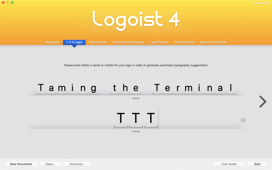
When you first launch Logoist, it starts with an option called “1-2-3 Logo!” It suggests you write a name or initials for your logo in order to generate automatic typography suggestions. I simply typed in Taming the Terminal for the name, and TTT for the initials and hit the arrow key to move to the next screen.
The next page says you can enter a tagline which would be cool, but I moved on. The next page showed me over 200 different logo options for Taming the Terminal. They’ve got sections for them – frames around the words, futuristic, stacked, classic, font effects – so many different styles to help inspire your own creativity.
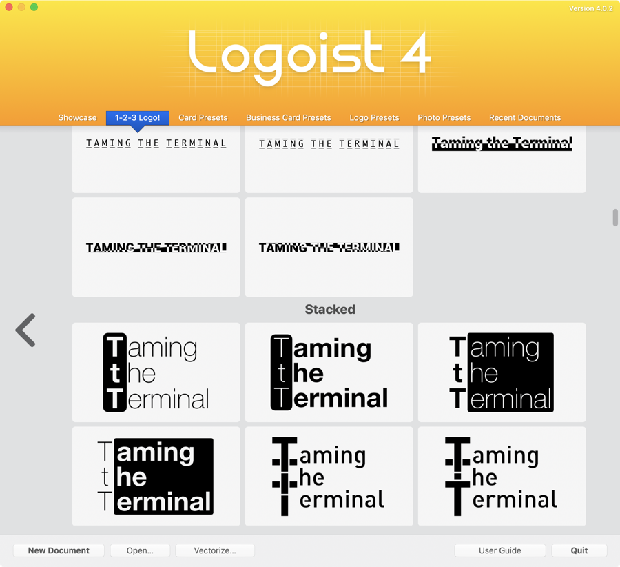
When I saw the stacked options, that’s when my eyes lit up. They showed the three words one above the other with the three Ts encased in a black box. It wasn’t that it was perfect, it was that it gave me the vision that I could modify it to be something awesome.
You might think all the rest of the heavy lifting would be up to me at this point, but Logoist took the original idea of the three stacked words with the T encased in a box, and then showed me a ton of variations on this theme.
For example, they showed me one with the Ts encased in a purple box with a reflection on the bottom. There were glowing letters, and some truly revolting color combinations, and ones that looked like neon. I didn’t count how many options they showed me but I’d estimate it as over a hundred variations on this original theme. And of course I chose the first one with a black box and white Ts. I’m an engineer for crying out loud, you can’t expect that much from me.

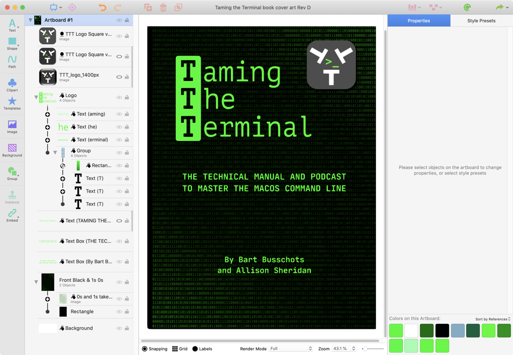
Now that the basic idea of the title of the book cover had been decided, Logoist let me into the main interface. In the center is the artboard where the graphics are displayed. To the left is where you manage the different objects in layers and groups. You can name the different objects and groups for easy identification, you can lock them so they don’t accidentally get modified and you can use the little eyeball next to each one to turn them on or off.
Down the far left is a list of object types you can add. Text and shapes are pretty much what you would expect but it goes bananas after that. The power of a full vector graphics application is revealed when you choose path. I’m not going to dive deep into it here because this is designing vector graphics by hand and I wanted to be spoon-fed for my project.
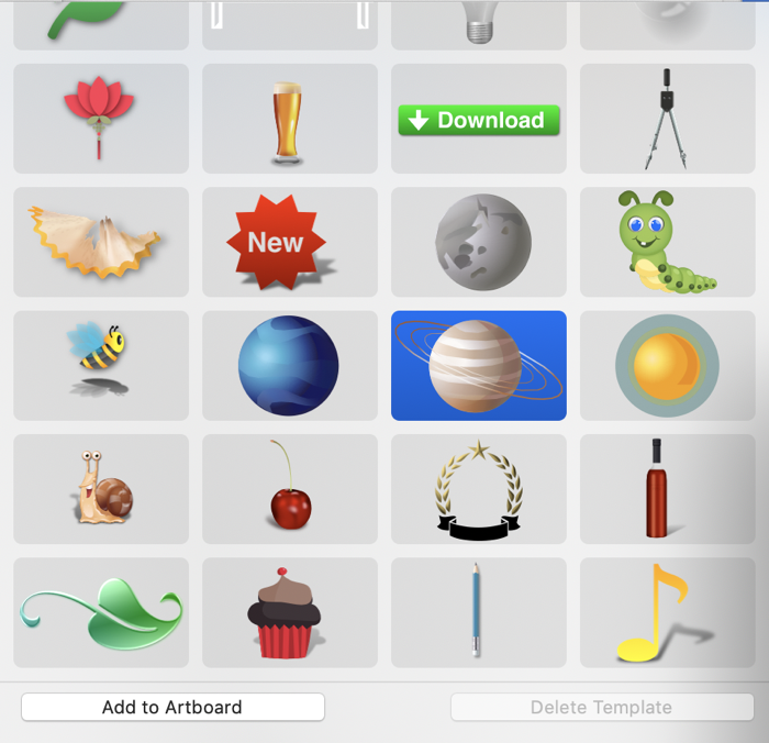
Below that you’ll find clip art and templates. Clip art is just black and white drawings, and while they are vectors so you can scale them as big or small as you want, they aren’t editable. But the templates are beautiful color graphics of things like a cow and tire and a baby and a caterpillar and a planet with rings. I think these are meant to be inspirational because there aren’t a lot of them but dropping one in will show you how they were made layer by layer. You can also create templates from your own artwork to be used in future products.
You can add images to the file and this is where I started to get to work on the cover. Steve created a great logo for Taming the Terminal, which he just updated to a more modern design just this week. I dragged his logo in and started to think about how I could incorporate it with the art of the book cover.

I knew the coolest place the book cover would be visible would be in Apple Books, so I looked up their size requirements. They want the cover to be 1400×1873 pixels. I changed the art board size to match in Logoist and now I had some room to play.
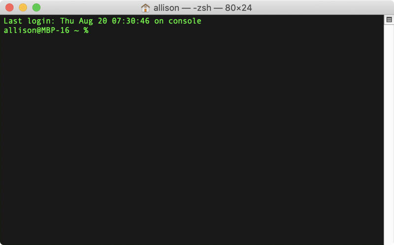
The book was about the terminal, and all of the cool kids use the theme called Homebrew for their terminals, which is a throwback to the original physical terminals which had bright green letters on a black background. I decided that the black box around the TTT in the title should be the same green. Luckily Steve had already figured out the green when he put the command line prompt in his logo for Taming the Terminal, so I used the little sample eye dropper in Logoist to grab the color for my title. Did you know that those eye droppers in most applications let you sample color outside of the application you’re using? Pretty handy.
Logoist had defaulted the text of my title to a sans serif font, but it needed to be a proper monospace font with serifs like the terminal. When I looked for fonts I was delighted to see huge representations of every member of the font family of every font. The list was pretty long but I could use search to find the one I wanted. I love the way Logoist displays fonts because you can really tell see how they’ll look.
When Logoist created this logo from the words Taming the Terminal, it created three objects for the Ts and then three standalone words from the leftover letters. I changed the “aming” from Taming to the font Jet Brains Mono and the change wrecked the alignment. But I was again delighted to find that I could simply click and drag the text as an object and I got little alignment lines to tell me when I had it placed properly. I could have stretched or rotated the words too but I’m not an animal.
I changed their color to the Homebrew green with a simple fill, but I could have added borders, shadows, glows, effects, and distorted the text.
Making the Background
If I was going to keep the look and feel of the Terminal, it seemed like having a black background behind these lime-green letters for the title of the book would be appropriate. Logoist made a gentle suggestion – would I prefer a nice black to green gradient instead? This is the power of Logoist. It knows artsy-fartsy stuff that I don’t think of, but more importantly, the suggestions are designed with the color scheme you’re already working in. I thought the gradient looked swell!
Luckily I’m smart enough to know that my eye isn’t as good as other people. I sent my cover design to my buddy Knightwise and he sent back a bunch of his own ideas. One was similar to what I had proposed but he had chosen a much cooler background. He found some stock art that had 1s and 0s repeated across it, with a fade to black in the middle. I really liked it but I did not have rights to the image, so I had to make my own.
Making Random Numbers
I’m rather proud of how I figured out how to make the background on my own using Logoist and a few other tools. The first thing I needed was the 1s and 0s in a random pattern. Try randomly typing 1s and 0s and eventually after a while you’ll get bored, so then copy and paste what you’ve typed to get enough to cover a page. You’ll notice immediately that there’s a pattern to what you’ve written and it looked super dumb.
I searched for and found a random number generator on the Internets (there’s a zillion out there). I know, they aren’t truly random numbers but a lot closer than I can create. Anyway, you tell these generators a range of values between which you want the generated list to be, and how many random numbers you want. For my project, I told it to give me 10,000 numbers between 1 and 0 inclusive. That gave me a text file with a line feed between each number. I removed the line feeds with a text editor, so I had now had this long string of 1s and 0s. I copied the entire contents to the clipboard.
Since I needed these 1s and 0s to look like the Terminal, I opened a Terminal session with the theme set to Homebrew, the classic green screen look I mentioned upfront. I simply pasted in the 1s and 0s without hitting enter. Then I stretched the Terminal screen to be about as tall as my giant monitor and about the same proportion as the book cover required.

Then I took a screenshot of my Terminal window and that gave me a PNG I could import into Logoist as my background. This was cool but the numbers were bright green and I needed a more subtle effect for my background. My desire was to have a diagonal gradient on the background that was very dark, almost black in the middle, but brightening up some on the two diagonal corners.
I dropped a diagonal gradient on the image going from black in the middle to bright green on the corners, but no matter what I did with adjusting the colors of the gradient, the angle, and even adding more points on the gradient, it just didn’t look right. The whole thing just looked washed out. That’s when I realized that the gradient was changing the black as well as the green because they were all part of the same flat PNG. 🤦🏼♀️
Out to the Googles to find out how to remove a color from an image and make it transparent. Of course there was a tutorial on how to do it with Affinity Photo. Ashley Cameron’s tutorial showed me that I could use the eyedropper to select the green from one of the characters, then use the Select menu to choose Select Sampled Color. Then I needed to change the tolerance to make sure all of the characters were selected. With that done, adding a mask to the layer caused the background black to disappear. A quick trip to the export menu and I had my transparent PNG of just the green 1s and 0s.
I bet there was an easier way to do this starting without a background at all, but hey, I got to justify my purchase of Affinity Photo and I learned something new so it’s all good.
I imported this new image into Logoist and resized it under the rest of my text. Now of course the black was gone from under my green 1s and 0s, so I simply created a black rectangle under the green text image layer. Finally, I could add my gradient to just the text image layer of green 1s and 0s and now the background stayed deep black as I adjusted the green text image layer using the gradient tool to gradually become very dark in the middle on a diagonal while staying bright on the two corners.
My Only Complaint
Overall I find Logoist incredibly easy to use and the tools are very intuitive. The one thing that throws me every single time is how to edit text. The text elements you have on your artboard are shown on the left side as layers just like any other object. When selected, my instinct is to try to edit the text right on the artboard. Instead, you’re supposed to go to a tiny box on the right column of settings and type inside that box.
It’s not hard, but if I haven’t used Logoist for a while I find myself looking all over for where to edit my text.
Finishing Up
I know this wasn’t a step by step tutorial on how to use Logoist, but I hope by going through an example of something I created with it helped to inspire you to realize that even without any artistic talent, you can create beautiful logos and other designs. If you need to design a business card, a greeting card, a logo, or even a cool way to send someone a photo, check out the templates for those too.
The name Logoist got me to try it but it’s so much more than an app to design logos. It’s an incredibly capable vector design program.
Logoist is $40 in the Mac App Store https://apps.apple.com/us/app/logoist-4/id1493005285?mt=12 so you can use it across your Macs and there’s no subscription fee. Over at www.syniumsoftware.com/… they’ve got a free demo download. It’s 100% functional but anything you design will have a watermark on it. I don’t think it gets better than that!

