
For many NosillaCastaways, a dark day in our tech lives was when our beloved app Clarify was end-of-lifed by its developers. I was heartbroken because I’d not only advertised the product on the show, I was a devout user of Clarify for all of the tutorials I made for podfeet.com and for my friends and family.
One part of the beauty of Clarify was that it let you rapidly take a series of screenshots as you walked through a tool or a website, annotate the screenshots with arrows and lines and even sequence numbers, and then add text to each step including HTML links and code blocks.
But the biggest advantage of using Clarify vs. just taking normal screenshots and annotating them in something like Preview was that it would export your step by step instructions into beautifully formatted PDFs, HTML pages, or even Word or PowerPoint. You never had to go through the absolute tedium of trying to move images around in a text editor and getting the pages to flow properly. Clarify did all of this for you.
After Clarify hit end of life, the developers did one last update to make it 64-bit so at least those of us who already owned Clarify could keep using it with macOS Catalina and beyond, but you couldn’t buy Clarify any longer.
I noticed that the demise of Clarify, even though my copy is still working, caused me to simply stop making tutorials. I just don’t do it anymore. I really do think it broke my heart a little bit that Clarify was abandoned.
In April of 2018 I wrote an article entitled Can StepShot Guides Replace Clarify?. I tried to write that as optimistically as I could, but StepShot Guides was very expensive at $120/year and it was very clumsy and I really did not like it. And StepShot Guides was eventually abandoned by the developers.
Now why am I bringing up these old wounds? This week I was contacted by Oleksii Sribnyi about his app called Folge at folge.me/…, which he’s marketing as a replacement for Clarify and StepShot Guides. Over the years I am often asked if I’ve found a replacement for Clarify and I surely miss it myself so I was very excited to give Folge a try.
I want to say upfront that Oleksii is possibly the most responsive and excited about his product developer I’ve ever encountered. He loves feedback and the more detailed the better. He said that he is always disappointed when users simply write, “I like your tool” or something equally vague. He has met his match with me – I’ve been sending questions and screenshots and even a little video recording to show him what I’m finding.
Folge Interface
Let’s start by talking about the Folge interface. The app is written in Electron, which means it’s basically a Chrome web app. The advantage of Electron is it allows for very rapid development and it allows Oleksii to have his app work both on Windows and Mac without having to develop separate apps. I recognized right away that he uses Bootstrap to do the design, which is a tool Bart taught us in Programming By Stealth. The result is a very fluid, beautiful and quick app. Electron apps are generally seen as heavier than native apps but I’m definitely not noticing this being slow at all.
What I do notice is that the “normal” Mac menu bar options basically don’t do anything at all. For example, there isn’t a Preferences menu in the menu bar, instead, you get to Settings using a hamburger menu like you would on a web app. It’s also odd that there are undo and redo menus in the menu bar and yet those functions don’t actually work inside Folge.
Once I understood this, I didn’t find it annoying at all because I’m so used to working in the web, but I did want to make sure you understood upfront how Folge might look different than “normal” apps.
Pricing
I usually like to wait till the end to tell you the price of a tool so if I really like it I can sell you on it first. But since I mentioned the high price of StepShot Guides, and we know the $39 price tag of Clarify wasn’t enough to make a sustainable business model, I figured I should let you know the pricing for Folge.
Folge is available for download at folge.me/… and they have both a free and a paid model. With the free version, you are limited to just PDF export, and your screenshots will have a small, type-written watermark in the bottom right corner saying they were taken by Folge. The normal price for a Personal license is 80 Euro, but he’s got it on a Black Friday sale for 59 Euro. For the US folks the regular price will be $93 but it’s on sale for $55 till the end of November. I always hate to talk about sale prices because we need to think about whether the tool is worth the full price. I don’t want people to be discouraged if they hear this after the end of November.
Taking Screenshots
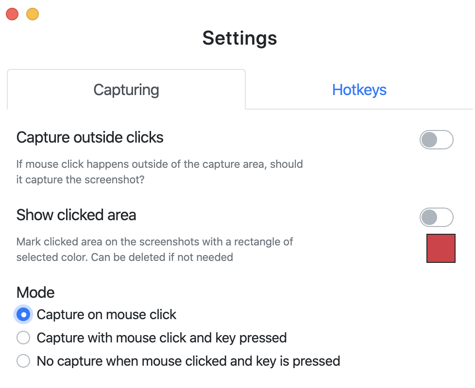
Folge has a unique method for taking screenshots. It is definitely a much different workflow than using Clarify but hopefully it will just be a case of needing to retrain my muscle memory.
When you first start using Folge you’ll be shown the Settings page. This is very important to how Folge captures screenshots. Once you’re in screenshot mode in Folge, by default screenshots are initiated by a simple click of the mouse and the screenshot will have a red, shadowed rectangle on it precisely where you clicked. I think the idea is that if you’re showing someone a step in a guide, you probably want them to click somewhere. However, I found this very hard to get used to and kept creating errant screenshots with these rectangles on them and had to do a lot of cleanup after the fact. The rectangles were never quite where I wanted them and weren’t formatted the way I prefer, and I find it much easier to add them myself.
Luckily, in the settings screen that you’re shown upon launch and which you can access at any time using the hamburger menu, you can change the mode to capture with mouse click AND a key pressed, and you can disable the Show clicked area toggle that puts the red rectangle in.
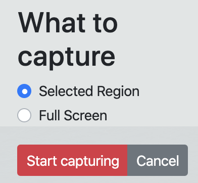
Now that the settings are the way I prefer, let’s talk about the workflow with Folge. When you create a new guide you get the option to start adding steps. A rectangular capture area will show up onscreen, allowing you to move the corner handles or to click and drag for a whole new rectangular selection area. In Clarify I was used to doing this click-drag of an area on every screenshot, but Folge assumes that you’ll want to capture many screenshots of that same selected area.
Once you’ve selected the area, you get a popup that says “Start Capturing”. You click the Start Capturing button and now you can actually start taking screenshots. If you’ve set the preferences the way I like them, a shift-click will capture the screen. Now you can click to go to a next screen for example and shift-click again to take another shot of the same area. Each time you take a screenshot, the popup will register it and update a counter for the number of captures. You also get a dandy little thumbnail of what you last captured and a magnifying glass which when clicked embiggens the thumbnail so you can ensure you captured what you wanted.
If you need to capture a different part of the screen, the Start Capturing popup will have a Pause button on it, which will allow you to move the capture rectangle around and resize it, and then you can Resume with the popup and keep going. This is the part of the workflow I’ll have to get used to because I’m used to being able to do a click, drag, then another click, drag, and on and on until I’ve gotten what I need. In Clarify using the R key would capture the previous area if you did need it to stay the same. I’m not saying this is a bad workflow at all, but I haven’t yet erased my muscle memory and replaced it with the concept of pause, resize, resume. Hopefully, my brain isn’t too old to retrain!
Annotations
After you’ve taken a few screenshots and hit Finish on the popup, Folge will open to the Guide view and that’s where the fun really begins. Down the left side, you’ll see thumbnails of each screenshot (or you can make that a list view). In the middle will be the step image, and on the right panel will be the Step properties. Properties are where you’ll give the step a title, and write some descriptive text.
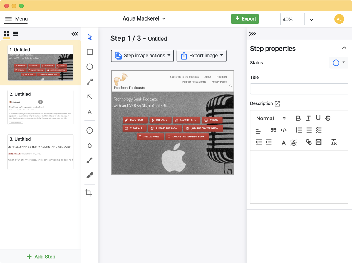
We’re going to start in the middle with annotations because that’s the most fun. Folge has the perfect array of annotations to apply and a very easy way to edit how those annotations look. You’ve got boxes and circles and lines and arrowed lines and text, which is really table stakes for an app like this. But you’ve also got Step Numbers, just like Clarify. If you click in several spots on the screenshot with Step Numbers selected, you’ll get sequential numbers.
Unfortunately, the developer hasn’t implemented one of the key tricks of Clarify on Step Numbers. Ideally, if you delete a Step Number, the remaining ones should renumber themselves. So if you’ve got steps 1, 2, and 3, and you delete 2, then you should have 1 and 2 left onscreen. If you do delete a step number, the new steps still keep going on up from the highest number you’ve added, so to fix this you have to delete all of your step numbers and start over to get them in order again.
I told you upfront that the developer, Oleksii Sribnyi, is super responsive, so I’m sure he’ll either enhance the tool to renumber or explain precisely why it can’t be done or give me a timeline for when he’ll figure it out.
After placing any annotation on-screen in Folge, you’ll get a formatting pane in the Step properties side panel to change it. You can change line thicknesses, drop shadows, text size, and more. I do have to say that the Step Numbers are a bit buggy, where increasing the font size messes up alignment, but I’ve already mentioned that to Oleksii and he’s now got it on his list to fix.
I know I get a little nuts when it comes to my love for annotation tools, but the arrows in Folge are delightful. You can change the line thickness and the arrowhead size independently which for some reason is actually a rare option! But you can also make arrows expanding which means the line thickness at the head is big but it comes to a thin point on the other end. Ok, that’s a small thing but it delighted me!
I do recommend getting the settings the way you like them on the first annotation you add because subsequent annotations will adopt the same formatting. Changing these settings changes the defaults for the next time you launch Folge, which is terrific.
Folge also includes a blur tool which is essential when taking screenshots to obfuscate private or sensitive information. There’s a crop tool in case you want to zoom in on a captured area. When a screenshot is cropped, you get a Restore Image button above the screenshot. That’s good because remember I said there is no undo in Folge.
Oleksii explained to me that he wrote some code very early on that he will have to spend a ton of time refactoring in order to enable undo in Folge. He’s got it on his list but it’s a bit down the road. The main place I wish I had undo is in the placment of annotations. If you resize one or move it inadvertently, you can’t back up a step. It’s not huge but it would be nice.
I do have to say that the handles for changing the size of annotations are very difficult to see, especially on darker backgrounds. They’re a very thin light blue and on Dark Mode screenshots they practically disappear. Another enhancement idea for Olekskii!
In the top bar you’ll see a size indicator and that’s the zoom level of the screenshot. Folge has nice keystrokes, like command-1 to fit to screen and command +/- to zoom in and out.
Step Properties
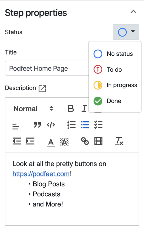
In Step Properties there are a couple of cool touches. You can do all the “normal” text editing in the description area, but you can also add links, add code snippets and have them appropriately formatted, add checklists, numbered and regular bullets, and highlighted text. But you can also embed a video! This utility is only useful if you have the paid-for version because obviously a video can’t live in a PDF. This is when the rich HTML export of Folge really comes into play.
If you’re feeling constrained in writing your description in the tiny box in the sidebar, you can pop it out into a big window where you can stretch out and get writing. This is again the beauty of it being a web app, it looks just like a popout text box in any browser so it’s familiar and very pretty with its Bootstrap elements.
Finally, you can set the status of a step from To do, In progress to Done. This will be very helpful if you have trouble remembering to finish annotating every step before publishing.
Export Options
At the top of the screen, you’ll notice that Oleksii chose a name for your guide and instead of something boring like Untitled 1, he’s using a random name generator so it might be called something like Aqua Mackerel. If you click on the name you can change it to something less playful and perhaps meaningful to you.
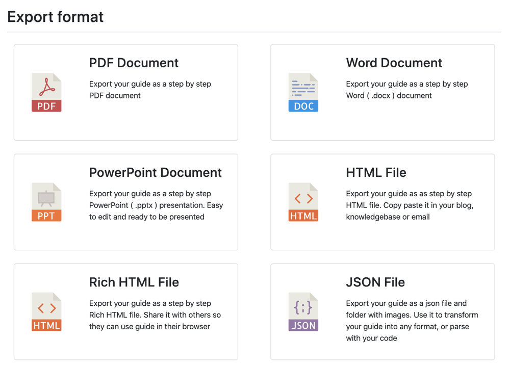
Next to the name is a big, green Export button. Your options (if you pay for Folge) are PDF, Word, PowerPoint, HTML, Rich HTML, and even JSON. If you export as a JSON file you can use it to transform your guide into any format or even parse it with your code. That last option is beyond my current skill set but we’ve got some super nerds in the community who will probably love that.
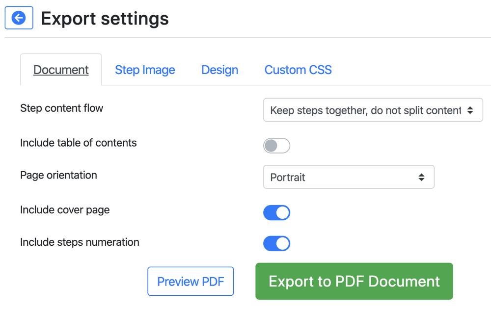
If we start with a plain PDF export we have quite a few decisions to make. The most important one is whether to keep steps together and not split content. I say this is the most important because this is precisely what is so hard to manage when working with difficult tools like Pages or Word to lay things out. You can have a table of contents added, choose page orientation, and even number each step. There’s a handy preview button so you can check out your choice before waiting for the PDF to be created.
But hold your horses, we’re nowhere near done making decisions! You want to decide whether to justify your images right, left or center, choose the image quality and format, and the image size. Again, the preview PDF button is your friend.
If you want to get fancy, move onto the Design tab of export to include a header and footer and even a logo and on the last tab, you can even define your own Cascading Style Sheet (CSS) to modify precisely how your PDF will look. Again, that’s a super-nerd option.
Folge does what I wish every application ever developed would do. When you export your guide, it pops up a window offering to show you where it put it! I know, we chose where to put it but why should we have to drill down again and find it? Just show it to me!
Bottom Line
I have to say that there is no question that Folge is a fantastic option to replace Clarify. You can use it for free as I said, but I think it is worth the $93 (or $69 on sale) for two reasons. One because the rich HTML export is gorgeous. Your final product will have beautiful drop shadow boxes around each step and a lovely floating table of contents, and by default, it’s a responsive design so will adapt to different screen sizes.
The second reason is that the developer has definitely put in a lot of work to make this as good as it is already AND is highly motivated to make it even better. We desperately need a tool to fill this space and I hope if you have a need to make tutorials for your friends, family or co-workers you’ll consider investing in Oleksii’s work. I almost forgot – there’s a Business License option too if you’re going to use Folge for a team. Check out Folge at https://folge.me.
(If you want to see how the rich HTML looks, I posted a goofy little example here.
