Whether it’s because you have a small screen or because you’re a menu bar app addict, if you have too many menu bar apps to fit on your menu bar, then you need Bartender from macbartender.com. If you haven’t heard about it before, Bartender is an app that allows you to control what you see in your menu bar by creating essentially a second, hidden menu bar. It’s been a huge favorite in the Mac community for ages, and it’s just getting a huge update for Big Sur.
When I say “for Big Sur” I really mean that it only runs on Big Sur, not on Catalina or earlier. I’m just fixing to make a plan to nuke and pave my production machine so I can go to Big Sur and I have to say Bartender 4 is a big reason on why I’m excited to do it. I recently created a tutorial on ScreenCastsOnline about Bartender 4 using my backup Mac which is already on Big Sur, and I really missed Bartender 4 when I went back to Catalina on the production machine.
If you want to learn how to use Bartender 4, of course I highly recommend signing up for ScreenCastsOnline, but I did want to tell you about Bartender 4 here to get you excited. Bartender 4 is in public beta right now, which means it’s free to download and use to give feedback to the developer until it is officially released. Once it is released, it costs a grand total of $15, and if you have a previous version you can get it on upgrade pricing for $7.50. I actually paid the full $15 because it is such a mission-critical app for me and I hadn’t paid the developer, Ben Surtees, in years, and I wanted to support such an awesome app.
Showing and Hiding Second Menu Bar
As I mentioned, the purpose of Bartender is to manage your menu bar items by hiding the ones you never want to see, and putting the ones you sometimes need to see on a second menu bar. In Bartender 4, you have new ways to show the second bar, and you get to control how this happens. Ben calls that second menu bar the Bartender Bar, but I always think of it as the second menu bar.
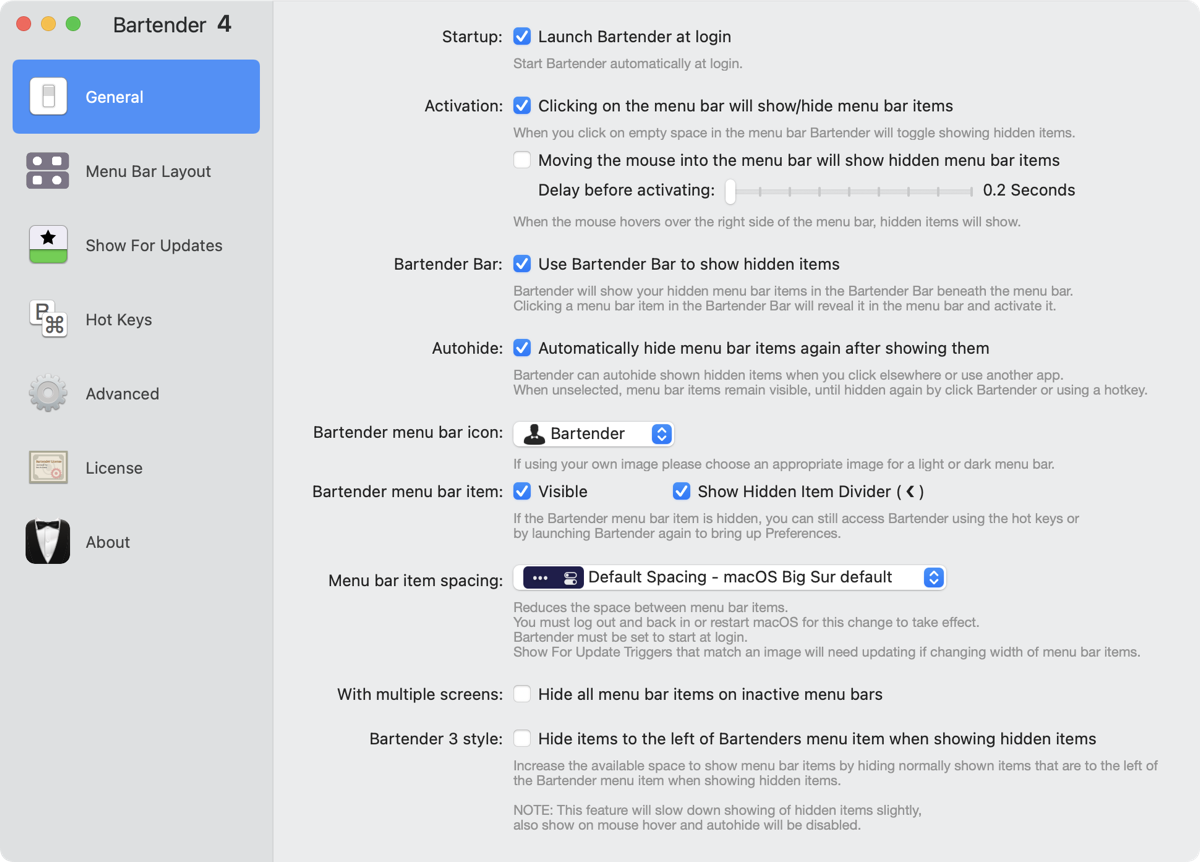
Assuming that you’ve put some items on a second menu bar using Bartender 4, you can click in the empty space of your menu bar and the second menu bar will appear. Click again and it goes away. It’s so much easier now to activate that second menu bar.
Maybe clicking is too much work for you to do. You can set Bartender to allow you to simply hover your mouse in the empty area to activate the second menu bar. If you try the hover method and find that Bartender gets triggered through accidental movement up there too often for your tastes, you can add a specific time delay before activating so it’s not flipping to the second menu bar except when you hover with intention.
Maybe having your primary menu bar disappear and be replaced by the second one is annoying and you’d rather see both at the same time. In Preferences, there’s a check box to use the Bartender Bar to show hidden items, and that means that if you click on the Bartender icon or in the empty space of your Mac’s menu bar, the second Bartender Bar will show up under where you clicked, without removing your normally-showing menu bar items. I think this makes it easier to get full situational awareness of your menu bar items.
Quick Search
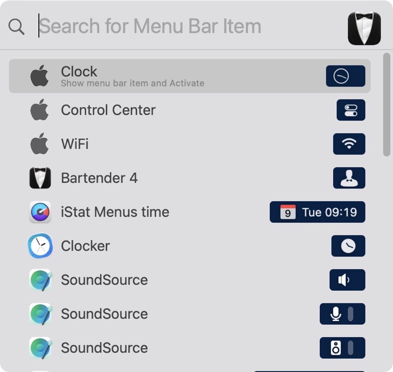
Because I load up so many apps on my Mac, I have a ton of menu bar items. As a result, it’s not uncommon for me to scan methodically through them all trying to find the one I with which I want to interact. With half hidden by Bartender, I sometimes can’t remember if I’ve purposely hidden the one I’m looking for or not, so I toggle back and forth trying to find the one I need. With Bartender 4, that problem is solved by the addition of Quick Search.
In Bartender 3, you could do a search of your existing menu bar items, and you can define a hotkey to trigger it, but it’s not quite as cool as it is in Bartender 4. In the older version when you trigger the search, you get a tiny search box under the Bartender icon and as you type the menu bar icons start disappearing leaving only the ones that match the search string left. It’s still pretty cool in Bartender 3 and I have to confess that I never noticed it was there in all the years I’ve been using Bartender. It proves the old adage that the best way to learn something is to teach it.
In Bartender 4, a simple right or control-click on the Bartender menu bar icon lets you select Quick Search and you get a lovely floating window where you can start typing the characters for the menu bar item you seek. The search window shows the color icon for the apps on the left, the name of the app in the middle and then on the right, you see what the icon looks like when it’s in the menu bar.
This format can be especially useful if you’ve got an app that spawns more than one menu bar item. For example, SoundSource from Rogue Amoeba spawns icons for the general app, your input device, and your output device, and it can even show icons for apps you’re controlling with Sound Source. In Bartender I see the pretty green/blue icon for Sound Source listed 3 times, and then the three menu bar icons it spawns, so I can select the specific item for which I was searching.
Being able to search for menu bar items with Bartender 4 is probably the main feature I missed when using Catalina.
Spacing of Menu Bar Items

Big Sur brought an odd change to the menu bar; it increased the spacing between menu bar items. The icons are so far apart that I’ve heard it speculated that Apple is preparing for a touch-screen macOS experience. If you have a lot of menu bar items, or just a small screened laptop this will be problematic because you’ll run out of room with even fewer menu bar items.
Bartender 4 lets you change the spacing back to Catalina and earlier spacing. This will make a lot of people happy. If you want even more space, you can even choose “no spacing” to cram in as many menu bar items as possible.
Bartender 4 has some more menu bar item spacing tricks up its sleeve. You can now add empty space to separate your menu bar items. That seems like an odd option right after complaining about too much space between items, but it can solve a real problem. Here’s an example.
Like many Mac users, I use iStat Menus to track my system, watching processor load, network traffic and RAM usage. This gives me a lot of menu bar items, and it would be nice to be able to set them apart from my other menu bar items to make them easier to identify at a quick glance. Just a smidge of separation can be useful.
You can change the width of the spacer from very small to absurdly large where the items slide over to the left side of the menu bar. You can even type text for the spacer. Not only that, you can put emoji in as the spacer text. I put the goofy one with the tongue hanging out 🤪 as my spacer. It adds zero value but it makes me giggle every time I see it. Bart is going to love this feature.
Menu Bar Layout
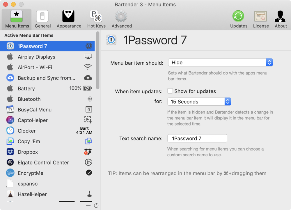
In previous versions of Bartender, to make menu bar items show, hide, or always hide, you had to go through a list of your existing menu bar items and for each one make the decision. It was kind of a tedious process because you couldn’t see at a glance which ones were shown or hidden.
In Bartender 4, it works very much like iStat Menus. In the Menu Bar Layout option in Preferences, you get three bars: one for Shown menu bar items, one for Hidden and one for Always Hidden, and you simply drag and drop your menu bar items up and down between the three bars. It’s ever so much better and more intuitive than it was in the previous version.
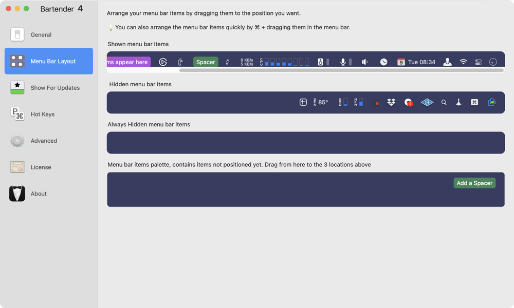
You’ll notice a fourth bar in this menu and it’s called Menu bar items palette. Right now the only thing you’ll find here is that spacer I talked about earlier, but Ben has plans for more cool things that will show up in the palette. Remember, this is a beta so it’s not yet feature-complete.
Show for Updates
One feature confused me at first but after studying it to make the video, and a lot of conversations with Ben, I think I understand it. The feature is called Show for Updates. The idea is that you can have the behavior of a menu bar icon (whether it’s shown or hidden) be changed if there’s a change to the utility behind the menu bar item.
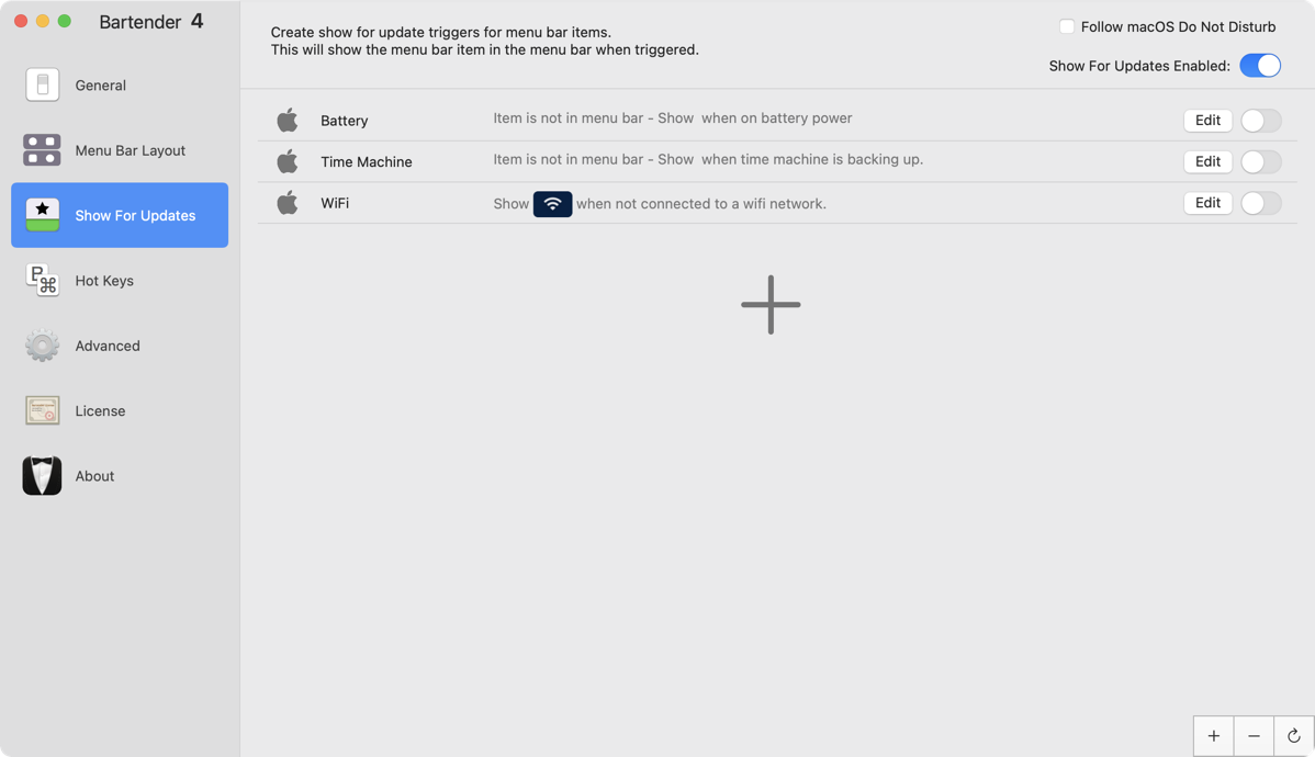
Ben includes three Show for Updates triggers as examples that will help explain the feature. One example is to show the WiFi menu bar item only if you’ve lost or disabled WiFi. That kind of makes sense. If everything is hunky dory with WiFi, why would you need to see the icon? The only time you really need to see it is when something’s gone wrong.
Another example is to only show the Time Machine icon when it’s actually running a backup. Remember even if it’s hidden, you can always bring it up to manually run a backup by hovering or clicking on the menu bar to show hidden items.
The last example in this section is a trigger to show the battery symbol only when you’re not connected to a power source. I’m not sure I’d choose to use this particular trigger, because I like to be able to see if my laptop is sufficiently charged before unplugging it. Whether you use any or all of these Show for updates triggers is up to you, but it’s great that they’re there so you can study how they work and learn how to create your own triggers.
I should mention that Bartender 3 did have show for updates as an option by application, but you didn’t have control over what behavior would cause a menu bar item to appear, they simply appeared if anything about their status changed. Now with Bartender 4 you can create your own triggers based on criteria you set.
Ben does give a warning in the advanced section that there’s a price to pay in energy usage if you use show for updates triggers, so he gives you some options to decrease the frequency of checking.
Hotkeys
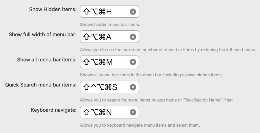
Bartender 3 allowed you to define hotkeys to trigger the behavior of your menu bar items and Bartender 4 maintains the exact same feature.
If it’s too tedious to click in the menu bar to activate the second menu bar, you can assign a global hotkey to do it for you.
Have you ever been on a small laptop, where the menus of the current app are so wide that you can’t see all of your supposedly visible menu bar items? I run into this all the time when I’m running at low resolution while recording videos for ScreenCastsOnline. With a hotkey in Bartender you can show the full width of the menu bar, which completely removes the menus from the current app and leaves only the Apple logo on the left. I’m not sure how and why Bartender is allowed to do this but it’s pretty cool.
My beloved Quick Search can also be triggered by a hotkey, and this is definitely going to be my favorite one.
If you really hate to use the mouse, you can define a hotkey that allows you to navigate left and right with the arrow keys between your menu bar items. I bet this feature would make it easy to write a Keyboard Maestro macro to launch a menu bar app.
Accessibility
I’m pleased to say that Ben is working on making Bartender 4 fully accessible via VoiceOver, but it’s definitely not yet ready for the visually impaired user.
Bottom Line
I think Bartender 4 is a fantastic update to one of my most beloved Mac utilities. I think it’s very cool that Ben has it out in public beta so anyone can play with it. I hope that I’ve given you enough to be excited about Bartender 4, and you go check it out at macbartender.com. Give it a spin, give Ben some feedback, and see if it solves some problems for you like it does for me.
