I’ve been making video tutorials for ScreenCastsOnline for around 5 years. I enjoy making the tutorials because it forces me learn new tools really well. It’s absolutely true that the best way to learn something is to teach it.
There are a lot of pitfalls when choosing a tool to teach. In order to make a tutorial, I have to really understand the tool. I start by poking every button and control in the app to figure out what it does, and I explore every preference and option. I know that I pretend I never read manuals but it’s actually not true; I often read the manual for more complex tools.
As I work my way through learning the app, I create a mind map using my beloved iThoughts from Toketaware. I just fling my discoveries onto the mind map and as I work my way through the app, I start to reorganize the topics into a story of how to use the app. For example, in some apps, the only logical place to start is with the Preferences (like Bartender 4) but with other apps, the Preferences are sort of the bow on top at the end.
One of the huge pitfalls in doing these tutorials, as any of the ScreenCastsOnline staff will tell you, is that partway through working on an app, you discover it isn’t what you thought it was when you decided to do the tutorial. Maybe the app turns out to be too simplistic to be worthy of a 30-40 minute tutorial. Often software turns out to be buggy and we definitely have to change horses when that happens. Sometimes you’re halfway through the process when the developer decides to put out a major update and it messes up everything you’ve done.
But there’s one thing that has never happened to me in this process before now. Last week I started doing a tutorial on an app that I assumed would be fairly simplistic and easy to fit within the 30-minute window. I made this assumption based on the price, and I couldn’t have been more wrong.
The app in question is Screenium from Synium Software at syniumsoftware.com. You may recognize the name of the company – they’re the folks who make Logoist, which I’ve talked about on the show and for which I also did a ScreenCastsOnline tutorial.. You may have also seen their app Mac Family Tree.
Screenium is a screencasting app, along the lines of ScreenFlow from Telestream (which is what we use at ScreenCastsOnline) or Camtasia from Techsmith. These apps are $129 and $100 respectively, but in contrast, Screenium lists for $55 and has been on sale for over a year for $27 in the Mac App Store! The developer told me they dropped the price when everyone had to start working from home, and that they plan on keeping the price that low for the foreseeable future.
I assumed that a $27 screencasting app must not be very capable, but thought maybe it would be useful for people with very limited needs. I could not have been more wrong. As I was learning the app and making my mind map and reading the (awesome) user manual, I realized that there was no way I could do this app justice in just 30-40 minutes.
I explained the problem to J.F. Brissette, my producer at ScreenCastsOnline, and his advice was to break it up into a basic and advanced tutorial, which is exactly what I’ve done. Even with breaking it in half, I think it’s going to be really hard to keep the advanced tutorial under the goal of 40 minutes!
Now that I’ve given you the background, I’d like to talk about Screenium itself and what makes it such an interesting application. I said it’s “along the lines of” the other screencasting apps because while it meets the same end goal, the approach in some aspects is vastly different from the other tools. I’ll walk through at the big picture level how Screenium works and how it’s different from other screencasting apps.
Start Window
Screenium has a Start window with four options for screen capture: Area, Full Screen, Single Window and iOS/tvOS Device. As you hover over each icon, they will animate and move towards you to show that they’re in focus. I know doesn’t add to functionality but it’s an attention to detail that I appreciate.
Capture tvOS Devices
The first three screen capture options are pretty standard, but the fourth one is very interesting. If you connect an iOS device via USB and do the Trust This Computer dance, you can record the screen, your voice, and the system sounds from the iOS device. I’ve seen that done before but I’d never recorded a tvOS device. I had heard that there was a USB port on Apple TVs for diagnostics purposes and that people had done interesting things through that port.
It turns out that if you keep the Apple TV plugged into a display using the HDMI port, and you connect a USB cable from the Apple TV to your computer, you can capture the Apple TV screen and audio with Screenium. The Apple TV HD and 4K models have a USB-C connector conveniently located well above the HDMI port. On the older models, it’s microUSB and it’s so close to the HDMI port that I simply couldn’t plug in USB and HDMI at the same time so I couldn’t get Screenium to recognize the device.
If the idea of capturing an Apple TV output would be useful for you, keep in mind that our little friend High Definition Copy Protection (aka HDCP) will prevent you from capturing any copy-protected content like TV shows and Movies. I was able to capture a game inside Arcade so there is some fun to be had. I was also able to capture the Apple Fitness+ app interface, but as soon as I started a workout, the screen went black but the audio was still there. I really hate copy protection. I think the best use of this option would be if you wanted to teach someone how to navigate the tvOS interface and its settings. I could see using Screenium to do that. Or perhaps you’ve written your own app for tvOS and you want to create tutorials on how to use it.
Recording Configurations
The next section of the start window is called Recording Configurations. Screenium has configurations for video, desktop, audio, camera, mouse, keyboard, and timer. Some of these have obvious settings, such as choosing the right camera, but some of the others are pretty interesting.
For example, under audio where you choose your microphone, you can choose more than one and they will all be simultaneously recorded. I’m not sure I need to have more than one microphone enabled, but it could come in handy and I haven’t seen another app allow that. Screenium also offers to let you capture system audio while recording the screen. They allow this through a download of the elderly, still functioning and yet unsupported Soundflower extension. If you must use Soundflower, the option is there, but I would highly recommend using Loopback from Rogue Amoeba for this functionality instead. And guess what? I’ve written an article about Loopback and done a ScreenCastsOnline video tutorial on how to use Loopback. (How many of you said under your breath, “Of course she did”?)
Under desktop configuration, Screenium can automatically remove all of your desktop icons while you’re recording, and replace your desktop background with a solid fill, or an alternate image. Maybe you’ve got a photo of a cute kitten as your desktop background, but you’re doing a demo of a 1st-person shooter game and you’re afraid it will reduce your cred in the community; you can replace it with a nice skull and crossbones background that only shows in the recording.

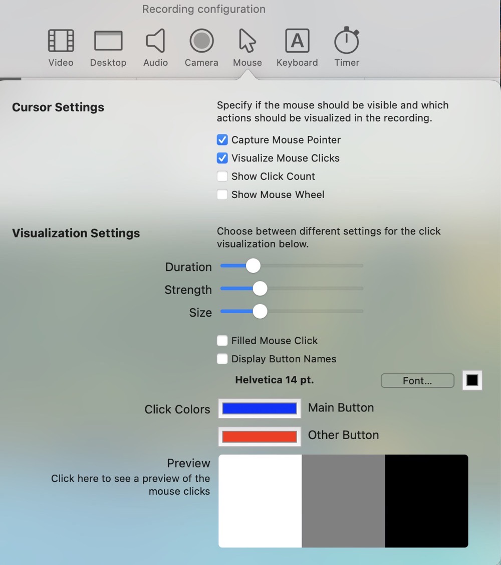
The mouse visualizations configuration is probably the coolest section. When you’re recording a screencast, if it’s a tutorial like what I make, you really want people to be able to see your mouse cursor and where you click. But maybe you’re demoing something where the cursor would be a distraction. You can set the default behavior to capture or not capture the cursor and mouse clicks. Even if you record the cursor and don’t want it later, you can always turn it off in the recording after the fact. ScreenFlow can do that too.
Both ScreenFlow and Screenium allow you to add animations to your cursor clicks, so for example when you click on a menu the video will show a series of red circles emanating from the point at which you clicked. This is really helpful for drawing your viewers’ attention. With ScreenFlow, you turn on these visualizations after you’ve made the recording, but Screenium lets you set defaults for all your recordings so you don’t have to set it up each time. Screenium also lets you change them within individual recordings after you’ve made the recordings.
But that’s not even the fun part. With Screenium in the Recording Configuration, they give you three rectangles, one white, one grey, and one black. As you choose a different color, duration, strength, and size options for mouse visualizations, you can click on those three squares to see which set of options give you the right effect across all of the different colored backgrounds. So if you choose a dark grey for the main button click, you’d see right away that it would never show up on the darker colors. You can even choose to have the button names displayed, so right vs. left click will show on the screen. Even if you don’t need to do this, it’s really fun to play with.
I know it’s dorky to be this excited about how a mouse cursor is presented in a video screencast, but Screenium has one more fun thing in this configuration tool. If you turn on scroll wheel, whenever you scroll in a recording, two downward or upward-facing chevrons will show on screen. I’m always saying, “let me scroll down here” but I wouldn’t have to if it was visible on screen like that.
Keyboard
When doing a screencast, it can be very handy to show your keystrokes when you’ve used a keyboard shortcut like ⌘-C for copy. In Recording Configuration for Keyboard, there’s a simple checkbox to record keystrokes, but it doesn’t have any further refinements than that. The problem with this control is that it records every keystroke, not just keyboard shortcuts. Luckily, once you’ve recorded a segment, you can uncheck a box for visualize text input but leave visualize keyboard shortcuts enabled. I’d prefer that to be a default you can set in Recording Configurations for Keyboard, but at least you can set it in each recording.
Timer
One of the annoying things in doing screencasting is waiting while a countdown timer goes by before you can start your demonstration. It’s only a few seconds and I know it’s good to have a countdown but it always seems to go on way longer than I want it to. Like other screencasting apps, Screenium lets you change the countdown time, but they do one thing better than others. When the countdown timer comes up, you can hit enter and it immediately lets you start recording.
It has another option that adds no value at all but I still really like it. You can have it make a sound when it counts down, and one of them is called TVesque. If you’re old enough, you can already hear the sound in your head of when we would see the pattern on the TV with a hand sweeping around and the beeping noise as it counted down. It made me smile.
Once you set all these Recording Configurations defaults, they stick with all future recordings until you change them, but remember you can always change any of these attributes after you make a recording. I enabled my webcam and I keep forgetting to disable it in the Recording Configurations, so every video I record has my dumb face on it but I can just select that video track and delete it.
Previous Recordings vs. Compositions
Screenium has an interesting way of storing and categorizing your recordings. When you finish making a recording, it opens the file in the timeline editing view. If you don’t save it, it calls it a “previous recording” and puts it in a holding bin in the Start window. If you do save it in the timeline view, then it becomes what they call a Composition. It shows the Compositions in that same library bin on the start window, but the file is saved where you specified, while previous recordings are saved by default in your user/Library/Movies/Screenium folder. It works out just fine but it’s just different from what I’ve seen in other apps so it took me a bit to figure out how to work with the recordings this way. In practice, a Composition will consist of much more than a single recording so it does make sense to save them in a logical location.
Interesting Features of the Timeline Editor
Enough of setting up the configurations, let’s talk about the timeline editor.
Objects
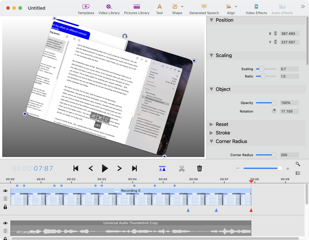
In Screenium, everything is an object. You can add objects to your initial recording by choosing from the video library you’ve already created, you can add pictures from your Photos library, and you can add text and shapes to your Composition. Each of these objects can be on its own track in the timeline. It’s a little counterintuitive, but the visibility of objects is controlled by the location of the track it’s on, with the lowest track being on top. For example, if you have a video track on top and below that, you have a track with an outlining rectangle, the rectangle will show on the video track. If you put the rectangle on a track above the video, it will not be visible.
All objects can be animated, so you can add a keyframe and have an arrow slide across the screen, or have some text fade out, or make a photo rotate out of the frame, or have a video object zoom in or out.
Visuals in Timeline Editor
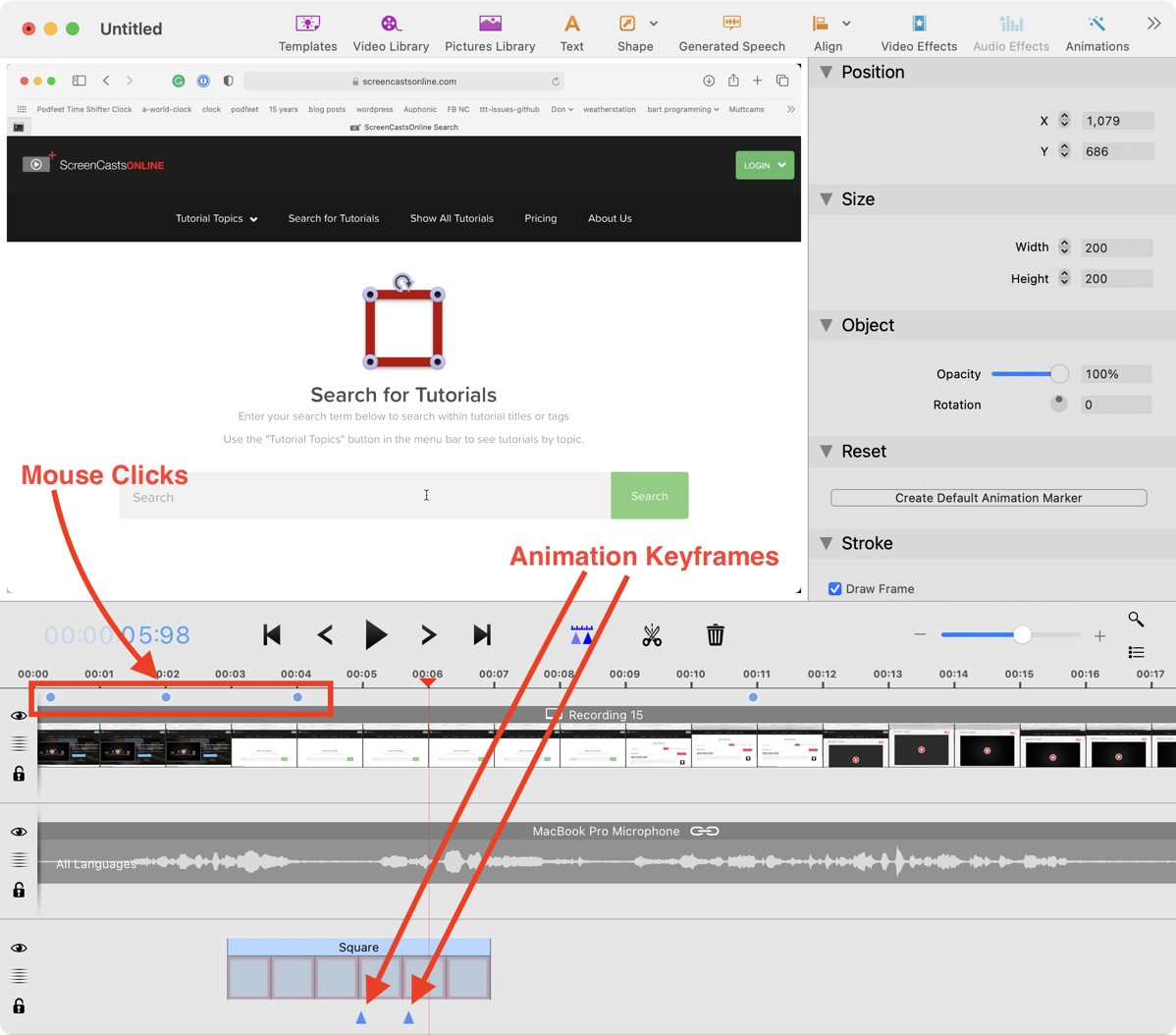
Screenium shows these keyframes as blue triangles underneath the affected track. It also shows blue dots above the tracks for where you’ve clicked the mouse, if you’ve turned on mouse click visualizations. This makes it really easy to navigate right to one of the animations or mouse clicks to make sure the visualization works the way you like it.

Attributes Inspector
To the right of the video canvas is the Attributes Inspector, which is a contextual set of controls to allow you to change the attributes of any object. This is where you can set the opacity, scaling, location, and more of each object. The level of control is really extensive and easy to manage.
I’m really pleased with Screenium’s control of simple objects. Drawing a box frame around something to draw attention is a really common need in screencasting, and it’s one of the most frustrating things to do in ScreenFlow. In that application, once you create a simple box frame, if you change the proportions of the box, the thickness of the border scales with it. If I change a long rectangle to be a square, I definitely do not want the sides to get thicker as a result, I want the thickness to stay the same. I’m always creating boxes and deleting them and adding them again to get it just right. With Screenium, a box is just a normal object and the thickness does not vary when you mess with the length and width.
Audio and Video Effects

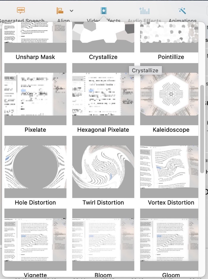
Screenium has some crazy video effects, and I’m not sure they solve a problem for me. You can distort your video with everything from a Gaussian blur to a kaleidoscope effect, to a twirling distortion. With the animation tools you can set the range in the video where these effects take place. If this is your cup of tea, the awesome manual has some nice step-by-step tutorials on how to apply these effects.
If you’re an audiophile, you’ll be glad to know you can add audio effects like low and high pass filters, a parametric equalizer, multi-band compressor, reverb, and more. It’s as easy as drag and drop onto the audio tracks to apply these effects. The graphics equalizer is delightful to work with. Instead of having to drag each of the 20 or so frequency bands up and down, if you control/right-click while dragging your cursor, you can simply draw the shape you want to see on the EQ.
Speaking of audio, one of the things I rely on with ScreenFlow is to be able to do voiceovers when I mess something up. Like when I was doing the recording for Parallels Toolbox and I kept accidentally saying Parallels Desktop. I didn’t need to go back and rerecord the video, I just needed to do a voice over to fix it. Screenium has VoiceOver too and it works well.
I stumbled across something delightful that Screenium can do that to my knowledge ScreenFlow cannot. You can select a track – video, audio, any kind of object, copy it, and then just paste it into another Composition. I can’t tell you how many times I’ve wanted to do that with ScreenFlow but you have to select a segment of the recording, export it to disk, and then in the second recording, import the exported segment into the library and then drag it from the library into the timeline. Screenium’s simple copy/paste is what I’ve always wanted ScreenFlow to do.
What would I improve with Screenium?
Ok, by now I’m sure I’ve convinced you that this software is bananas capable, and incredibly inexpensive at $27 for such a professional tool. But I would be remiss if I told you I thought everything in Screenium worked the way I like it. If I had my druthers, there would be way more keyboard shortcuts. Adding a fade in/fade out to an annotation object happens constantly, and instead of a pair of keystrokes like with ScreenFlow, with Screenium you have to add animation keyframe markers and use a dropdown menu to get to these options. For something I do that often, I need keystrokes!
An even more common need is to cut out a segment of video and audio and have the following video/audio slide to the left to remove the gap. With ScreenFlow, you click/drag to select where you want to remove, and hit command-backspace to cut, and everything to the right moves over to fill the gap. In Screenium you make the left cut, then the right cut to isolate a segment and then delete it, and then right-click on the following tracks and select Shift to Previous object. For how often I do that, I’d feel a huge loss in productivity until Mike Price wrote me a Keyboard Maestro shortcut to do it.
I was able to create animations, but the keyframe model isn’t intuitive for me. I haven’t quite figured out which keyframe is starting or ending the animation. I suspect some practice would cement it for me but as Bart would say, the penny hasn’t dropped for me yet on this one.
Bottom Line
I’ve said it twice already, but the bottom line is that if you need a highly-capable video screencasting application, I’d highly recommend you take a good look at Screenium before shelling out 4-5X as much for Camtasia or ScreenFlow. My basic tutorial on Screenium will be up on ScreenCastsOnline in about 2 weeks, and if I get moving on it, the advanced class will be up 2 weeks after that.
