In my article about accessibility in the Federal Government, I explained that they had created a tool to help them assess their own websites for accessibility errors. It’s called ANDI – Accessible Name & Description Inspector. I teased that I’d installed it and that I’d tell you more about how it works in a later article.
To review, ANDI installs as a bookmarklet for your web browser. It works with Chrome, Microsoft Edge, Firefox, Safari, and even Internet Explorer, and you can find it at ssa.gov/…
I’ve spent a lot of time on podfeet.com working to eliminate every accessibility problem I can by using another tool called the WAVE Web Accessibility Evaluation Tool, so I assumed podfeet.com would perform really well on the ANDI tests. It did well, but I definitely found a problem I hadn’t check out before testing with ANDI.
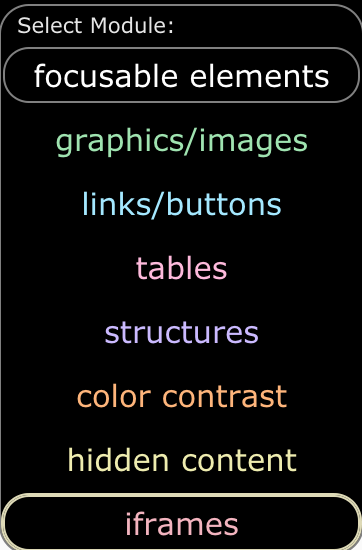
When you select the bookmarklet while on the web page you want to test, a banner will be displayed across the top of your browser window with a dropdown menu entitled focusable elements. As you select each element option, the tool will identify potential issues with the page. Every alert doesn’t mean catastrophe, which is why a hybrid approach of a tool and a human is the only way to be successful in fixing issues.
Let’s walk through the seven focusable elements in ANDI.
- Graphics/images checks to ensure that every meaningful/non-decorative image has a text equivalent. If you have flowers decorating your site, they don’t have to say “flower” on them, but if the graphic has any meaning, it’s important to explain the meaning of the graphic in hidden text for screen readers.
- Links/buttons ensures that every link and button has a text equivalent so that screen readers will successfully read out their purpose. The worst thing is to have unidentified elements like buttons labeled simply “button”. Oh – and here’s a pro tip. When you’re labeling your buttons, don’t put the word “button” in the description because the screenreader already knows it’s a button. If you do put “button” in the description, the viewer will hear something like “back button button”!
- Tables is similar to the previous two elements, where it checks to make sure that every data table cell has a contextual equivalent.
- Structures doesn’t explain exactly what errors it’s seeking but I know that it’s checking to make sure you’re using headings. I used to simply make new sections in my blog posts by making a line that was bold, but screen reader users rely heavily on headings in order to jump to the content in which they’re interested. As much as I hate to admit that Markdown is useful, it does make creating headings much simpler. I just have to add two hashes to make a heading level 2 for example. Use headings, they’re easy, you can style them with your CSS and they add usability to your website.
- Color Contrast is the bane of my existence. If you want a double-A (AA) rating for contrast, the contrast ratio has to be at least 4.5 or higher. I say it was the bane of my existence because while the WAVE tool would tell me my color contrast was too low, it wouldn’t tell me how to fix it. When ANDI finds a low contrast area, it actually gives you a very similar color combination you can change to in order to give the element high enough contrast to improve visibility.
- Hidden Content is a little bit confusing to me. It says that it will discover hidden content that should be tested for accessibility using other ANDI modules. The only problem is that I haven’t yet figured out how to access the other modules.
- Iframes – I said there were 7 focusable elements, and I’ve only listed 6. The 7th element is iframes, and you can only see it and select it if you have an iframe on the page. Iframes are a kind of janky way to embed things onto a page from another source.
While most of my pages came through with relatively flying colors using ANDI to test them, that iframe test showed me some real problems. People have often asked me to have a page where they can see all of the hardware and software I use to create the podcasts. The page I created was, to be as complimentary as possible, a hot mess. It was ugly, it was out of date, it was filled with Amazon Affiliate Links that no longer are valid, 3 of the links were broken, and ANDI found that the iframes were inaccessible. Guess what? That page is gone now!
Then I got to thinking, I’ve got other pages with embedded elements. On the NosillaCast Live page, I’ve embedded a Discord chat window, and I’ve embedded the YouTube Live video, and both of them are in iframes. I discovered because of ANDI that they are unnamed. A quick search of the Internets revealed that giving them a title would make them accessible, and in about 3 minutes it was fixed.
I learned something else I’ve been doing wrong because of ANDI. 100% of the time I put an image on podfeet.com, I include the alternative text, aka alt text, that tells the screen reader user what the image is about. Sometimes in an article, I’ll wrap a link around an image. For example, in Claus’s short Everything is Fiddly post about how sketchy it is to use Apple’s documentation to ensure proper publication of his Open Access Helper extension for Safari, I decided to put an image from the Mac App Store of his app. Once I had the image in there (with appropriate alt text of course), I figured I’d help people find his extension by wrapping the image in a link to the Mac App Store.
Now here’s the problem ANDI highlighted. While the image has a description with the alt text, screen reader users have no idea where that link will take them without listening to a very long, glop-filled URL. Turns out I should have been adding titles to all of these links wrapped around images. I absolutely did not know this till ANDI taught me. It won’t be hard to add them at all since I’ve already written the alt text, I can just copy that, and paste it into a title. I think that will be a TextExpander snippet with a clipboard paste!
I’ll be looking at all of the “special pages” with ANDI, and going forward I’ll be doing my linked images with proper titles, but I can tell you I am not going back through 16 years of blog posts to fix them!
You might think I’m a swell human for making Podfeet as accessible as possible, but remember what Michael Waschull, Acting Intelligence Community CIO said about accessibility. He said that if you aren’t inclusive you get groupthink, and then you make bad decisions. I want everyone on this entire planet, (and potentially other planets) to be able to consume the content I produce here. This is essential so people will tell me when and where I’m wrong and then we all collectively get a little bit smarter.


“I want everyone on this entire planet, (and potentially other planets) to be able to consume the content I produce here.”
Sheesh…what an EGO.
Just kidding. GREAT ARTICLE!
We are on the search for a new 508 scan tool and happened across ANDI. It appears to be exactly what we want/need…except…it does not scan whole sites.
We are looking doing the scripting in-house…but wonder if someone has already done it. Why re-invent the wheel…right?
Testing your site is the most important step in creating a quality product. Drupal is perfect for getting started. The entire base set is carefully designed, tested, and has improved security. I advise you to learn more about it here https://anyforsoft.com/blog/must-have-drupal-modules/