I’ve written a lot of posts about Parallels Toolbox, the menu bar app that gives you access to lots of tiny tools that each do one specific thing. The reason I’ve talked about Parallels Toolbox so many times is that they keep adding more and more tools to the toolbox, so every year or so, it’s fun to tell you what’s new.
Right after I wrote my last article about Parallels Toolbox, I let Aleksandr (Parallels Toolbox project manager) know about the post. He let me know that they were working on a pretty substantial interface change to the toolbox. At first, I was dismayed because I’d just finished the article, but I realized that it would give me an excuse to talk about one of my favorite tools yet again when the new interface came out. That time is now.
As a reminder, Parallels Toolbox is a subscription service, but it’s only $20/year. That works out to $1.67 per month. For a tool that is constantly being updated with additional, useful options, it’s a fantastic deal.
The Problem to be Solved
Developers who use the subscription model say that having a constant revenue stream helps them keep adding features and improving the software. I don’t know if I believe all of them, but this has absolutely proven to be true with Parallels Toolbox.
For that paltry $20/year, Parallels has continuously added more and more tools to the toolbox over time.
- 18 tools in 2017
- 9 additional tools by 2018
- 10 additional tools by 2021
That’s now 37 tools in the toolbox, which is why the subscription feels like money well spent to me. But picture if you designed a toolbox to hold around 18 tools but over the years you kept acquiring more and now you’re stuffing 37 in that same toolbox. It was starting to get hard to find the right tool for the job at hand.
In my most recent article, I explained that they added the ability to change some tools be invisible, but that’s sort of like creating a junk drawer for abandoned wrenches that you might need some day but you’ll forget about in there. Not an ideal situation and it was definitely time for a new coat of paint.
New Interface
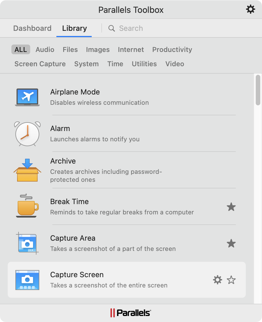
The new interface gives you two separate views: Library and Dashboard. The Library view lists all of the tools in a nice, compact, alphabetical list. You get the visual icon, the name, and a short description. Before the redesign, they used a grid view, which while alphabetical, was harder to scan for the app you need.
If I could have an improvement to Parallels Toolbox I’d ask for two things, especially on this view. I’d like to be able to increase the length of the window, but it’s a static size. If you don’t have scroll bars always visible (System Preferences → General → Show Scroll bars: → Always), you actually might think there are only 6 tools in Parallels Toolbox instead of 37 because that’s all you can see. The other thing I’d like is to be able to tear off the Parallels Toolbox menu from the menu bar. I’ve gotten used to being able to do that with the Rogue Amoeba tools like SoundSource, and now I want it in all my tools.
Anyway, at the top of this long list in the Library view you’ll see some category names:
- Audio
- Files
- Images
- Internet
- Productivity
- Screen Capture
- System
- Time
- Utilities
- Video.
The categories are great because you just select what you want to do without having to know the name of the tool. The other reason this works well is that one tool can fit in multiple categories. For example, if you want to create a screen recording, you can look in the video tab OR the Screen Capture tab and you’ll find the tool you’re looking for.
To use a tool, you can simply click it in the list from the Library. If you hover over the tool, you’ll see a hollow star and a gear. If you click the star, it will turn solid, and then it will be shown on the Dashboard tab. There’s even a cute little animation as the tool flies up to land on the Dashboard tab. By starring your favorite tools, they’re ready at your fingertips on the Dashboard, and yet all tools are still there in the Library. It’s a much better way than throwing tools in a junk drawer and making them invisible.
When you decide that a tool isn’t getting used enough to be worthy of being on the Dashboard, back in the Library you can click the star again, it changes back to hollow and disappears from the Dashboard. You don’t get a cute animation when you banish a tool though.
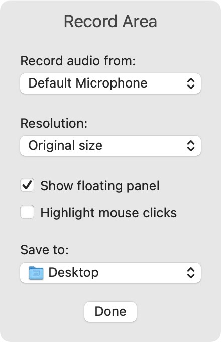
I mentioned that in the Library view when you hover over a tool, you also see a little gear. Tapping the gear will surface any tool-specific settings. For example, if you tap the gear on Record Area, you’ll get dropdown options to change which microphone to record and your desired resolution, and checkboxes for whether to show a floating panel and whether to highlight mouse clicks and finally a dropdown to choose the location to save your videos.
In case you’re curious, the floating panel lets you change the microphone on the fly, set a delay before recording and tells you the keystroke to stop the screen recording. Have I mentioned I love tools to record the screen? No? I use Parallels Toolbox’s screen recording more than any other option I’ve tried.
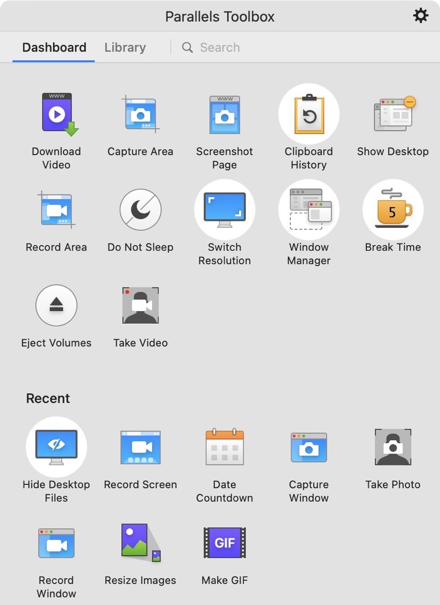
I explained that the Dashboard is where all your starred (favorite) apps go so you have quick access to them. Below the Dashboard, you’ll also see Recent tools you’ve used. I really like the Recent section, because often I use one tool over and over again during one particular project, but it may not be worthy of the favorite status.
In fact, looking at the Recent section I just figured something out. It shows my most recent tool is “Hide Desktop Files” and it’s highlighted in a white circle, meaning it’s active right now. I have been thinking that I’m running a nice, clean desktop lately and I was super confused when I worked on my backup laptop earlier today. You see, the desktop was a hot mess and I use iCloud syncing of my Documents and Desktop, and over there I’m not running Parallels Toolbox. Maybe delusion is a good thing.
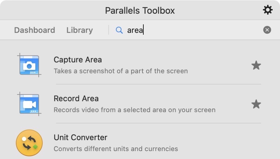
If categories are not your thing, Parallels Toolbox has a search tool as well. In my experience it finds the tools I expect it to find, and sometimes a few more. For example I searched for the word “area” expecting it to find only the Capture Area and Record Area tools, but it also found the Unit Converter tool.
The only thing I could think of is that the Unit Converter will tell you how many square feet in a square centimeter. You know I couldn’t let that go without being sure, so I searched for volume and length and sure enough, Unit Converter came up in those searches as well. So it looks like they put in tags of some sort so that you can search for what you’re trying to do rather than having to know the name of the tool. I have to say, very clever folks designed these tools.
Bottom Line
When you first launch your new, shiny copy of Parallels Toolbox you’ll be offered an affiliate link to send to your friends, family, fellow parishioners, and random people in the grocery store. If someone uses your affiliate link, you get three months free and so do they. What? You want MY affiliate link so you can help support the show? I’m so glad you asked. I put a link in the shownotes, and to make it easier on you, I’ve added it to my ever-growing list of spammy links at the end of every podcast episode’s shownotes!
Allison’s Parallels Toolbox Affiliate link
I haven’t forgotten that on my to-do list is to remember to nag Aleksandr every few months to make sure they move accessibility up on their to-do list, and I’ll be sure to let you know when they’ve prioritized it higher and they’re ready for you to test it.
In my last discussion of Parallels Toolbox, I told you about the tool Break Time that at an interval of your choosing, locks up your screen and makes you let go of the keyboard for 3 minutes and take a rest. I said I wasn’t sure I’d keep using it but I’d give it a try. It turns out I’m loving it. When it’s Break Time, I can snooze it for a minute or so, or I can skip the break. But 9 times out of 10 I get up, walk in the other room and find some small task to do that I was going to do later anyway. If I take a break all by myself without it nagging me, when I come back there’s a message giving me positive reinforcement for the break. I am meeting my stand goals more often than ever before. I call that a win all around.
I know it sounds like I’m advertising for Parallels Toolbox but I promise you I’m a huge fan and I use at least one tool a day if not more.

