If you’re a data nerd, you really need to get solar. When last we left our heroes, our solar installation had just been completed. To review, we had 22 370-Watt solar panels installed, giving us a maximum theoretical instantaneous power generation of 8.14 kW (kilowatts).
The little inverters on the back of each panel do some digital switching to convert to the 240V standard, and that conversion plus the combining of all the inverters has about a 20% loss. So doing a little math that won’t even scare David Roth, 80% of our theoretical max of 8.14kW gives an actual maximum of 6.5kW of instantaneous power generation which is what we see when our panels are fully illuminated at mid-day.
Knowing the maximum power you can actually create under perfect conditions helps to understand the data you can see on the different tools for monitoring your solar power.
Kilowatts, as I mentioned, is a measure of instantaneous power. If you look at your electric bill, you won’t see anything about kW. Instead, you’ll see that you are charged by the kWh (kilowatt-hour). A kWh is the measure of energy and is the power generated (or consumed) averaged over an hour. My brain thinks it would make more sense to call this kW PER hour, but this is brought to you by the same electrical engineers who say that the electrons go one way so the current goes the opposite direction. They hate us all.
Tracking Energy Production with Enphase
Our solar system is made by a company called Enphase, but they call their solar monitoring app Enlighten. I think their goal is to make sure you can’t possibly remember the name when searching for it on your phone. You can also access your solar data via Enphase’s web interface.
You can just imagine how many times Steve and I refreshed our screens within the first couple of days trying to see data from our solar panels. The experience was very disappointing. Our Enphase system came with a cellular modem installed which they told us was an advantage over WiFi. If your WiFi is dodgy where the electrical panel is installed, then cellular could be an advantage, but if you have good WiFi then it’d definitely be a disadvantage.
The huge downside of the cellular connection is that the data uploads at a very infrequent rate. Sometimes it would be 40 minutes in between updates. I think we saw well over an hour once or twice, and it definitely wasn’t refreshing at the rate Steve and I wanted. We were at Lindsay’s house right after our solar system got turned on, and we were really frustrated by the lack of instant gratification.
When we got home, Steve used the app to connect our system to WiFi, and finally, we had updates every 15 minutes, which was much more gratifying to watch.
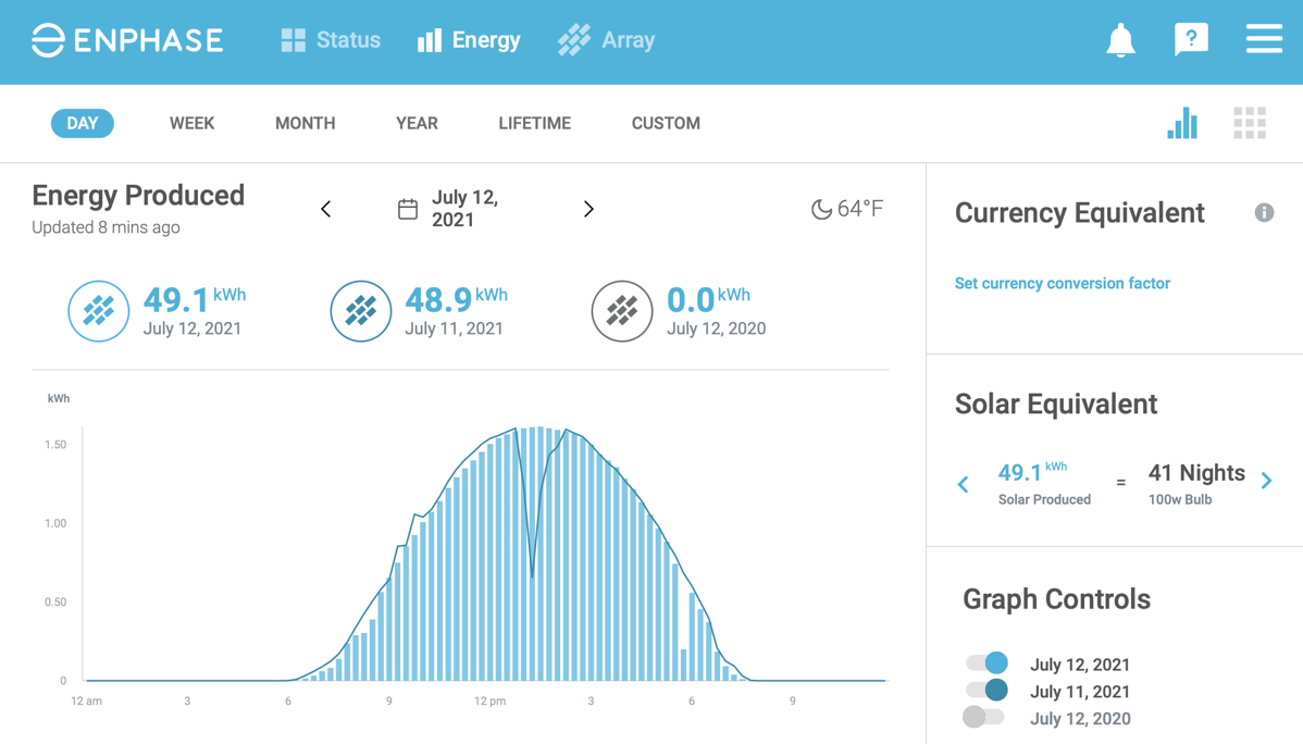
The Enphase app has three major tabs. On the Status tab for a current day, you can see the peak power, the total energy produced for the day, and see how it compares to the day before. Because they think you’re a moron, they show you how many hours you could have burned a 100W lightbulb for the energy you generated. Hint: it’s the kWh you generated divided by 100. It’s cute and was fun the first time I saw it but after the first time, I think it’s wasted space.
The Energy tab is where the real fun is. You get an hourly bar graph for the day you’ve chosen, with an overlaid line plot of the previous day if you like. It’s fun to compare day to day. The screenshot I put in the shownotes illustrates a day where we had a really nice curve hitting the peak of our system, but then a brief moment of clouds a little bit before 6 pm. The overlay of the previous day shows a huge dip down in energy production around 1 pm.
The last tab will be uninteresting 99% of the time, and yet is really important to check regularly, and that’s the Array tab. When you view the array, you see all of your solar panels in their physical orientation on your roof and you can see how much energy each panel/inverter has created over the day. Inverters evidently fail from time to time, so it’s important to glance at this tab regularly. Both Lindsay and Kyle had them fail and their frequency of monitoring the status of their inverters directly correlates to how much money they spent buying electricity instead of generating it themselves.
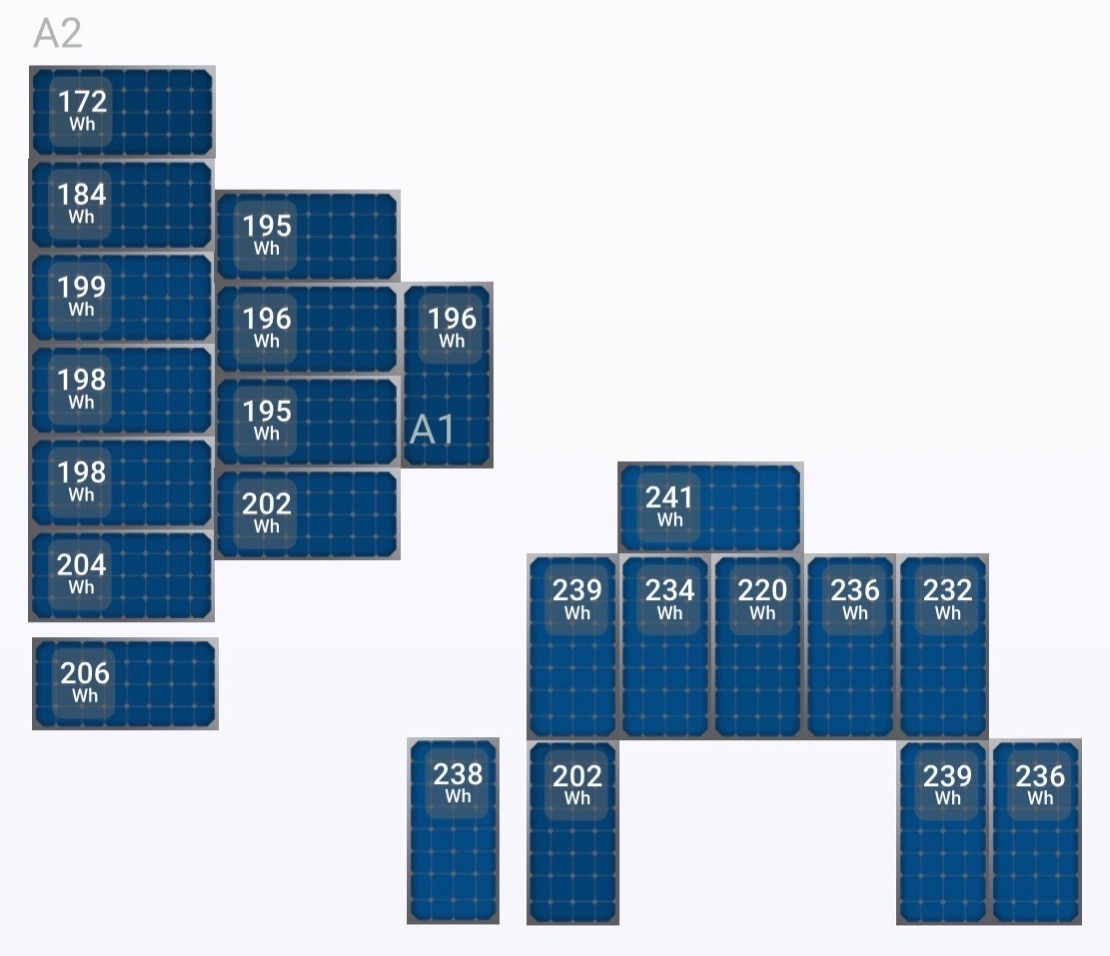
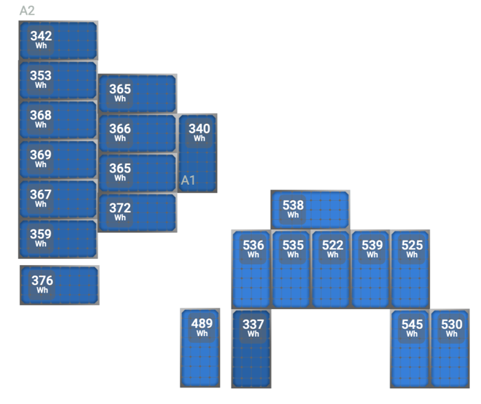
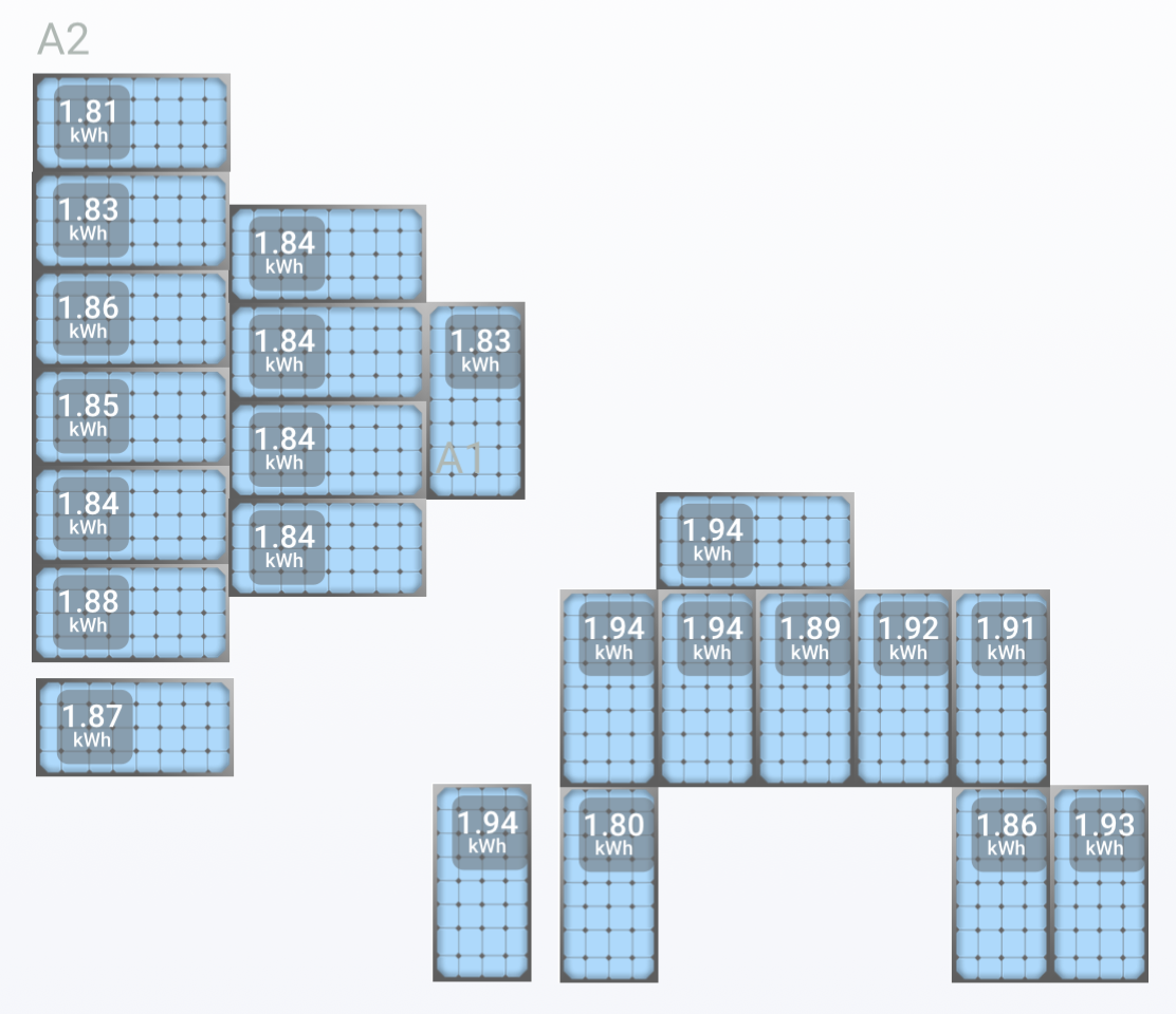
The array health tab lets you see at a glance whether every inverter is operating. In the morning, each little solar panel graphic is shown in dark blue, and as it gets filled with sunlight during the day it turns to a lighter and lighter shade of blue. At midday, our panels on the east roof are a darker blue than the ones on the south roof, and the panel shaded by the chimney in the morning is a darker blue as well.
While the color-changing aspect is useful for situational awareness of the health of the array, the numbers on the chart require math to interpret. Instead of showing the instantaneous power in kW, the panels show the energy in Wh they have generated over the elapsed time of the current day. This allows you to view your panels to see which ones are giving you the most benefit, which is most useful if you look at them after the entire day has passed.
The most interesting thing we’ve learned so far is that our west-facing panels are actually generating more per panel than our south-facing panels. Living near the coast in California, the most common weather forecast is, “Early morning low clouds followed by hazy afternoon sunshine.” In other words, the sun has a clearer shot at our panels in the afternoon than during earlier parts of the day.
Those three tabs are pretty much all you can get with the Enlighten app. In settings, you can turn on the currency equivalent so you can watch how much money you’re saving by generating energy, but you can only put in one rate for your electricity cost per kWh. Maybe you live in a place where Time of Use isn’t a thing, but we have a super complex system of electricity cost as a function of time, day, and season. It’s designed to encourage you to do things like not run your dishwasher or charge your electric vehicle between 5 and 8 pm. I’m not against it, but it’s super complicated.
In the summer, we have Peak, Off Peak, and Mid Peak hours where Mid Peak only exists on the weekends. In Winter, we have Off Peak, Super Off Peak and Mid Peak but it’s a full 7 days a week. I definitely won’t dig deeper into these details but the delta between these rates can be as much as 28%. In other words, the Enphase app allowing us to only type in one number for our cost per kWh is pretty much useless.
As cool as it is to see how much solar energy we’re collecting after you’ve spent a lot of money on panels you really want to be able to compare it to how much you’re consuming. Did I buy enough panels? Did I buy too few? Will I really generate more energy than I consume? The only way we had to answer this question was to stand at the electrical meter and wait until the display showed us the net power going back to the grid (generated – consumed). It was a bit tedious to stand outside looking at the meter and it seemed there should be a better way.
Sense to Measure Grid and Solar
Around this time, listener (and actual real-life friend from my workdays) Jamie Cox wrote a comment on my blog post that he has the same solar system we got and he started to give us some advice. We took it offline to email as it was getting pretty detailed, and pretty soon Steve and Jamie were firing off photos and graphs and getting super nerdy. I love it when my friends get to know Steve, and this was clearly two people talking the same language.
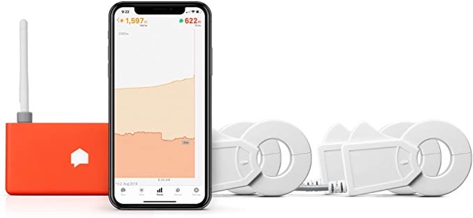
The main thing we learned from Jamie was a suggestion that we look into buying a Sense Solar. You may remember that at CES in 2020 I interviewed Scott Taylor, VP of Business Development about their Sense Electricity Usage Monitor. The device we saw at CES plugs into the breaker on your electrical panel and then has two clips that encircle the black and red main wires coming out of your main electrical circuit breaker.
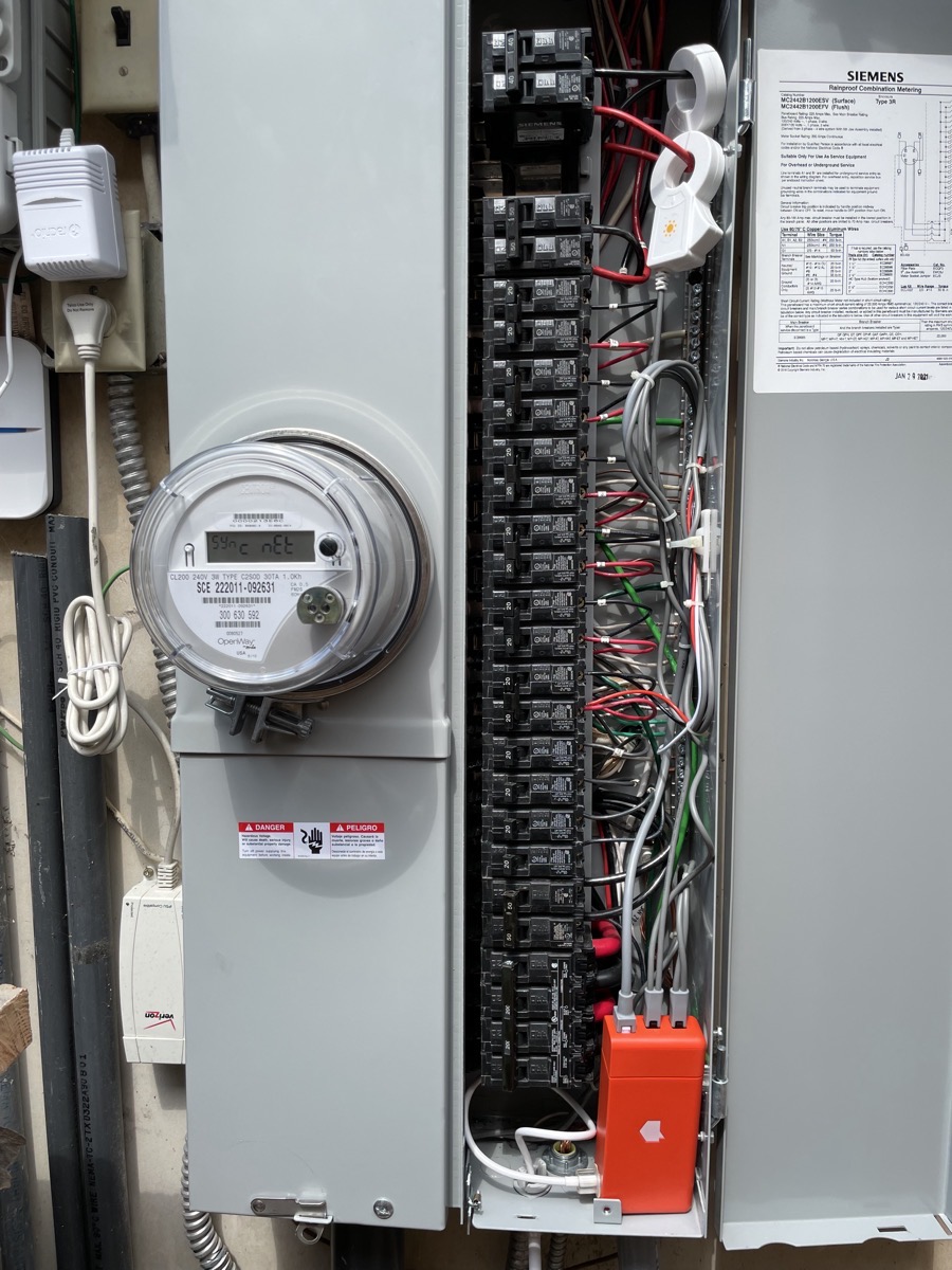
As Scott explained it to me at CES, the cool thing that Sense does is monitor your energy usage and builds a profile of how much energy individual devices in your house are using. Evidently, two different TV models will actually have different signatures for the waveforms of their electrical usage, allowing Sense to even tell you which TV is drawing how much energy. I was ready to buy one right away, but a few people who had installed Sense gave me feedback and said the machine learning model to figure out which devices were which didn’t work all that well.
Whether or not Sense does a good job of figuring out which devices are which, Jamie gave us good reason to consider buying the Solar version of Sense. He explained that if you buy the Solar model you can get that elusive metric we really want – a comparison of not just our generated energy but our consumed energy. Not only that, the graphs Jamie showed us were practically real-time, not this silly every 15-minute sampling nonsense we were getting from the Enlighten app. The Sense Energy Monitor with Solar runs $350 on Amazon right now.
The Sense with Solar comes with four clips – two to encircle your solar main wires and two to encircle your main breaker wires. It also comes with the Sense Monitor, which is a small orange box that reads the current traveling through those wires, computes the generated/consumed power, and transmits the data to the cloud. The data being sent to the cloud allows you to access the information from a dedicated mobile app or the web.
The instructions for Sense suggest an electrician install the device as you’re connecting into your breakers and turning off power. As handy as Steve is with this stuff, even he had an electrician help us hook it up, and he was glad he invested the money in having it done correctly.
As soon as the power and solar were flipped back on, we had instant gratification with our Sense Solar. The number of graphs with clear, actionable information is fantastic.
Turning Things On and Off to Measure Impact
From talking to Jamie, it sounds like Sense takes literally months to populate with good information about how much power your individual devices are using. In a few days of watching it, it has found two refrigerators so that’s something. However, we’ve found a way easier way to measure the impact of different devices. Turn them on and off.
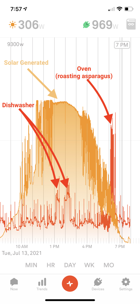
Steve turned the oven on to broil and we saw a massive spike. Our baseline total house power was running around 1,000W and when he flipped on the oven to preheat for a few seconds, the graph dramatically jumped up 1,900W! Seriously, our whole house was using half of what the oven wanted all by itself.
The Sense interface lets you pinch to zoom in and out, so you can obsessively watch the graph second by second, or pinch in and see a whole day on screen at once.
Looking at the entire day, I can easily identify the spikes in power usage. One day we ran the dishwasher which turns on the heating element in two different phases and I can see both peaks at around 1.2kW, and then I can see a giant peak for when Steve was roasting asparagus in the oven for me for dinner. The cool part of Sense Solar is that the energy consumed is superimposed on a graph of our energy generation.
Solar Generation
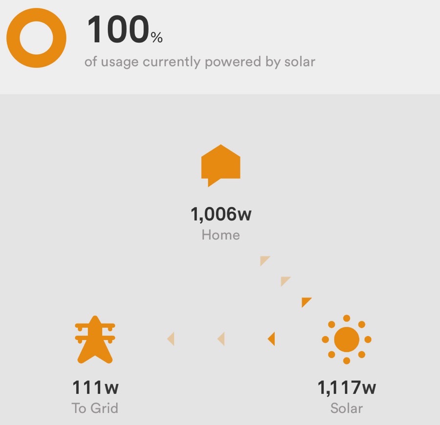
In a very rare turn of events, I had the opportunity to watch our solar production while it was actually raining in July in Southern California. It was a freak summer storm (lasted a couple of hours during which we got a massive 0.02” of rain.) While that’s not anything to write a blog post about, I discovered something else cool I can do with the Sense app.
When looking at the energy graphs, in the upper left there’s a little sun icon showing the instantaneous power generation. I noticed that while it was still fully overcast, it said we were generating 1117w of power. In a moment of childlike exploration, I tapped on the sun icon and discovered possibly my favorite graphic in the Sense app.
It’s a little graphic showing the power traveling between three icons: a little house, a sun, and an electrical tower representing the grid. It showed that while completely overcast, we were generating 1117w, and of that 1006w was powering our home, and the remaining 111w was going back to the grid. The little animated arrows showing the energy flow into our home and the grid made me so happy. This is what it’s all about.
Time of Use Data
I mentioned earlier that we live where our energy charges depend on the time of use. It reminds me of the 1990s when cell phone bills were broken down by the time of day. If you’re too young to know about this, we actually paid by the minute of talk time back then and we paid a different rate during the day, during the evening, and on weekends.
Anyway, back to time-of-use billing for electricity. Enlighten only allowed us to enter one single number for our cost per kW, but Sense has a section where you can type in as many separate rates as you want. I can’t believe Steve’s dedication. He typed in all eight sets of times, dates, seasons, and costs. I’m so glad he did because now there’s a new graph that’s even cooler.
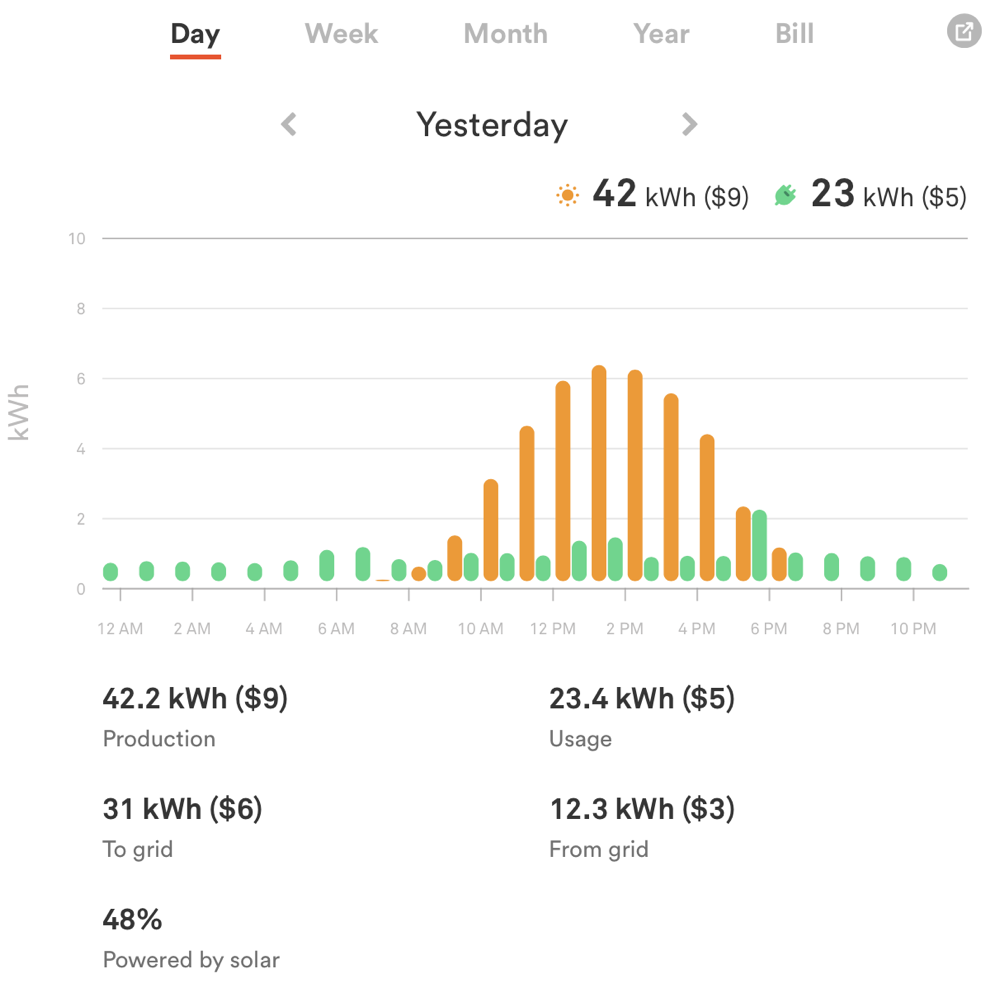
Below the cute animation showing how much energy you’re putting back into the grid (or taking out of the grid), there’s a usage graph by day, week, month, year, or bill. The graph is a cartoony representation of our up-to-the-minute graph, but below that, it has a bunch of metrics.
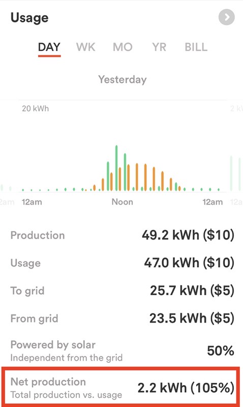
For the day, I can see our total solar production, energy usage, how much went to the grid during the day, and how much we took from the grid across the entire day. This is cool because it takes into account the energy we burned through when the sun was gone as well as while we were helping to power the grid. I can even see our net production.
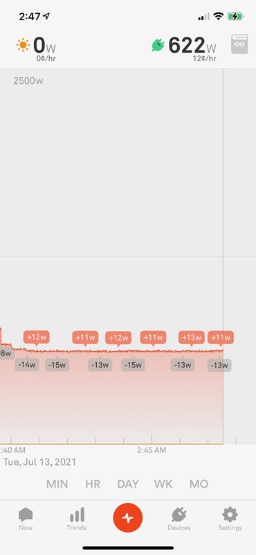
One night I happened to wake up around 3 in the morning, and discovered my phone in its charger was still turned on, and showing the usage graphs in the Sense app. This was a lucky accident because I was able to find out how much energy we’re consuming when we’re using absolutely nothing. They call this the vampire load – the cost of all the devices sitting in “ready to turn on because we’re too impatient to wait a minute” mode. TVs, DVRs, and all devices with a little light on them are all contributing to this baseline level.
It wasn’t nearly as bad as I thought it would be – we burn a little over 600w when we’re sleeping. That’s equivalent to having 6 100w lightbulbs turned on, David.
But What About Those Electric Vehicles?
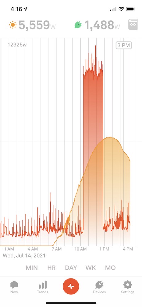
The graphs we looked at for the first few days didn’t include charging either of our cars. We don’t charge very often because we don’t really drive very much. We’re about to drive to San Diego though, so I plugged in Steve’s Tesla Model Y. He already had 200 miles of charge available, so I was adding only around 100 miles to charge it to 100%. Battery charging gets very inefficient when you’re past about 65% charged, so the last 100 miles took 2.5 hours.
During that time we were able to see from Sense that our energy usage went up by 9000W while the car was charging. Now the question is whether our solar generation was enough to cover that and our normal usage. I was impatient to get this article up so I didn’t wait for the end of the day and instead decided to do a little bit of math.
9000W x 2.5 hours = 22.5kWh
That sounds about right, as we have 75kWh batteries in our Teslas and I was charging it up by about a third. Now let’s see if we have 22.5kWh to spare in our solar generation.
Now here’s the amazing part. We had a pretty good day of solar generation at close to 50kWh, and at the end of the day, even with charging our electric vehicle up 100 miles, we still generated more power than we consumed. It wasn’t much, but we actually put 2.2 kWh back into the grid. I am amazed by that.
We sized our solar panel arrays to not only cover our current energy needs (including charging the cars), but we’re also having central air conditioning installed and we wanted a net-zero impact on the grid. With Sense Solar, we’ll actually be able to tell whether we have succeeded at that goal, without having to wait till the end of the month when we see the bill.
Bottom Line
I entitled this article, “Solar is For Data Nerds” and I think I’ve supported that statement by my level of enthusiasm. I can prove it one more way. At 4:15 pm on the first day, while we’d been using Sense to monitor our solar array and energy usage, both Steve and my iPhones were dead.
