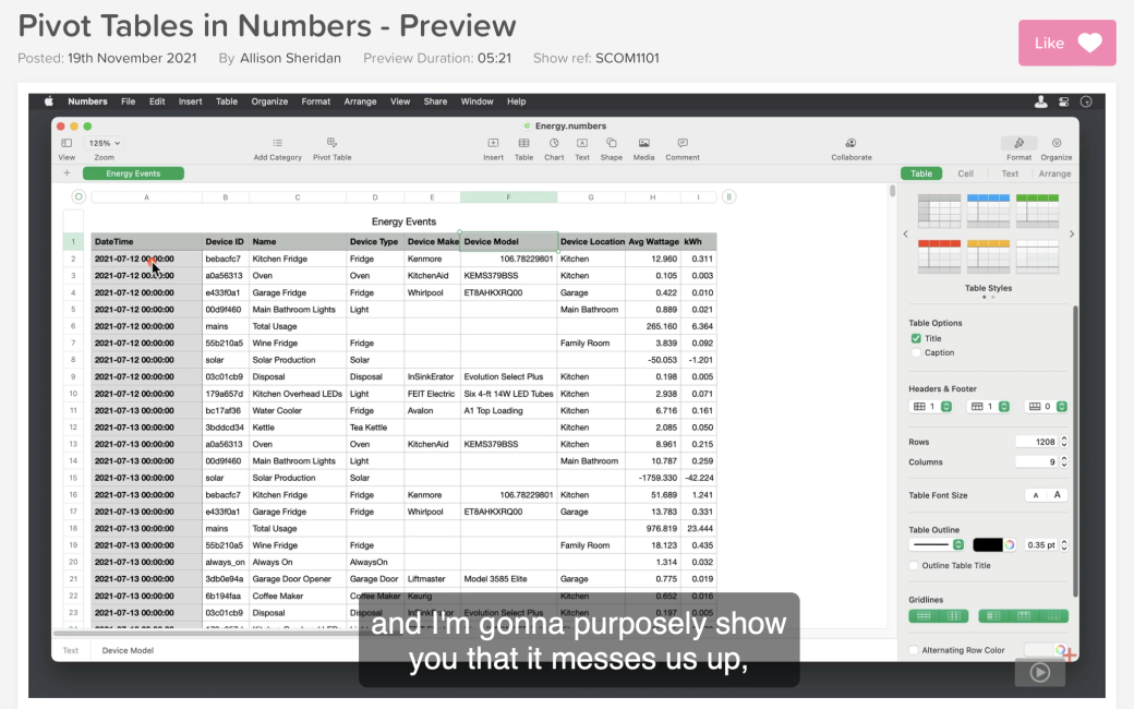
A few weeks ago I told you the glorious news that Apple had implemented pivot tables in Numbers. I told you with breathless excitement how much I love pivot tables and how thrilled I was. I then told you how to actually use them with a real-life example. I tried to convey my excitement in a way that would convince you that you, too, could know the joy of pivot tables in an app that comes free with your Mac.
I was so excited by the new pivot table capability, that I decided it was worthy of a video tutorial for ScreenCastsOnline. When I’m really excited about a tool, the video is so much easier to do. I showed how to do the same pivot table on the Mac, iPad, and iPhone, adding tidbits along the way to show how awesome they are on all of the devices.
While I was working on the tutorial, I happened to be chatting with Terry Austin on Telegram, and I mentioned that I was doing a new tutorial for ScreenCastsOnline. He told me that he really enjoys my tutorials. I took that as high praise because he does video tutorials himself so he knows how hard it is to do them well. Then I told him that the next one was going to be on pivot tables, and he wrote back one word: “Pass.”
I took a few paragraphs to tell him why they’re cool, and the problem they solve and gave a few examples, and then he said, “Hey, I’ve got these rosters of students I’m working with that are a real pain to manipulate, I wonder if pivot tables could help?”
Now think about the problem I faced with the rest of the ScreenCastsOnline audience! I have to hook them quickly. I came up with some good examples that I got into immediately:
- Perhaps you’re a system admin at a university and have a 3000 line spreadsheet with user IDs, class names, instructors, and testing requirements and you need to condense this down to some actionable information.
- Maybe you’re the manager of a large city’s intramural sports teams and you’ve got detailed data about the players, the sports they’re playing, the field names, and the coaches and you need situational awareness in case a storm is coming through town on how to contact people efficiently.
- Maybe you’ve been doing freelance work and you’ve downloaded all of your income and expense and you want to figure out where your income is coming from by category.
- Maybe you downloaded your health data for all your exercise and you want to obsess over it but you need to see it summarized by type of exercise with total calories burned.
Then I talked to Don McAllister who writes a newsletter where he describes the tutorial and I explained that it’s a tough subject to get people to watch and asked if maybe he could pump up the excitement. Luckily, Don is a big fan of pivot tables too. Here’s what he wrote:
I wanted to give a big plug for the full ScreenCastsOnline tutorial this week, Pivot Tables in Numbers. Pivot Tables are fantastic and their omission from Numbers was probably the reason I kept a copy of Excel on my Mac.
Pivot Tables just make it so easy to manipulate and analyze huge data sets and I can’t think of anyone better to illustrate that than Allison Sheridan. She is also a huge fan of those — heck, she even thinks using them is fun! So don’t be put off if you’re not a huge spreadsheet user; Pivot Tables have many uses and Allison’s enthusiasm for them shines through in this week’s show. Be sure to check it out.
If you’ve been hanging back on the subject of pivot tables and aren’t yet convinced, I hope you’ll take a look at the teaser video I’ve posted and consider trying out the free 7-day trial of the ScreenCastsOnline tutorial service so you can watch this tutorial and the amazing back catalog of content.

