I’m Addicted to Screenshot Apps
Hi, my name is Allison, and I’m addicted to screenshot apps. I’ve reviewed more of them than I can count over the years. A new one will come into my life and then eventually fade from my favor. I keep falling back to the tried and true, if limited built-in Screenshot.app in macOS paired with Preview for doing annotations.
I think my love of screenshot apps comes from my desire to teach and explain. Taking a screenshot is nearly always the beginning of a process, where step two is annotating it, and only then sending the screenshot along.
Most of the screenshot apps that bring annotation capabilities along also save your images into a library. I’m sure this is useful to some, but my needs are usually ephemeral, and if not, I prefer to save my screenshots to the Finder.
I’m a keyboard shortcut junkie, so the shortcuts for the built-in Screenshot.app work really well for me. If I know I’m going to just plop a screenshot into an email as-is, I’ll just use command-shift-control-4 to capture a portion of the screen to the clipboard ready to paste. If for some reason, I do another copy before I’m ready to paste, I know the screenshot is safely waiting for me in my awesome clipboard manager Copy ‘em.
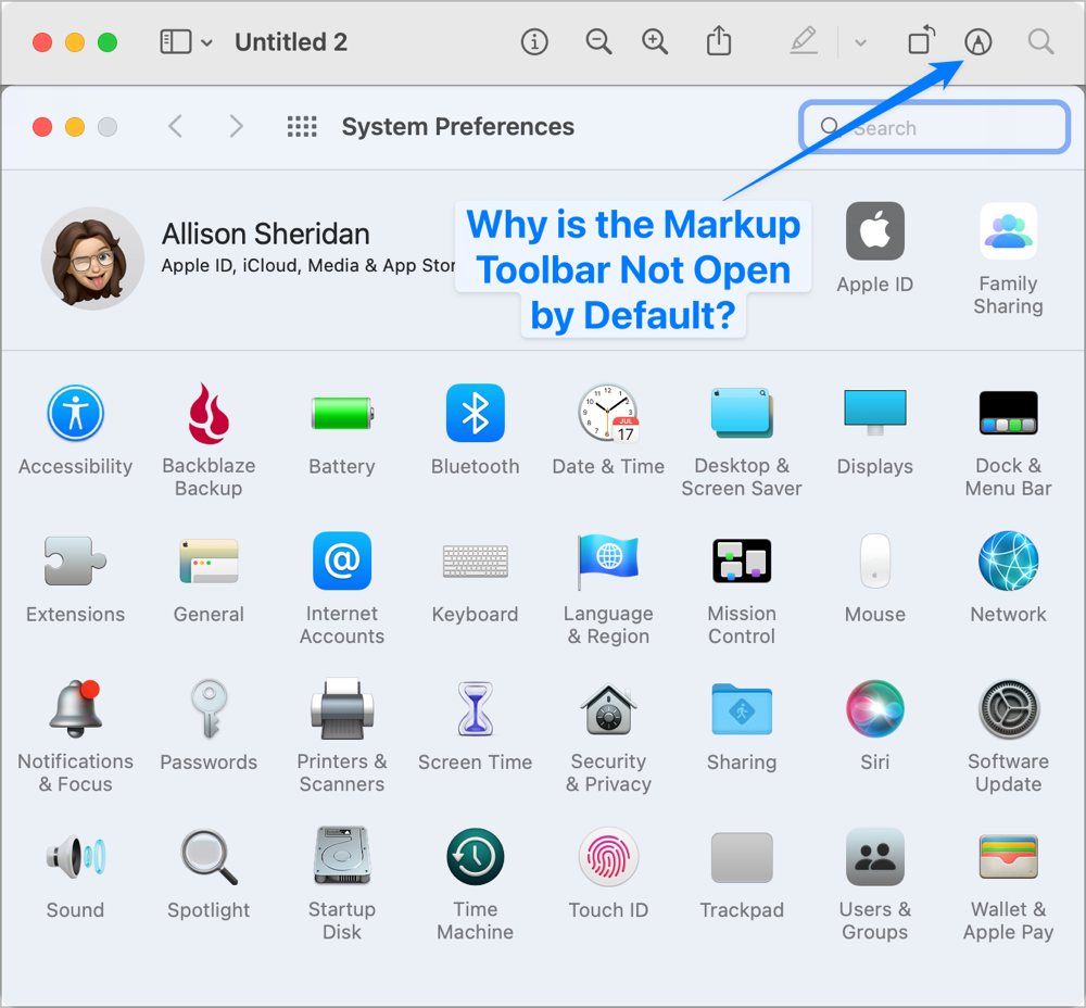
If I want to annotate my screenshot before sending, I use command-shift-4 to copy a region and have Preview open immediately ready to do my annotations. This works, and Preview does have annotations, but to be honest they are pretty irritating to use. I’ve mentioned my annoyance about this before, but for completeness, I feel the need to complain again.
First of all, the annotation tools in Preview aren’t available by default. You have to tap the little pen in a circle icon or use command-shift-A to show the Markup Toolbar. I find this so annoying that I spent about a week trying to write a Keyboard Maestro macro to automatically open it any time I opened Preview.
But what annoys me even more is how when you want to add geometry such as a rectangle or an arrow, it drops the geometry right on the image, requiring you to move multiple points to get the geometry into size and position. Every other app I’ve ever used waits for you to click and drag to precisely define the position and size in one motion.
The Markup Toolbar is also missing a really important annotation tool – there’s no blur. Obfuscating private information is a constant need and I end up drawing colored boxes instead, which looks unprofessional and also doesn’t leave the viewer understanding there was text underneath.
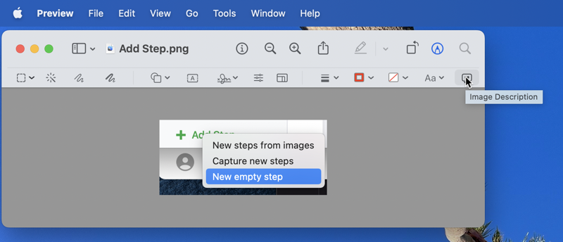
I want to give one shout out to Preview before telling you about my new favorite screenshot and annotation app. There’s an icon at the end of the Markup Toolbar in Preview that I only recently noticed. It looks like a thought bubble with a double quote inside it. I hovered over it and discovered it allows you to add an image description, also known as an alt tag, which will be read aloud to screen readers. Evidently, this was added into Preview in macOS Monterey but I missed the memo. In any case, that’s a pretty cool option. This would save the bother of adding it in every service where I post an image.
CleanShot X
Since I’m always on the prowl for a new screenshot and annotation tool, my little ears perked up when I heard people start talking with great enthusiasm about the app CleanShot X from cleanshot.com/.
CleanShot X can be purchased in a variety of ways. You can make a one-time payment of $29 which includes the app, a year of updates guaranteed, and 1GB of cloud storage to send shareable links of your screenshots and videos. CleanShot X is made by the same developer (MTW) as PixelSnap, so if you already own PixelSnap 2 because Terry Austin told us how cool it is, you can get 20% off the already affordable $29 for CleanShot X. They even have discounts if you have multiple Macs with price breaks the more you buy. They’ve got a 30% educational discount off the purchase price too.
If you’re a heavy cloud user or want to use CleanShot X with a team, there’s an $8/month plan for you. There’s one more way to get CleanShot X, and that’s through your Setapp subscription. You can’t say their pricing isn’t flexible, because there’s a plan for everyone.
What Can CleanShot X Do?
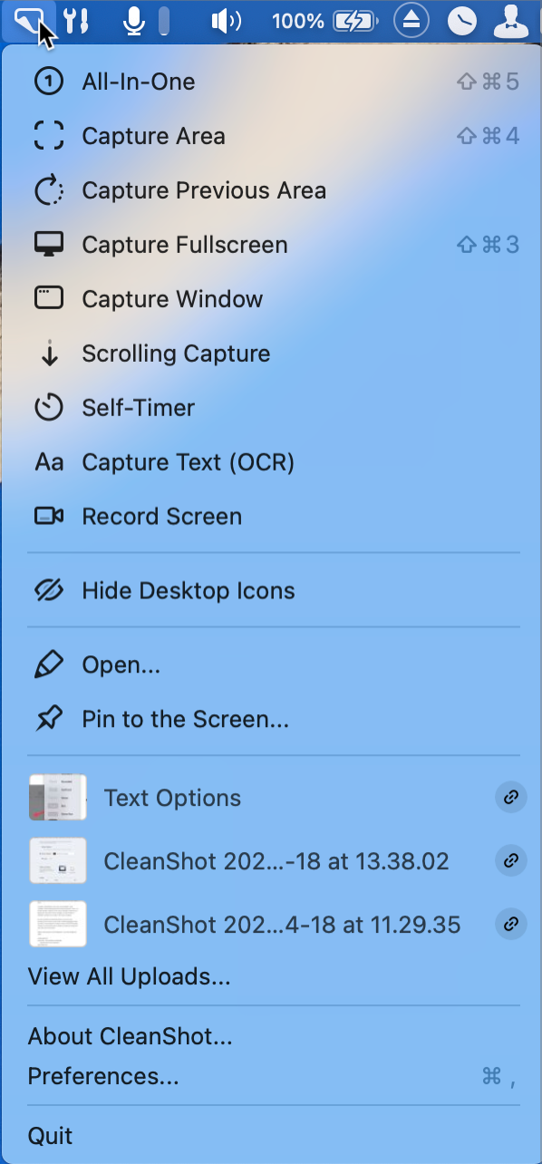
CleanShot X allows you to take screenshots, annotate them, save them locally or save them to their cloud service that comes with your CleanShot X license. While it does the standard types of screenshots such as area, full window, and timed screenshots, it can also do what they call scrolling screenshots. This allows you to capture an entire web page or a long document as one screenshot. That’s a pretty nifty feature.
It also has the capability of doing OCR of text. You simply invoke the OCR tool, drag across some text and you’ve immediately got it captured to your clipboard. I’ve been using the awesome tool TextSniper I told you about last June to do this, and I find it super useful. You might be thinking the built-in feature for grabbing text from images in macOS Monterey had Sherlocked that need, but both TextSniper and CleanShot X do a much better job.
CleanShot X can also record video of your screen either to a video file or as a GIF. Given the correct permissions, CleanShot X can record not just the screen, but also capture your microphone, the computer’s audio, and your camera for a circular picture-in-picture effect. It can also capture mouse clicks, and even keystrokes to be viewable on the screen.
Before capturing an area, you can change the size to match a standard aspect ratio such as 4:3 or 16:9. I like to capture small areas pretty often but in other tools, I always end up sending these odd aspect ratio videos so this feature will help me a lot. It even remembers the aspect ratio you’ve chosen from video to video.
When you’re done capturing a video, you can change the relative volume of your mic and the computer’s audio, you can choose whether to have the two audio streams on separate tracks for later editing or whether to merge them, and you can trim the audio. I’m astonished at the video capability in such a $29 app.
You can access all of these different types of screenshots from the menu bar app for CleanShot X, or if you invoke the keyboard shortcut for what they call “All-In-One”, you get a floating window allowing you to pick and choose which kind of screenshot or video recording you’d like to do.
Why CleanShot X Might Stick
I’ve often wondered why I abandon screenshot apps after a while, and I think I may have discovered the answer. It’s easy to fall back to the built-in tools because of the keystrokes to invoke them. CleanShot X has a very easy onboarding process that changes all that. When you first launch CleanShot X, it asks you if you want it to be your default screenshot tool. If you say yes, it tells you to open System Preferences → Keyboard → Shortcuts → Screenshots and to uncheck all of the keyboard shortcuts for the built-in tool.
As soon as you do that, those same keyboard shortcuts are enabled for CleanShot X. For example, I can hold down command-shift-4 and take a screenshot and instead of Preview opening, CleanShot X pops open to its annotations window. I’m still in the honeymoon stage, but I think having CleanShot X respond to my decades-long muscle memory might just make it sticky enough to last.
How is CleanShot X Fundamentally Different?
CleanShot X isn’t just a better screenshot tool, and it’s not just a better annotation tool. The interface to use CleanShot X works more the way I want it to work. All throughout the tool, there are features that feel like a smoother version of the built-in tools.
A tiny example is that when you take a screenshot with the built-in tool and Preview opens, after you save the screenshot, it stays up on screen. Sometimes that’s desirable, but usually after I save I want it to go away. With CleanShot X you take the screenshot, annotate it, save it and it vaporizes. If you simply copy the screenshot with Command-C instead of saving, it also vaporizes. If you want it to stick around for a while, you can pin it to the screen so it doesn’t disappear.
In contrast, with Preview on a screenshot, I do the annotations, then I have to select all with command-A, copy with command-C, and then paste where I need it. After I’ve copied it, that screenshot stays up on screen and unsaved, and Preview belly aches when I try to close it because I haven’t saved it. I taught myself the command-delete trick to push the delete button on that save-as dialog that comes up, but it’s a lot of faffing about. The workflow of CleanShot X to simply hit Command-C and move on works much better for me.
One more vaporize option – if you take a shot and don’t like it, just hit the escape key to make it pine for the fjords.
You aren’t restricted to one pinned screenshot either, you can pin as many screenshots to the screen as you like. When I’m proofing shownotes that Bart has written if I have a question on a section I’ll just pin it to the screen waiting till we get on our call and after they’re resolved I can close any I’ve made and I never had to save a file anywhere.
That’s just one example of how CleanShot X feels fundamentally more efficient, at least for the way I want to use it.
A Veritable Cornucopia of Preferences
General Settings
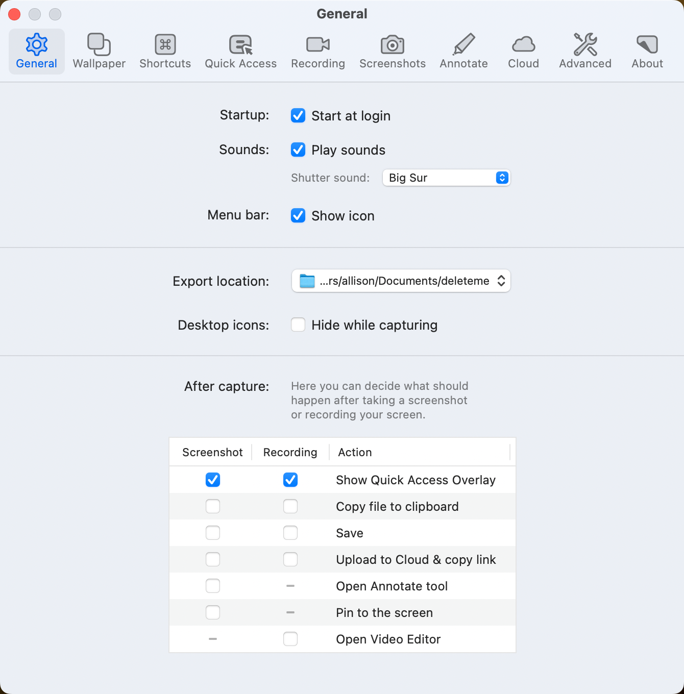
By default, when you take a screenshot, you’ll see a tiny Quick Access Overlay in the bottom left of your screen. If you hover over the overlay, you’ll see buttons to copy or save the image to your default location, close, pin to the screen, open the annotation tool, or upload the image to CleanShot Cloud.
CleanShot Cloud is a pretty nifty service. With the standard purchase of CleanShot X (or via Setapp), you get a 1GB cloud account as I mentioned earlier. When you upload to CleanShot Cloud, you’re immediately given a link to send to people of the screenshot. A lot of web forms to get tech support don’t allow the uploading of images to illustrate a problem so I plan on using links to CleanShot Cloud when I run into that roadblock. There’s a nice web interface to CleanShot Cloud so you can tag and name images, and even delete images to keep it tidy.
Back to the Quick Access Overlay. While the Overlay has all the options you might want, it’s somehow not satisfying to me to see such a small thumbnail of the image I’ve captured. The first thing I did in the General Preferences for CleanShot X was to check the box to automatically open the Annotate tool when I take a screenshot, instead of the Quick Access Overlay. That toggle was what gives me the behavior I described earlier.
Now I get to see the full screenshot to make sure I’ve captured the right area, and I can jump right into using the annotations tools. If I don’t need to annotate this particular capture, I can just hit Command-C and go on my merry way since we already know CleanShot X will close automatically.
If hitting Command-C is too much bother, there’s a checkbox in General Preferences to automatically copy the screenshot (or recording) directly to the clipboard right when you take it. If you’ve got it set to open the Annotate tool when you’re done, you can simply look at the image and then hit escape to go on your merry way.
You can also set CleanShot X to pin your screenshot to the screen by default, or upload to their cloud service and copy the link. If my description of loving how it vaporizes gave you a cold chill, don’t worry, you can tailor it to your workflow.
Wallpaper Settings
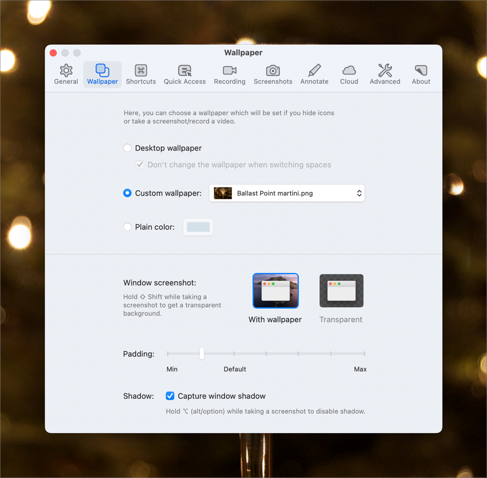
If you’re a messy desktop icon person, in General Preferences you can check the box to hide desktop icons while capturing. Another option to class up your screenshots is to have a drop shadow with a professional-looking desktop background (instead of the cute one of your puppy). These options are available in the Wallpaper tab of Preferences. Toggling this setting means no more looking for that pesky defaults write command to disable and enable the default shadows for the built in tool.
One warning about these options; wallpaper and drop shadow are entangled preferences. If you enable wallpaper, custom, plain, or your normal wallpaper, it won’t show up in your screenshots unless you also enable Capture window shadow in the same preference pane.
I like that the shadow option is a toggle, and I really like that you can set how much padding you want on your drop shadow. I also like that you have the option of a transparent background to your drop shadow rather than any wallpaper at all. No matter how you like your screenshots, you’ll find a combination you like in CleanShot X.
For the Shortcut Junkies
If you’re a shortcut junkie, CleanShot X is filled with them. Many are pre-assigned, but there are even more you can add. For example, from the menu bar app, there’s an option to “Open from Clipboard” which works great but I was cross that there wasn’t a keyboard shortcut for it. No worries, in Preferences you can add a shortcut for that option and many more.
I haven’t told you about the annotation tools yet, but all of the tools have keyboard shortcuts too. That’s something I would have loved to have in Preview. I’m now using CleanShot X to annotate pre-existing PNGs, and in fact in the Finder Get Info window, I told macOS to open all PNGs by default in CleanShot X.
Quick Access Preferences
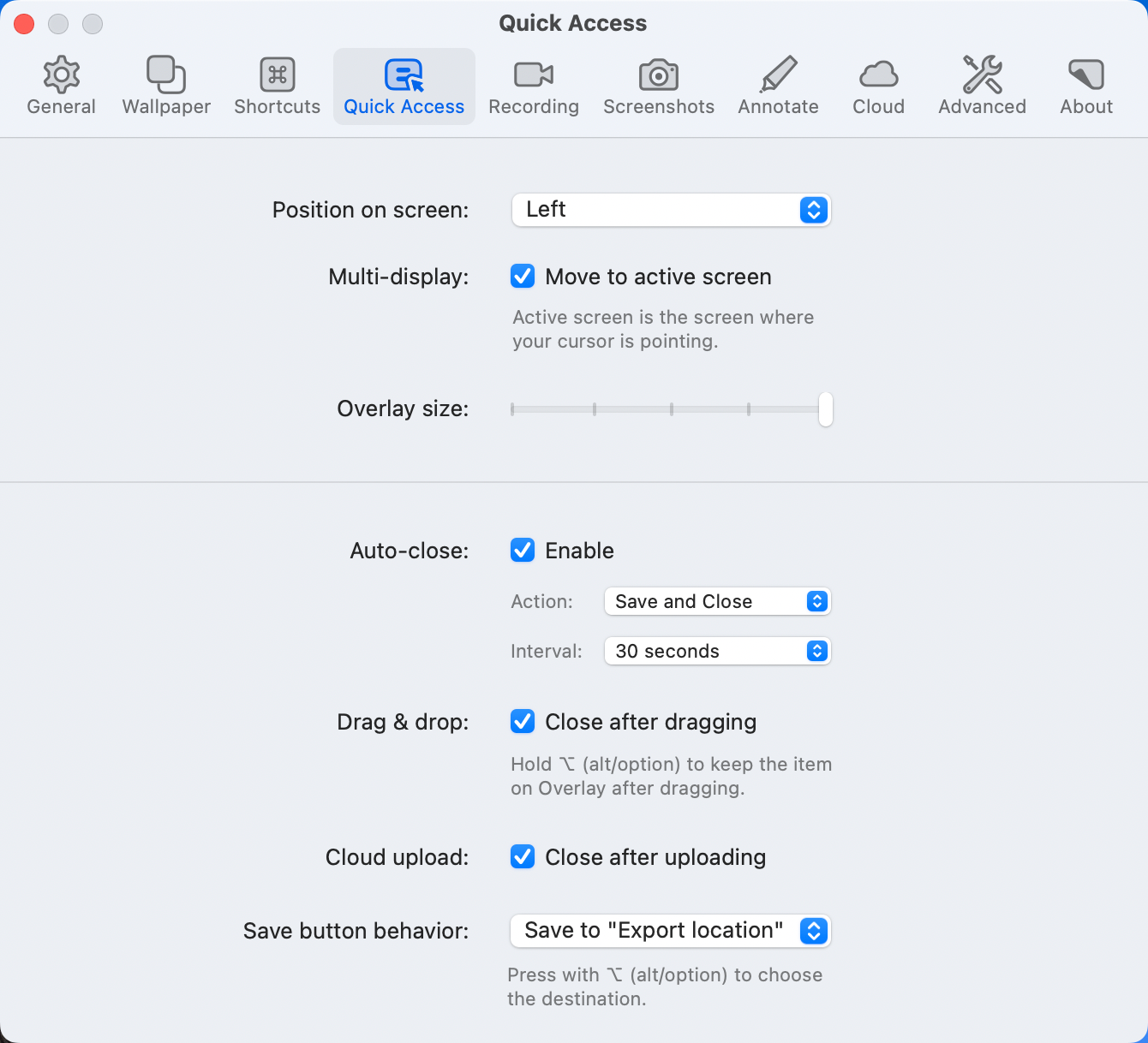
I’m not a huge fan of the Quick Access Overlay, as I already mentioned, but it’s quite possible that if I spent some quality time in the Preferences for this feature I would come to appreciate its value.
You can change the position of the Overlay on the screen, and you can change its size so it’s not a postage stamp. Another thing I didn’t like about the Overlay is that you simply must dismiss it, but in Preferences, you can actually tell it to auto-close after a time period of your choosing, and what it should do when auto-closing – save and close, or just close.
I make no promises but the Overlay is much more useful to me with some of those settings tweaked.
Screen Recording
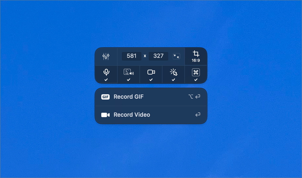
Screen recording options are controlled in three different panels of CleanShot X preferences: General, Video, and GIF. On the General tab, you can globally choose whether to show the cursor, highlight clicks, and show keystrokes, but you can also change these options on the fly as you start recording the screen.
In Recording preferences you can change whether to see those controls on the fly, whether to display the recording time in the menu bar and how to deal with scaling of retina videos.
I can’t tell you how many times I’ve been in the process of recording my screen when a notification pops up and wrecks it. With CleanShot X there is an option to enable Do Not Disturb automatically while recording. I worried that it might not work with Apple’s new Focus Mode in macOS Monterey, but in my testing, notifications absolutely did not appear while I was recording. Yet another reason to love CleanShot X.
In the video tab (which is different than the GIF tab), you can set the max resolution to reduce file size and upload time. Based on my experience with other apps, if your machine is at all underpowered, I’d suggest keeping the max resolution set to original and then scaling the video down after capturing it. Forcing your computer to transcode to a lower resolution while also recording will definitely challenge your system. You can set the video frame rate, and allow CleanShot X to open the video editor immediately after recording.
If you agree to let CleanShot X install a small driver, you can capture computer audio with your video captures. It’s an experimental feature at this time, so if it doesn’t sound right, they ask you to report the problems and they give you a button to uninstall the driver. There’s a toggle for whether to merge your voice and the computer audio onto one track or whether to have them on separate tracks which can be handy if you’re going to edit in an external editor.
GIFs only have a few options – you can set the frame rate, the quality, and the default resolution. To be honest, I haven’t thought up a use case to use a GIF for screen capture. Not that many funny things happen on my Mac. Well, I should say not that many” funny ha-ha” things happen; plenty of “funny weird” things happen! If you can think of a reason a GIF would be useful, I’d sure like to hear about it.
Even Screenshots Have Preferences
By default, CleanShot X saves screenshots as PNGs (which is the most efficient format for screenshots) but you can change it to JPG in preferences if you like. Just as with video recordings, you can scale your retina screenshot to 1X but I can’t think why you’d want to do that. Sometimes it’s nice to have a frame around a screenshot if you’re embedding it into other materials, so CleanShot X allows you to add a 1px border to all screenshots.
You control the self-timer interval within preferences with options from 2 to 15 seconds. One of the reasons to use timed screenshots is to catch an app “in the act” so CleanShot X has an option to freeze the screen when taking a screenshot.
I really like CleanShot X’s default screenshot behavior of showing crosshairs for where I’m capturing and showing a magnifier of the cursor position. This allows me to be certain to get exactly the region I desire. If for some reason you don’t like that behavior, you can disable it in preferences.
Annotate Annotate Annotate
As much as I love all of the capture methods and options of CleanShot X, I don’t want to shortchange telling you about the awesome annotation tools.
CleanShot X has the typical annotation tools such as rectangles, ellipses, lines, arrows, and text. But there are so many nice little touches to how they work that add up to why CleanShot X is so amazing. Have you ever taken a screenshot and needed to add an arrow or some text, but you didn’t leave enough room in the screenshot for the annotations?
With CleanShot X you can literally color outside the lines! Draw an arrow starting outside the screenshot, and the annotation editor simply expands the image with a transparent background to accommodate it. This might be my single favorite thing about CleanShot X.
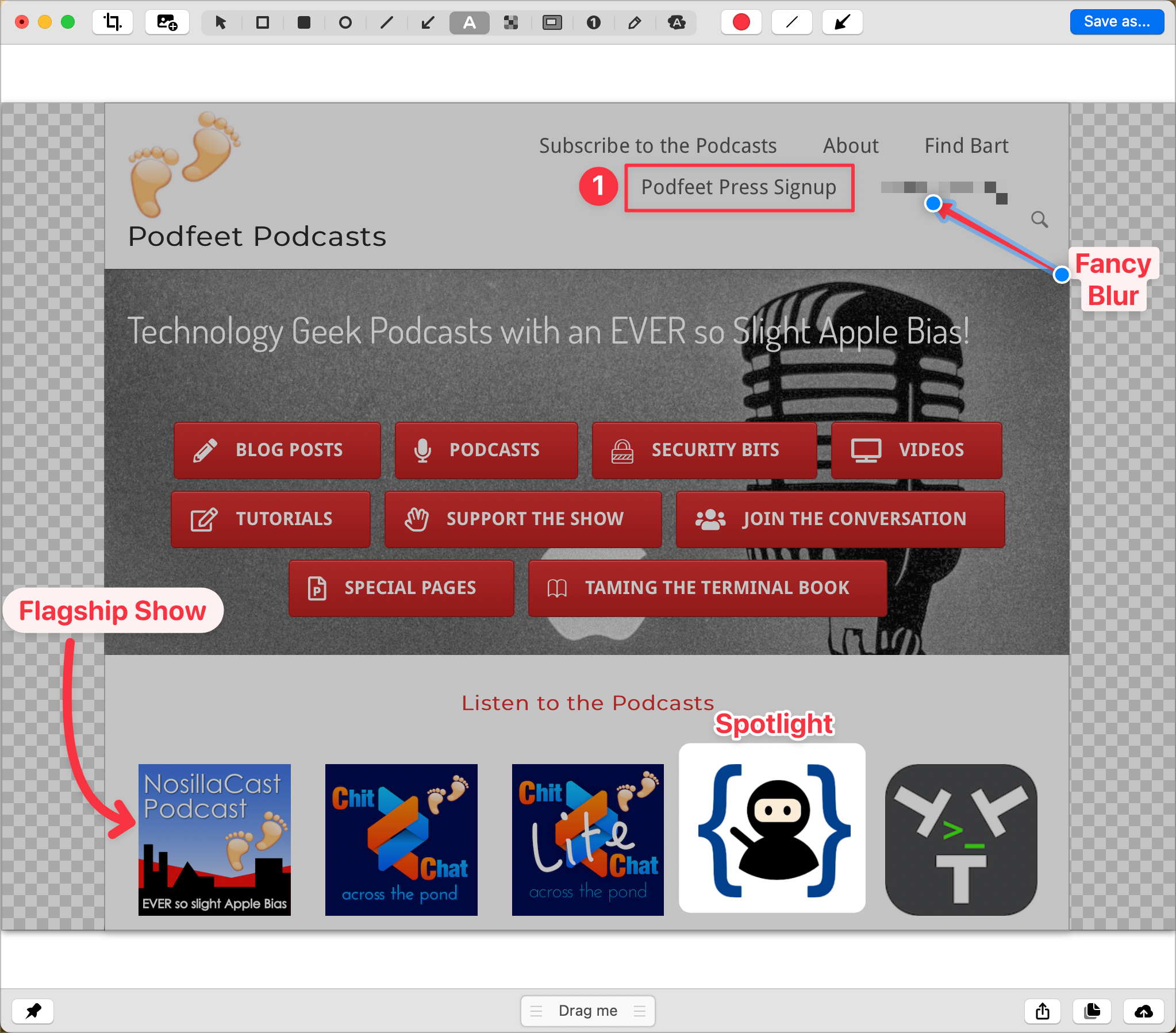
In the intro, I explained that the markup tools in Preview lack a blur tool for obfuscating personal or distracting parts of your screenshots. CleanShot X has you covered with a simple and easy-to-use blur tool. Just drag across a region and then move it around or resize as needed.
There are times you’re not as interested in hiding information as you are in drawing attention to specific things in the shot. With CleanShot X you have two options. There’s a fairly traditional highlighting tool, but better yet there’s a spotlight tool. With the spotlight tool, you drag across a region and it keeps the brightness up around that region in a nice rounded rectangle but dims the rest of the screenshot. You can spotlight as many areas as you need, and you can even control how dim the rest of the shot becomes.
The text annotation tool is interesting. It’s got some cool features but it’s also rather limited in another way. You can format your text by size and color, but you can’t choose from all of your fonts.
Instead, you can choose between standard and monospaced, you can have the text outlined which looks sort of cartoony to me, but you can also have the text inside a nice rounded rectangle box or a fully rounded pillbox. The background of the boxes is a very light shade of whatever font color you’ve chosen. For example, red text will be in a pink box. I know that sounds revolting but it’s actually pretty nice. I would prefer to have a little more control over the font options but it’s a passable method of annotation.
The other interesting effect is that when you plop in some text, you’ll see a smiley face icon above the text. If you click the smiley face, you’ll be shown the emoji picker to add to your text or in place of any text.
In my review of the tutorial guide application Folge (more than a screenshot tool) I mentioned that I really liked that it included little numbered bubbles so you can illustrate the order in which the viewer should follow your described steps. I also said it was cool that Oleksii made it so if you delete a numbered bubble, it would automatically renumber the rest. Well, CleanShot X does exactly that too! I’ll still reach for Folge when I need to do a long-form tutorial but for a single screenshot, CleanShot X will be great.
Taking the numbered bubbles up a notch, you can change the size, and even change them from numbers to letters to Roman numerals and set the starting number. This delights me.
Fairly often I wish I could combine two screenshots together. Before CleanShot X I would take the two screenshots, save them, wait the 22 seconds it takes Affinity Photo to launch on an M1 Max, copy one shot to the other, then change the size of the image canvas, slide the second one in position and then save the image out as a new PNG and quit without saving the Affinity Photo file. I had to REALLY want to have two images smashed together to go through all that work.
With CleanShot X there’s a simple button to add a screenshot to an existing one. You can’t add another full window screenshot but you’re invited to drag across a region on the screen and it automatically puts the new image below the original. If it’s too close for comfort, you can drag it farther down, or even drag it to the side or top and CleanShot X will resize the canvas automatically. This will be a huge timesaver for me.
I should mention that if you think it’s a disadvantage for some unimaginable reason to have the canvas expand automatically, you can disable that in preferences. Also in preferences, you can turn on color names, which is super helpful for those with color blindness.
I’ve mentioned a few times that you can pin screenshots to the screen so they don’t vaporize. They look a little odd floating without any kind of shadow or outline, so in the advanced tab of preferences, there are three checkboxes specifically about pinned screenshots. You can affect whether pinned screenshots have rounded corners, shadow, or a border. While the rounded corner checkbox does round and square off the corners when toggled, the shadow and border checkboxes did not add a shadow or border for me when I first tried it.
CleanShot X isn’t a buggy piece of software so I suspected there was something else at play. I went back to the screenshots Preferences and tested a theory. I checked the box to add a 1px border to all screenshots and then took a new one and pinned it. Sure enough, the pinned floating screenshot had a border on it. I went to wallpaper preferences and turned on the shadow option and that also made my newly pinned screenshots have a shadow.
You know me with stuff like this, I had to run a final experiment. What if prefs said to have a border and a shadow, but pinned screenshots didn’t say to show the shadow and border? The results are mixed. I got a border, but no shadow when I pinned a new screenshot.
I wish that these two features were independent as the controls imply. I don’t like a shadow or a border on my images as a general rule, but pinned screenshots are a little disconcerting just floating without any kind of border. I did have to find something to complain about with CleanShot X or you would never believe all of my raving about it!
When you’re happy with your annotated screenshot, there’s a “Drag me” handle at the bottom inviting you to simply drag it into whatever communication method you’re using.
Also at the bottom right, there’s a typical share sheet icon, a copy icon, and an icon to share the image to CleanShot Cloud while copying the link in one single step. You’re immediately ready to paste into any medium.
One more thing on the annotations window. All of the tools are available via VoiceOver. It’s good that all of the buttons are labeled, and as I said they all have keyboard shortcuts as well, but I’m not sure how you’d annotate an image if you can’t see it. I have learned never to underestimate the visually impaired so maybe there is an effective way for them to annotate a screenshot.
Bottom Line
The bottom line, as you’ve probably gathered, is that I’m besotted with CleanShot X. If I ever abandon my Setapp subscription, I’ll definitely buy this app outright. I might even do that while I still have my Setapp subscription. I’ve been known to buy apps I found in Setapp that I use all the time so that the developer actually gets the love directly.
If CleanShot X sounds like it might meet your needs, go check it out at cleanshot.com/….
