
Back in March, alert reader Anthony Walla noticed something annoying about the Podfeet home page when viewing it from his iPhone 11 Pro.
You know how I have a graphic of a MacBook with big red buttons for the various categories of content on podfeet.com? When I first designed that look, I took great care to test usability on all different sizes of screens. I made two nice rows of red buttons on wide-format screens like tablets and laptops, and they collapsed into a vertical column of buttons on the small screens on phones.
But over time, I’ve added a few more buttons to help surface the awesome content Bart creates. I remember adding the “Special Pages” shortly after Bart wrote a long, detailed article on Chit Chat Across the Pond about GDPR. We wanted a way people could get to that content more easily. To be honest, I haven’t designated too many things with that moniker, but it includes:
- My Privacy Policy
- Bart’s DNS Resolver article
- Dorothy’s Programming By Stealth Index
- My mammoth iOS 11 Mind Map of Doom (™Donald Burr)
- My Live Show Setup which is really there for me as a reference guide when things go wrong
- A reference guide on how to bypass a Verizon FiOS router to use your own WiFi router to control the network
- NosillaCast Live which is available everywhere
In addition to the Special Pages button, I later added one for Security Bits, figuring that’s such a good reference resource it should be available at a push of a button rather than filtering through Blog Posts to find it.

And then Bart, Helma, and I collectively created the Taming the Terminal Book from the internationally famous podcast, and I made that its own button. I’d honestly forgotten it had its own button on the front page and I always go hunting for it!
Each time I added a new button, I should have been rechecking to make sure that no device had trouble viewing the home page. But I never once did that. Tony sent me a note with a screenshot showing that all of the buttons after Support the Show were missing, so he couldn’t Join the Conversation, see the Special Pages, or download the most awesome Taming the Terminal Book button.
I wrote back and patiently explained that his phone screen was just too small, and he simply had to scroll to see the rest of the buttons.
Tony sent a second screenshot that illustrated that it wasn’t a scrolling-on-a-small-device problem – the buttons really aren’t there. In the second screenshot, he scrolled up so that you could see the content below the buttons, and sure enough, the grey MacBook was cutting off along with the buttons right below Support the Show.
I let the problem simmer in the back of my mind for a few weeks, dreading trying to figure out why this was happening. Finally, I jumped in to fix it.
I use a WordPress theme called SiteOrigin North to design my website, and it has a tool (still in WordPress) called Page Builder where you can build a custom static home page. It works well but it’s a bit janky to work with if you’ve been out of it for a while.
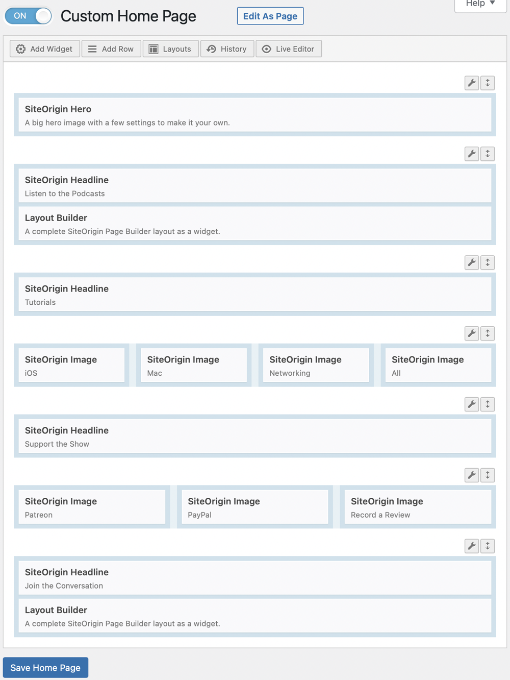
The Custom Home Page builder lets you lay out rows of content with little blocks representing different types of content. There’s a term in the “biz” called a Hero image. That’s when you have a giant background image on top of which you put other content. My MacBook grey cover photo is the Hero image, and I add the text saying the tag line and an area for the buttons. Each button can be configured to go to another page or content on the same page, and the size and color, and icons on the buttons can be individually modified.
I looked through all of this and for the life of me couldn’t see why the buttons were cut off but only on smaller-screen devices.
The good news is that SiteOrigin gives the theme away for free, but you can pay the grand sum of $29 for premium support via email. I shot off an email to SiteOrigin at 8:33 PM, and at 8:51 PM my new friend Alex S from SiteOrigin responded with the solution. Somewhere along the line, I had set a static height for the graphic which was shorter than the room necessary for all of the buttons when stacked vertically on mobile.
After I got that part fixed, I noticed that there was a huge gap below the grey Hero image, and Alex helped me get rid of that too.
I used another tool to verify that Podfeet.com would look good on pretty much any device. The tool is called Sizzy from sizzy.co/…, and Helma from the Netherlands tipped me off to it. It does a lot of other things, but one thing it excels at is showing you a website on many different screens at once. You can see Podfeet on an iPhone 12, Google Pixel 4 XL, Galaxy S10, and a MacBook Air all at once.
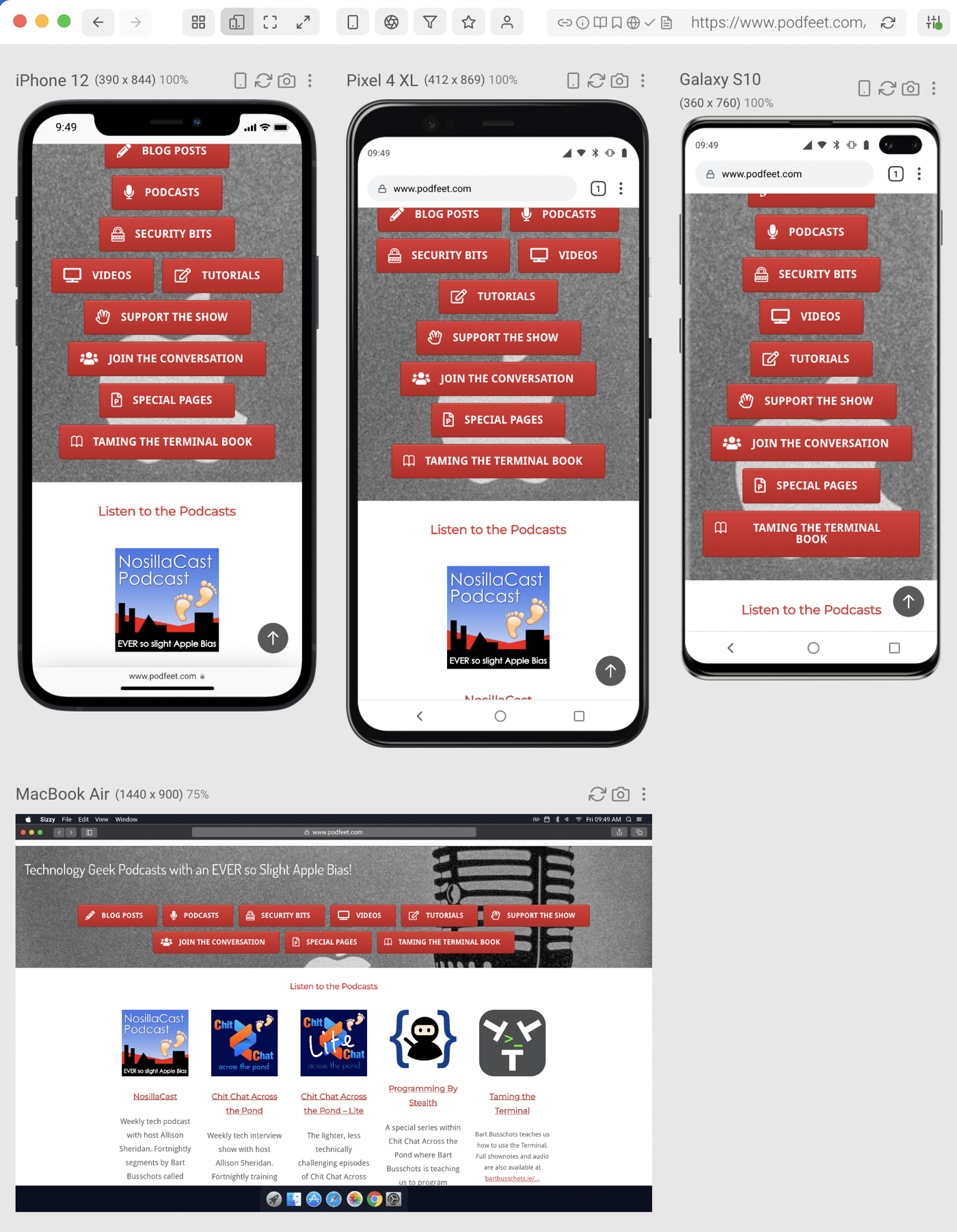
Sizzy is expensive for my minor use of it at $7/month or $199/year but it’s also in Setapp so I get it for my $10/month for all the other tools. I really should spend some more time investigating everything it can do, because there are at least a dozen buttons I’ve never pushed in Sizzy that probably do cool things! For example, I just noticed there’s a rotate button so you can check each mobile device in portrait and landscape, and you can even take a screenshot of each device.
The bottom line is that I’m super happy that Tony wrote to me about this problem, and I wish someone had pointed this out a lot sooner if they’d noticed it. Be like Tony and write to me if you see something wrong! I may not be able to fix it, but I’ll try. I really liked Tony’s response when I explained to him what I found and how I’d fixed it:
This is why I like following you. Not only did you respond to say you fixed the issue, but you also shared the detail of how you fixed it!
I think the home page of podfeet.com looks much better now, and have you also noticed how fast it is???


Allison, good going! You can improve the consistency of the buttons by making them the same width.