Sometimes when I’m noodling what to talk about on the show, I bring up Launchpad and just scroll through all of the pages of pretty app icons for inspiration. I’ve been podcasting about tools for the Mac and iOS for so very long that this is normally a fruitless effort. But this week as I flipped through my apps, I discovered one I’d been using for ages, and yet oddly I’d never gone through it in detail. You may have heard of it — it’s a long-time Mac favorite — called Moom from ManyTricks.com.
Moom solves several problems.
- Do you like your windows “just so” and get twitchy when they get moved? Moom can memorize the location of a set of windows across applications and put them back in position if they get disturbed.
- If you change contexts throughout your day and want a different set of app windows arranged for each context, Moom can memorize them all.
- Moom will let you drag a window to the edge or corner of the screen for a quick snap to half or even quarter screen.
- If you’re a little bit more fluid in your window management, and you’d like to be able to center a window temporarily and have another window pop into a tall column, and a third window in the bottom left corner, you can do all of this with hot keys or with your mouse.
- I don’t know if window management is important for the visually impaired, but in my experiments, Moom was pretty darn accessible. I found a few buttons here and there that were unlabeled but overall menus read out loud without excessive verboseness, dropdowns were selectable, and all controls worked as expected.
Moom costs the princely sum of $10 from the Mac App Store or directly from the Many Tricks website. After installation, you can choose to run it as a standard app, but most users run it as a menu bar app.
Moom is spectacular but near as I can find, it has little to no documentation. They have FAQs on the website, and they have blog posts, but I can’t find a manual. I’m going to walk through all of the features and explain them to the best of my understanding so you’ll have this as a handy dandy reference guide.
The Easy Benefits
Moom has some super-nifty high-end features, but it also has a few features that you get without any configuration at all.
New Features on Green Zoom Button
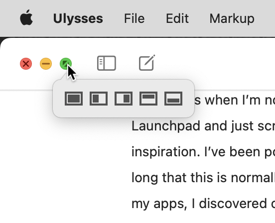
Once you’ve installed Moom, every window on your Mac will have a new feature. You know the little red/yellow/green buttons in the upper left of every window? The green button controls the zoom of that window. Without Moom, clicking the Zoom button changes the window to full screen. But with Moom installed, it has new magic powers.
If you hover over the green Zoom button, you’ll now see a little dropdown with five icons. Each icon represents a different way you can choose to have the selected window change size. Four of them will change the window to half screen: left side, right side, top half, or bottom half.
The remaining option changes your window to fill the screen, but not go into full screen. Full screen hides the toolbar of the open app and creates a separate Space for the application window. When you use the fill screen button in the Moom dropdown, the window fills the available space on screen but leaves the toolbar visible and doesn’t create a new Space.
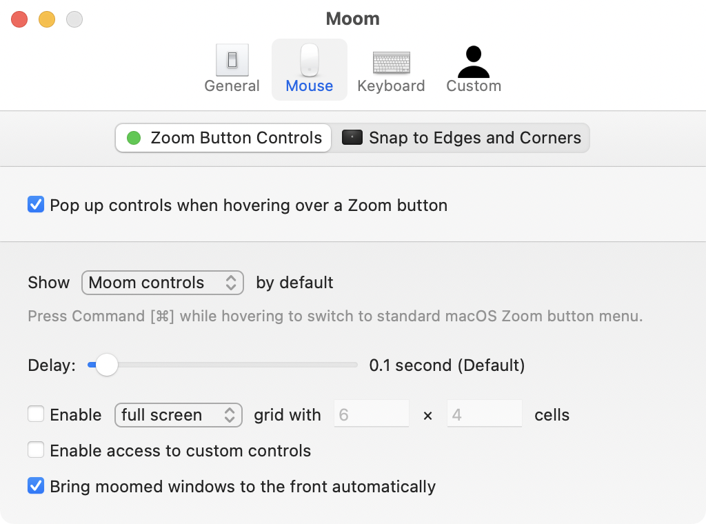
In Preferences for Moom, you can add a bit more control to the way the Zoom button works. The Mouse tab of Preferences allows you to disable these pop-up controls entirely, or you can change it so you have to tap the ⌘ key on hover to see the controls. You can also change the delay time for when the pop-up controls appear. Both of these options might be helpful if most of the time you don’t want to use the pop-up controls for Moom and so you want to be more intentional in using Moom’s half-screen options.
Snap to Edges and Corners
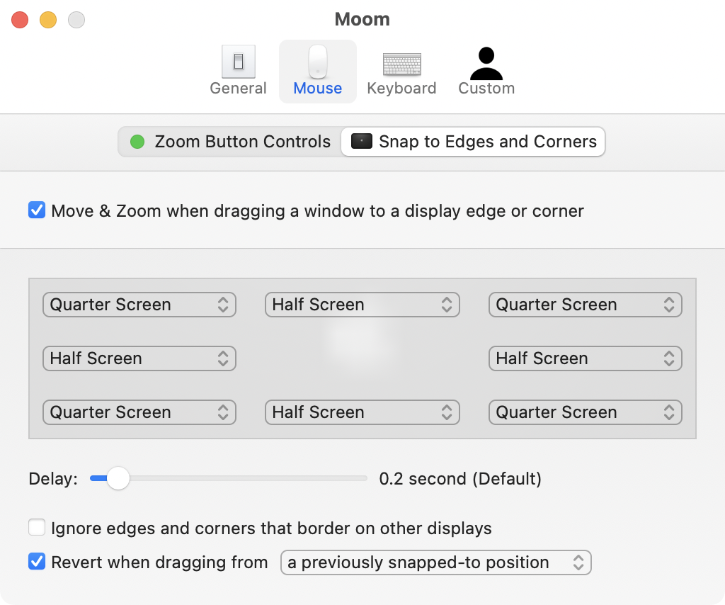
One of the things Windows users miss when they use a Mac is the ability to drag a window to an edge and have the window snap to cover half of the screen. If you’d like that behavior, Moom has it built-in. On the Mouse tab of Moom Preferences, there’s a subtag called Snap to Edges and Corners. This snapping feature is enabled by default but you can disable it in this preference pane if it gets in your way.
There are 8 screen zones that can enable snapping, not just dragging to the left or right. In the Snapping preferences, you’ll see a dropdown for what you want to happen when you drag a window to any of the four corners, the left and right of the screen, as well as the top and bottom.
These dropdowns are set quite reasonably. If you drag a window to the left or right edge of your screen, a blue dashed rectangle will appear, outlining how the window will snap to fill exactly half of the screen split vertically. When you let go of the window, the rectangle disappears and the window snaps into place.
Likewise, if you drag to the top or bottom, you’ll see the blue dashed rectangle filling the top or bottom half of the screen. Dragging to the corners gives you windows that fill exactly one-quarter of the screen.
I assumed that the dropdowns in Preferences to control what happens at the corners and edges would allow you to create a very confusing situation, like dragging to the top-right corner causing the window fill the left half of the screen, but they protect you from doing that to yourself. Your choices are to keep the default or to make the window fill the screen in that corner or edge, or do nothing at all.
One thing to note. When you move a window to the edge or corner, it’s not the window location itself that causes the snap. It’s where your cursor is that’s dragging the window. For example, if you grab a window over on the far top left, you won’t see the snapping rectangle until that part of the window gets to the corner or side. Not a big deal but it confused me why sometimes I’d get the snap right away and sometimes it wouldn’t react at all.
In the Snap to Edges and Corners preferences, you can change the delay before snapping takes place. The default is 0.2 seconds, but if it’s happening too quickly or too slowly you can change that delay to your liking.
If you use two displays, it might be a little annoying to have the snapping rectangle offered when dragging a window from one display to the next. You can set Moom to ignore edges that border on other displays.
Custom Controls for the Win
If you feel like you’ve gotten your $10 worth out of Moom already, that’s great. But for that measly $10, Moom has a lot more capability. To get to the advanced features, go to the Custom tab in Moom’s preferences.
With custom controls, you can define specific sizes for windows and the anchor point for them, and you can define regions of the screen for your windows. I’ll explain in more detail with examples in a minute.
Before setting up any custom controls in Moom, you’ll see a few custom control examples created to get you started. The first two example customizations both show a dropdown that says Move & Zoom. Below that is a rectangle with a 6×4 grid of cells. The left two-thirds of the cells are dark grey and the right third cells are light grey.
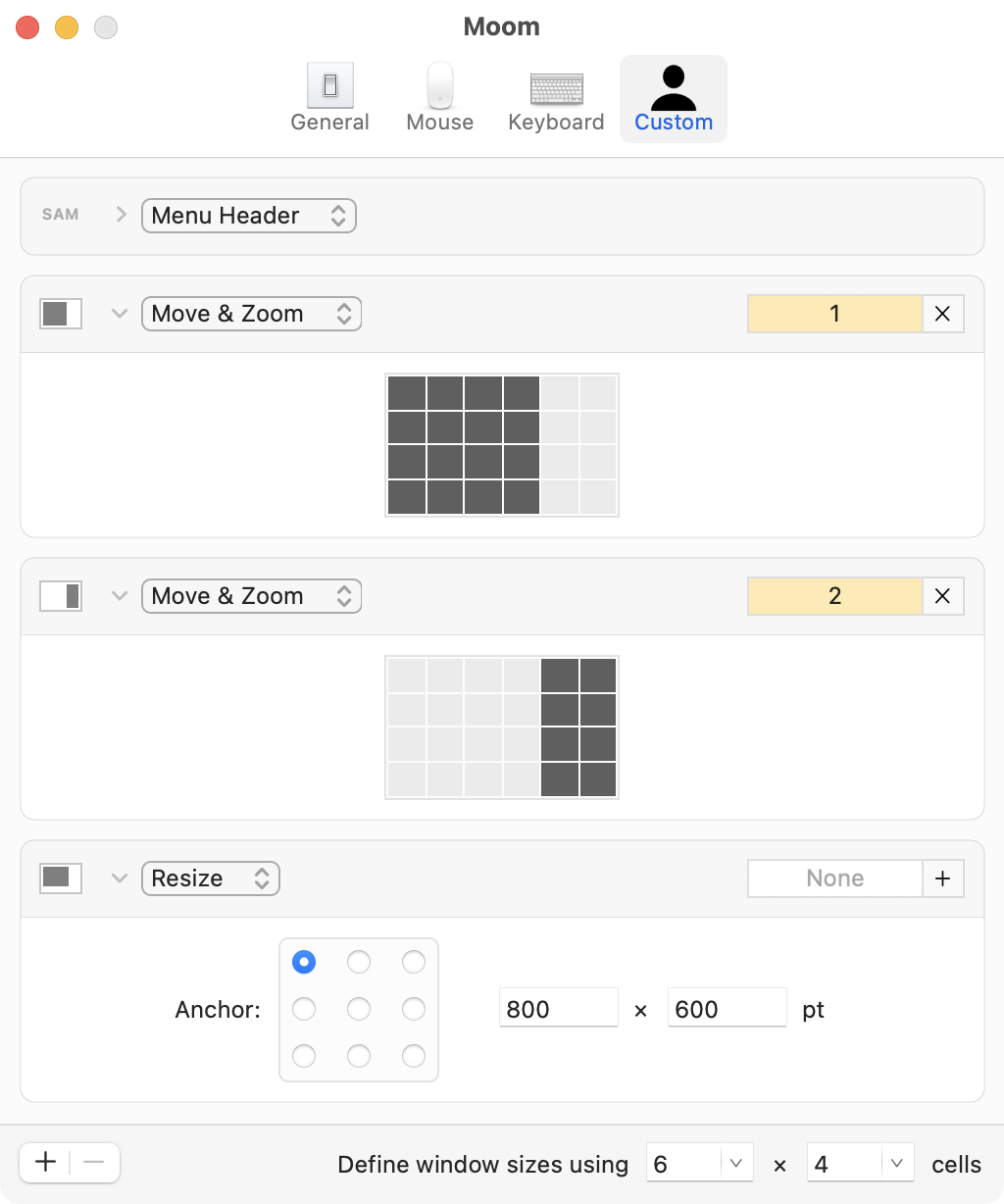
The dark cells in the grid represent what portion of the screen the window will take up if you select this particular option. Move & Zoom means that the window will move from wherever it is now and zoom in or out to fill the grid as shown. This is one of those things that’s quite easy to understand when you see it, but clumsy to explain.
There are three different ways to enable custom controls once you create them. With a window selected, you can enable a custom control by going up to the Moom menu bar app and selecting the custom control you want. Your window will jump to that new location and size.
The second method requires a setting change in Preferences under Mouse in the Zoom Button Controls section. By enabling the checkbox to enable access to custom controls, you’ll be able to access them directly from the green Zoom button on your selected window. You can also choose to have them visible as soon as you hover over the green Zoom button.
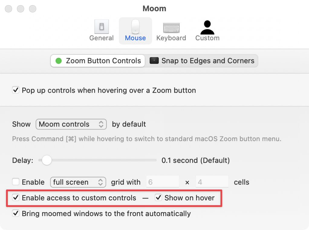
Now when you hover over the green Zoom button, to the left of the Moom standard window configurations, you’ll see a little person’s head with a downward chevron, and from that dropdown, you can select one of the custom controls, like the default that takes up the left two-thirds of the screen.
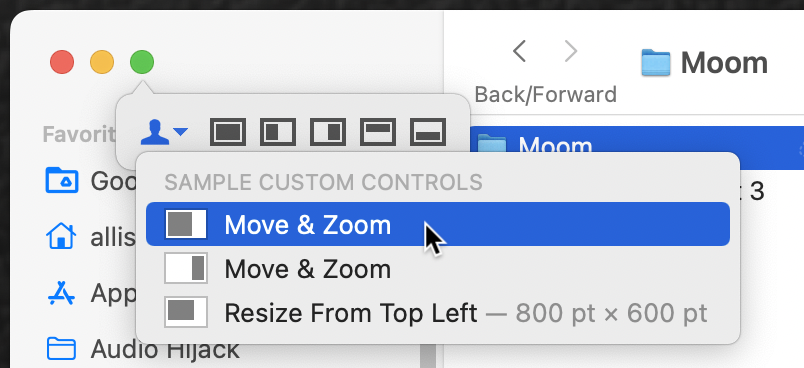
Using hover on the green Zoom button is a bit more intuitive since it’s right in the window you have selected, vs. going way over to Moom in the menu bar. But there is an even faster way.
If you have a few custom controls that you really like and use often, you can set up hot keys to trigger them more quickly. Each custom control in Preferences shows a little box in the upper right where you can click and then hold down a hot key combination of your choosing.
The first two custom control examples have the numbers 1 and 2 set as their respective hot keys. For the life of me, I could not figure out how you could trigger those just by typing a 1 or 2. It didn’t make sense. Stay tuned and I’ll explain later how to make these single numbers invoke your custom controls.
Beyond Move & Zoom
Resize
Move and Zoom custom controls are the flagship options with Moom, but you can do even more. Let’s say you want to create a video that is exactly 800×600 points. One of the default custom controls demonstrates the Resize custom control. Instead of boxes you click and drag, you have two dimension boxes in points.
Another use for this precision would be if you’re taking a series of screenshots for a tutorial and you want to make sure you have consistency. When Steve and I create the live show for YouTube, we broadcast the window of my recording software Hindenburg, and Moom can create that very precise size for me reliably week after week.
When you choose a Resize custom control, your window will resize from one of the corners, or the middle top, bottom, left, or right. You control this by setting the anchor point in a little grid.
Grow and Shrink
I can’t think of a use case off the top of my head for the next two custom controls: grow and shrink. With these, you define a specific number of points by which you want a window to grow and the edge from which you want it to shrink or grow. I’d be curious if anyone can think of a use case.
Toggle Full Screen
One custom control baffled me at first. It’s called Toggle Full Screen. I say it’s baffling because it does what it says on the tin, but we already have a toggle for full screen. We can click the green Zoom button on any window to go into full screen, and then hover at the top to get the toolbar to show again and hit the green Zoom button to bring the window back out of full screen.
I guess this was baffling to me because it seemed far harder to go up to the Zoom button, hover till the standard controls for Moom showed, then hover over the little person’s head to reveal the custom controls, and then click Toggle Full Screen. But then I remembered that you can assign hot keys to any of the custom controls, so maybe this toggle does make sense..
Center
With a big display, I often want the application window in which I’m working centered on screen. Moom offers a custom control called Center, and curiously it has two options: standard macOS center and actual screen center. I tested them both to see the difference. The result might be subtle or dramatic, depending on the size of the window before you command it to center.
I started with a window that I’d set to half screen width on the left and then selected center from Moom. Both standard macOS center and actual screen center were the same from left to right but the macOS center was just a few pixels higher.
In my second experiment, I used Moom to create an 800×600 pt window and dragged it off to the side. When this small window was moved to center, the macOS center was significantly higher than actual screen center. I rather like the centered but higher option that is standard macOS center.
Defining Custom Controls of Your Own
Ok, so having these example custom controls is swell, but it’s also incredibly easy to make your own custom controls. Remember the first example which had two-thirds dark grey cells on the grid and one-third light grey cells? If you click and drag across any number of cells, they’ll turn dark grey and change the configuration caused by that custom control.
For example, if you click drag the bottom right four squares, you can hover over the green Zoom button and choose that option to make your window be small and in the bottom right corner.
The first thing I realized when I started playing with this method to define custom controls was that the grid being just 6×4 cells was not granular enough. The good news is at the bottom right you can change it to be more granular. I didn’t find the limit, but doubling it to 12×8 cells gave me more freedom in setting window sizes.
As you experiment with these custom controls, and even when you’re really good at it, you’ll want to know how to remove them. Select a custom control, and it will get a blue outline. You can either hit the delete key to remove it or the minus button at the bottom of the window. Note that there is no undo when deleting custom controls.
Window Layout Snapshots
I’ve described a lot of features in Moom that make it well worth the money, and I haven’t yet told you about the feature I use the most. Moom can memorize the way you have all of your windows laid out as a snapshot.
As an example, my use case is when I’m creating video tutorials for ScreenCastsOnline. Imagine I’m demonstrating an app like Audio Hijack for a tutorial. I’m recording away, but then I need to use my laptop for something and I unplug it from my displays and come back later to do more recording.
I can certainly try to get the Audio Hijack window exactly back to where it was before I unplugged, but no matter how hard I try, there will be a jump in the video that is unacceptable. I could put in a transition like a page curl, but if you do more than a couple of those it gets really tiresome.
Instead of stressing out about window placement, when I’m setting up for a new tutorial, I put the recording software ScreenFlow on the left two-thirds of my big display, and iThoughts with my mind map where I’ve compiled the flow I want for the tutorial. Then over on my laptop screen which is set to a low enough resolution to create great video for the viewers, I open Audio Hijack and put it at the macOS center of the screen so it’s high enough not to cover up the closed captions.
Once I have all those windows set just the way I need them, I go to the Moom menu bar app and choose Save Window Layout Snapshot. The custom control type will be called Arrange Windows. There’s a nice title field where you can name your snapshot, or by default it shows the names of all the applications that it captured. Also by default, it ignores obstructed windows. I guess that makes sense that if a window was covered up you must not really care where it was.

Let’s say you get your nifty layout captured, but you change your mind on a window and want to move it a bit. No problem. Move the window or windows around, and then choose Update Snapshot. You’ll get a pop-up that asks whether you want to replace the snapshot or merge the new snapshot with the original.
Those sound pretty similar and in my usage, they are the same. But there is a difference. Let’s say you have only Mail open and you save a snapshot. Now close Mail and open Notes. If you update the snapshot and choose replace, it will only know about Notes. But if you choose to merge, it will remember the location of both applications. I should point out that Moom won’t actually open a closed application, but if it’s open and it was part of the saved snapshot, it will place the window in the saved location.
I love saved snapshots and my video tutorials are all the better for it. When I’m done with a particular tutorial, I delete the saved snapshot.
Organizing Custom Controls
If you really get to having fun with Moom, you might create a lot of custom controls. You might create some for when your laptop is connected to a big display and others for when the laptop is standalone. You might create some custom controls for different contexts, such as work and play.
For you, Many Tricks added the ability to put some organization into your list of custom controls. In the same dropdown where you choose Move & Zoom, Resize, or Arrange Windows, you have two options: Menu Header and Separator. Separator adds a horizontal line that you can move up and down to delineate different sections of your custom control list. Menu Header gives you a named menu header to separate your controls, e.g. “Work” and “Play”.
I Need the Space
Now that you know all about custom controls, I can back up and tell you about a couple of things I skipped over in Preferences.
When using some of the standard window locations such as left and right half, the windows can feel kind of crammed together. On the General preference pane, there’s an option to separate the windows by anywhere from 2 to 50 pts. I find the default of 10 pts to be just enough room without wasting space. You can choose whether to also apply this padding to the screen edges so your windows aren’t smack dab against the edge.
And for the Keyboard Junkies
All of these many tricks in Moom are useful, but we really need to address the keyboard junkies in the crowd. We’ve given them a little bit with assigning hot keys to custom controls, but there’s much more. If you look in Moom Preferences at the Keyboard pane, you’ll only see one thing. It says Trigger keyboard control with hot key and there’s a field to enter a hot key combo.

As soon as you enter a hot key, this massive list of options suddenly reveals itself within Keyboard preferences. There’s really no explanation of what these options do, so the best way to figure them out is to use your hot key to see what happens. I hit my hot key and a big Moom logo popped up on screen with right/left/up/down arrows around it. But I didn’t have the foggiest idea what to do with that logo. Clicking the arrows around the logo only made the logo disappear.
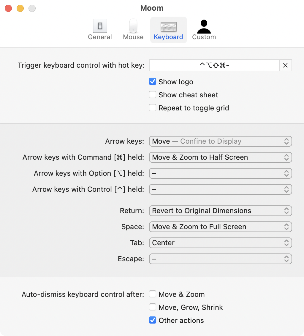
Time to take a closer look at the controls in the Keyboard preference pane. By default, the Show logo box is checked, which explains why I saw the logo. The next checkbox says Show cheat sheet. With that box checked, using the keyboard shortcut now reveals a list of actions you can take when that logo comes up. It explains that hitting the Tab key will center the selected window, space will make it full screen, Command right/left arrow keys will Move & Zoom to half screen on the appropriate side.
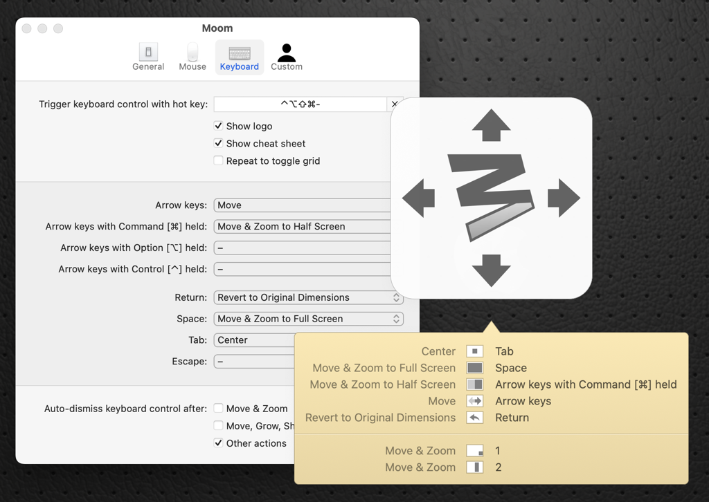
You’ll also now see dropdown menus to alter the behavior with Command-arrow keys, Return, Space, and Tab, as well as adding more actions for adding the Option and Escape keys. You can also choose to hide the logo since it doesn’t really do anything at all. If you’ve got a great memory, you don’t have to see the cheat sheet either – you can hit your hot key and then the trigger for the action you want the selected window to take.
Remember way back when we first learned about custom controls, and I said the two examples had 1 and 2 as their hot keys and I couldn’t figure out how to trigger them? Well, in the cheat sheet for triggering actions from the keyboard, it shows the two examples with 1 and 2. So if you hit the hot key you assigned to trigger the keyboard options, and then hit 1 or 2, the windows will move into position. Mystery finally solved!
The Grid
You’d think all the mysteries of Moom would have been revealed by now, but this last capability was hard for me to figure out. Moom has a feature where you can click and drag with the mouse to define a screen region on-the-fly that you want to fill with your currently-selected window.
Under Keyboard for the trigger controls, you’ll see options for how to control this click-drag on screen to set the size of a window, but they don’t do anything at all unless you’ve also changed a setting on a different tab in Preferences. Open Mouse → Zoom Button Controls preference. Enable Grid has a couple of options. You can choose to enable a full screen grid or hexagons, and you can control how many cells you can use, just like in defining regions with custom controls. Personally, I find the idea of using hexagons for this absolute madness.
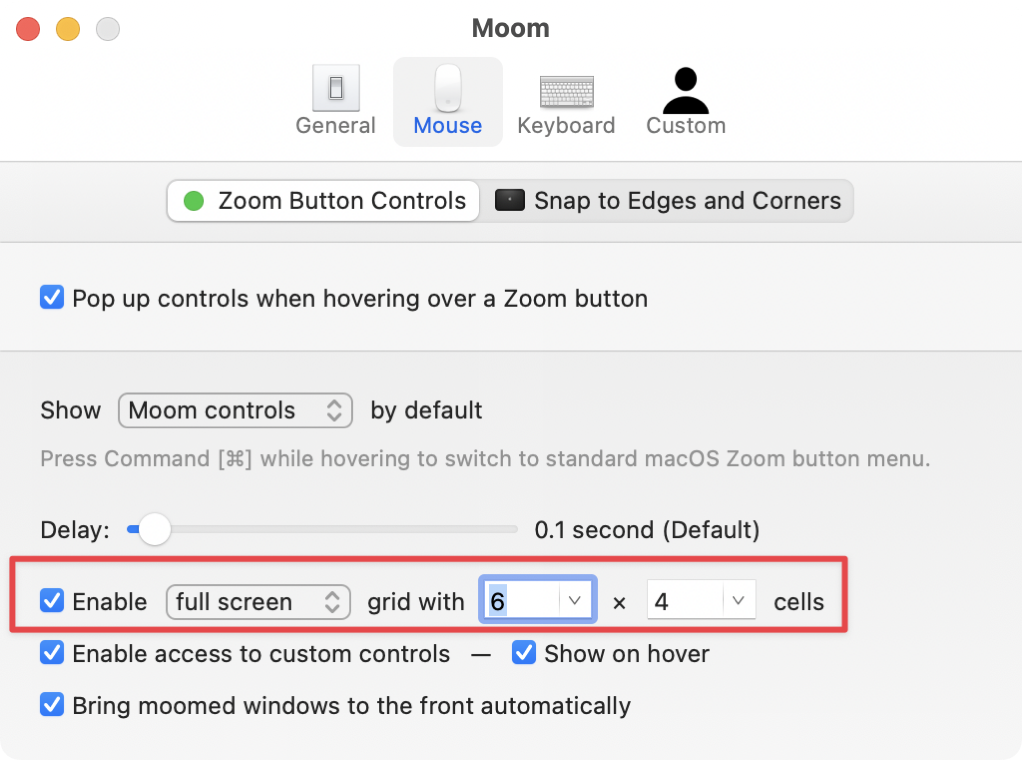
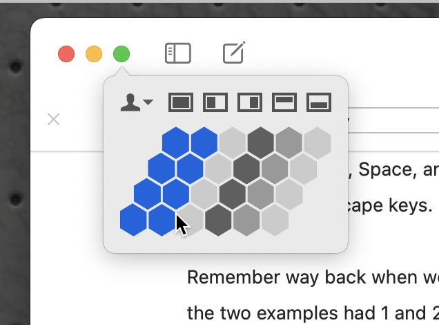
Once you’ve enabled the grid (not using hexagons because you’re not an animal) and chosen the grid size (as before I find 12×8 cells provide just enough granularity), you’ll have access to the grid in two places.
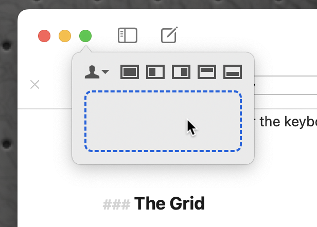
The easiest place to choose a grid is to hover over our little friend, the green Zoom Button. You’ll still see the five standard window layout options as before, but below that, you’ll see a rounded rectangle with a blue dashed outline. Clicking in that rectangle initiates the click to drag a region for your window. This is definitely far easier to execute than it is to describe!
The second option is to give us access to the click-drag of the grid with our hot key trigger. In Keyboard Preferences, turn on the Repeat to toggle grid option. If your hot key trigger was Command-T, you’d hit Command-T-T to bring up the click-drag grid tool. If the grid is your jam more than having quick access to your custom controls, you can choose to have the grid show first, and repeating the trigger brings up the custom controls.
See why I say it might be easier to hover over the green Zoom button instead?
Bottom Line
I am really glad I walked through all of the options in Moom because I learned a lot trying to explain it to you. I use it all the time, but I definitely wasn’t using it to its full potential.
I know I went into a lot of detail, and my goal with that was that for each kind of user you’d learn about what would work for you. If you’re a mouse person, it’s got you covered. A keyboard person? Done. Maybe you just want to set your Mac screens up “just so” like a certain Steve Sheridan, and never faff around with the rest of it; Moom is perfect for you too.
$10 for Moom from Many Tricks has something for everyone.
If you’d like to see Moom in action by the awesome Alec Johnson, he demonstrates how he uses Moom with his Stream Deck on his Take One Tech YouTube channel.

Al, I use multiple screens for my preferred applications i.e.; mail on screen 1, safari on screen 2, a tabbed terminal window and a finder window on screen 3, on screen 4 I have a messages chat window, expressVPN window and a Dynu IP update client window. Screen 4 is reserved for various graphic application, e.g.; Pixelmator Pro, Preview, Affinity, etc. When these apps are fired up they go to the correct screen as per the macOS options for that application. Of course I often have a Finder window on any screen as needed and unassigned apps on any “current” screen. I have desired placement for most apps and MacOS seems to retain any previous app placement and screens and I navigate easily with two finger swipe on my Magic Mouse.
Does Moom handle multiple screens? I saw lots of references to “screen” but unsure of multiple screens. Make sense?
thanks,
Does Moom handle multiple screens? I saw lots of references to “screen” but unsure of multiple screens. Make sense?
Yep, it sure does work with multiple screens, Tim.
Windows and Chrome:
Hi!
Is it possible to have Chrome on one screen, and chrome on another screen?
My wife is switching to the Mac full time from windows and is in the Medical field. She often is working with people and needs to quickly access information in different chrome tabs. On windows 11 she had an instance of chrome on her left screen with a set group of tabs. In her middle screen she had chrome with a different group of tabs and on her right screen she used Firefox for the services that didn’t work with chrome.
Would this program help her be able to manage this type of setup?
She is sighted, and I’m completely blind. I think it should work but thought I would see if this tool would help her. We red this article yesterday and it sounds like this tool may be her favorite productivity hack.
Her comment yesterday was:
I have not had to be productive on the Mac in the past
because she could always use windows.
Anyways, love the blog and very helpful resource.
Best – Michael!
KJ7PAZ – @payown
Sorry for the late reply, Michael – hopefully you found your answer that yes she can have the exact layout you describe.
I think what might be tripping her up is that you don’t have two separate instances of an app open (like two Chromes). You have two sets of tabbed windows. macOS only ever has one copy of an app open. It’s a fundamental difference in the way macOS works vs. Windows (neither is wrong) but it shouldn’t cause any problems. Ping me directly if she still needs help with this.
Great article. Very comprehensive. I’ve used Moom for years and was looking for a refresher when I installed Moom on a new laptop… stumbled across your post – and learned alot.. Thanks!
Glad you found it useful!