Jump to Tips
- You Can Refresh the App Store
- Alphabetizing System Preferences
- Use the ⌘ Key with the Window Title Icon to Navigate Up the File Path
- Adding Keyboard Shortcuts to Menu Items
- Zoom with Accessibility
- Hotkeys to Change Finder View
- Right-size Column Widths to Minimum Needed
Welcome to Part 4 of my Tiny Mac Tips. This is an ongoing series I started in order to teach my dear friend Jill from the Northwoods how to move from an adequate Mac user to a proficient one.
You Can Refresh the App Store
Mac App Store updates are a constant presence in our Mac lives because, if developers are doing their jobs, they work to improve their apps, they need to keep up with changes Apple makes to macOS, and to keep ahead of security problems. While constantly having to run updates is tedious, you really don’t want apps that aren’t being kept up to date.
I love the Mac App Store and get a lot of my apps through this convenient mechanism. But have you noticed that sometimes it gets confused? The other day I dusted off my 2016 MacBook Pro after several months of disuse for the main purpose of running the latest macOS security update. When it was up to date, I decided I might as well update the apps. But the Mac App Store said I had zero updates. You and I both know that’s not probable.
I remembered that Dave Hamilton has said more than once on the Mac Geek Gab that the Mac App Store is a web browser under the hood. That means you can force it to refresh. While on the Updates page, I tried ⌘-R and suddenly I had 19 updates awaiting me.
Hopefully, you won’t need this trick but tuck it back in your brain just in case.
Alphabetizing System Preferences
I know System Preferences are going away in macOS Ventura, to be replaced with the new Settings app to mirror iOS, but many of us will stay with macOS Monterey for a fair bit of time before moving on to the new OS. While we’re still on macOS Monterey or before, I’ve got a tip on how to make System Preferences easier to navigate.
When I look at the grid of icons in System Preferences organized by some bizarre idea of categories that only Apple understands, I can never find what I’m looking for. I know what the Displays icon looks like, and I know how it’s spelled, but I can scan my eyes back and forth 5 times across the grid and not see it. I’ve been using a Mac for 38 years and I’ve never gotten comfortable with the layout of System Preferences.
It turns out you can actually view System Preferences alphabetically, and there are three ways to do it.
First, if you select the View menu from System Preferences, they’re listed in alphabetical order right there! I don’t know how long it’s been in the View menu because it literally never occurred to me that System Preferences even has menus. I never looked at the menu bar until someone showed me this tip. I wish I could remember who showed it to me to thank them.
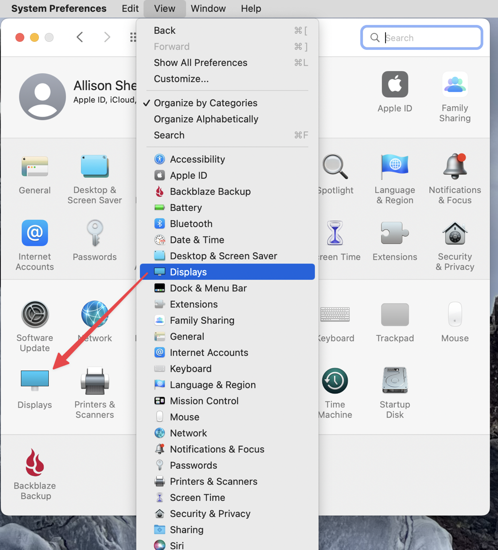
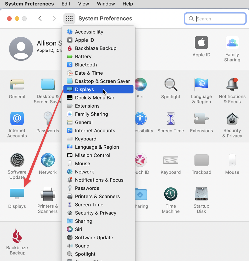
In System Preferences, if you look at the top of the toolbar, there’s a little 4×3 grid of dots representing the grid of icons on the home page of System Preferences. If you’re inside a Preference pane, such as Displays, and you click on that little grid, it takes you back to the home screen of System Preferences. For ages, that’s all I’ve ever done with it.
But one day, instead of just clicking on the grid icon, I clicked and held it, and a menu dropped down with all the System Preferences panes in alphabetical order! That means you could jump from Displays to Network without even passing through the home page.
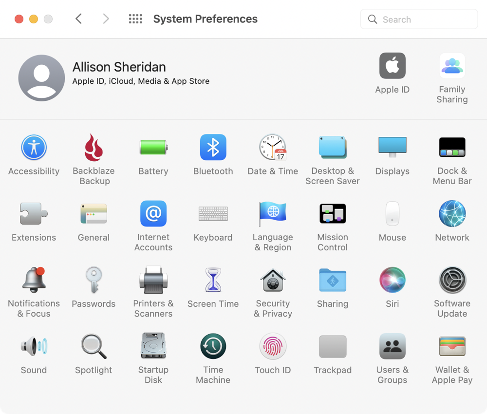
Now if you’re as enamored with the alphabetical listing of System Preferences as I am, ideally they’d be in alphabetical order on the home page. In the View menu, you have the option to change it from Organize by Category to Organize Alphabetically. As I said, I don’t know how long that View menu has been there but it was life-changing when I alphabetized my System Preferences.
Use the ⌘ Key with the Window Title Icon to Navigate Up the File Path
In Part 3 of my Tiny Mac Tips series, I taught you how to turn on the Window Title Icons in your Finder windows, aka proxy icons (System Preferences → Accessibility → Display, and on the Display tab, check the box that says “Show window title icons”). This is the little folder icon that you can use to drag into Save As dialog boxes to save to an already-open folder.
In Apple’s infinite wisdom, the Window Title Icons are hidden and are only revealed when you hover for a while next to the folder name at the top of the window. Anyway, whether you’ve left them hidden or always viewable, there’s something fun you can do with them.
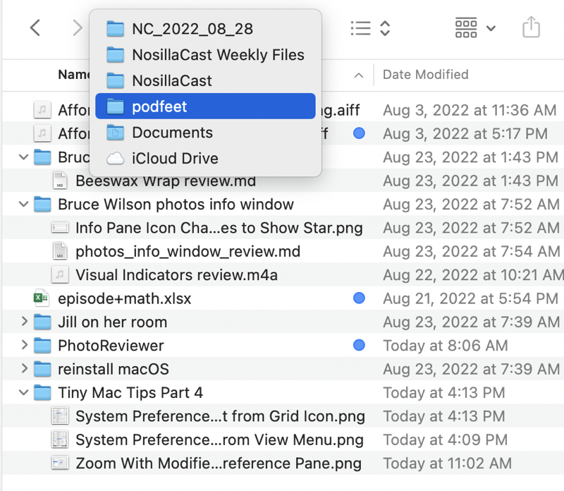
Let’s say you’re buried five folders down in your Documents folder and you want to go up a couple of levels. You could use the back arrow several times to get back up. Or, you can hold down the Command ⌘ key and select the Window Title Icon. Immediately you’ll get a dropdown menu showing you the full path of folders, sort of upside down.
For example, I sync my Desktop and Documents folder to iCloud, so the bottom of the dropdown says iCloud Drive, then above it says Documents, etc. That’s what I mean by upside down.
Using the Command ⌘ key on the Window Title Icon is something I do so often that it’s an instinct now.
If remembering the Command key is hard for you, or you don’t like your Window Title Icons showing, remember the tip from Part 3 where you can view the file path at the bottom of all Finder windows? In that tip, I explained that you can use the icons in the path bar to navigate up the path. I prefer the Command key on the Window Title Icon method because I bury my stuff so deep in the file structure that the titles of the folders get cut off in the path bar. As a dropdown, the file names are full-width to read in all their glory.
Adding Keyboard Shortcuts to Menu Items
If you’re a keyboard junkie, it can be really frustrating when there’s a menu item you use often in an application and there’s no keyboard shortcut for it. Luckily there’s a feature in macOS that allows you to add keyboard shortcuts to menus even if the developer didn’t include one.
Let’s take a look at a standard Mac app as an example: TextEdit. Most of the commands have keyboard shortcuts, but View -> Show Tab Bar does not. This is a bit of a contrived example because you probably don’t need to toggle this menu often, but work with me here.
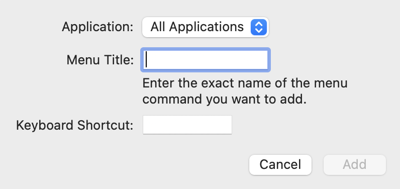
To add a keyboard shortcut, open System Preferences → Keyboard and then select the Shortcuts tab. On the left side of the pane, choose App Shortcuts. On the right side of the pane, you’ll see a list of any shortcuts that have already been created. Click the + button below the panes. This will open a small screen where you answer three easy questions.
The first is to choose the application in which you want to have the shortcut function, or you can create a shortcut for all applications. From the dropdown that has all of your installed applications, choose TextEdit. Next, you need to enter the exact name of the menu command you want to add.
When they say you have to use the exact name, they mean it. In our example, we want to use View and then the dropdown to Show Tab Bar with leading caps. In order to convey to the shortcuts menu that you want to select from a dropdown, you use a minus (-) followed by a greater than sign (>) or ->. So our exact command would be:
View->Show Tab Bar with no spaces between the words and the ->.
That wasn’t too painful. Now we have to tell it what keyboard shortcut we want to assign. I’ll choose control-option-command-V. Test it out, realize you made a typo or left a space in the command, go back and fix it and test again. At least that’s the process I follow.
Let me give you a perfect example of where this feature has helped me out. My favorite screenshot tutorial app is Folge from folge.me. It’s really cool and does a great job of helping me create tutorial guides, but it is pretty non-standard for a Mac app. Oleksii is a rockstar of a developer who actually begs for improvement ideas for his app. Seriously. He sent an email out to all of his customers entitled “Help Folge” and the message was:
Please answer one simple question: “What is the single most important feature you are missing in Folge?”
Who does that?
Anyway, one thing that was missing for me was that Folge doesn’t have the standard macOS app keyboard shortcut to open Settings using Command-comma. No problem, I opened up System Preferences, Keyboard, Shortcuts, App Shortcuts and added the standard keyboard shortcut.
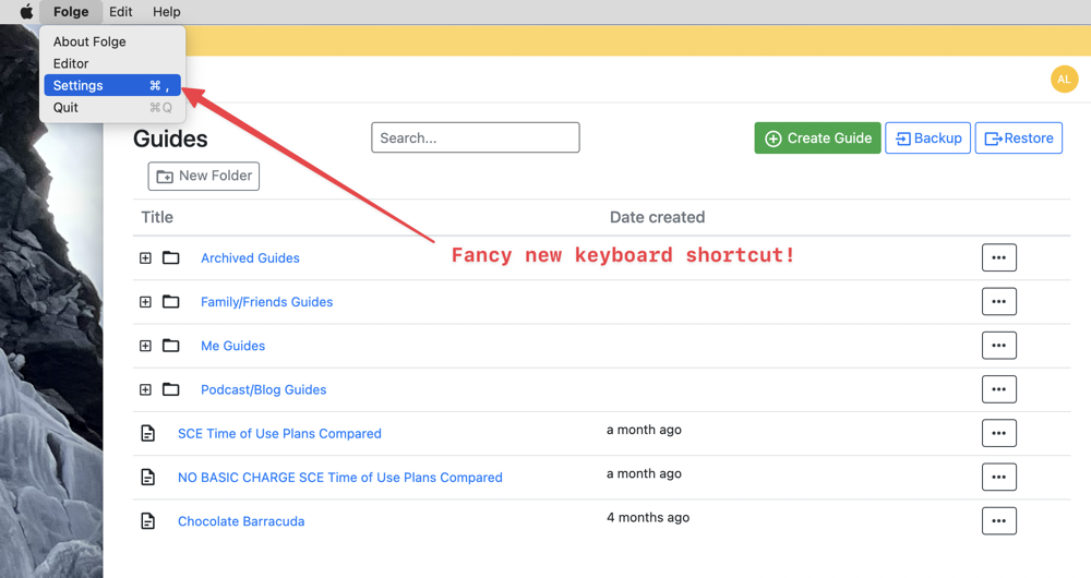
One thing you might be wondering is whether it will be annoying to have to remember these keyboard shortcuts or have to dig down into the System Preferences pane to refresh your memory of what you chose. Nope, none of that folderol is necessary, because macOS puts your fancy new keyboard shortcut right into the menu for the app just like it was native from the developer.
The only tricky bit about adding keyboard shortcuts to apps is when there’s a submenu called with an ellipsis (…) to get to the next screen. It’s not hard but you have to get it exactly right. I’ve put a link in the shownotes to the Apple Support article that explains it in detail for when you need to do it.
Zoom with Accessibility
When I open Apple Maps on my Mac and zoom in on the city street level, the text is often too small for me to read. I zoom in on the map a little more, and for a brief second the text is larger, and then it’s repainted and the same tiny size. My vision isn’t that of a 20-year-old, but when I had cataract surgery, I chose 50cm as my focal distance because that’s computer distance so it’s pretty darn good.
Another place I’m often frustrated is trying to see some detail in an online image that’s too low resolution to make something out, but I’m pretty sure if it was simply bigger I’d be able to see more.
You may have just passed 40 and find that you could use a little help with smaller text on occasion (and you haven’t given into the inevitable glasses in your future), but you don’t need to have all the fonts embiggened or to lower your overall screen resolution just yet.
There’s a quick trick for these infrequent needs. With this trick, you’ll be able to zoom in very quickly on your screen to see something and then go right back to a normal view.
Open System Preferences / Accessibility / Zoom. Check the box labeled “Use scroll gesture with modifier keys to zoom”. Below that, you’ll see a dropdown to choose a modifier key. I use Control, which I think might be the default.
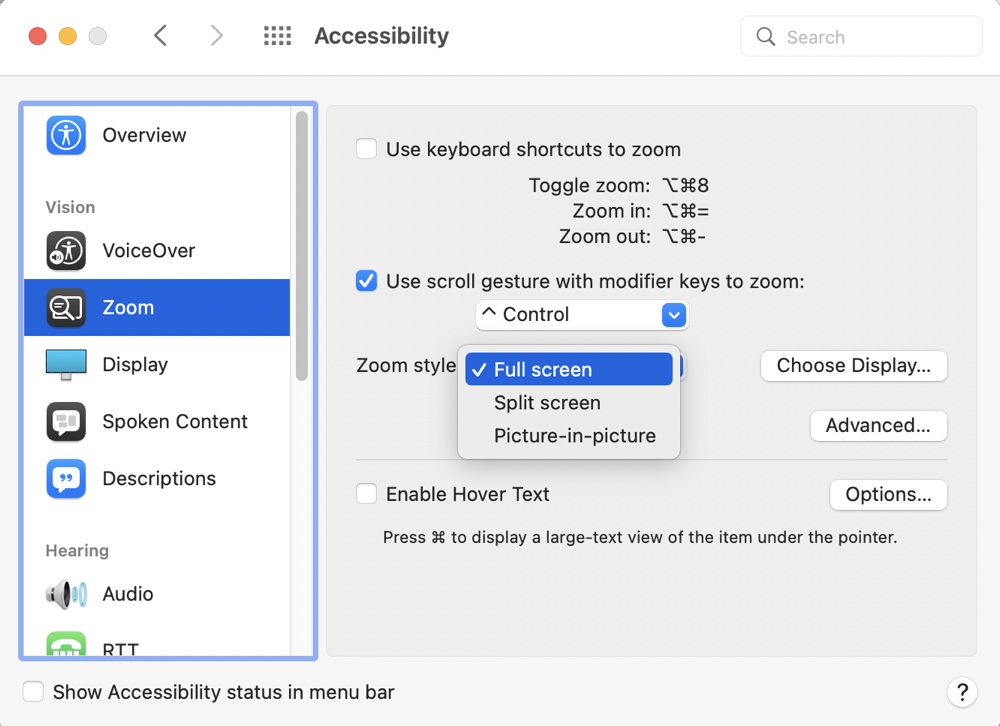
Without changing any of the other settings, hold down the Control key on your keyboard and use your mouse or trackpad to scroll up. You’ll see your entire screen zoom in, centered wherever you left your cursor. To go back to normal, hold the Control key down again, and this time scroll down.
This setting is one of the first things I change on a new Mac installation. It never gets in your way when you don’t need it, but it’s always at your fingertips when you do see something wee tiny on the screen that you’d like to see much closer.
There is an option below the modifier key dropdown entitled Zoom Style. By default, it’s set to full screen, which is the behavior I just described. You may prefer one of the other options, which are Split Screen and Picture-in-picture.
Split screen puts a thin slice of your screen across the top showing where you’re zooming in. I think it’s a weird representation but if you like it that way, you go girl.
Picture-in-picture seems a bit more logical to me. When you use your modifier key and scroll, you’ll see a box around your cursor within which the screen zooms in and out. If you move your cursor near the edge of the box, it will start to move with you, so you can move the picture-in-picture precisely to the thing you want to see more clearly. Because it doesn’t move instantly with your cursor, it feels laggy to me and I don’t favor it, but perhaps you’ll find it less disconcerting than having the entire screen zoom.
Give these options a play and see which one works for you. The only trick is to remember the modifier key when you need to zoom in to see something more clearly and keep that optometrist at bay for a wee bit longer.
Hotkeys to Change Finder View
Speaking of hotkeys, did you know you can change your Finder view with hotkeys? There are four views available in Finder windows. Icon view, which is self-explanatory, List view which is the one where you open little disclosure triangles next to folders to see inside them, Column view (which according to me is the correct view) where selecting a folder expands the items within to the right, and then Gallery view, which used to be called Coverflow, where you get a big icon view of the selected item and small icons in a row below.
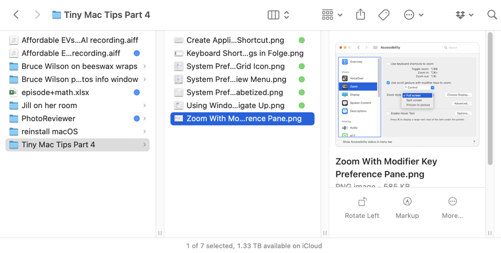
Whether you agree with me about the one, true Finder view, or if you’re some kind of deviant who likes one of the other three, it’s good to know that you can use a keyboard shortcut (aka hotkey) to change views. The reason it’s good to know is that Apple seems to have abandoned the idea of maintaining our preference for a given view when rebooting or logging out, or even opening a new folder.
The four hotkeys are ⌘ 1 through 4 to trigger icon, list, column, and gallery views in that order. To simplify things, just learn ⌘-3 because that’s the one that triggers column view. You’re welcome.
⌘-1 Icon view
⌘-2 List view
⌘-3 Column view
⌘-4 Gallery view (aka Coverflow)
Right-size Column Widths to Minimum Needed
When you open a Finder window in Column view (the correct view), the columns are often either way too wide or way too narrow for the list of items within. Wouldn’t it be nice if the columns were just right?
If you have your scroll bars set to automatically appear when you start to scroll (System Preferences/General/Show scroll bars), you’ll see a plain vertical line between your columns. When you place your cursor over the line, double-click on the line, and the column to the left will right-size to just fit the names of your files.
If you’ve navigated down a few folders, you may have many columns that need to be right-sized. There’s a tip for that too. Hold down the magic Option key and then double-click on any one of the column separator lines and they will all resize to be appropriate for their own content.
If you have your scroll bars set to always show, there’s a slight difference in how to right-size your columns. Instead of a vertical line, you’ll have a vertical channel to hold the scroll bar (whether one is visible or not). You can’t double-click on that channel to set the column width. Instead, at the bottom of the channel, you’ll see two little vertical lines. Double-click or Option-double click those two tick marks to right-size your columns.
Sadly, Apple made a decision in Big Sur to make these changes not stick when you close your Finder window. The next time you open the same folder, the columns will be the wrong size.
There is one method of changing columns that does stick. If you hold down the Option key and simply drag to change the column width (without double-clicking), this changes all columns to be the same width. If you close the window after doing this maneuver, reopening any Finder window in Column view will have all columns set to the width you just defined.
I wish it was possible to right-size all columns and have it stick as a default, but I’ve not been able to find a way to do that. If anyone knows, I’m all ears!
Bottom Line
I’m sure having fun doing this Tiny Mac Tips series. I’ve got more than I could fit this week so stay tuned. And of course, I’ll get to redo half of them in a month or two when macOS Ventura comes out and changes System Preferences into Settings, and maybe there will be entirely new tips to teach!


These tips were very helpful. Thank you.