MarsEdit is My Blogging Platform
I’ve mentioned quite a few times that I use the awesome blogging tool for the Mac, MarsEdit from Red Sweater Software. Every blog post you read has come from MarsEdit.
MarsEdit lets me write in the plain text language Markdown, or I can write in HTML, or I can mix and match the languages when needed. For example, it’s much easier to create a bulleted list in Markdown with a simple * on each line, than it is to use opening and closing <li> tags in HTML. But I sometimes prefer the formatting of links in HTML. MarsEdit lets me use the right language for the right job without fighting with me.
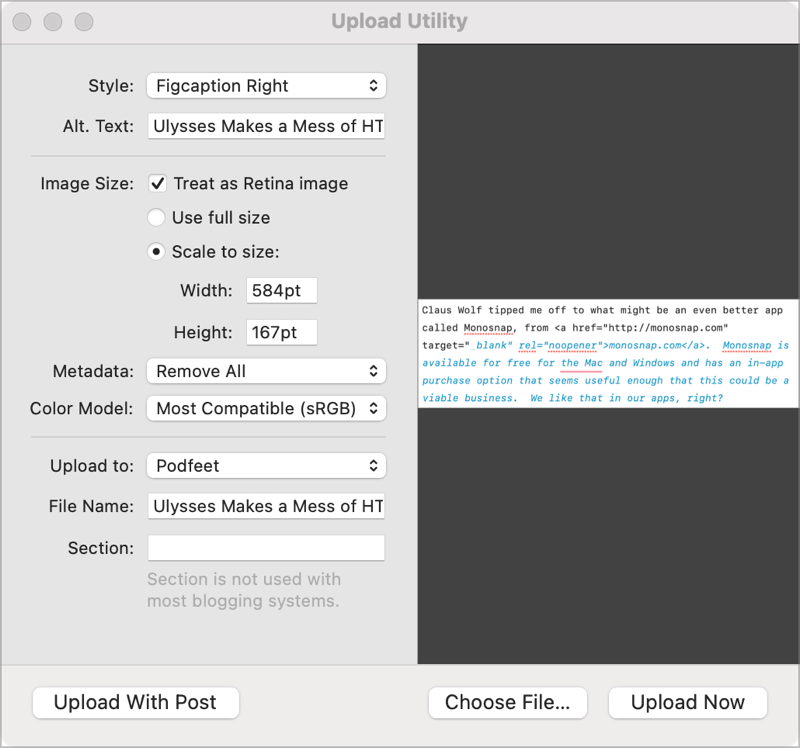
Another reason I love MarsEdit for blogging is how easy it is to add images to my posts and to format and size them exactly the way I want. I can drag them into the text editor, and the Upload Utility opens. Within there, I can use Media Markup Templates that I’ve created. One of my templates allows me to specify that I want an image uploaded into a figure that is right-justified, with a 10px margin on the left, and a caption underneath. If I’m feeling frisky, I might use my left-justified or center-justified template.
MarsEdit prompts me to create a post slug, which is the text you see after podfeet.com. It lets me put posts into categories, which is what allows you to see just the blog posts or just the Security Bits posts, or all of the Chit Chat Across the Pond posts. I also add tags using MarsEdit, but I’m pretty sure the way I built my interface to the site doesn’t actually allow you to use them for anything. I still tag away as though they do something.
When I’m done writing up a blog post, I can send the post to my website as a draft and do final updates on the site like adding the featured image. When I’m done and I publish, I can refresh MarsEdit, and the final published version syncs back down to from the web to my Mac in MarsEdit.
It’s a delightful tool and I love using it. There’s only one thing more I want it to do. I want it to run on iPadOS. But it doesn’t, and even though I constantly beg the developer Daniel Jalkut to write the iPadOS app, he hasn’t done it for me yet.
Writing on iPadOS
If I’ve got a fabulous tool on the Mac, why do I need it on my iPad too? Because I find it delightfully relaxing to write on my 12.9” iPad Pro with its Magic Keyboard. I’m less distracted and it’s a great device to use when I’m sitting in bed sipping my morning coffee. I prefer to use the iPad watching TV or riding in the car on long road trips.
I spend a lot of time in my studio working with my big display and comfy giant chair, but I need a change of venue after a while. I might want to sit on the back deck with the cats and Tesla playing outside on the grass, or maybe just sit in the kitchen so I can see outside.
I don’t always want to write on my iPad though; I want to flip back and forth between the iPad and Mac.
While it would be ideal to have MarsEdit on iPadOS, the next best thing is a cross-platform Markdown editor for writing my rough drafts. I don’t need to do the final edit there — I’d be happy enough copying the Markdown from the text editor when the first draft is done and pasting it into MarsEdit on the Mac.
A few years ago I went on a hunt for a tool that would let me write my blog post rough drafts on the iPad and Mac. My requirements were:
- It had to sync between the Mac and iPad so I could write in either place depending on my mood.
- It had to support Markdown and, if possible, a mixed environment with HTML
- For me to use any tool on the iPad to write long-form, it simply had to have support for TextExpander.
Life is too short to type everything out like an animal. According to my weekly TextExpander report, I normally save around 45 minutes per week using TextExpander! That’s an average of 39 hours per year which is like a whole work week of vacation. So, yeah, TextExpander is a requirement!
There are a surprising number of apps that support Markdown for text editing on the iPad, but adding the TextExpander requirement really narrowed down the playing field. I wish Apple would just implement TextExpander in iPadOS already.
Ulysses

When I did my search a few years ago, I settled on Ulysses because it was on both platforms and supported TextExpander. It was in SetApp for the Mac so it was an easy pick to try out. Finding it adequate, I bought into their subscription model so I could use it on my Mac and iPad. After I got into using Ulysses, they changed their pricing model. To use it cross-platform on all of my devices is now $40/year, or $6/month. It’s not super expensive but it’s not insignificant.
Ulysses has nice themes and has a mode where you can focus on just a paragraph at a time. It also has a typewriter mode that’s delightful — the line you’re currently typing on is always centered on the screen. For some reason, I don’t keep it that way but I’m always delighted when I give it a play.
Ulysses allows you to sort notes into folders with a simple drag and drop. This is how my brain works so I really like that. It has metrics in the sidebar to tell you how many words you’ve written and how long it will take someone to read it to themselves or read it out loud. That out-loud part helps me a lot in figuring out how long the blog post will take me to read.
There are two things that have really been on my nerves with Ulysses over the last few years. These two paper cuts have been grating on me and are why I decided recently to ask for help looking for an alternative to Ulysses.
I struggle with links in Ulysses. Like most Markdown editors, it lets you hit ⌘-K to produce a popup window where you can enter the text you want people to see, and a second field for the link itself. It will create (under the hood) the standard Markdown link format. This format puts the text in square brackets and the link in round brackets.
I say under the hood because as soon as you create the link, it puts the text and link in this ugly box where you can’t see the plain text format for links. It’s annoying as heck to try to edit because my cursor either won’t go inside the box or it is inside the box and I can’t type text to the right outside the box. It’s hard to explain but it irritates me.

As I mentioned, I sometimes also want to use HTML links as I do with MarsEdit. It seems to get very confused by them, italicizing part of it for example and everything that comes after it. The Markdown export also seems to get confused by those HTML links. In the export it will escape out the angle brackets in the HTML, making them useless when put into a real blog post. It’s so aggravating to have to go back and fix any links I created this way!
In the same vein, Ulysses gets very confused by programming code I may embed into a post. It will escape out certain characters, so when I export the text in Markdown I have to peer very closely at every character to see where it borked it up.
As you know, I like to put images into my blog posts. My process is to take screenshots with CleanShotX while I’m writing an article, save them to a folder and name them exactly what I want the alt text to be for them. This speeds up my process because when I pull them into the final product in MarsEdit, the tool automatically takes the title as the alt text. It does make my titles long, but who cares, I get the alt text for free and I can tell my images apart in Finder.
I still want to pull my images into the blog posts using MarsEdit during the final edit, but I need a good way to put a placeholder into the Markdown text editor I use. Ulysses does let you drag in images, but it puts them as teeny thumbnails that don’t help me see what image it is. It also doesn’t show me the Markdown that would include the image title.
My workaround has been to type the image name onto a separate line near where I want to put the image, offset by three equals signs so I hopefully notice it when I go into final edit in MarsEdit. It was a hacky way to do it but I had no choice.
Apps I Didn’t Choose
I put out the call to our Slack community giving them my requirements for a Ulysses replacement and I got some swell suggestions, one of which became my new text editor. Let’s briefly pass through those apps I didn’t choose before I talk about the one I really like.
Craft
Marty Jencius suggested Craft from Luki Labs. Craft is a beautifully designed, freemium app that has a different take on notes. It uses blocks so you see your notes in a rectangular layout, like playing cards on a page. It emphasizes design elements like embedded images. There’s a lot of capability in the free app and if you want more storage and collaboration, you can subscribe for $5/month.
While Craft is a cross-platform Markdown editor and has TextExpander support, I didn’t actually give it a good college try because it was too fancy for this particular work. I might give it a try later to meet some of my other note-taking requirements, but I actually want something plain with few bells and whistles.
If a beautiful design in a note-taking app is something you’re looking for, check out Craft from craft.do.
Obsidian

Alan suggested I take a look at Obsidian. He said he really likes it. Grumpy (aka Mike Price) said David Sparks of Mac Power Users goes bananas about it and that Federico Viticci is a fan as well. David is a dear friend and a brilliant technology guy so that sounded like a good recommendation. Sometimes he goes a bit overboard on the nerdiness of his integrations but I respect that about him.
Obsidian has a plugin architecture that allows the functionality to be extended. I like that in an app. In order to use TextExpander you would have to install a plugin via their Obsidian Hub. I’d rather see it built in but I assume it works just as well.
I went to obsidian.md to check it out and was immediately stuck. While Obsidian works on a very reasonable freemium model, I wasn’t able to check out the cross-platform integration without paying $10/month for the iPad app. That’s an enormous amount of money compared to the $40/year I was paying for Ulysses.
Drafts
Marty also suggested trying Drafts which will do Markdown and supports TextExpander. I tried Drafts years ago and the basic design didn’t suit me. It seemed to be more for crafting short drafts that would be then exported as a Tweet or a Toot or a micro.blog post.
Drafts may have changed, but when I tried it, every time you opened the app you were facing a blank page. That makes sense for the use case I just described, but I want a sidebar with folders and notes nicely filed away to be my opening page. I didn’t test Drafts again this time around.
Bear for the Win

The winner for me turns out to be a delightful cross-platform app called Bear from bear.app, also suggested by Marty.
Bear is incredibly simple and elegant. It is, of course, cross-platform, and works with Markdown and TextExpander. It’s the most reasonably priced of everything I tried. The subscription price is only $1.50US/ month or $15/year. You can use a lot of the features of Bear without paying a dime, but at $1.50/month it seems an easy buy to support the developers and get a bit more capability in return.
Syncing between iOS and macOS is essential, and I have to confess I don’t know how Bear does it. I know it works, and it’s super fast (I clocked it at 8 seconds), but I don’t remember configuring it and I can’t find any settings to enable syncing. The only thing I can find is a toggle in the app to disable syncing on a specific device. It must be via iCloud sync and just magically works. If I can’t remember how I did it, we can safely say that sync is effortless.
Links in Bear
Before I get into the functionality of the app, I want to say that I love the way Bear handles links. If I want the link to be on some text, I can copy the URL first, select the text, and hit ⌘-K. This pops open a little window already prepopulated with both the text and the link. I can hit Save, or if I want to keep my hands on the keyboard, I can hit enter twice to cycle through the options to save.
When the link is created, it shows the text in red in square brackets, and then a simple chain icon inside round brackets. There’s no need to see that long URL glopping up my text, right? If I click on the chain link icon, it allows me to edit the text/link combo again, but if I click on the text for the link, it opens it in my browser.
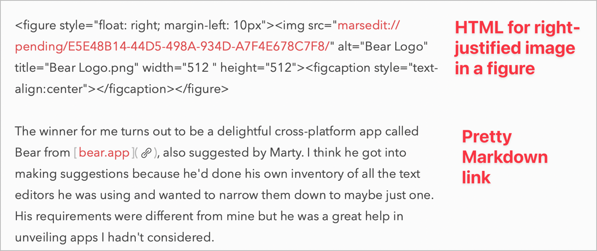
And, Bear treats HTML links like first-class citizens too. The HTML doesn’t get escaped in any way, the URL itself is formatted in red and it’s a live link so you can test it to make sure it’s correct. Absolutely the best of all worlds for linking. I feel my stress level going down 50% using Bear over Ulysses just because of this.
So far I also haven’t run into any weird escaping problems in Bear when I type in code inside of backticks.
Images in Bear
I tested dragging in images from my desktop into Bear while writing on my Mac, and the images come in nice and big just like I wanted. When I export to Markdown, the images don’t come along as Markdown is just plain text, but the names of the images show up in the Markdown. This means that when I get over to MarsEdit, I can see the name of which image goes where in the blog post. No longer do I have to type in three equals signs on a separate line to grab my attention for where the images go. Another time saver! I can even take screenshots on the iPad and drop them into Bear and they look great.
I can hear Bart right now losing his mind because he prefers to add images at the end so he doesn’t lose his train of thought. We talk often about how I can juggle multiple thoughts without dropping many of them, and I think that’s evident in my preferred workflow. If I don’t drop in images while I’m writing, I find that I either forget what screenshot I wanted to drop in, or I get lazy later and don’t go back and recreate them.
Tags Instead of Folders
Bear doesn’t use traditional folders to organize notes. Instead, the app uses the concept of tags. I’m still a bit clumsy at using this way to organize my information but I’m getting better at it. You can create a hierarchy of tags that create what look like folders, and you can drag and drop notes into one of these nested tag “folders” once they exist.
When you’re starting from scratch to add a note to a tag, you actually type the tag right into the body of the note. Type a hashtag followed by a word (or words) and it will put it in a little pill shape so you know it’s a tag, and now this new tag will show up in the left sidebar. Using tags lets you keep notes in multiple locations which can be handy.
If you want to create nested tags, you add the upper-level tag as before but then add a slash, followed by the subtag, and enclose it in a second hashtag.
Once you have these tags (and nested tags) created, you can start new notes within the appropriate nested tag in the left sidebar and the newly created note will be tagged automatically. When I first started using Bear I found this whole tagging thing really annoying but I keep discovering ways to make it easier and I think I’m finally getting the hang of using it.
When I exported my first blog post to Markdown and pasted it into MarsEdit, I realized that I’d have to delete these tags so they didn’t appear in the blog post. But then I found a toggle in Bear’s preferences where you can have the tags removed on export. Perfect solution.
There is one problem with this tagging system, and it’s that you can’t use the hashtag symbol in any of your text because it turns into a tag. I ran into this with some links that had hashtags as in-page anchors which are shown with a hashtag. The suggested workaround is to wrap anything with a hashtag in it as a code block to make sure it doesn’t become a tag. That’s fine in Bear but when it gets back to MarsEdit it will be formatted as monospace text which may or may not be ok.
Search is Weird
On the Mac version of Bear, you can use ⌘-F to search within a note, just like any normal app. You get the classic little window with a button to add a replace option. But the iPadOS version of Bear is oddly missing the ability to search within a note. ⌘-F does nothing, so I went searching the Bear website to figure out how to search within a note.
It turns out you can only search from the column of notes, and it finds all notes with your search term. While that might be useful, you still can’t find all instances of a word or phrase from within a single note. I searched for “draft” and it correctly found this note, but it only showed a tiny preview of where it found one instance of the word “draft”. When I selected the note, it didn’t highlight the word in my document, nor did it allow me to find other instances of the word.
If I wasn’t so delighted with the Markdown and link support in Bear, I think I might have given up on this app when I found this big missing feature. I sincerely hope someone tells me that I just missed it, but since the Bear documentation doesn’t mention it, I don’t think I’m wrong.
No Built-in Viewer
This is going to sound like I’m describing an app I don’t like, but I’m going to tell you about another missing feature. Bear doesn’t have any kind of built-in viewer for your rendered Markdown. On the Mac, the app supports integration with Brett Terpstra’s Marked app, which is a Markdown viewing application.
Marked 2 is $14 in the Mac App Store or directly from Brett at marked2app.com and it’s available as part of Setapp. I already have Marked 2, so on my Mac, it’s easy enough to keep it launched when I’m writing in Bear so I can make sure things look right.
But on iPadOS, there is no equivalent to Marked, and I imagine that’s an Apple-imposed limitation. The Bear developers could have included a viewer but they chose not to. This isn’t a showstopper and not being able to check how things look does keep me more focused, but I still wish it had that capability.
Metrics & Exports
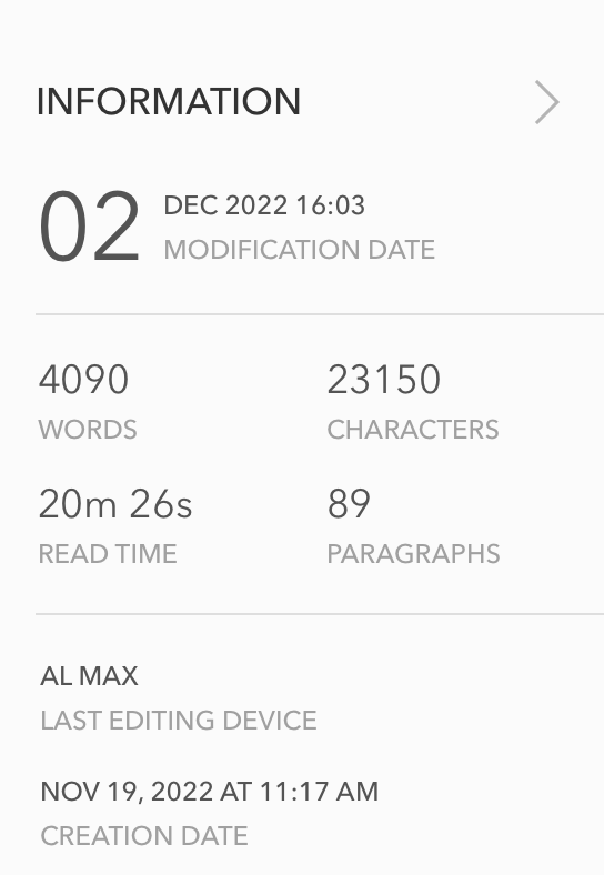
I don’t know how important metrics are to you, but I do need to keep situational awareness of how long my posts are to make sure Steven Goetz won’t yell at me for the show being too short. Maybe you have a certain number of words or characters you’re allowed for an article you’re writing for someone else, or you’re working on your great novel and want to keep track of how many words you’ve written.
On both the Mac and iPadOS versions of Bear, there’s a little “i” icon in the upper right that tells you how many words, characters, and paragraphs you’ve written and approximately how long it will take to read out loud.
Below those metrics are icons that allow you to export to Markdown, PDF, HTML, Word, JPG, or Rich Text format with a single tap.
Themes
On iPadOS, even with an external keyboard, you get a set of icons that allow you to do some standard Markdown formatting such as adding headings, a line separator (horizontal rule), bold, italics, underline, strikethrough, adding links, bulleted, and numbered lists. You can also add tags with the hashtag icon, and even enter a drawing mode or insert an image from the camera or image gallery.
On the Mac, you get a few more options, like code and code blocks along with highlighting and attaching files.
Changing themes is always fun and both versions have several built in. Oddly there isn’t much flexibility in choosing the font. I really like the Red Graphite theme that uses the Avenir Next font. It’s a good thing I found a font I like because you only get to choose between 6 different fonts with Bear.
I love the distraction-free mode with both sidebars collapsed. Those sidebars contain the list of tags and the list of notes within the current tag.
Linking between notes
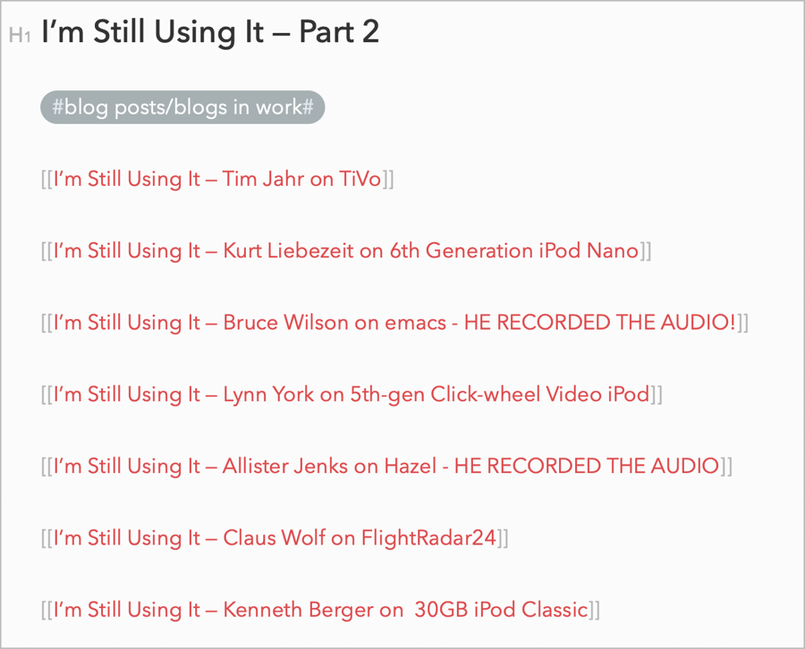
Bear allows you to link from one note to another within the note. I don’t have a lot of use for this option, but I gave it a go while working on the next “I’m Still Using It” segment. I created a separate note for each of the seven new entries we have. I put them all in a nested tag called “i’m still using it” (all lowercase because that’s how Bear does it).
Then I created a note called “I’m Still Using It Part 2”, and I pasted in links to each of the short notes from the contributors. From the main note, I can click on any of the note links and they open immediately. This is kind of a contrived example, but I wanted to test it out in case it’s of value to you.
Bottom Line
The bottom line is that I really truly enjoy writing with Bear. It’s $25/year less expensive than Ulysses, and now I don’t cringe when I know I need to enter a link.
I was able to export all of my notes from Ulysses and import them into Bear with no trouble at all. They’re waiting for me in the auto-generated Untagged folder but I might just leave them be. The good news is that I finished my analysis 3 days before my annual Ulysses subscription was due. Thanks to Marty, Al, and Grumpy for helping me find a great alternative that actually saved me money.


I’m glad you found that Bear works for you. One correction I want to make about obsidian — the ipad app is free. The $10/month you referenced is for the syncing service. Obsidian will sync with icloud without subscribing to the obsidian syncing service. I know that’s vital to your workflow, so the difference may not matter, but just wanted to point out that the app itself on the iPad is free.
I’m in a similar vein with you, having used Ulysses essentially since it came out. Long, long-time user. For me, the two paper cuts are they took Markdown out of the right-click menu and forced you to open it up on the main menu. It used to be SO fast to right-click and run. The other one is the lack of being able to turn Markdown on the screen OFF; how friggin hard could that be to implement?
I still have my subscription to Ulysses, as I love their version control and just have so many docs in it, but Bear is easily my Go To now for all kinds of <2,000 word documents.