Every year I make a calendar for my family that includes the very best photos of the year. I’ve been doing it every year since my own kids were little. Everyone loves it, including me.
When I started doing it, it was only Steve and me and the two kids, but now our family has grown to 10. I used to do one big photo for each month but as the family expanded, each page is now a collage of 20 photos per month.
I used to use the built-in tools in iPhoto to make my calendar, but in 2019 Apple decided to stop providing this capability. They developed an API that allowed third-parties to help you create projects like photo books and calendars and more. One of the companies that developed a plugin for Photos is a company called Mimeo Photos. It’s actually the company Apple used to use to print their calendars and the quality is fantastic.
I wrote about Mimeo Photos back in 2019 and I sang its many virtues. At the time I said I was in love with it, but I think over the years it’s mellowed into I’m in like with it.
It does let me create beautiful calendars that warm our hearts and that’s the most important thing. It does let me have a lot more flexibility with the layouts than Apple’s tools ever did. The calendars are simply gorgeous when printed. They’re expensive at $35 each after tax and shipping, but again, gorgeous and my family loves them so the price is ok with me.
This Year it Got Hard
This year I ran into some significant challenges making my calendar, but in the end I think it showed a better path to success. I have some improvement suggestions for Mimeo Photos but we’ll get to that in a bit.
My family embraces the calendar, so we start a shared album every year and the kids pour funny and awesome photos throughout the year. This year I had over 460 photos in the shared calendar album to choose from. That’s a good thing and a bad thing, right?
Apple Photos completely failed me in making the calendar this year, and I’m not sure why. Let’s walk through how you create a calendar (or other project) inside Apple Photos.
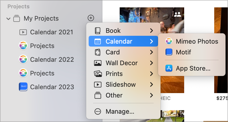
On the Mac only (not the iPad), if you scroll down on the left sidebar past the stock things like Library, Favorites and Memories, past Albums, Shared Albums, and My Albums, you’ll finally find Projects. If you hover over the words “My Projects” you’ll see a plus button.

If you click the plus button next to My Projects, you can see options to create a book, calendar, card, wall decor, prints, slideshow or other. In my case I chose Calendar. If you don’t have any extensions installed you’ll have the option to go to the App Store where you can download different extensions. I have Mimeo Photos installed along with a direct competitor called Motif.
Once you tell Photos you want a calendar, you’ll be walked through some options by Mimeo Photos like on what month would you like the calendar to start, and for how many months you would like it.
Pro tip: Start it in February and have it be 12 months so the last month is January. I used to try to get it done in December and it was the wrong time to cram a major project in! Getting it done in January is much less stressful.
After making a few decisions on the design of your calendar in Mimeo Photos, you are ready to start adding photos. And this is where Apple Photos makes it really hard. Remember all of those things we had to scroll past to get to projects at the bottom? You have to scroll all the way back up and grab the album icon for the shared album and drag it into the calendar’s photo section.
But this year, Photos would not let me add my images to the calendar project in Mimeo Photos. When I tried to add them by dragging and dropping, Photos would become non-responsive. It didn’t even give me the courtesy of a spinning pizza wheel of death! I had to force quit to get it to respond.
After deleting the calendar and recreating three times, I abandoned that whole path and decided to give the other calendar option, Motif, a try. I never got a chance to kick the tires because after creating the project I couldn’t add photos to that calendar either. That got me to thinking it wasn’t the extensions that were the problem, it was Photos itself that was messed up.
After force-quitting Photos a half dozen times, I was desperate for a solution. I started poking around online and was reminded of the fact that you can rebuild your Photos Library. I hadn’t done that in a while and thought it was a good idea. I know, I hear it too, that impending doom music, right?
First of all, it took the better part of a day for it to rebuild the library. With 95K photos, I suppose I should have expected that, but it was still torture. But even worse, when it came back to life, everything was working except shared albums. Remember, that’s the one thing I needed to work for this project.
Instead of images in my shared albums, I just had little rectangles with clouds on them. I keep originals downloaded to my laptop so this didn’t make any sense. I kept checking back hour after hour hoping they would have magically arrived, but this went on for days. I was bereft.
iCloud.com to the Rescue
But then I remembered that icloud.com should have my originals. This ended up being the first key to my success. Luckily, and surprisingly, icloud.com does have shared albums, so I was able to download all of the originals into a folder on my Mac. It’s days like this that I’m glad I coughed up the money for a huge SSD.
Mimeo Photos has a Web App
But that didn’t solve the problem of how to get them into the Mimeo Photos extension. I went to the Mimeo Photos website to try to figure out a way around my problem, and guess what? They have a web app version that’s pretty close to identical to the Photos extension!

When I say it’s “pretty close”, the way it differs is that it’s way faster to use, and you’re not crammed into a partial window inside Photos. With the extension I always feel like I’m in the center seat of a 5-person row on an airplane with my elbows pushed together trying to eat my dinner with a spork!
I mentioned that with our growing family, I started putting 20 images on each page. Mimeo Photos has a layout that gives me a 5 x 4 grid of squares into which I can drop my photos. Using the Mimeo Photos web app, I can put the window in full screen on my external display and really see how the 20 images look.
I have to mark Mimeo Photos down a notch though for not taking advantage of that glorious web-based screen real estate when they show you the photos you imported. In the extension for Photos and in the web app, they have a narrow column on the right where you can see all of the photos you’ve imported for the project. You can only see two photos on a row.
On the extension, there’s a button that allows you to widen that column, which makes the images easier to view. But on the web app there is no option to widen the column. To be honest, with this giant album of 460 photos, what I really want is to be able to widen the column and have say 4 photos across, rather than the 2 that they allow you to view. 230 rows of photos to be constantly scrolling up and down through is a real chore.
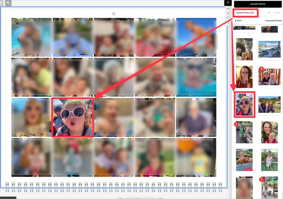
Mimeo Photos allows you to choose to view all photos, used photos, or unused photos. In theory, this is great. If I keep it showing me only unused photos, every month I do should cut down how many photos I have to scroll through by 20.
I say “in theory” because we don’t have the most robust process for uploading photos to the shared album, so some photos definitely got uploaded more than once, so “unused” was a matter of opinion. I’ll circle back to that in a bit.
I have another pro tip for you. If you’re using a lot of photos, don’t try to theme your calendar pages. It’s way too much stress. I used to try to make sure only costume photos were in October, and make sure I featured a specific person on their birth month. Instead I go with totally random right from the start. If you restrict yourself to themes, you might end up using a costume photo that’s not all that great when a hilarious one of your granddaughter smashing her face up against a glass window didn’t make the cut.
I do have to make sure that in the end I have close to the same number of photos from each family but I may be the only one who actually pays attention to that. I created a Numbers spreadsheet when I was close to done so I could make sure to be fair to both of my kids families.
I mentioned that the page layout is squares which means a fair number of photos can never be used. Without manually adding black bars, a wide group photo never makes the calendar unless it’s worthy of being the cover photo. That limitation actually helped me narrow down the hundreds of images!
Adding and Moving Images
In Mimeo Photos you can add an image to the calendar in a lot of different ways. If you first select one of the placeholders in the grid, and then scroll endlessly till you find a photo that looks like it might be good, you can just tap on it in the scrolling sidebar and it will pop the preselected location. Alternatively, you can find a photo first, and then drag and drop it onto one of the placeholders.
Sometimes you end up with photos on the right page but you’d like to rearrange them. Easy peasy, just drag one onto another and they’ll swap position. I mentioned in my original Mimeo Photos review that Apple doesn’t allow extension developers to have access to undo inside Photos, but in the web app for Mimeo Photos there is no restriction so undo is there to save you.
Remember I said I was keeping a count by month to make sure I was fairly representing the families? After I had the calendar mostly done, I realized it favored my son’s family dramatically in the first half of the year and my daughter’s family dramatically in the second half of the year. If you’re thinking I was able to easily fix this, you’re a dreamer.
The only way to fix it would be to select a photo, remove it with the trash can, scroll to a different month, remove the image that was in that month, and then find the first photo amongst the hundreds in the scrolly window and drop it in. Next I’d have to find the second photo I removed in the scrolly window of doom, and then flip pages to the first month that’s now missing a photo and drop it in. I know that sounds complicated, but I assure you it’s way worse than hearing it described. It’s close to impossible to do this.
One of the reasons it’s worse than hearing it described, is that as soon as you remove an image, the scrolly list pops back to the top. Kyle’s family photos ended up mostly in the top half and Lindsay’s were mostly in the bottom half, so every time I needed to find one of her family right after deleting one, I had to scroll back down through hundreds of photos yet again.
Luckily my kids all agreed that if it was overall fairly distributed they were good. Smart kids!
Getting my initial layout complete took about 3 days of on and off work. But this is the super fun part. I get to laugh at the ridiculous photos my kids put in the album and enjoy all 460 of them as I “work” on the calendar. Once I had my first draft done, it was time for inspection by the family.
In recent versions of the plugin for Apple Photos, Mimeo Photos had an option to print a proof version to PDF. Sadly, the web version has no proofing option.
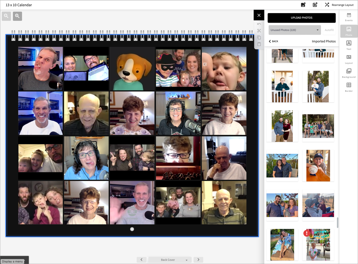
My solution was to flip through the pages and take 14 screenshots – one for each month and the front and back covers. I’m rather pleased with the back cover, by the way. We have a family video call with Steve’s mom and dad and all the kids once a month, and I take screenshots from time to time, especially if things get silly. I took excerpts from the different screenshots and created a hilarious collage of 20 photos (included in the shownotes for your entertainment.)
I zipped up the 14 screenshots and dropped the zipped file into Dropbox and asked the family to review the calendar. The inspection rules were to make sure I didn’t have any duplicates, and also if there was a particular photo that they simply loved that didn’t make the cut, they could identify a photo of their own family to make a swap. I told Kyle he couldn’t replace a picture of Lindsay’s kids with one of his own. You know how he is.
Kyle and Nikki wrote back a bunch of fun comments about how much they loved the calendar after reviewing it. They called out specific pages and showed real excitement. Steve had seen me working on it but he still dutifully went through the whole thing and found nothing he thought needed to be changed.
And now we come to Lindsay’s review. I should mention that Lindsay is an associate director of Quality Assurance before telling you her results. She found FOUR sets of duplicates … and one photo that was triplicated!!! I didn’t notice any but I had been looking at the same photos on and off for days, but Kyle, Nikki, and Steve didn’t catch any of them either. Isn’t that hilarious? I told her to tell the story at work because it simply proves that she’s in the right line of work.
I’m not sure our process is completely to blame for the duplicates and the triplicate. Remember I said that Mimeo Photos allows you to view the column of photos by unused? When I was fixing one of the duplicates, I noticed that the same photo was still in the unused view, even though it was already in the calendar twice.

Mimeo Photos Web App Is Better for Ordering
Once I had the duplicates and triplicates fixed it was time to make my orders. I send out 5 calendars to 5 different addresses. I dread this part every year because in order to send 5 calendars to 5 different addresses, the Mimeo Photos plugin makes me upload the entire calendar with all those images, 5 separate times! It takes forever.
But guess what? If you use Mimeo Photos via the web, the data is already up there! I didn’t have to upload it even once. No more uploading over and over and over again. I did buy all 5 separately, but they take Apple Pay so it wasn’t nearly as painful. I have to say, it delighted me.
Bottom Line
The bottom line is that I am in serious like with Mimeo Photos. I will change that back to love if they make it easier to navigate and track a vast set of photos in the future. Until then they get 4 stars from me. I do give a big thumbs up to the web interface for Mimeo Photos over the plugin to Photos.
The only downside to the web version is that you can’t print a proof of your project. But the good news is that the web app is much more responsive. Flipping between pages is much faster than it is inside the Photos extension. And the huge upside to the web app is not having to upload my project 5 separate times to send it to 5 different people.
And finally, I love my family. This calendar is filled with the silliest, and most precious captures. I also realized that my family sticks their tongues out a lot. I have no idea where they get that.


In my family I used to be the one to make the annual calendar, but several years ago my wife received a free calendar coupon from Shutterfly and now the annual calendar is HER project. And did I mention it’s free? I guess they hope to sell additional copies once the first one is made.