A few times over the past couple of years I’ve mentioned an app called Sizzy that Helma from the Netherlands recommended to me. Sizzy is a very slick tool for people who are developing websites and web apps. The main problem it solved for Helma and me is that it shows you what your web app or site will look on a whole bunch of different platforms all at once.
You might make a site that looks great on your Mac, but squished onto an iPhone SE it’s not useful at all. Sizzy can show you the site on the SE and a Galaxy Tab and a portrait-mode iPad and more.
Helma discovered Sizzy in Setapp and turned me onto it. I kept meaning to do a review, but it was a pretty high-end tool and had so much more built-in capability that I didn’t use or understand that I never did the review.
A few months ago, we discovered that Sizzy had been removed from Setapp and we were both super sad. I looked into buying Sizzy but it’s a subscription model with the least expensive pricing being $12/month. For how little I actually code, I couldn’t justify the price. If you do web development for a living, I highly recommend you check out Sizzy to see if it can help you in your work. It just wasn’t right for me, but I was sad to lose the responsive design mode that I used from Sizzy.
This week though, Helma discovered something wonderful. The lovely people at Mozilla have come out with a Developer Edition of Firefox that includes tools to view your sites and just their responsive design on a whole bunch of platforms. And of course, it’s free.
You can download the Firefox Developer Edition at www.mozilla.org/…. From there, navigate to the site you want to test. In the toolbar on the right side is a wrench and under that is an option for Responsive Design Mode (or you can use the keystroke option-command-M.
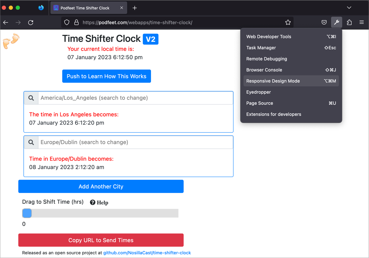
Immediately the layout of the website you’ve navigated to will change to reflect one of the screen sizes. Mine defaulted to an iPhone 11 Pro, but there’s a dropdown to show many more options. It looks like the list isn’t super up-to-date because it maxes out on the iPhone 13 Pro. It includes the Galaxy Note 20, Galaxy 10 and 10+ and more.
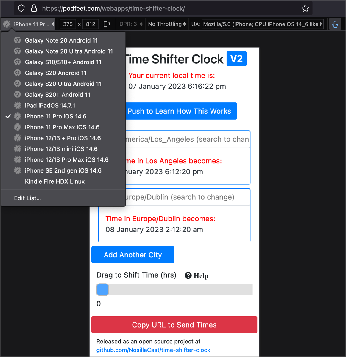
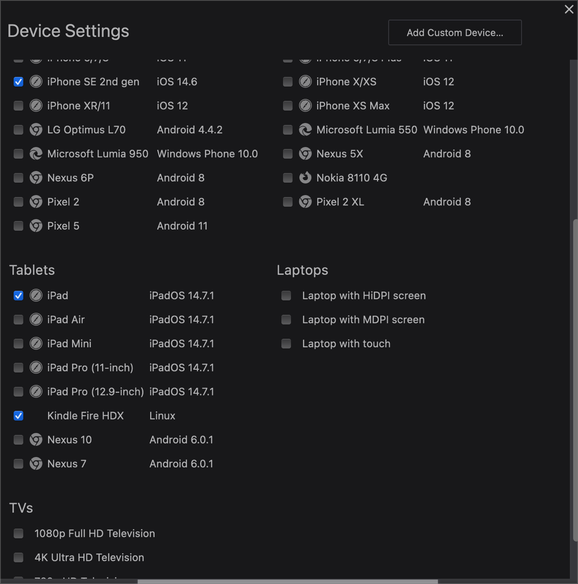
At the bottom of the dropdown, it has an option to edit the list, and from there a grid of lots more devices. You can check and uncheck them to make your dropdown list just the devices you’d like to see.
If you don’t see a device you really need in the grid, you can create it yourself with the Create Custom option.
You will probably want to explore their new features to help you master the CSS Grid, find inactive CSS, work more quickly with their fonts panel, and more.
I’m delighted to have an easy way to get the one feature I used in Sizzy, and for the glorious price of free.
After I wrote up this glorious discovery, I tooted it out on Mastodon and other places. @[email protected] tooted me back with:
You don’t need the developer edition for this afaik, it’s available in all versions of Firefox. Chrome and Safari have very similar tools too.
I jumped into “regular” Firefox and sure enough, under the Tools menu in Browser Tools is Responsive Design mode which brings up the exact same thing. And here I thought Helma and I had made fire! I feel silly but I’d much rather feel silly and never know the tools are right there.
In Safari you have to do a smidge more work (work I’d already done). Open Safari Settings (Preferences if you’re on pre-Ventura macOS). Select the Advanced tab and at the bottom, you’ll see a checkbox to show the Develop menu in the menu bar.
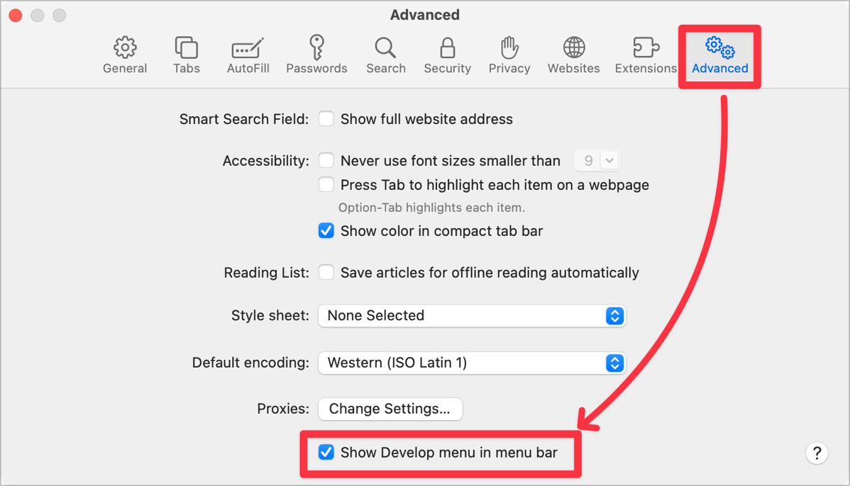
Once you close Settings/Preferences for Safari, you’ll now see the Develop menu between Bookmarks and Window. It’s a long menu with lots of cool stuff in it, but the 7th item down says Responsive Design Mode and can be triggered with Control-Command-R.
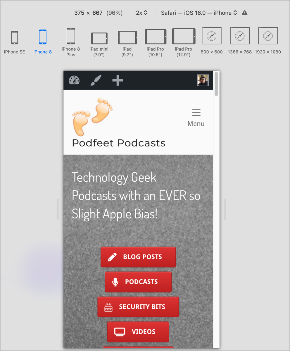
You’ll be rewarded with little icons for the major Apple products (but only up to iPhone 8 Plus so I guess Firefox isn’t actually far behind.) In typical Apple fashion, it doesn’t include any Android tablets or phones but it does have 3 screen resolutions you can test. Unlike Firefox, you can’t rotate to landscape either. It’s sweet that Apple tried, but I’ll be using regular Firefox for testing responsive design of my web apps and websites.
I’m so glad that scottishwildcat corrected me, especially before I talked about it on the podcast!


You don’t need the developer edition for this afaik, it’s available in all versions of Firefox. Chrome and Safari have very similar tools too.
Thanks Calum, or should I call you scottishwildcat? 🙂
Good discovery, Calum – thanks!