I’ve talked a lot about the process of nuking and paving my Macs over the years, and I just finished the process a couple of weeks ago. I’ve mentioned that I have a giant mind map that I follow to install all of my apps and to configure all of them.
Would you like me to talk about every single app I install and how I configure them in the “pave” half of a nuke and pave? It’s only 15 pages long in outline form…
Yeah, I didn’t think so. I do a lot of little tweaks to macOS and Apple’s built-in apps to make it just the way I like it after a nuke, and I thought that might actually be of interest to many of you.
Finder
Show Me the Bars
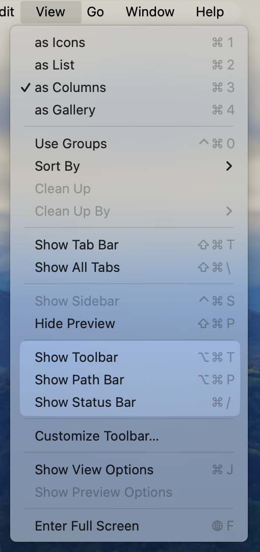
There are quite a few settings I change in the Finder that I find makes my computing life easier.
With a standard Finder window, there are three bars that are really useful to have visible at all times. The toolbar across the top is on by default, which gives you access to a number of buttons to control things like changing from icon to list or column view, grouping of files, sharing, and more.
But two other bars are off by default and I feel paralyzed without them. Under the View menu in Finder, you can turn on the Path Bar and the Status Bar. The Path Bar shows at the bottom of Finder windows, and it shows you the full path graphically back to the root folder. For example, I have a folder of images I’m working with for this article, and I can see with one of them selected that the folder is called Paving, it’s inside this week’s NosillaCast folder, which is inside NosillaCast Weekly Files, which is inside a NosillaCast folder, which is inside a folder called podfeet, which lives in Documents, which is inside iCloud Drive!
Maybe you don’t always need to pay attention to the full path, but if you do have the Path Bar showing, you can do magical things like jump to a much higher directory in the path or even drag files up the path. We learned that little trick from Helma from the Netherlands a while ago.
The even more critical bar to keep showing in Finder windows at all times is the Status Bar. This sits below the Path Bar and it tells you how many files are in the currently selected folder, as well as how much space is available on the disk. If the selected folder is in iCloud Drive, you’ll see how much space you have left in the cloud. I use the Status Bar really often when I’m comparing two folders that are supposed to have the same contents. Rather than counting the files, I can quickly tell at a glance at the Status Bar.

Stop Hiding Already
One of the silliest user interface design decisions Apple has made in the past few years has been to have certain features only visible when you hover over something. The worst example of this is how if you hover over the title of a Finder window, you’ll see the folder icon appear. But if you move away, it disappears again.
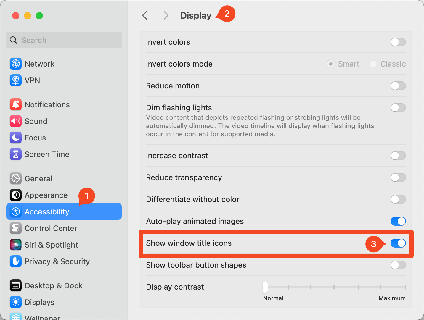
This window title icon is super useful. If you’re in a Save As dialog box in any app, and you have the folder into which you want to save open in Finder at the same time, you can drag that little folder icon into the Save As dialog box and it will change to that folder. I use this all day long. One of the first things I do when I set up a new Mac or pave an existing one is to tell the system to stop hiding that icon from me! I have trouble remembering what it’s called so it’s super hard to search for where to turn that darn hiding off.
It’s in System Settings / Accessibility / Display / Show window title icons. If you toggle that on, then your precious folder icons will always be visible. I have no more idea why this is hidden inside Accessibility than I understand why Apple chose to hide the icon from us in the first place!
Get with the Grid
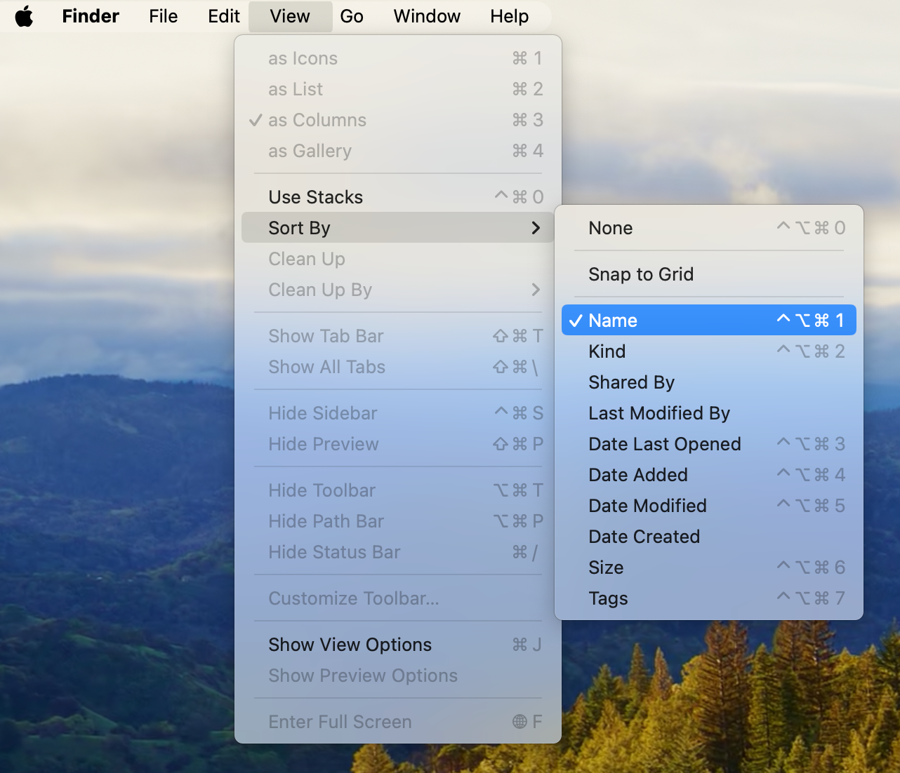
I don’t favor icon view when perusing a folder, but it’s the only way to view your Desktop. For some reason, Apple seems to think that most of us are comfortable living in anarchy with our files and folders sprinkled haphazardly around on our Desktops. I’m sure you don’t like it that way any more than I do.
Up in the Finder View menu, look for Sort By and you’ll see several options. One is to Snap to Grid which is a good first step because at least when you drag things around, they’ll stay in neat columns and rows. But I go a step further and Sort by Name. This option causes snap to grid to be enabled and alphabetizes your Desktop files as nature intended, and as a bonus prize, it puts your drives at the top.
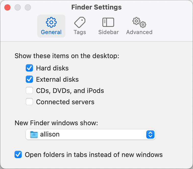
Oh, did you say you can’t see your drives and external disks? Take a quick trip to Finder Settings and choose which items you’d like visible: hard disks, external disks, CDs, DVDs and iPods, and connected servers. I know, iPods and optical media, right? Even hard disks are an antiquated term for internal disks these days. I think it’s curious that this setting isn’t in the View menu, but instead within Finder Settings, but I guess we should be happy they didn’t hide it in Accessibility.
While you’re in the Finder Settings menu, did you know you can change the location where new Finder windows open? I find no value in the Recents folder which is selected by default so I always change this to my home folder.
iCloud Drive
I’m a big fan of syncing Desktop and Documents through iCloud Drive. I get why you might not want to do that, but I really like having all of my documents available on both of my Macs and on my iPad /iPhone within the Files app. I purposely bought my MacBook Pro with a 4 TB drive so that I would never have to make compromises on what I could keep locally. This giant drive allows me to keep my 100,000+ photos in full resolution. Having them locally means I can back them up locally, and not entirely depend on Apple to protect my precious photos.
When you enable syncing via iCloud Drive for Desktop and Documents, it will default to optimized storage. This means that it will move files into the cloud that you haven’t used recently if it needs to save storage. In my experience, it does that even if it’s not running out of space. Just like with my photos, I would like all of my documents to always be local. I don’t want to have to depend on an Internet connection in order to access my own files.
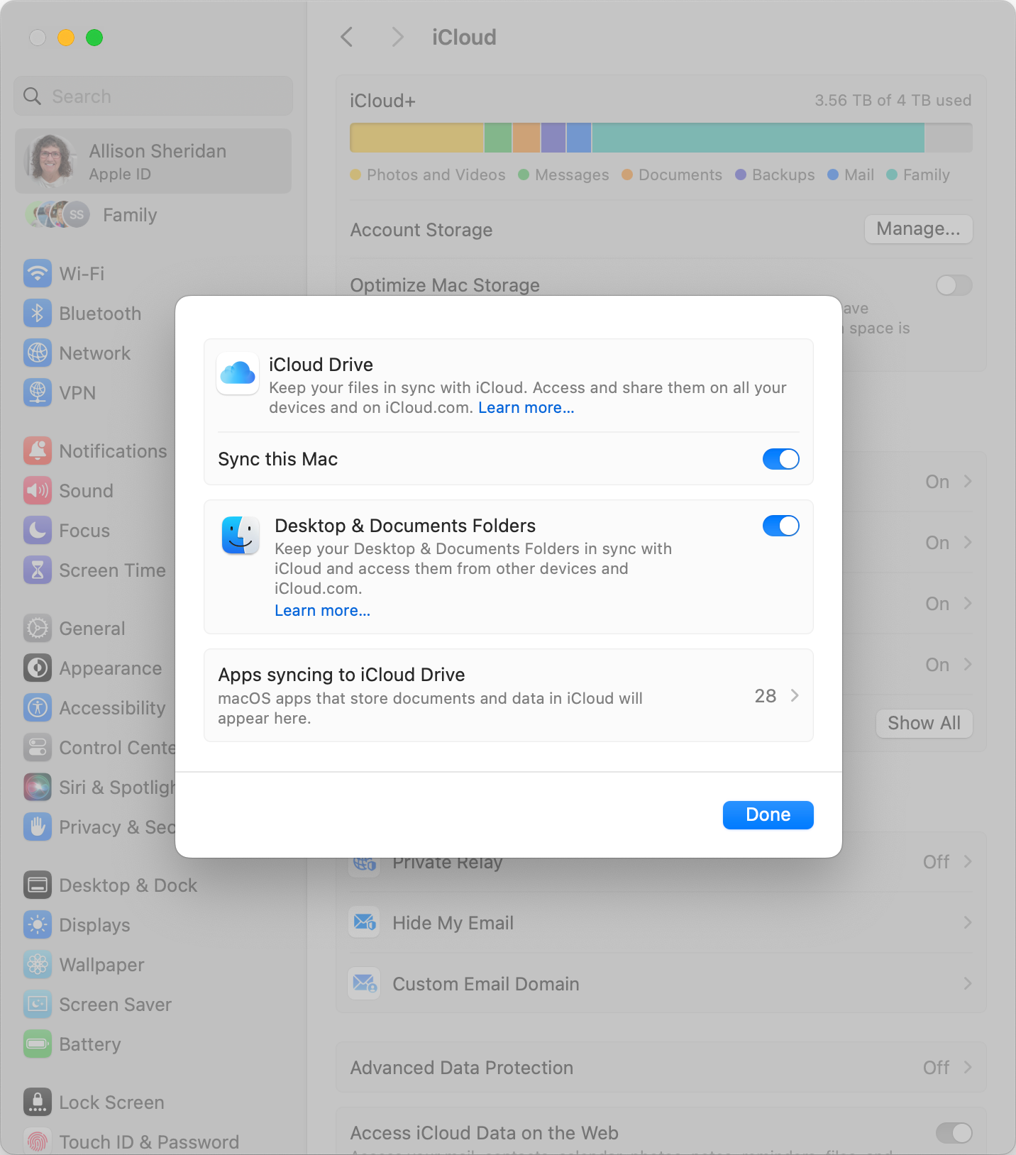
To enable syncing of your Desktop and Documents, start by opening System Settings, select your Apple ID at the top, select iCloud, then iCloud Drive. In the window that pops up, turn on the toggles for both Sync this Mac, and Desktop & Documents Folders.
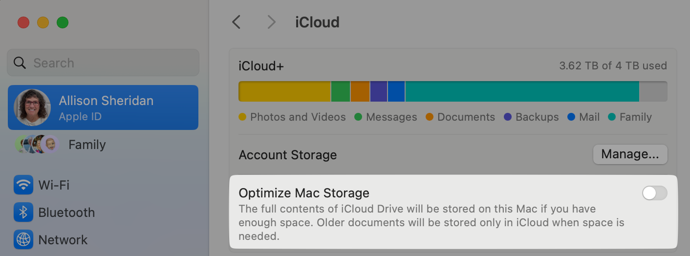
In order to make sure your files are always stored locally, back on the iCloud page, you’ll see a toggle for Optimize Mac Storage. This will be toggled on by default, but if you have enough local storage, you might want to toggle it off.
Mail Needs Some Help
Setting up Mail the way you like it is a very personal thing, so I’m not going to tell you what you need to do, but I will tell you what I like to do.
Send New Messages From
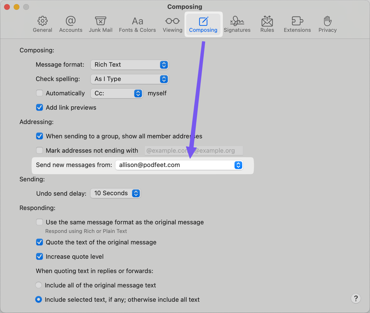
I have several email addresses but I like to default my emails to come from [email protected]. When you first set up a new Mac, Apple tells you that it knows best. If you open up, Mail, Settings, and select the Composing tab, you’ll see that it will automatically send “From best account”. I don’t know how it decides what is the best account but I can tell you it’s almost always wrong. I change mine to my professional email address, and if I’m writing to my friends or family, I can always change it on the fly to my personal address. I have found that this setting is not particularly sticky though, it seems to degrade over time on my different devices, so it’s a good idea to keep an eye on the address from which Mail is sending.
Setting Fonts in Mail
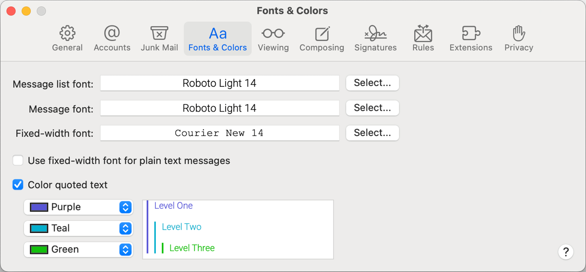
I don’t think that I’m alone in being kind of fussy about what fonts I use when viewing and creating content. in Apple Mail on the Font & Colors tab within Settings, you can change the message list font, and the message font, and you can set a fixed-width font. I am not particular about the colors for indented quoted text, but if that blows your dress up, you can change that as well.
I have become fond of the Roboto Light font which I downloaded from Google Fonts, and Courier is my go-to for a fixed-width font. Even if you’re not fussy about your fonts, you might want to change the size of the fonts for the message list and for your messages. Perhaps you’re a youngster, and you would like to pack in more information on the screen – you can set them to be smaller than the defaults. If you are a wee bit older, you might want to increase the size. All of this is available in the Font & Colors tab in Mail Settings.
Where’s Bcc?
I find it amusing when we continue to use terms and iconography that used to have physical meaning, and yet no longer do. A perfect example is that every save icon is a picture of a floppy disk and yet most younger people have probably never seen one.
Another great example is the terms CC and Bcc. Even if you are of the younger set, you may know that it stands for carbon copy and blind carbon copy, but like the floppy disk, you may not know the origin story. Back in my day, before computers came on the scene for typing, if we wanted a copy of something being typed, we had to put a piece of carbon paper between two pieces of paper. When you typed on the top sheet, it would imprint on the carbon, and transfer the letters to the sheet underneath.
When you wrote a letter, it was considered good form to type CC: followed by the name of anyone who received a carbon copy of the letter you were sending. But if you didn’t want the recipient to know that you were sending a copy to someone else, that was called a blind carbon copy.
In Apple Mail by default, you can see the “To:” field and the carbon copy field, but you don’t see the blind carbon copy field. If you want to send an email to a large group of people, it is considered good form to hide their email addresses from each other, and the blind carbon copy field is where you do that.
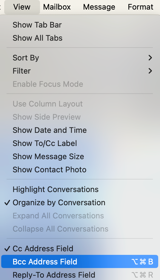
In order to be able to send blind carbon copies, go up to the View menu in Mail and select “Bcc Address Field”. If you only want to see the Bcc field occasionally and you are a keyboard shortcut junkie, you can use Option-Command-B to toggle it on and off.
Recent Messages Belong at the Top
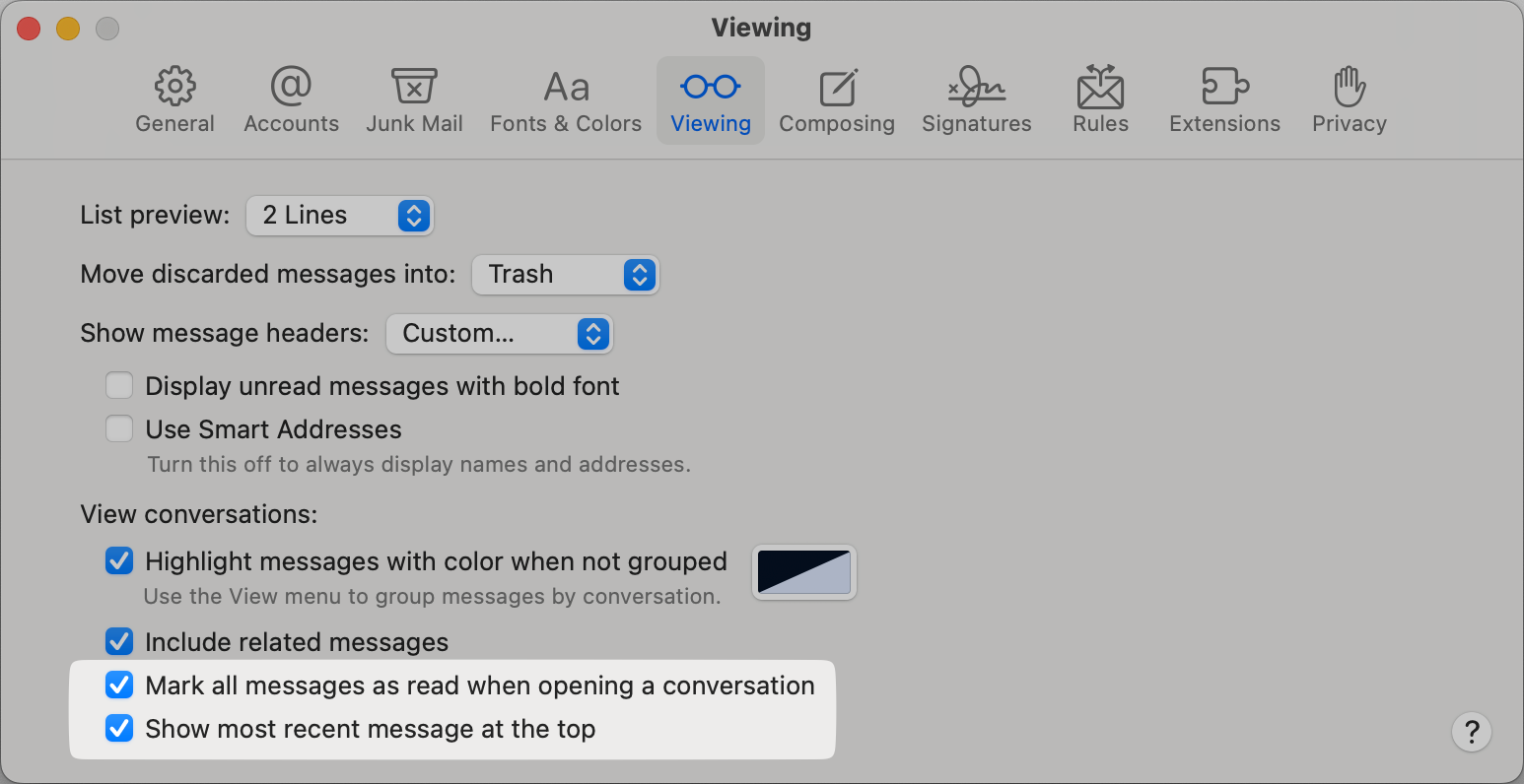
Since Apple first introduced its Mail app, the most recent messages have always been at the top. I wish I knew why, but the default is now to show new messages at the bottom. If you open up Mail Settings and select the Viewing tab, you will find a nice little checkbox that says “Show most recent message at the top”, as it should be. I also check the box right next to it that says “Mark all messages as read when opening a conversation”. It drives me bananas when I see that blue dot next to a long message thread and I have to scroll through all of the messages trying to figure out which one is unread.
Here’s a bonus tiny tip that I learned from the Mac Geek Gab. If you select a single message within a thread and hold down Command-Shift-U, it will toggle that one message unread and read. If you apply Command-Shift-U to a thread where every message has been read, it gets a little weird toggling only some of the messages as unread. But if any of the messages in the thread are marked as unread, it will mark them all as read with just that key combo. No more scrolling to find the blue dot!
I plan on using this often because I like to leave the very last message in a thread as unread to remind me to respond. Now I can control quickly what gets that blue dot.
Open With What I Tell You
Probably the most irritating thing about a fresh install of macOS is when you open an audio file and it imports the file into Apple Music. I literally have never wanted that to be the option. I also never remember to fix this until the first time it happens on a clean install.
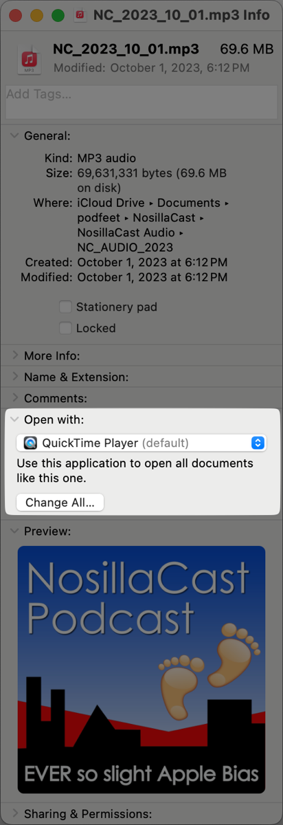
The trick is to select an audio file in the Finder, such as an MP3, and in the Finder menu bar, choose File > Get Info, or simply hold down Command-I to bring up the Get Info window. This will give you a lot of fun information about the file. Partway down you should see something that says, “Open with”. It may have a chevron pointing to the right, which indicates that it can be opened.
There will be a drop-down menu, which is most likely set to Apple Music. I change audio files to open in QuickTime. Below that you will see it says, “Change all…” When selected, you’ll be asked to confirm that you want to make such a drastic change, but just say “Yes!”
Once you’ve done this for MP3 files, you have to rinse and repeat for WAV, AIFF, and M4A files. It’s a bit of a hassle, but it’s a lot harder to accidentally open files in music and then have to go get rid of those files that are cluttering up your Music library!
You can change what application opens your files of any type, not just audio files. I set PNG files to open in Shottr so I can easily annotate them or pin them to the screen, I set SVG files to open in Affinity Designer, and DOCX files to open in Apple Pages.
Let’s Go On Safari
No Files are Safe
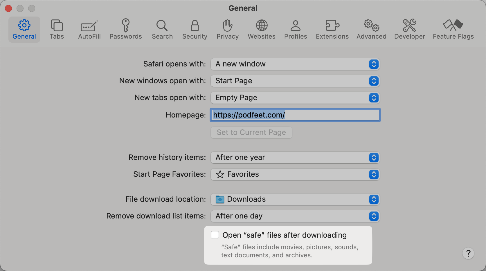
Years ago, Apple made a very silly decision for one setting in Safari. If you look at the general tab at the bottom, you’ll see a checkbox that says”
Open “safe” files after downloading
“Safe” files include movies, pictures, sounds, text documents, and archives.
This box is checked on by default. I suppose it might be pleasing to have files open automatically after you download them, but how does Apple know that these files are safe? Especially archives — they could contain just about anything including executable files! I recommend giving yourself the opportunity to make sure that you were the one who downloaded a file before deciding to open it automatically. I uncheck this box the first time I open Safari.
Extend Safari
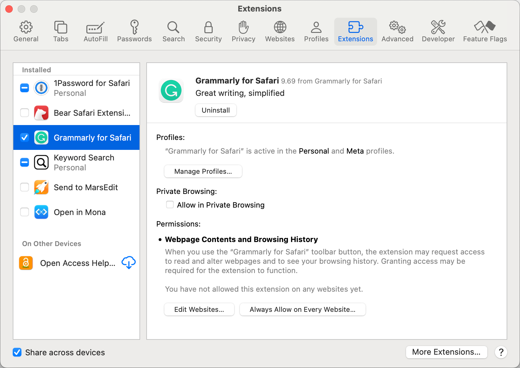
I have a couple of Safari extensions that I really like. If you open up Safari Settings and select the Extensions tab, you can add new extensions. 1Password for Safari is a fan favorite that gets installed first thing. I like to use Grammarly to check my spelling, grammar, and punctuation in all applications on my Mac, and I also install the Grammarly for Safari extension. Any time I am typing in a web form, Grammarly helps keep me from appearing uneducated.
Last year I told you about a terrific Safari extension, called Keyword Search and if anything, I am a bigger fan today than ever before. In a nutshell, Keyword Search allows me to type just a couple of letters into the search bar to tell it which website I want to search. For example, to search my own site, I type “sp” before my search term. I use “gi” to do a Google Image search, “sco” to search ScreenCastsONLINE, and “spbs” to search the Programming By Stealth show notes. I would feel like I had my hands tied around my back without the Keyword Search Safari extension.
I also have an extension called Open Access Helper, written by NosillaCastaway Claus Wolf. I don’t often need to use it myself, but it’s an extension that helps you find open versions of research papers that might be under a paywall on your first search. It’s not bypassing any copy protection, it’s just searching in other legitimate resources where information is more freely distributed. Since I don’t often do this kind of research, I keep it on my Mac but don’t enable it until I need it. If you do, it might be a great extension for you.
Nerd Alert
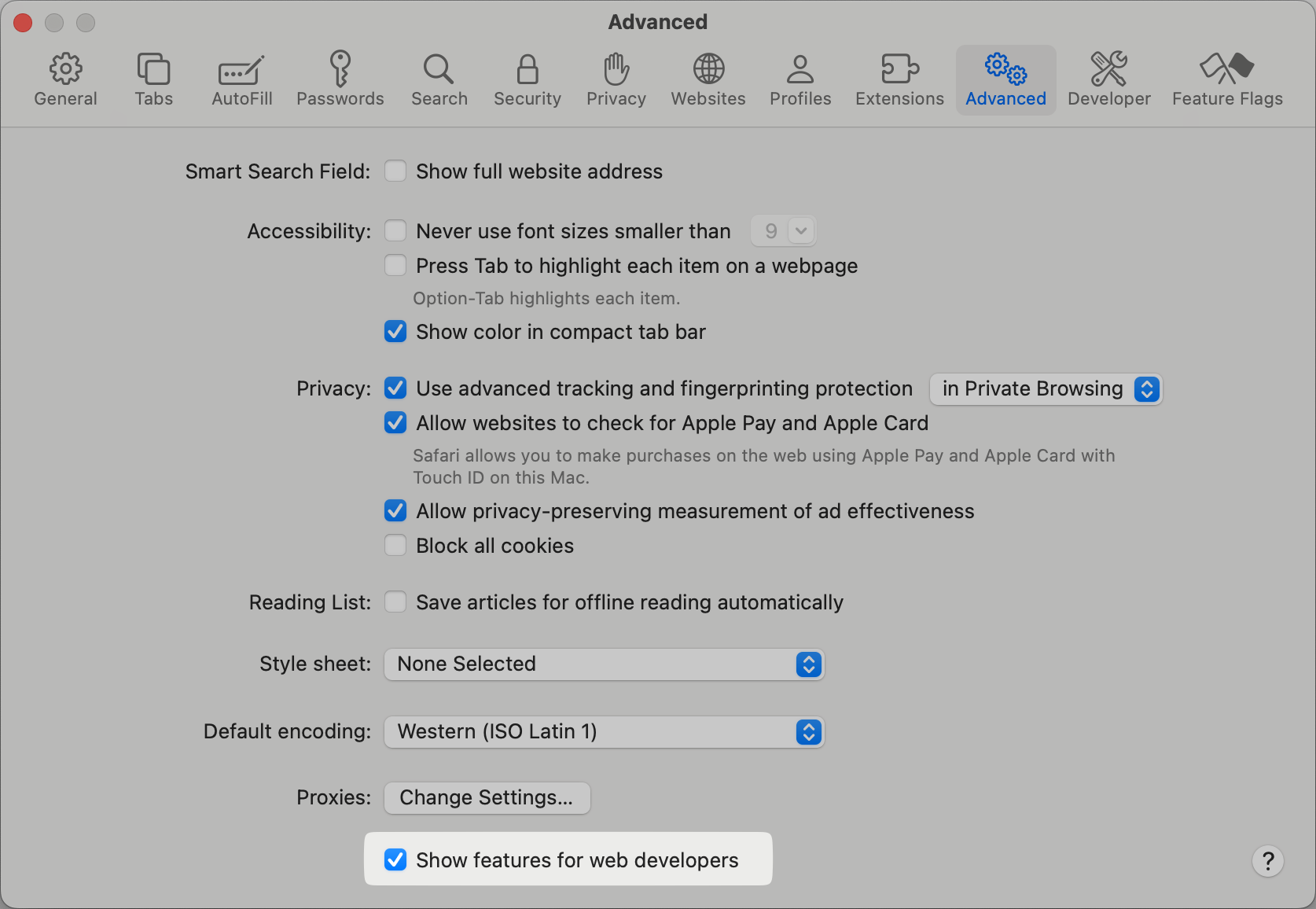
If you’re a developer, or if you occasionally want to see what’s under the hood on a web page, there’s a secret menu you can enable in Safari. In the Advanced tab of Safari Settings, at the very bottom, you’ll see a checkbox labeled “Show features for web developers”. This will enable a new menu from the Safari menu bar entitled Developer. My favorite tool in this menu (when I’m not using the console to play with JavaScript), is the Show Web Inspector option.
If you select the little crosshairs in the tools that pop up from the bottom, you can drag your cursor around the web page, and it will show you the HTML code for what you’ve selected. This sounds super nerdy (and it kinda is), but there’s a relatively un-nerdy thing I use it for.
When I want to tell you about a video tutorial I’ve created for ScreenCastsONLINE, I log out of the SCO website so I can’t see any paid-for content. Then I search for my latest tutorial. In the web inspector, I use the crosshairs tool to select the free preview version of my video. At the bottom of the Safari window, I can see the URL for this free preview.
I copy that URL and paste it into a blog post of my own where I promote the tutorial. Ok, maybe that is pretty nerdy but maybe it’s just the right amount of nerdy for you.
All Systems Are Go
Let’s go through a few of the System Settings I change at the Finder level.
I’m Impatient
I am very impatient, so one of the first things I do is speed up how quickly a key repeats if I hold it down. In System Settings, scroll all the way down to nearly the bottom, where you will see Keyboard. At the very top of the menu that opens, I take that key repeat rate slider, and I drag it all the way to the fastest setting. I don’t remember what the default is for Delay until repeat, but I drag that slider until it’s the second shortest option.
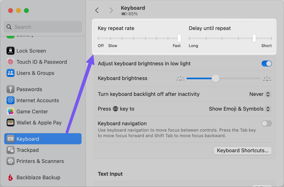
This is a perfect example of my preferences that might very likely be different from yours. Maybe when you open up a new Mac, the key repeat is way too fast for you. Either way, it’s good to know where you can control this.
I Like Tapping, Not Clicking
I don’t know why, but I really dislike clicking on a trackpad. I much prefer to tap the trackpad rather than having to press hard to click. There are two settings to control this that I change, and for no reason other than Apple likes to make settings kind of a fun scavenger hunt, they’re in two very different places.
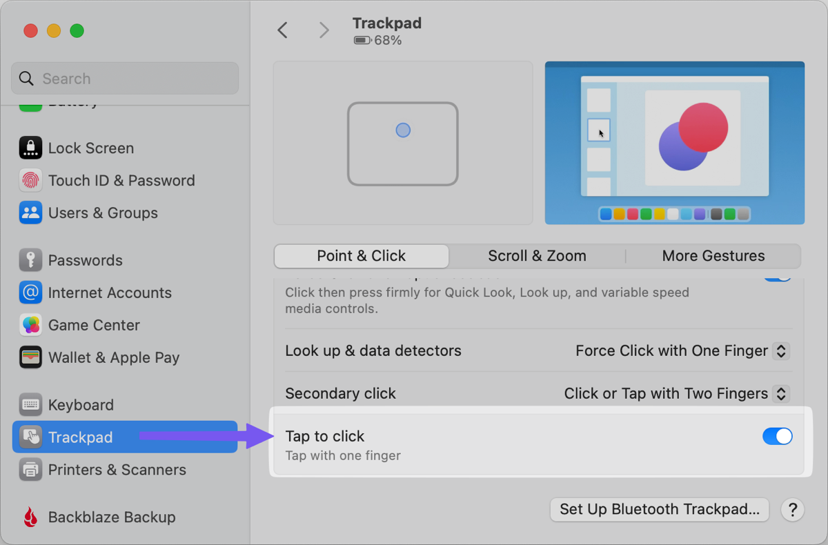
To simply enable tap to click on your trackpad, in System Settings, right below the keyboard settings, we just changed, you’ll see Trackpad. At the bottom of that menu, you will see a toggle to “Tap to click”. Even if you’re OK with true clicking, it’s nice to have that feature enabled for when you’d like to use a lighter touch.
That’s a Drag
The other time that I normally have to click instead of tap is when I want to drag a window or a file around on screen. You can enable a feature that allows you to gently place three fingers on your trackpad while at the top of a window or on a file and drag without clicking. This feature is called three finger drag and boy howdy, is it buried. It used to be in the Trackpad settings which made sense, but no longer is it easy to find.
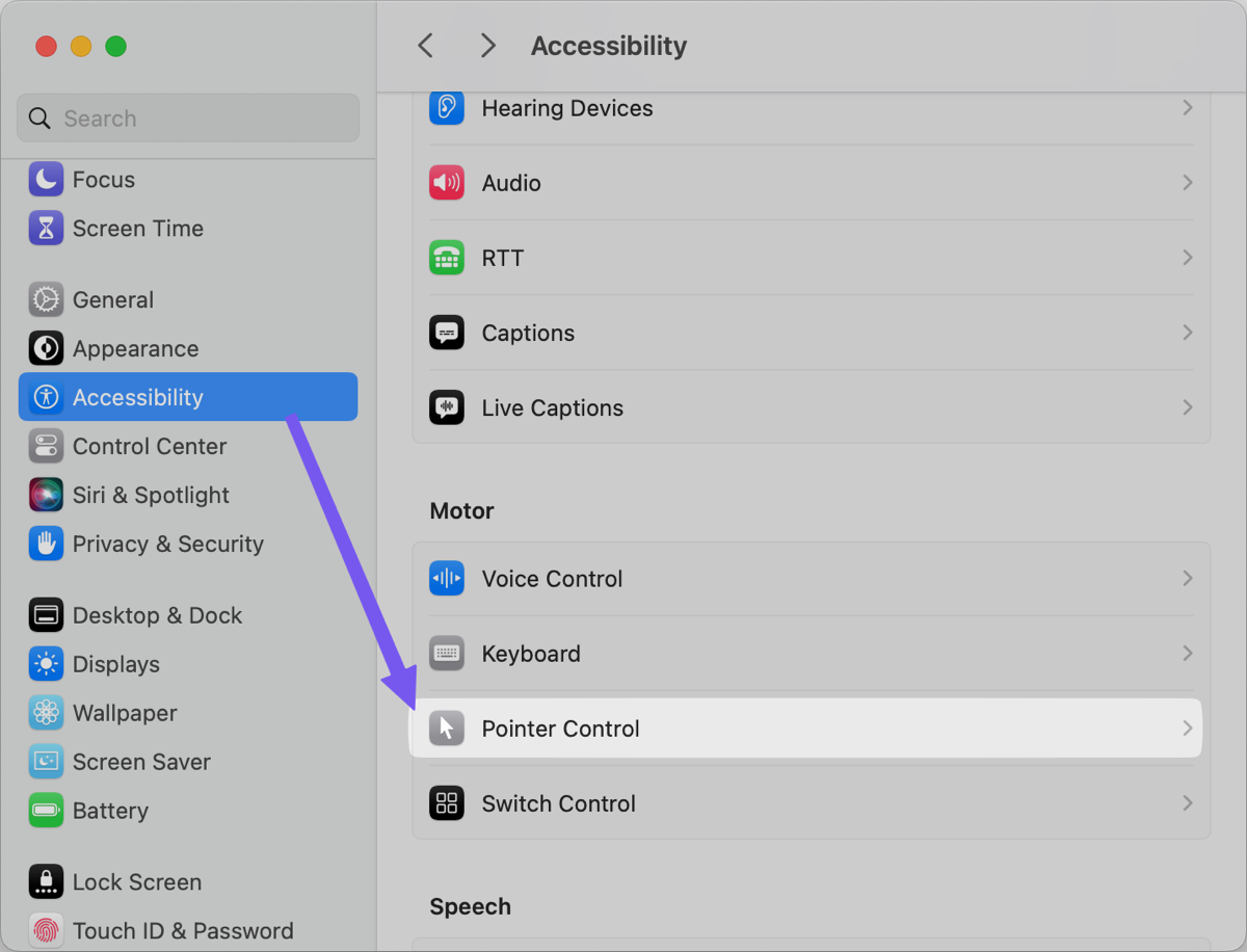
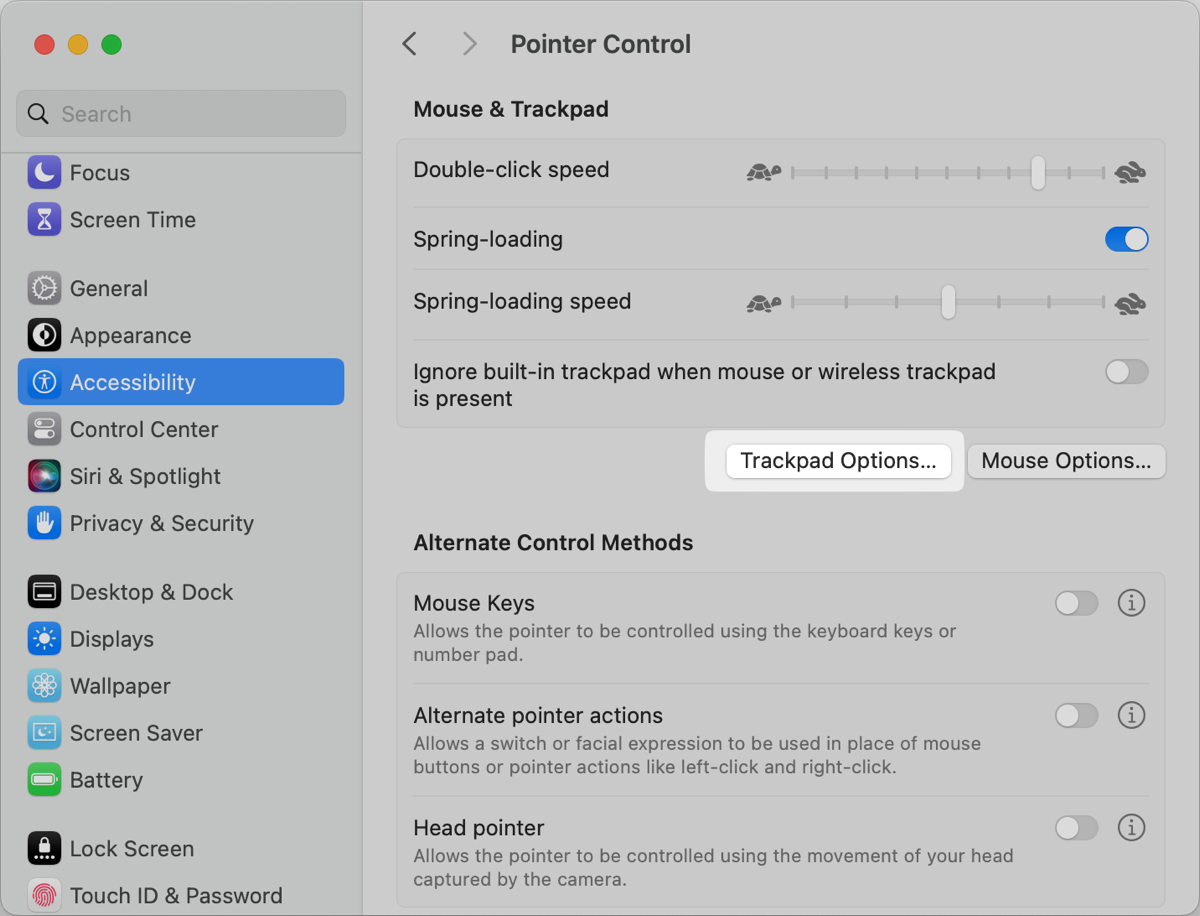
In System Settings, open Accessibility, and select Pointer Control. On that page, you’ll see a button to change Trackpad Options. Finally, one of the options that will be revealed is Dragging style with a drop-down where you can select Three Finger Drag. It’s upsetting to me that they didn’t hyphenate three-finger, but you’ll get over that transgression the first time you use three fingers to drag a window or file.

Zooooom!
I had cataract surgery a few years ago and I now have the best vision of my life but I still run into situations where something is printed too small on a website for me to be able to read. My favorite example is street names in mapping apps. If you zoom in to try to read them, the city and streets get bigger, but the street names shrink back to the same size.
The solution is to enable using a gesture with scrolling to temporarily zoom in on your screen. Open our good old friend, System Settings again, and go to our favorite tab, Accessibility, and select Zoom. Look for a toggle to enable “Use scroll gesture with modifier keys to zoom”, and below, that you’ll see the option to choose a modifier key for the scroll gesture. I use the default Control key.
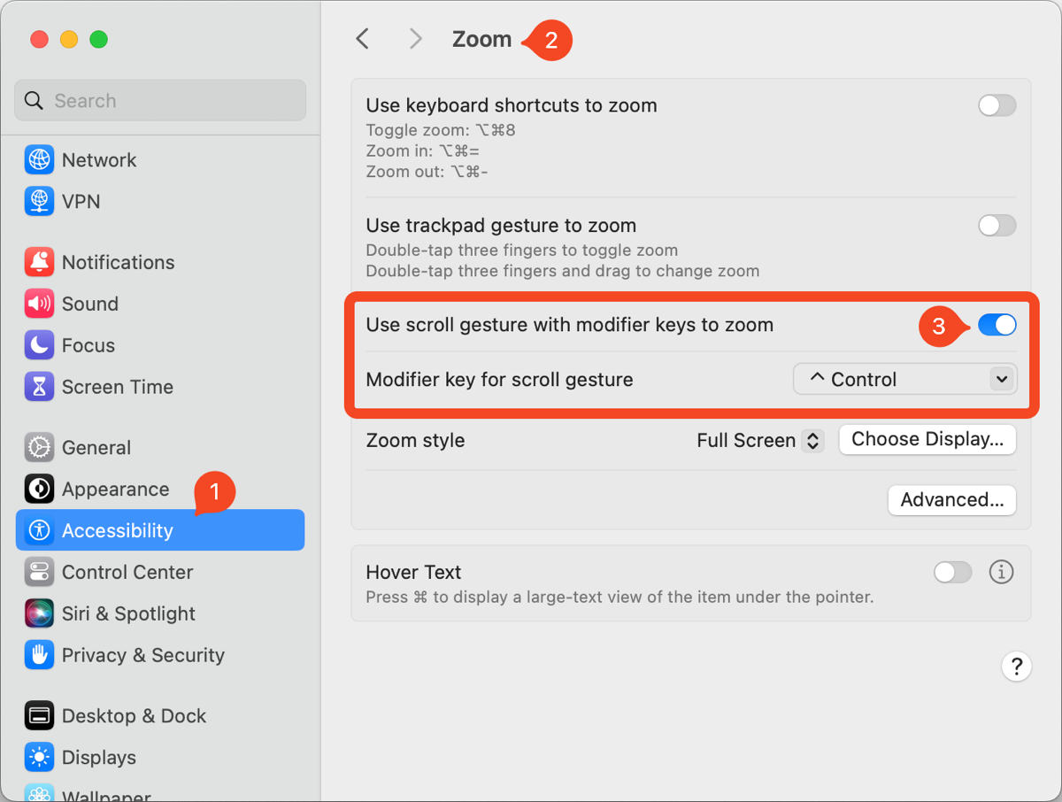
Once this feature is enabled, you can hold down the Control key and scroll up on your trackpad or mouse. The entire screen will zoom in right where your cursor is so you can read that darn street name. Once you have successfully read the absurdly tiny text, simply hold down the Control key again, and scroll back down, and everything will go back to normal. I really like this feature because it simply never gets in your way but it’s right there at your fingertips when you need it.
Bottom Line
I’ve talked about most, if not all of these settings in the past over the years, but I wanted to collect them all in one place where you could see the kinds of settings that might make your Mac life more efficient after a clean install or after getting a new Mac.

These are great – I learned a few new tricks here. Here’s one I’d like to contribute: I like to add a keyboard shortcut to open Launchpad. Remember Launchpad? It’s that full screen thing where all your apps appear as icons, with a search field at the top. Why would you open Launchpad when there is Spotlight, you ask? Well, if your intent is to open an app, Spotlight shows you too much, in my opinion; although an app is usually at the top of a Spotlight search I’ve run into situations where something else was at the top, with the app further down in the list. No bueno!
The keyboard shortcut for Spotlight is Cmd-Spacebar. I set up Launchpad to open with Option-Spacebar, just one key to the left. You do that in System preferences > Keyboard > Shortcuts; look for Launchpad in the list on the left, select it, then click on the checkbox for “Show Launchpad.” It will ask you for the key combination that you want to assign; here is where I type Option-Spacebar.
I’m still running Monterey, so things may have changed in Ventura or Sonoma. Heck, Apple might have done away with Launchpad on the newer operating systems. That would be a shame, as I like to hit Option-Spacebar and then type two or three letters to narrow down the launch options to just the app desired, then hit Return to open the app. No mouse required.
I do these very same things but I haven’t written them down like this.
I’m going to have to save this page and use it as a cheat sheet for my next nuke and pave.
Thanks Allison. This is great!
What a phenomenal list.
I’ve got a modest list of things that I set on a new Mac — but it is not nearly as extensive. One difference: I implement a lot of it from the Terminal.
How, you ask?
Many of the things you describe appear as settings that are stored in Preference files (.plist) in ~/Library/Preferences — which can be viewed and edited using the excellent application PLIST Editor https://apps.apple.com/us/app/plist-editor/id1157491961.
And once a property list entry is is known, the the corresponding Terminal command “defaults” can be used to set it.
Here’s a pice of a text file I copy and paste into the Terminal when I get a new Mac:
Makes screenshots appear on the Desktop (instead of ~/Downloads/
defaults write com.apple.screencapture location ~/Desktop/
Disables window shadows in screen shots
defaults write com.apple.screencapture disable-shadow -bool true
killall SystemUIServer
##Ensures Library folder is visible (and not hidden as it is by default)
chflags nohidden ~/Library
I would imagine that many (if not most) of the things you set via the GUI can be streamlied with the defaults command — making nuke-and-pave much quicker.
For example, I just opened my ~/Preferences/com.apple.finder.plist file with PLIST Editor and it appears that showing the Toolbar, Pathbar, and Statusbar might be set by these:
defaults write com.apple.finder ShowToolbar -bool true
defaults write com.apple.finder ShowPathbar -bool true
defaults write com.apple.finder ShowStatusbar -bool true
[“might be” because I haven’t tested it yet]
Since you enjoy doing deep research, I suspect you will have a lot of fun finding the corresponding defaults commands for all the things you set with the GUI, and creating a script you run in the Terminal to set them all in one fell swoop! That sounds like an Allison project to me 😉
Looks like some of my “##” was excised when I pasted it in. I apologize for not catching that.
Thanks Allison. Awesome Tips. I am feeling quite tipsy 🙂
Next I’m gonna learn the keyword search extension
OMG Greg – I’m going to use that!
This insightful blog on macOS settings post a clean slate (Nuke and Pave) offers a concise yet comprehensive guide. The author adeptly navigates through essential tweaks, ensuring an optimized user experience. From system preferences to security configurations, it serves as a valuable resource for anyone seeking to enhance their Mac’s performance and usability.