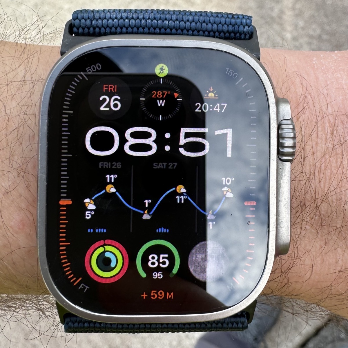
In this episode of Chit Chat Across the Pond Lite, Bart Busschots joins us to talk about weather apps. He’s a serious weather nerd by necessity, living in Ireland and being an avid bike rider. As he walks through the apps he’ll explain which ones fall down on privacy, and which ones have good apps for everything from the watch to iOS to the Mac. He’ll even go through how he uses different widgets to help him decide how much rain gear to wear.
One caveat to our conversation. At the end of our conversation, I sprang the question of price on Bart and he answered to the best of his memory, and his memory was a bit rosier than reality. You’ll hear him say that none are more than 20 euros per year, but I looked up Weather Up, and in the US it’s $40 per year. Might still be worth it to you. This is my bad because I didn’t give him a heads-up that I’d be asking about price.
Links and commentary are available below the fold.
Read an unedited, auto-generated transcript with chapter marks: CCATP_2024_04_26
Triggers:
- Looks Like Rain: Visualizing the Weather on a Color-Coded Timeline – MacStories
- Talk Show episode 396 with Weather Up! developer David Barnard
Problems to be solved:
- Free weather apps (other than built-in Weather app) are a privacy train wreck — I wanted rid of them all!
- Developers need to pay for access to weather data, so all weather apps need monetisation of some form — if you’re not paying explicitly you’re paying implicitly!
- Best-case monetisation by regular tracking ads
- By their nature weather apps need location access, so incentives to monetise from tracking companies is very high
- Over many years, I collected an amazing mess of more weather apps that you can shake a stick at, many free, all with location access!
- Many single information-sparse widgets wasting screen space on:
- iOS lock screen
- iOS home screens
- iOS widgets screen
- WatchOS Watch face
- Not making use of new interactive widgets on iOS
- Not happy with any weather app on watchOS
Remaining apps:
Carrot Weather (iPhone & iPad) 4
- Extremely configurable, including a preset that behaves like the long lamented DarkSky app Apple bought and killed
- Was able to get everything I loved in DarkSky, but tweaked to be even more like I want it with customisable header and footer regions above and below the list
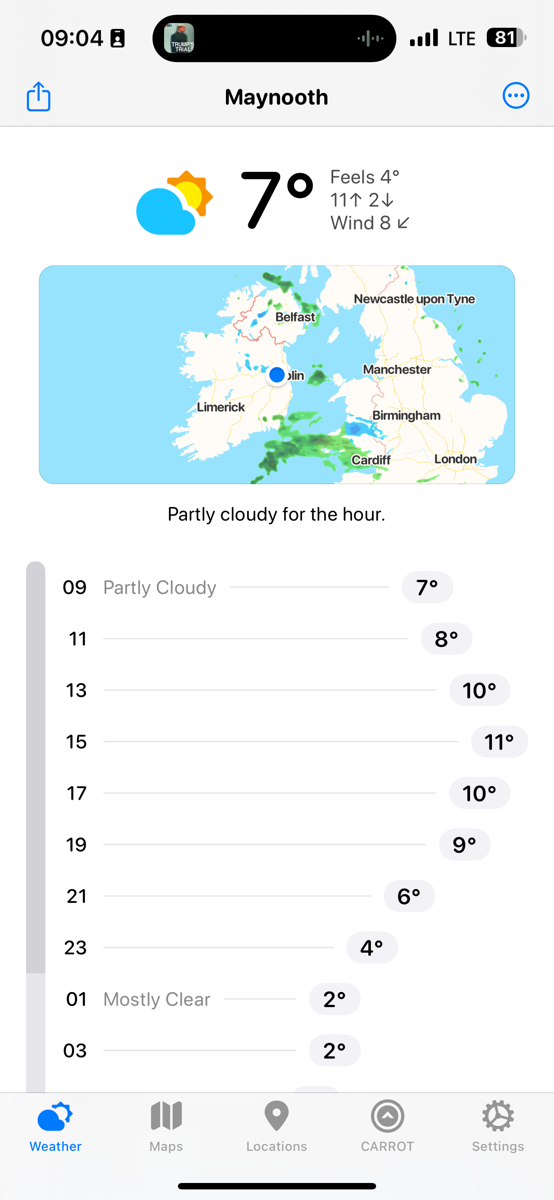
- Powerful custom notifications like umbrella warnings in the morning
- Nice selection of traditional widgets — many nice and information-dense, but not interactive
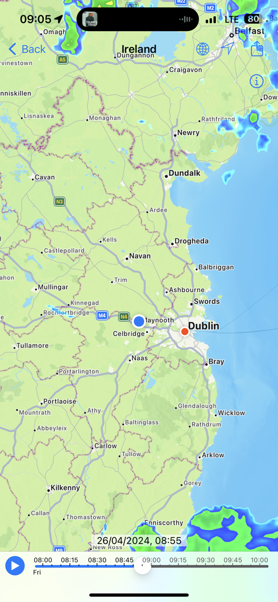
RainToday (iPhone & iPad)
- Best radar data for Ireland of any app I ever tried
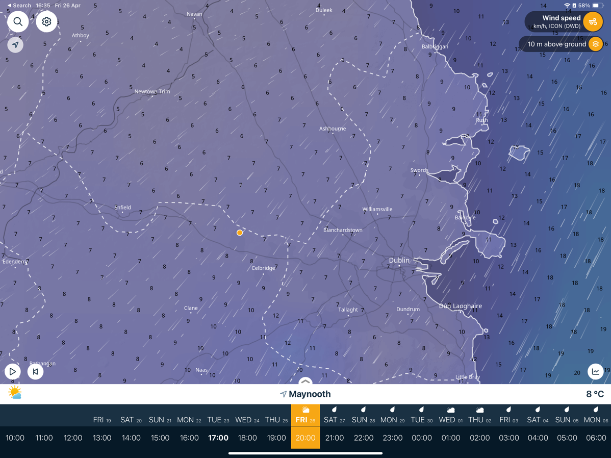
Ventusky (iPhone & iPad)
- Best wind visualisation of any app I’ve ever tried
- Better radar widget than Rain Today (more useful zoom level and less cluttered)
Looks Like Rain (iPhone)
- Does one thing, but does it really well!
- A truly original interface
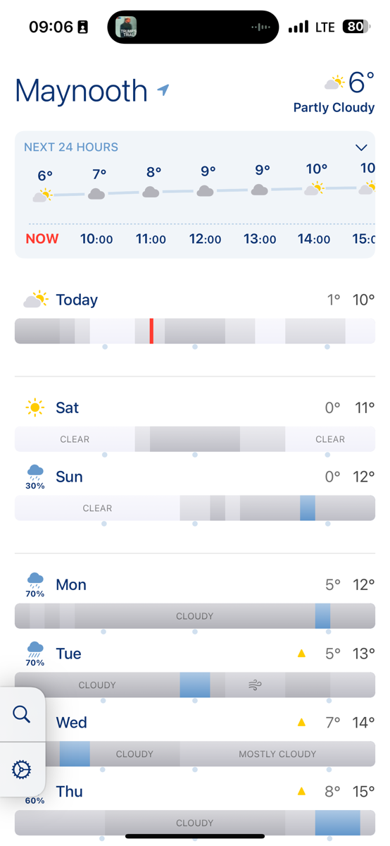
– Nice selection of traditional widgets
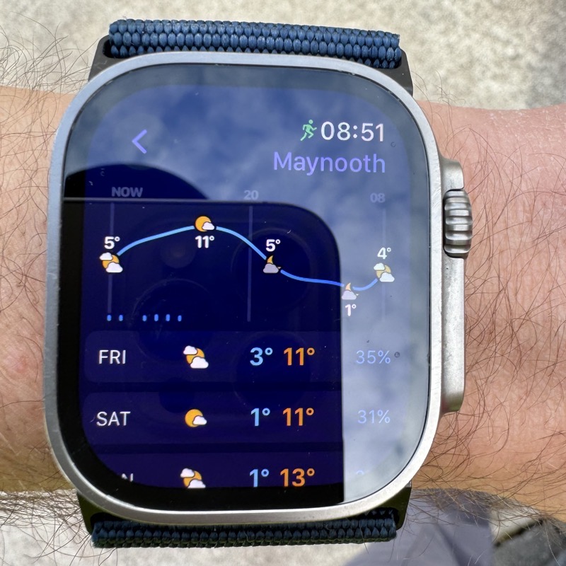
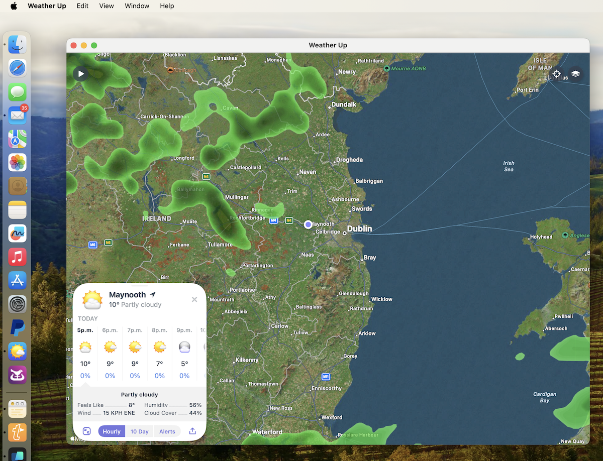
Weather Up (iPhone, AppleWatch & Mac)
- A widget-first app
- The best interactive widgets I’ve seen from any app
- The best WatchOS app I’ve found
– The only one of all my apps that works well on M-series Macs
– Within the app itself it is a map-first interface and it’s at its best on larger screens IMO
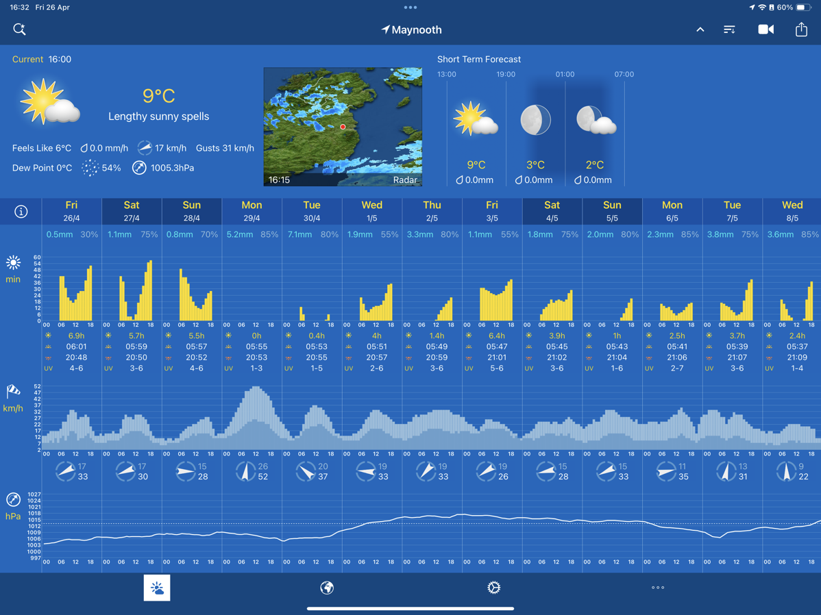
Weather Pro HD (iPad)
- Makes maximal use of the iPad screen real-estate to show graphs of just about every weather metric stacked vertically, showing the next 10 days
- Great for seeing long-term wind, rain, temperature, air pressure, and sun trends
Remaining Widgets:
- iOS Lock Screen: Looks Like Rain
- Two-wide but very cleverly changes its appearance as appropriate — when there’s no current rain it gives a nice outlook for the day, when there is, it shows the duration and heaviness as a bar chart
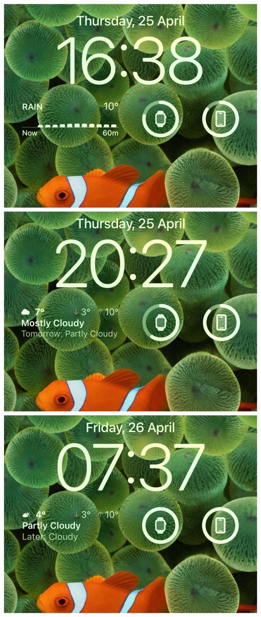
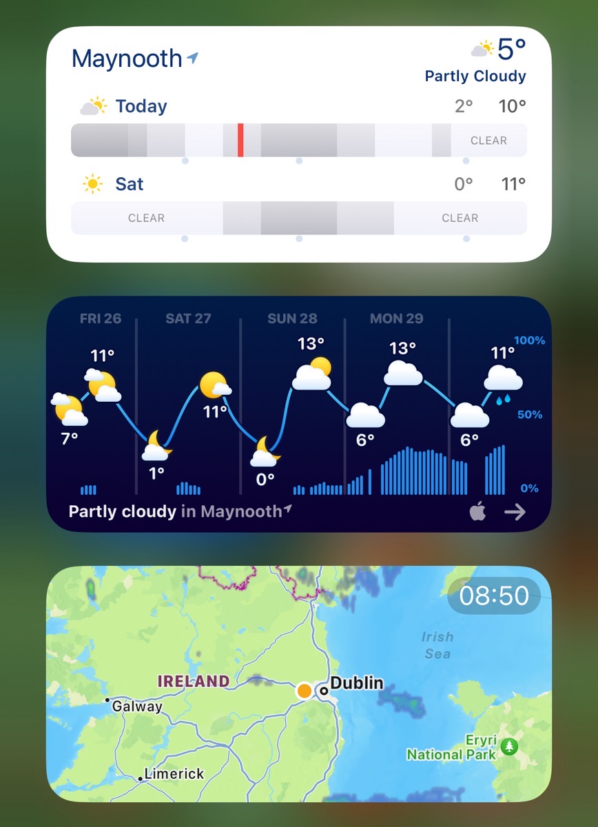
iOS widgets screen
- Looks Like Rain (2 days rain bars)
- Weather Up (Interactive widget)
- Ventusky (current radar)
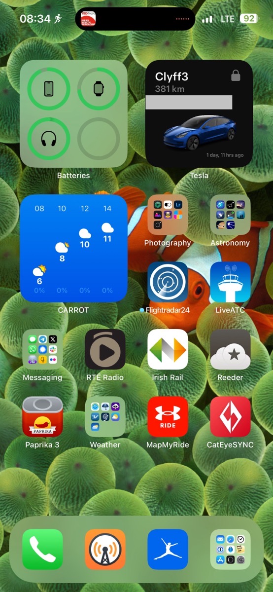
iOS Home Screen widgets (different in different focuses):
- Personal focus: one 2×2 showing dense info for current quarter of the day
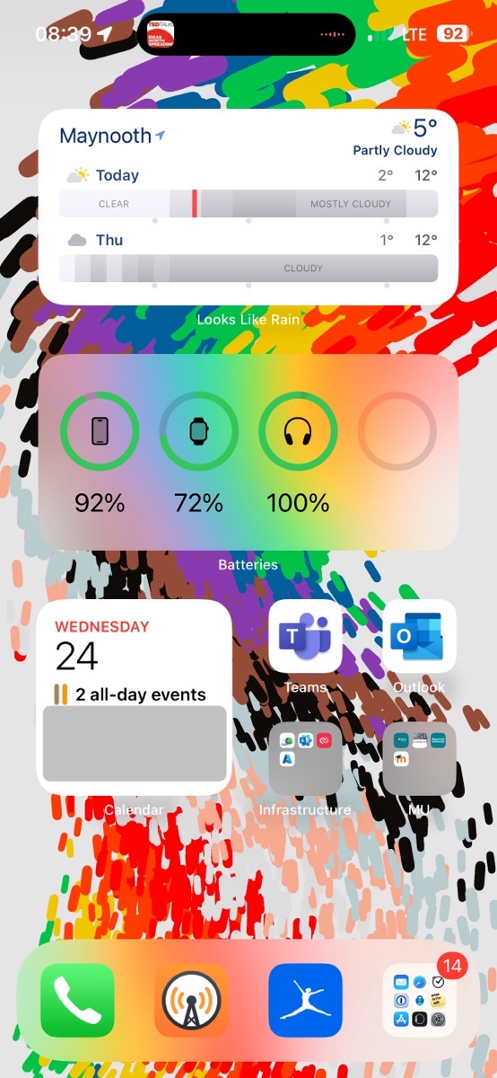
– Work focus: one 2×4 showing rain/cloud bars for today and tomorrow from Looks Like Rain
- WatchOS: Weather Up! (Down from 3 widgets to just one!)
