I talked a few weeks ago about the Bartender kerfuffle when developer Ben Surtees sold it to a company called Applause. While I’ve not taken up the alarm bells, many still remain skeptical of this new company. You’ll also remember that Physics Nerd Graeme reviewed Hidden Bar for us as an alternative to Bartender.
This week, I’d like to tell you about another alternative to Bartender called Ice. Jordan Baird is the developer and he provides a couple of ways to get Ice. You can download it from his site icemenubar.app/… where you can download it for free. You’ll be invited to, but not required to give him a donation for his efforts. He also distributes Ice as an open source project through GitHub under an MIT license. This license allows others to fork the code, improve upon it, and even distribute it themselves. On the GitHub page for Ice, you’re also invited to sponsor his efforts. If you end up liking Ice, please consider supporting Jordan’s efforts.
Who is Ice For?
If you’re a hard-core Bartender user like me and use all of the features of Bartender including context switching and the secondary bar, making groups of menu bar items with their own icon, then Ice may be too limited for you. But I encourage everyone to try it out because it might do everything you really need in a menu bar item manager.
Hidden Bar is a good little app, but after listening to Physics Nerd Graeme’s review and testing it myself, I find Ice to be more polished with more capability in terms of styling. It’s also under active development with the latest release just two weeks ago, where Hidden Bar hasn’t been updated in a couple of years.
Ice Installation
One of the things that freaks people out with Bartender is that it asks for screen recording permissions. Ben went to great lengths to explain why that privilege was required to do his magic, even though he’s not actually recording the screen.
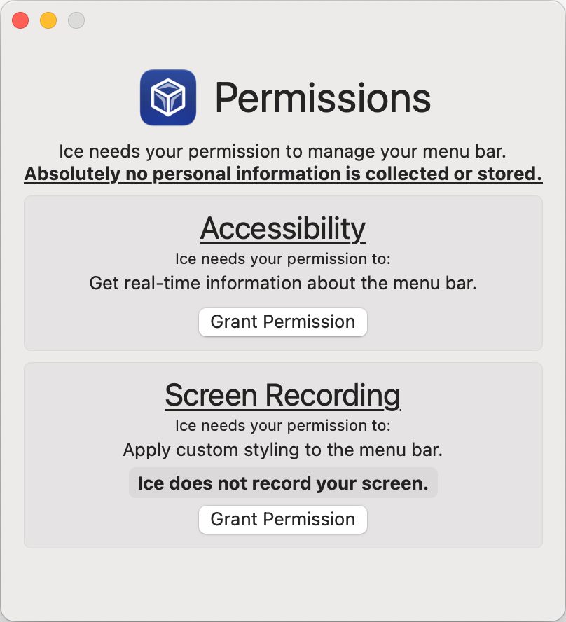
Like Bartender, Ice requires screen recording permissions. Jordan specifically says in the request screen: “Ice needs your permission to apply custom styling to the menu bar. Ice does not record your screen.” You’ll hear about the custom styling later that’s much like what you can do with Bartender, and which you can’t do with Hidden Bar.
Setting up Ice
Like Hidden Bar, Ice separates your always shown from your hidden menu bar items using a little chevron that points to the left. Using the standard method of holding down the command key to rearrange menu bar items, you can drag the ones you want to see all the time to the right of the chevron, and the ones you want hidden to the left. The chevron separator is also a menu bar item so you can drag it left and right too with the command key held down.
Hidden Bar had a problem where the separator disappeared into the menu bar but Ice doesn’t suffer that problem.
After I organized my menu bar items a bit with Ice, I just happened to right-click on its menu bar icon to do something else when I noticed in the dropdown menu an option to “Show the Always-Hidden Section”. When I selected that option, a second chevron separator appeared at the far left of the menu bar. I was then able to command-drag any menu bar items I simply never wanted to see over to the left of the chevron.
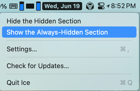
Bartender has three sections too, but you drag the menu bar items into the three different sections using the Settings pane. It works but I like the way Ice does it even better.
Now that we’ve got things organized a bit, let’s take a look at the Settings that allow us to tailor it even more.
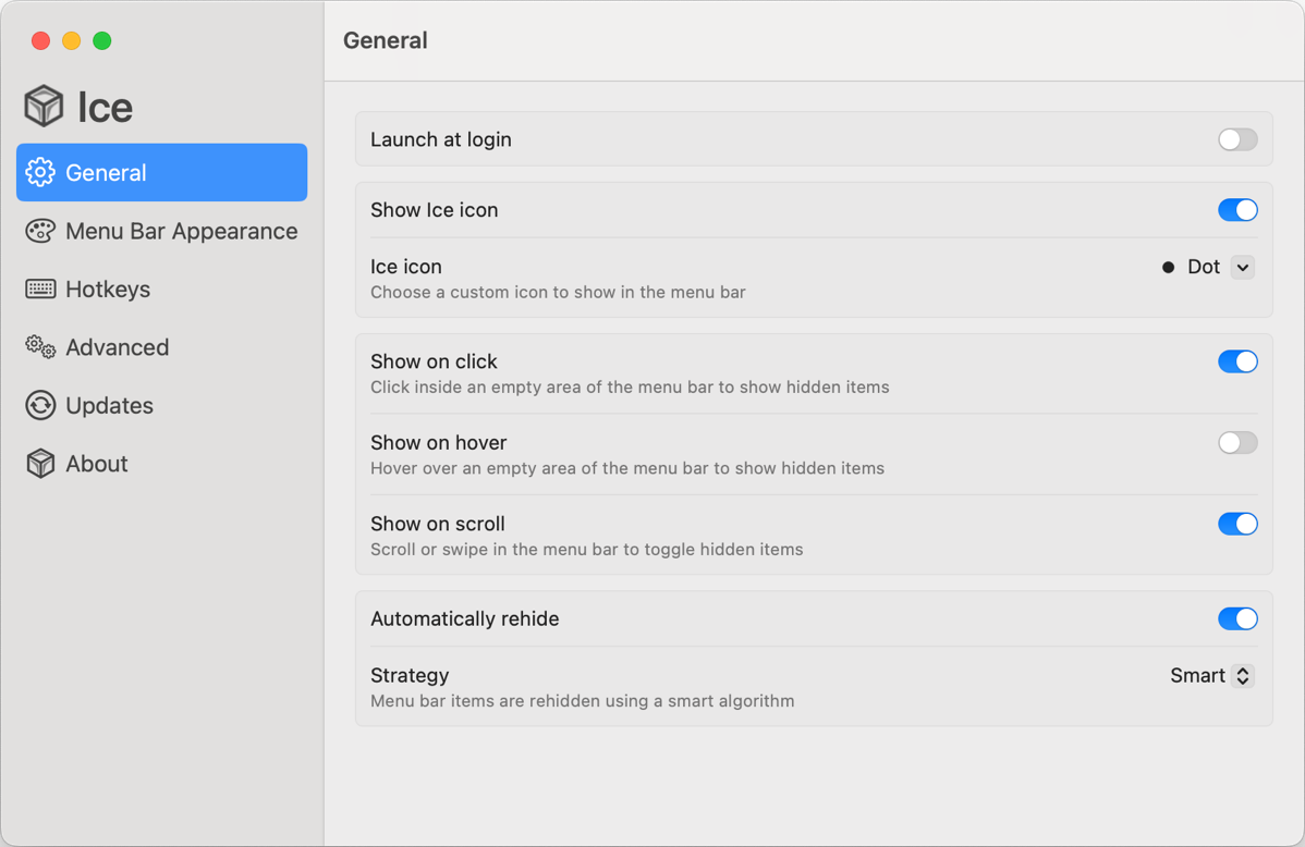
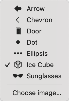
On the General tab, we can choose an icon for Ice and there’s a bunch of cute ones built in. On top of that, you can even choose your own image for Ice. I changed mine to podfeet as a test, but the high-contrast black icons Ice offers you are easier to see than my little orange feet.
Since Ice is hiding a lot of icons now, we need to tell it how to reveal them to us. In the General Settings, can choose to click on an empty area of the menu bar to show hidden items, or simply hover over an empty area to have them revealed. If neither of those suits your fancy, there’s an option to scroll or swipe across the empty area to reveal your menu bar items. You swipe from left to right to get the menu bar items to fly out to the left. You put them away by swiping back to the left. Seems sorta backwards but it works.
Once you’ve chosen a method to reveal your hidden menu bar items, you repeat the same action to hide them again. You can choose to have them automatically rehide, and with that toggle turned on, you get a new dropdown for the strategy you want Ice to use to hide them.
The first strategy to choose from is a smart algorithm and I honestly don’t know what rules it follows. You can also choose Timed, which reveals a slider for how long you want it to wait before hiding from 0 to 30 seconds. I tested it at 0 seconds and sure enough it disappears instantly when you pull your cursor off the menu bar.
Finally, you can choose to have the menu bar automatically rehide when the currently focused app changes. Interesting option and works as advertised.
Accessibility
As I worked my way through all of the settings, I took a pause to see if these settings for Ice were accessible. With one exception, I found that they were accessible. That one exception was a tint slider that we’ll talk about in a moment. I suppose if you’re a VoiceOver user, you might not care that much about changing the tint, but sliders are easily made accessible.
Then I got curious about how one would rearrange menu bar items with VoiceOver. I couldn’t figure it out on my own, so I asked for help on Mastodon, and @[email protected] responded. I want to give you his full response because he was very kind after I explained I was a low intermediate doing my best to test apps for VoiceOver.
As a blind VO user, I first of all want to seriously thank you for doing this! Doesn’t matter honestly if your experience using VO might be limited, as long as you test what you can and keep an open ear for user feedback on accessibility issues, that already goes a super long way and is significantly more than what some other devs / companies out there are doing, great job!!! Unfortunately it’s true that there isn’t a reliable way of rearranging status menu icons using VO. However, it is possible to navigate to all the icons which are in there by pressing the VO keys (either CTRL+Option or Caps Lock) + M twice, which will move VO focus to the first icon. You can then navigate through the various icons by pressing VO + Right Arrow / Left Arrow and activate the focused icon using VO + Space. Hope that helps!
I appreciated his words of encouragement and I was also truly surprised that Apple doesn’t let VoiceOver users rearrange menu bar items.
Using the keystroke combinations Robin gave me, I discovered an advantage VoiceOver users have over the rest of us. Remember that the whole point of Bartender and these alternative apps is to help us deal with too many menu bar items? Well, VoiceOver users get to hear ALL of the menu bar items even if there are way too many to be seen and they’re hidden under the application menus on the left. They’re still there for VoiceOver to find. Isn’t that nifty?
It’s funny – while Ice is nearly completely accessible, it solves a problem blind people may not need and since they can’t rearrange things with VoiceOver because of missing capabilities in macOS, they really won’t care. Still fun to learn!
Ok, back to learning some more settings in Ice.
Menu Bar Appearance
In the most recent version 5 of Bartender, Ben added some really nice visuals to our menu bars. Jordan appears to have borrowed the new aesthetic elements heavily from Bartender (or maybe it was the other way around). Let’s go through what you can do to tailor the look to your desires.

You can add a tint to the menu bar with either a solid fill or a gradient, and you can add a shadow to the menu bar. I really like a contrasting tint on my menu bars with Ice and with Bartender. You can add a border of varying thickness, but I find this gives the menu bar a coarse look to it, but if you like it, you do you.
One of the coolest visual effects in Bartender and in Ice is the ability to split the menu bar and shape the two sides. Splitting the menu bar gives you two distinct menu bars – one for the app’s menus on the left and one for the menu bar items on the right. In Ice, once you split the menu bar, you can choose the shape of both ends of each menu bar. You can make either end squared off or pill-shaped. I like having the split menu bar with a pill shape on both ends, and a nice gradient, and a drop shadow.

Advanced Settings
I’m going to skip over Hotkeys in Settings because it will make more sense if I walk through the Advanced settings first.
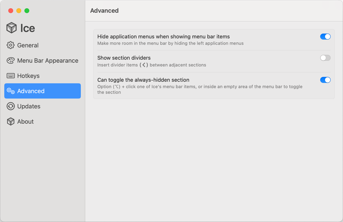
The first advanced option hides application menus when you show hidden and/or always hidden menu bar items. This feature collapses the active app’s menus down so you only see the Apple icon in the upper left. This makes it more likely that you’ll be able to view the menu bar items you need on a small screen.
On my 14″ MacBook Pro’s screen at its default resolution, I was able to see 42 of my 44 menu bar items all at once when the left side collapsed! I normally keep 8 of those always hidden and a lot of them hidden except when I need them.

It was around this time in my testing that I realized Ice has one weakness and it’s multiple monitor support. As I started modifying settings, like hiding application menus, the graphics got messed up in different ways on my internal and external displays. The menu bar got too short vertically to hold the text on the internal display and too tall on the external display.


As soon as I unplugged my external display, the internal display looked dandy with Ice. That’s when we really need Ice to perform well, so that’s good, but having janky displays of your menu bar items when you plug in a big display is still a problem.
I think I found a solution to the problem though. In Displays Settings, for a given display you see just a few standard resolutions. But you can also select Show All Resolutions and see even more. In the standard list for a 14″ MacBook Pro, you’ll see the default of 1512 x 982. But in the longer list, you’ll see 1512 x 945, which is 37 pixels shorter. As it turns out, the notch is 37 pixels, so if you choose 1512 x 945 you have no notch.
As soon as I changed my internal display to 1512 x 945 and the notch disappeared, BOTH displays’ menu bars managed by Ice turned back to normal.
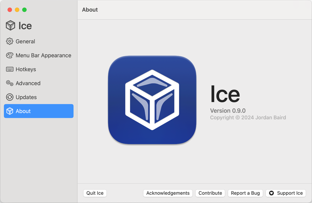
Sounds like I’ve found a wee bug. Since Ice is an open source project, it’s super easy to report a bug in the GitHub repository under “issues”. You don’t even have to find it yourself, Ice includes a button to report a bug on the About tab of Settings. You’ll also find a Support button to send some financial love.
Still in the Advanced tab, you can choose whether to show the section dividers – those little chevrons that mark which items are hidden or always hidden. The main advantage of turning the section dividers off is that they take up slots that can be used for menu bar items. Remember I can see only 42 of my 44 menu bar items on my internal display when showing all items? I would actually be able to see all 44 if I turned off the section dividers.
You don’t really lose functionality with the section dividers because you can toggle them back on while you rearrange things, and then turn them back off.
Finally, you get a toggle that will let you option-click in the empty area of the menu bar to see your always-hidden items. If it’s hard to find an empty space, you can option-click on the Ice menu bar item itself to toggle always hidden. The feature works very well and predictably.
Hotkeys
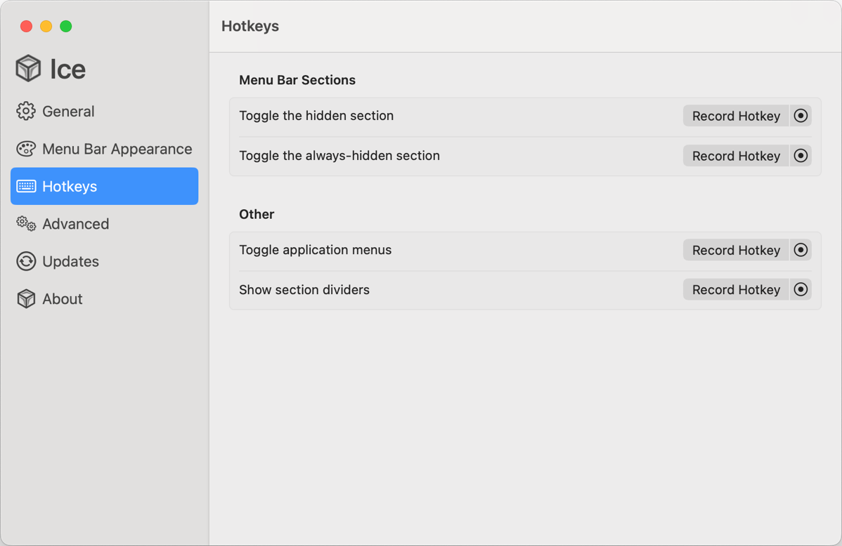
Now that we understand the advanced settings, we can back up to the Hotkeys settings. You can record a hotkey to toggle the hidden section and another one to toggle the always-hidden section.
If you want to manually remove the application menus out of the way, you can assign a hotkey to that function. In my experiments, I found that the hotkey would quite reliably toggle off the application menus on my external but not internal display.
Finally, you can record a hotkey to toggle section dividers on and off.
Bottom Line
The bottom line is that Ice is a lovely replacement for Bartender, and it’s free unless you choose to support Jordan’s work. I still miss the secondary bar of Bartender, but the ability to make split menu bars with pretty rounded corners and a nice tint is quite pleasing to me. It’s easy to arrange menu bar items, see hidden items and even see always-hidden items. Bartender doesn’t let you see always-hidden items on demand – you have to manually move them into the secondary or primary bar to see them. I like the way Bartender lets me make little menu bar item groups like all of my cloud services under a tiny cloud emoji icon, but I can live without that if I have to.
Remember, Ice is in active development, so after you push the support button for Jordan, remember you can always ask for enhancements.
If you like what you’ve learned about Ice, check it out at icemenubar.app/…
After I finished the review, I posted in the discussion area of Jordan’s GitHub repo for Ice about it and he responded with some really interesting comments:
The display bug is sadly one of the more common issues. I may have come up with a fix for it, but unfortunately, I can’t test it myself as I don’t have a MacBook with a notch (the bug doesn’t occur without one).
As mentioned in your comments, there is a beta available that has a secondary bar! Although, be prepared for some bugs.
On a final note, if you choose a custom image, you can actually have it display as a monochrome image, as if it were a default icon in the menu bar. You just have to check the option to “Use template image”. Maybe it could use a better name.



“I still miss the secondary bar of Bartender, …”
It’s currently in beta:
https://github.com/jordanbaird/Ice/issues/1#issuecomment-2165444584
Enjoy!
SteveM