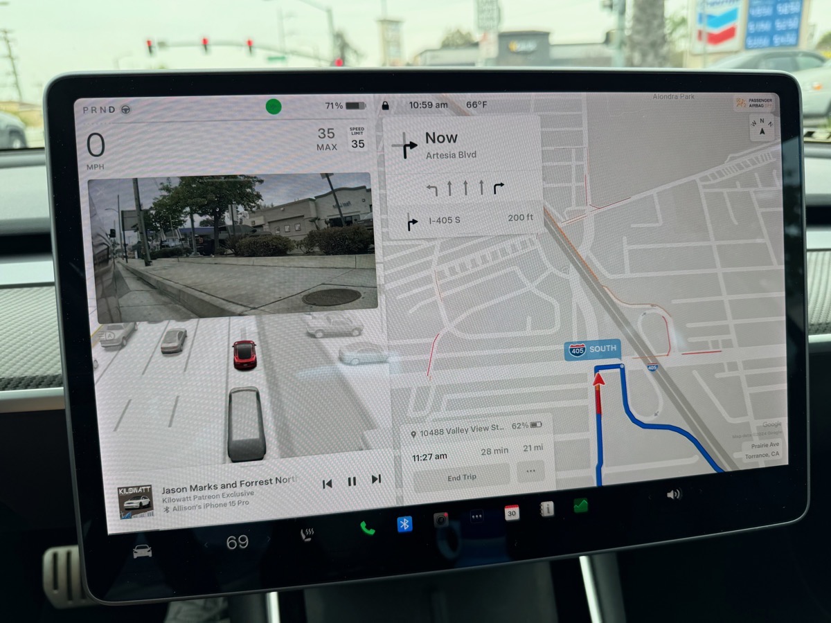
I’m a big fan of the giant screen in Teslas, especially because of how it displays navigation. In the Model S and X, the screen is vertical, while in the Model 3 and Y that Steve and I own, the screen is in landscape orientation. On the left side, you get a visualization of the vehicles, traffic lights (showing green, yellow, red), pedestrians, and even things like trash cans along the side of the road. When I turn on my turn signal, the rear-facing camera on that side shows me the over-the-shoulder view so I don’t hit a bicycle on the right or a car on the left. The right 2/3 of the screen is almost all navigation and it’s really good looking with lots of detail.

rear-facing camera with turn signals, and podcast playback at the bottom

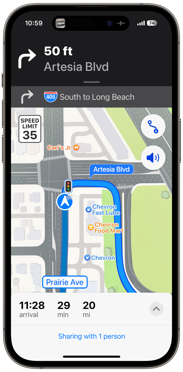
but giving better turn-by-turn directions
But everyone else on the planet who has experienced CarPlay says that it’s amazing. We’ve rented quite a few cars with CarPlay and while I didn’t favor it at first, it’s growing on me. The audio turn-by-turn directions are great. Some of my favorites include, “Not at this light, but at the next one, turn left” and “Take the right two lanes to exit North on the 405.”
However, the Tesla navigation gives much better situational awareness on the map. It’s not just that the screen is giant, it also chooses a zoom level that makes sense for not just seeing the next block or two, but where you’re going miles ahead.
CarPlay has so darn much clutter with cartoony graphics that I am always frustrated with not being able to see the big picture. Now I know with fancier cars than I rent, there are touch screens so you can pinch and zoom, but on the rental cars, it’s super annoying to use the buttons and knobs to get into zoom in/out mode. Again the graphics are coarse so they don’t give the detail I get on the Teslas.
But on CarPlay, my Apple Watch is in the game so if a turn is coming up and I’m not watching the map closely, my watch will give me the gentle taps to tell me to turn. I know that a left turn and a right turn are a different rhythm of taps but I’ve never gotten the hang of knowing which one is which. Easy enough to glance at the screen to see which way to go.
Listening to podcasts with the Tesla audio system is trivially easy. I set up a playlist on my iPhone, and if Bluetooth hasn’t connected to Steve’s phone instead of mine, I hit play and the audio comes out of the car’s speakers. I can use the scroll wheels on the steering wheel to jump forward and back in a show, stop altogether and change the volume, all without messing with a touch screen. I can see what podcast is playing at the bottom of the left side of the screen.
With CarPlay though, you can directly access your podcatcher of choice, or at least Apple Podcasts or Overcast, without looking at your phone. You can use the screen to navigate the podcatcher’s interface and choose different shows and episodes. But I don’t want to do that kind of thing while I’m driving. When Steve is driving the rental car and I’m the passenger, it is a pretty cool way for me to make the changes while he keeps his eyes safely on the road in front of us.
The best part of CarPlay and audio is how it’s intelligent about what to do when audio is playing but audio navigation instructions also need to be heard. If you’re playing music, it automatically ducks the music down while the navigation is read, and then brings the music back up when it’s done. But if you’re listening to a podcast, it stops the audio while navigation is being played and then starts back up where it left off. That’s genius.
Sadly in the Tesla, the audio of the podcast or music both keep playing while navigation is said out loud.
You can see I’m conflicted on which one I like better. But after owning my car for four years, I realized I could have the best of both worlds.
The other day I was going to meet a friend for lunch about a half hour away in an unfamiliar location. My iPhone offered to start directions for me because it saw the event in my calendar. I wanted to share my ETA with my friend in case I ran into traffic, so I told Maps to knock itself out.
Then in the Tesla map interface, I typed in the address using the onscreen keyboard to start navigation. I started my podcast and as expected, the show started playing through Bluetooth to my car.
But what surprised me was that the audio navigation instructions came through from the iPhone over Bluetooth too! And you know how I was jealous that CarPlay pauses podcasts when it needs to give driving instructions? Since it’s the iPhone itself that controls that, not the head unit in the car, the same thing happened in my Tesla. It was awesome.
I’m sure someone is yelling into their phone right now that I’m missing one big problem – that the two nav systems could choose different routes and things could get confusing. You’re right, that could happen, and it did on my drive.
On my way to lunch, the iPhone told me that I could cut 3 minutes off my drive time if I took Katella. I had no idea when Katella was coming up or what it would do if I didn’t take Katella, so I just kept following the Tesla screen. I didn’t want to look down at my phone on the charging pad, so I ignored the confirmation request. Turns out the Tesla nav took Katella anyway so I never had to decide between the routes.
On my way home, there are several options for where to get off the freeway, but none of them are necessarily wrong. The two systems suggested different paths, so I took the one I normally prefer and I’m pretty sure it was less efficient because it was under construction.
But here’s the thing – I’m not in that much of a hurry when I’m driving. I’ve learned in my 50 years of driving that rushing about doesn’t usually get you there all that much sooner and it’s a lot of stress to worry about making every light and getting ahead of other cars. I’m a mellower driver than I was when I was younger so if it takes me 5 minutes longer to get somewhere I don’t lose my mind.
The bottom line is that I’ve thought all along that I had to decide between my two available navigation systems, but now I know I have the best of both worlds. I have the best parts of CarPlay plus the best parts of Tesla navigation.


We use both maps, with the iPhone mounted on the dash.
That way we can choose the route most beneficial to us.
Also, I love the traffic lights showing up on the Apple Maps.
Looks wise, Apple Maps is more pleasing. Rumor has it that Google is doing a makeover to bring back those who have left.
By the way, we don’t pay Elon for the monthly charge to get traffic on the Tesla maps. Everyone in the family likes it better on the Apple Maps.
We are slowly adapting to the mellow life — that’s a good switch.
Niraj – I’m going to one-up you and point out that the Tesla app doesn’t just show you the traffic lights – when you get closer it shows you the color of the light! And it can bong to alert you when the light turns green. Apple Maps on the phone is pretty nice, but it’s CarPlay I was comparing it to. I’m surprised you’d rather look at that tiny screen than the giant screen in your car!