You’ve just heard (or read) Physics Nerd Graeme explain why he chose Typora as the text editor to write his notes for his Physics Shorts videos. I had been planning on doing my own review of Typora, and while he beat me to it, there are some features I want to tell you about myself.
When I went looking for a Markdown editor for writing my NosillaCast articles, Typora was a top contender. It didn’t make the cut because it doesn’t have an app for the iPad. I do a lot of writing on my iPad for the podcast so that was a deal breaker. I ended up choosing Bear instead because it’s a very clean and affordable Markdown editor that does have an iPad version.
Accessibility
Before I get into the problem to be solved and more detail about what you can do with Typora, you should know that Typora isn’t accessible with VoiceOver. There are small bits and pieces that work, albeit unreliably, but swaths of the interface are invisible to VoiceOver.
Just to make sure it wasn’t my lower-level skills in VoiceOver, I asked my friend Slau to double-check and he reported that there are “No “standard” text fields. Poor classification of controls, and UI elements.” It seems like a plain text editor should be one of the easiest apps to make accessible, but this is not the one. Slau said that he uses the app iA Writer from ia.net/….
The Problem to be Solved
I have been a happy Bear user for a year and a half, but then a problem did need to be solved where Typora would be the perfect solution.
Bart has been writing the shownotes for Programming By Stealth in Markdown for quite a long time. Our collaboration method is to use the Git version control system. Git is mostly for programmers, but it works just as well for text collaboration. He writes the shownotes in a simple Markdown text file, and then pushes it up to GitHub. I then pull it down from GitHub. I edit for typos and grammar, add the links to the podcast, and push the text file back up to GitHub. He pulls the changes to his desktop and now we have the version of the text file.
I’ve always done my editing of the Programming By Stealth shownotes using Visual Studio Code because I’m a nerd. It has a mode where you can see the Markdown syntax on one side and a preview of how it will look on the right.
He recently switched text editors for writing his shownotes and chose Obsidian. I haven’t seen exactly how this works, but Obsidian sorts notes using some so-called “front matter” in a language called YAML. I don’t know YAML, but we just started learning it in Programming By Stealth. It’s a way to write simple, human-readable configuration files.
So what’s the problem to be solved? This “front matter” in the form of a YAML configuration file is visible in the code version of the shownotes when I view them in VSCode, but invisible when I look at the preview version. This means that the two panes are misaligned vertically. If I see a typo in the preview pane, it’s very difficult to find it in the code side where I have to edit the text. Once I find it there, now the preview pane is scrolled to the wrong location. I’m doing these typo corrections often in real-time while I’m trying to learn from Bart, so if I get lost in the shownotes, I can’t keep up.
I complained to Bart about how his change to Obsidian was making my job so much harder, but he was set on this new tool.
I was cranky for quite a few weeks about this front matter. I even would cut it from the text, do all my edits, and then paste it back in when I was done. Kludgy but at least I was able to read along while he talked and edit for typos. Then Bart suggested I try using Typora for reading and editing the shownotes.
As you just heard Physics Nerd Graeme explain, Typora gives you the best of both worlds. It’s a real-time preview of the rendered Markdown text, but you can also edit right from within the same window. While Bear also gives you a single editor window which is also the preview, Bear keeps your writing in a database. In order to collaborate with Bart on the Programming By Stealth shownotes with Git, Typora is a better solution because it just works with text files in normal directories. At $15 after the free trial, it was worth giving a shot.
Now that I’ve justified why I’ve added Typora to my growing repertoire of text editors, let me add some more flavor to Graeme’s mini-review. This won’t be a particularly methodical review but rather I’ll highlight some of the features that blow my dress up.
Words and Speed
Bear and Typora both show you how many words you’ve typed in a note and how long it would take to read the document. I use this when I’m writing articles for the NosillaCast to help estimate how long the entire show will be. Typora has an advantage over Bear. It lets you define in settings how fast you read. I read a long document out loud while timing myself and found I read around 200 words per minute. Being able to adjust the setting gives me a more accurate estimate of the length of the article when it’s on the podcast.
Sidebar
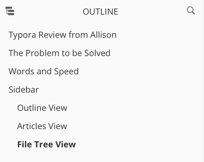
Typora has a left sidebar that can take on many different forms. In the View menu, you can toggle the sidebar on and off, and choose what you see in the sidebar.
Outline View
I’m a big fan of the outline view while writing. If you use heading tags while writing in Markdown (one # is a big heading, two #’s is slightly smaller, etc) then you see those headings and subheadings in the outline. You can jump around your document by selecting the headings from the sidebar.
Articles View
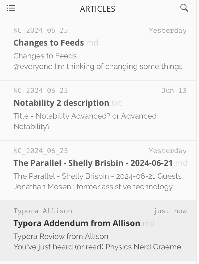
If you open a document that’s in a folder containing other text files, changing the view to Articles shows you the list of documents that may or may not be in the same folder. This view confuses me a little bit. I can’t quite figure out how it decides what files to show you. It seems to pick maybe one folder above where your current file lives and shows you any text files in the same folder, or one above where you are. I know that sounds confusing but it’s because I’m confused. In the sidebar each file has grey text above it telling you what directory the file is in.
The other interesting thing about the Articles view is you can be working on one document, and select a different one from the Articles sidebar and the current window just changes to that other document. You’re not asked to save your work before it flips, but somehow you don’t seem to lose anything even if you didn’t save first.
File Tree View
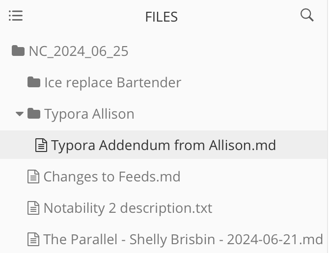
File Tree view is a lot like Articles view, but it also lets you see the directory structure above your current file. I have the same confusion with how it decides what folders to show me. I’m writing in a folder called Typora Allison, and I can see one folder above that and the folder that’s parallel to the one I’m in. Oddly you can select the folders above and while you can tell you’ve selected a folder, nothing happens. You can’t navigate up and down from there.
When you’re in the File Tree or Articles view, if you hover over the bottom of the left sidebar you get some additional options. A plus button appears that lets you instantly create a new file, but oddly it creates that new Markdown file at the upper-level directory. Again this might be my confusion on how it’s supposed to work but it’s still a mystery to me.
Still at the bottom of the sidebar, there’s a three-dot menu hidden until you hover that pops open a plethora of new actions. You can create a new file, search, reveal your file in Finder, open a new folder, and an odd one called Refresh Folder. I’m not sure what would keep a folder unrefreshed? You also get five sort options with icons that explain themselves when you hover over them.
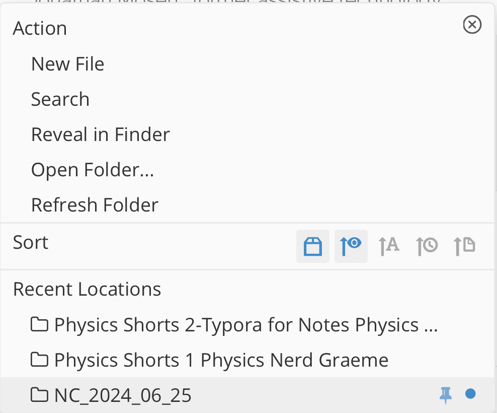
The last bit of options here is a list of recent locations. I thought this revealed a clue to how to define this top-level folder that has been confusing me. The folder two above where I’m working is listed and has a blue pin next to it and a blue dot. I tried pinning a different folder in this history list and nothing changed. I may have to break down and read the manual to figure this one out!
When I first looked at this hidden menu I was worried the text would be too small for some folks, but stay tuned to learn about the zoom feature in a bit.
Viewing Your Markdown Source
Physics Nerd Graeme mentioned that he uses a keystroke to flip his view from pure text to being able to see and edit his Markdown. When Bart convinced me to try Typora, he showed me a setting that lets you have both views at the same time without flipping back and forth.
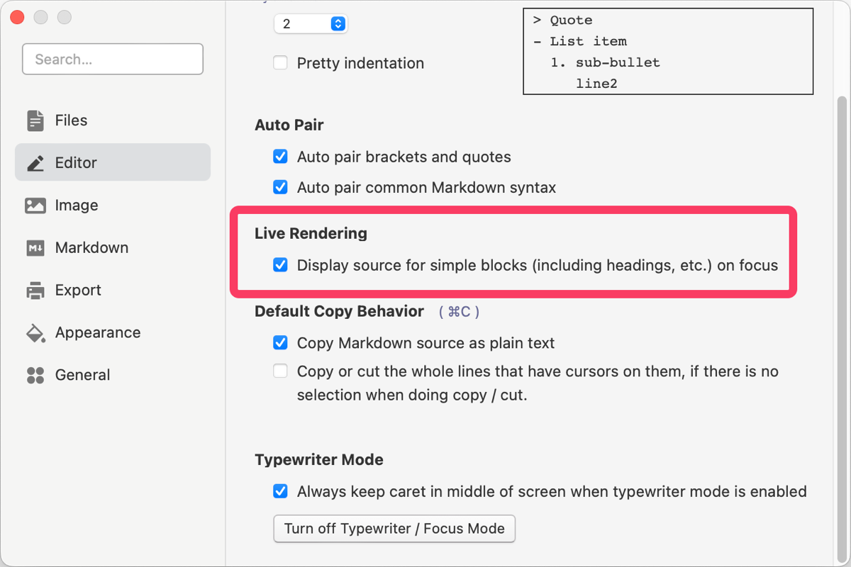
In Settings → Editor, there’s a checkbox under Live Rendering that says “Display source for simple blocks (including headings, etc.) on focus”. With this enabled, you can just click on any element, like a heading, a block quote, or even just a word that’s italicized and you’ll see the Markdown syntax and be able to edit it. As soon as you click away, it goes back to being formatted text.
I told Graeme about this setting, and he prefers it the other way so it’s nice we have a toggle for it. On this same settings page, you can set to auto-pair brackets, quotes, and common Markdown syntax. How many times have you opened a parenthesis or a quote mark and forgotten to close it? With Typora you’ll never need to remember.
Speaking of Settings, they have chosen to use a fixed window size that’s too small to accommodate everything in each settings pane. It’s kind of annoying to have to scroll up and down just a little bit to see everything, and often the settings open with the top cut off so you have to scroll to get to it.
Zoom and Themes
The default font size is dandy for me, but I wondered whether the standard Command-Plus/Minus would increase or decrease the font, but it didn’t work. Then I went hunting in the menu to look for control of fonts, but that’s not an option. I was concerned this might be a problem for some folks, but then I stumbled across the answer. Typora doesn’t use the standard keystroke to increase and decrease the text, but it does have a feature called Zoom and it uses Command-SHIFT and then +/- to increase and decrease the size of the text. In Settings, you can also set a default zoom level so it’s always the way you like it.
While I was poking around looking for fonts, I noticed the menu entitled Themes. They have 6 themes to choose from and I have to say I think all of them are lovely. I was surprised at how different the themes made the same text look, and I’m not just talking about light vs. dark.
The default theme is called Github and it looks pretty standard, but Gothic is totally different. Headings are in all caps and centered, and the paragraphs are all full-justified. How fun is that? I’ll let you play with the themes to see if you find something interesting that you like.


Export
Typora has a plethora of ways to export your text.
If you just want the Markdown from Typora, a simple Command-A, Command-C will copy it for you to put elsewhere.
In Typora, a single hit of the Enter key creates a new paragraph with a visual line feed. In Bear, I use two hits of the Enter key to create a line feed and a new paragraph. If I copy the text from Typora to Bear with its single Enter method, I don’t get nice separated paragraphs. However if I paste the same Markdown text from Typora to MarsEdit, I do get the nice line-feed-separated paragraphs. It seems that there are two ways to do line feeds in Markdown and not all editors do it the same.
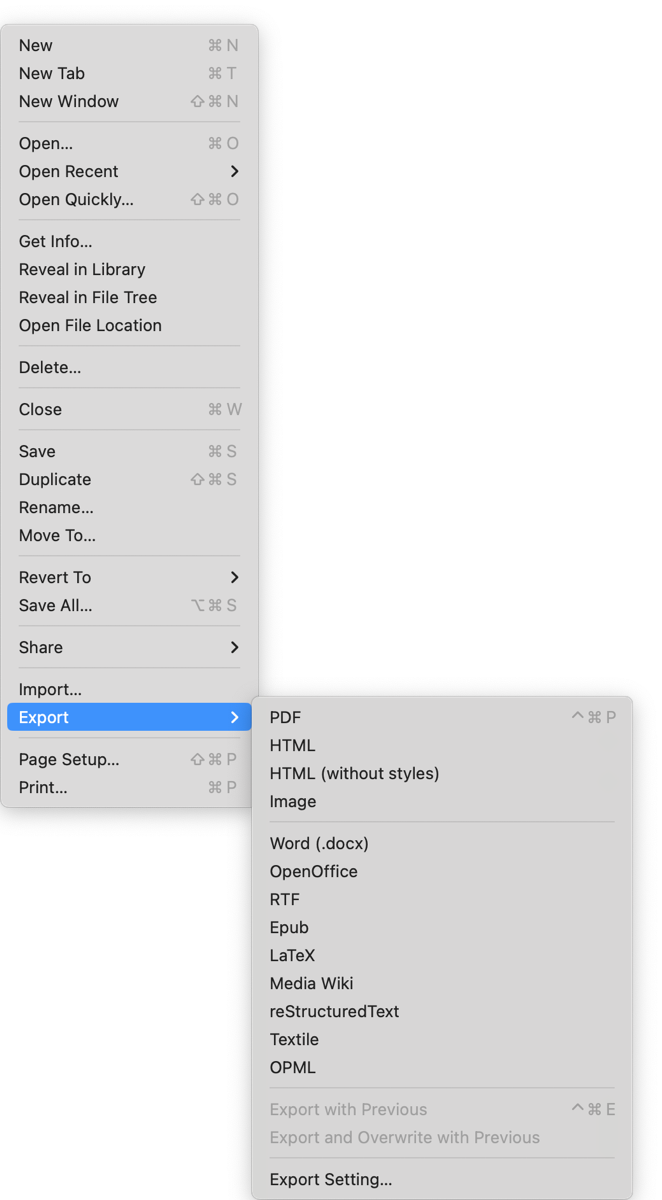
But if you want your export to be in a different format, boy does Typora have you covered. You can export in PDF, HTML with or without styles, as an image, Word, OpenOffice, RTF, Epub, LaTeX, Media Wiki, reStructuredText, Textile, or OPML! Whew, that’s a lot!
Tables
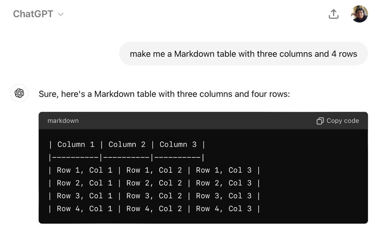
I love how simple it is to make tables in Markdown compared to the old-fashioned way in HTML, but I don’t do it often enough in Markdown to be able to remember the syntax when I need to make one. Lately I’ve been using the app MacGPT as my assistant, so I can ask it to make me a Markdown table with three columns and four rows, and in a second or two I can copy the code and insert it into my text editor.
But with Typora that’s not necessary.
Under the Paragraph menu, you can insert a lot of different Markdown syntax commands without having to remember them. I don’t know why the menu is called Paragraph but there’s good stuff in here.
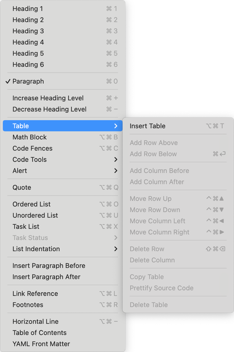
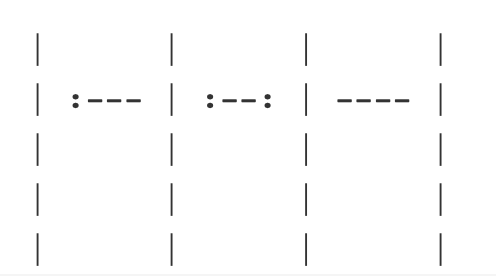
One of these is “insert table”. Once selected, you’ll be asked how many rows and columns you want. Typora automatically drops a beautiful table into your document. Unlike other Markdown syntax, clicking in the cell doesn’t show you the table’s markdown, but you can use the keystroke Graeme taught us (command-/) to see how it’s written. But you don’t have to worry your pretty little head about that syntax to modify the table. No trying to remember where the colons go in order to left or right justify the text in a column.
Just click inside the table, and you’ll see a little menu pop up in the upper left that lets you edit the table. You can change the number of rows and columns and change from left, center, and right-justified for each column.
Bottom Line
I’m afraid I have to draw a line under this review and now I understand why Graeme only went with a mini-review. It’s so much more capable than I thought at the outset. The more I investigate Typora, the more I’m falling in love with it.
I truly wish that Typora had an iPad app so I could do all of my writing in it, but until it does, I’ll have to content myself with using it for Programming By Stealth shownotes. And maybe for those one-off little notes I write…
Check out Typora at Typora.io for only $15 with a free trial.

