
A few weeks ago I told you about a nifty little app called Presentify by Ram Patra. As I often do for the devs when I talk about a piece of software, I dropped Ram a note telling him how much I enjoy Presentify and sent him a link. He was delighted and asked if I wanted a code to his newest app, FaceScreen. Of course I said “Yes!”
FaceScreen’s reason for being is to present a small video window of your camera to be shown to people with whom you’re sharing your screen. I had the opportunity to use it for the recent talk I did for the Silicon Valley Mac Users Group (SVMUG) about how to use Audio Hijack. While I was presenting my entire screen, the Zoom call didn’t show my video to the viewers. I did want them to be able to see me, and FaceScreen worked brilliantly.
The producer from SVMUG, Robert Brown, confirmed that they couldn’t see my face other than FaceScreen so it was a big help for those watching live. He went on to explain that when the recording was complete from Zoom, there was a thumbnail view of my camera in the upper right. However, he said it wasn’t very good compared to the video from FaceScreen. He covered the zoom thumbnail with a black rectangle and kept my FaceScreen video thumbnail view.
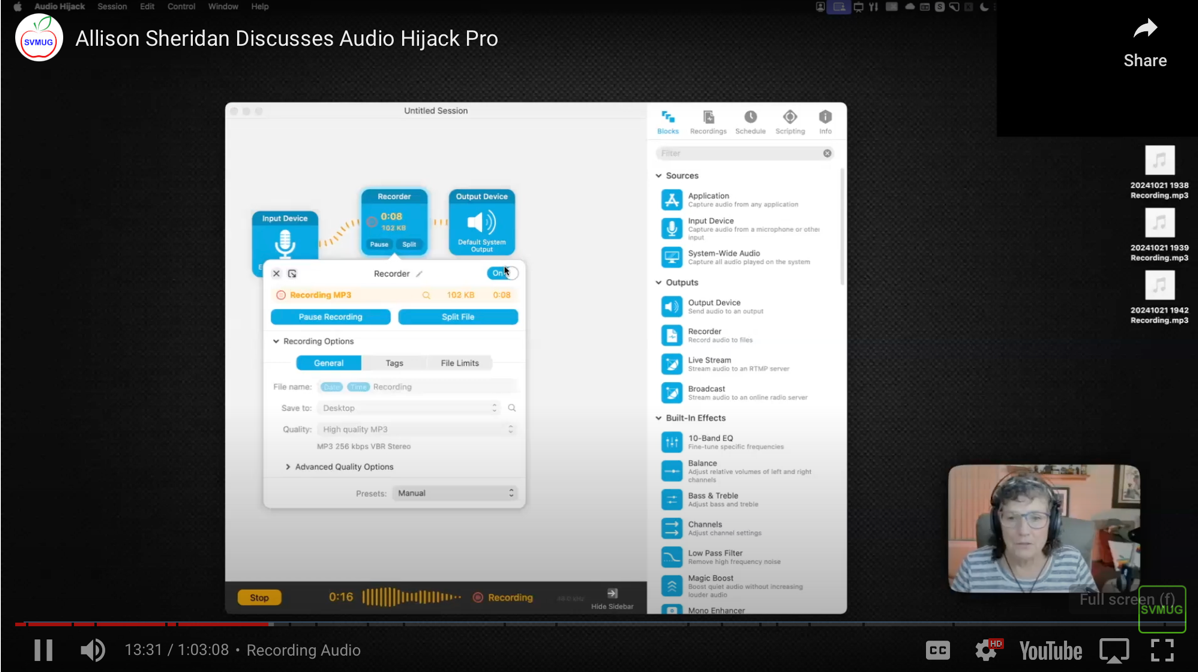
I think that’s a pretty good endorsement! Now that I’ve sold you on the idea, let’s learn about the app.
FaceScreen is a menu bar app available in the Mac App Store for the grand sum of $4.99 USD. and once installed it’s a simple click to enable and disable your camera, presenting a small floating window on screen. There are no fancy keystrokes to memorize to move the window around, you simply drag it with your cursor.
The power of this simple tool is all found in the settings for FaceScreen. Before I go through the settings, I wanted you to know that I tested them with VoiceOver, and everything I tested passed with flying colors. I was able to move sliders, toggle switches, and read every element in settings. Yay for accessibility!
General
The general tab gives you a few simple controls, such as whether to start at login and which camera you’d like to use as your default. In my case, I have a big-girl webcam, the Logitech 4K Pro but I can also choose the internal webcam on my Mac laptop. Note that if you switch cameras, you have to toggle FaceScreen off and back on again to have the change take effect.
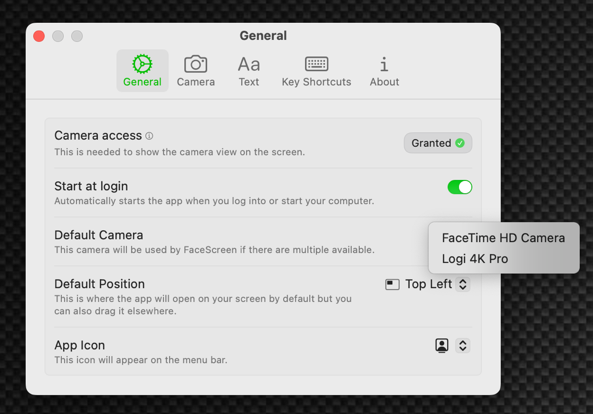
I explained that you can move the window around, but in General settings you can also give it a default location of top left, bottom right, bottom left, or top right.
If you’re like me and you have a lot of menu bar items, you may find it hard to tell some of your icons apart, so Ram gives you a lot of options about the look of the app icon for FaceScreen.
Camera
While you choose your camera in the General tab, there’s another tab in Settings called Camera where you don’t choose your camera. Lots of fun to be had in here though! First of all you can change the shape of the little floating window that will be framing your lovely face. You can choose between circle, squircle, and rectangle.
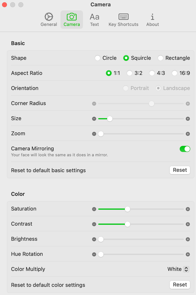
There’s one oddity to those three choices. Lower down in the Camera settings you’ll see a slider for corner radius. You would think that the corner radius would affect the squircle option, but it’s greyed out for squircle. It turns out you can add a corner radius only to the rectangle option.
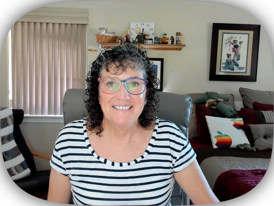
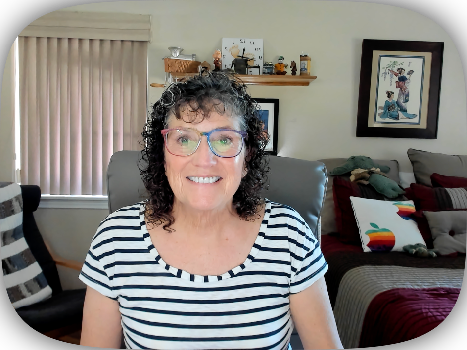
The squircle is a quick way to get the desired shape but if you want more control, a rectangle with a corner radius seems like the way to go.
Below the three radio buttons for the shape, you can set the aspect ratio to 1:1 (square), 3:2, 4:3, and 16:9. Additionally you can change to portrait or landscape orientation for the rectangular aspect ratios.
There’s a slider to increase the overall size of the floating window. I encourage you to set the size when you have your screen resolution set for your presentation. If you have a large, high resolution screen, it’s just plain mean to your audience to show them your screen that way. Remember people are often viewing on iPads these days and most aren’t bigger than 11″.
Before presenting, I always ask what resolution they recommend for the particular audience. For my recent presentation to SVMUG, Robert Brown explained that setting my display to 1920×1080 would be best. Evidently when you do a screenshare, Zoom presents at 720p which scales perfectly for 1080p. I set my screen to 1920×1080, and then dragged the scroller up on size in FaceScreen until it looked big enough to show them my face but not so big it was overwhelming their view of my demo.
Now that you’ve got the size of the video window set properly, you may want to zoom in on yourself a bit, and FaceScreen has a slider for that. If you crank the size up to the max, the video fills about two thirds of a 15″ MacBook Pro screen.
The next control is interesting and I think I did it wrong for SVMUG. It gives you the option to mirror the camera, meaning your face will look the same as it does in a mirror. I chose that option because it looked right to me … but it turns out that makes it backwards to your viewers. Maybe it’s not critical because you don’t have any text showing in your video, like something written on your shirt or in the background, but it could easily be confusing for the viewers either way.
If you’ve messed around with the settings and you’d like to get back to the defaults, there’s a nice reset button.
The settings window isn’t quite tall enough to view everything in the Camera tab, so if you scroll down you can see some controls for the color from your camera. You can adjust saturation, contrast, brightness, and hue rotation. That last one is super weird. I was wearing a pink shirt and when I rotated hue all the way, my shirt was a purplish blue and my beige walls were pink! If you want to have more fun, you can change the color multiply setting. I’m sure this is useful if the white balance is off on your camera, but I mostly just made things look psychedelic. Good thing there’s a reset for the color settings too.
Text
While you’re displaying your video to your audience, you can also have text displayed under your video. You can toggle it on and off from the menu bar, and from Settings on the Text tab you can edit the text shown. By default it will say FaceScreen, so you just might want to change that.
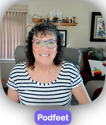
You can choose the font, the font size, the font color and background, and even the radius and padding of the background around the text. It’s fun to play around with these settings because you can make the text and padding HUGE and put it all in a fun font.
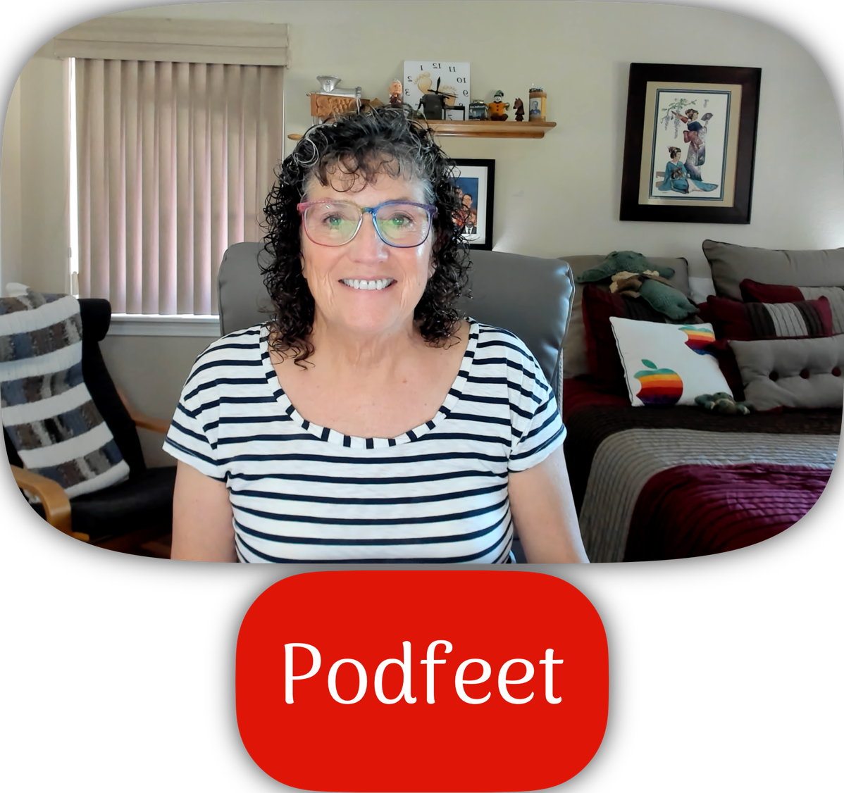
After you’ve had a nice play with it, you’ll be happy to know there’s a reset button so you can start over and create a boring but professional look.
Key Shortcuts
If you’re a keyboard junkie, you’ll enjoy the Key Shortcuts tab. You can create shortcuts to toggle FaceScreen on and off, toggle the text on and off, and to increase or decrease the camera view’s size.
Bottom Line
The bottom line is that I already got my $5 worth of fun out of FaceScreen by allowing viewers of my Audio Hijack tutorial for SVMUG to see my little face while presenting, and I can’t wait to use it again. Learn more about the fully accessible FaceScreen at facescreenapp.com/…

Thanks for this expounded write up. You have covered a lot of things — features of this app, problems with other solutions, and your real-life experience. So, thanks for this once again.