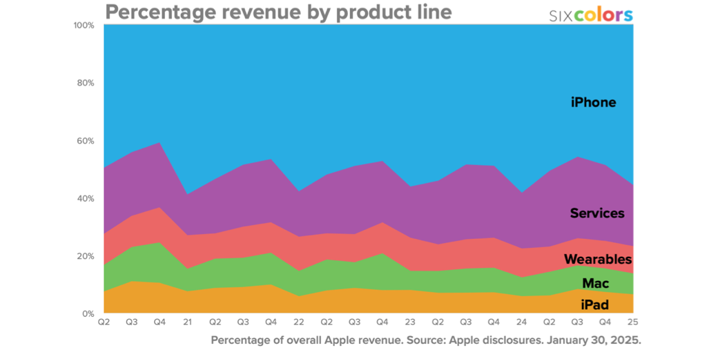
If you’ve been on the Internet before, and you’ve heard of a little fruit company called Apple, then you’ve probably seen Jason Snell’s famous Six Colors charts on Apple earnings. In this episode of Chit Chat Across the Pond, we don’t talk about earnings, we talk about the magic behind how he creates his famous charts. It’s full of nerdy fun like how he decides when to use a serape chart vs. a bar chart, how he calculates a rolling average, how he gets the data for the charts, and how he gets the charts from Apple Numbers into his website. His joy at finding people who want to talk about the nerd side of this is evident in his enthusiasm.
- Apple Q1 Earnings charts on Six Colors including video of Jason Snell and Dan Moren discussing what the numbers mean.
- How Jason automated creating the blog posts from Numbers: Chart Party at sixcolors.com.
- Jason’s podcasts: The Incomparable, Upgrade, and other appearances
Read an unedited, auto-generated transcript with chapter marks: CCATP_2025_02_06
Referral Links:
- Parallels Toolbox – 3 months free for you and me
- Learn through MacSparky Field Guides – 15% off for you and me
- Backblaze – One free month for me and you
- Eufy – $40 for me if you spend $200. Sadly nothing in it for you.
- PIA VPN – One month added to Paid Accounts for both of us
- CleanShot X – Earns me $25%, sorry nothing in it for you but my gratitude