Is it just me, or does it seem like Apple has added so many gestures to their OSes that triggering the wrong thing is a constant annoyance? I’m seeing this gesture fiddliness on almost all of Apple’s platforms. Let me elaborate by going through a few I’ve logged just in the last few days.
Control Center
On the Mac, in the upper right of the menu bar, we have the time and then two little switches. I can’t tell you how often I click on the wrong thing. Usually, I’m trying to get to Control Center, but I click on the time instead of the switches.
Clicking on the time, a whole bunch of stuff flies in from the right. I’m not even sure how it chooses what to show me. As I was writing this up, I could see notifications from ChatGPT, Mail, and my Ring devices with an offer of 11 more notifications. I can see various widgets I haven’t configured myself, including a calendar, weather, a world clock, and top stories from the News app. If I scroll, I can see even more widgets that I don’t care about. Annoyed, I click away and more intentionally click on the little switches to get to Control Center.

Maybe you have no problem remembering to click on the switches rather than the date. Maybe it’s just me.
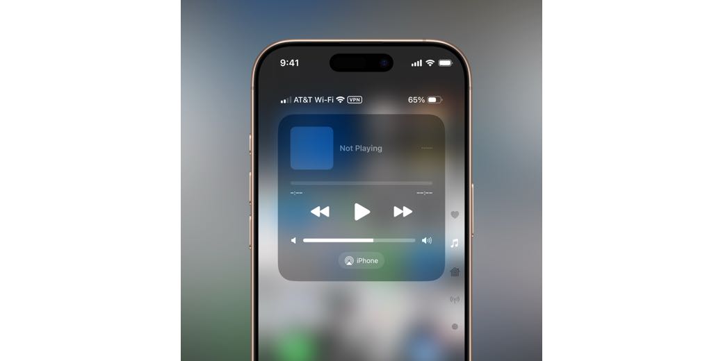
But lately Control Center is even more fiddly for me on iPhone. I’ve been using an iPhone since there was an iPhone, so I know how things work. Control Center is activated on an iPhone without a home button by a swipe down from the upper right. While this worked for the last several versions of iOS, now I find that at least 30% of the time, I get the notifications screen instead. I know Notifications is activated by swiping down from the center, not the right, yet I’m getting it anyway when I swipe on the right. Maybe they narrowed the area that’s considered “on the right” with iOS 18?
After I see the Notifications screen I didn’t ask for, I swipe back up in the center to make Notifications go away. Even if I swipe down from the far right, my troubles aren’t over. When Apple introduced what sounded like a good feature, multiple Control Center pages, it also introduced more fragile gestures.
I may be swiping too vigorously, but instead of getting to the “normal” Control Center items, such as network, volume, and brightness, the swipe gesture takes me to the Music section of Control Center. If you know me, I never ever ever want to go to anything about Music.

Sometimes, my swipe takes me all the way down to the Home section of Control Center, which is all the way down on the third page. While the Home section is more useful to me than Music, I still just want to look at Bluetooth!
I kept experimenting with this gesture, trying various levels of enthusiasm, and it looks like it’s not the speed with which you swipe. It’s what you do when you come to a stop with your swipe. Before lifting your finger, but after you’ve come to a stop, you can slowly move your finger up and down to move between the different pages of Control Center.
While I’m glad I figured out how to control Control Center, this isn’t the most intuitive, easy-to-learn, repeatable set of gestures.
Siri
I’m not going to make fun of Siri for how simple-minded it is, or how it accidentally triggers on all of my devices when it thinks I’ve called it for help. But I will complain about how recent gesture changes trigger it even more often.
On macOS Sequoia, a double tap of the Command key launches Type to Siri. It’s a lovely little window that pulses through various pastel shades. It floats right below the menu bar on the right.
One of the tips that popped up right after the upgrade of the OS was that you could ask it things about macOS. I tested it by asking it how to find a particular item in System Settings, and it answered by saying that it had found some articles on the web about the subject. That was the last time I intentionally triggered Type to Siri by double-tapping the Command key.

But I have to tell you that at least two or three times a week, I will be feverishly typing an article or an email or a witty post on Mastodon when suddenly no characters are spitting out on my application of choice. That’s because Type to Siri has been triggered and has hijacked my keyboard output. It’s not that hard to hit the Escape key to hide Type to Siri, but I wish I knew what I was doing that makes it think I’m double-tapping the Command key.
macOS isn’t the only place I accidentally trigger Siri. On iOS 18, at the bottom of the screen, there’s a black bar Apple calls the Home Indicator. Swiping up on the Home Indicator takes you out to the Home Screen. But with iOS 18, if you double-tap on the Home Indicator, it triggers Type to Siri. Just like with macOS, it pulses in lovely pastel shades. I intentionally triggered Type to Siri on iOS exactly once, to test so I was sure I knew how it worked. However, at least once a week, I trigger Type to Siri accidentally when trying to swipe up to get to the Home Screen.

Too Many Buttons
Remember when Steve Jobs was so adamant about having the fewest number of buttons on devices designed by Apple? When customers complained that the Apple mouse only had one button instead of two, they sarcastically gave us a no-button mouse.
While that purist perspective is problematic for usability, it’s easy to go the other way. The iPhones 16 now has 5 buttons where it used to have 3 and one toggle. While the functionality and choice have are in some ways improvements with these extra buttons, it’s now much easier to trigger the wrong thing.
I was pleased when they added the action button on the left above the up/down volume buttons with iPhone 15, replacing the simple mute toggle. The action button is user-definable, which gives us the freedom to use it for what we want the most. On the iPhone 15, I assigned it to launch the Camera app, while others used it for triggering a Shortcut, and still others set it to give them the mute switch they still needed. When the iPhone 16 came out with the Camera Control don’t call it a button button, I changed the action button to launch ChatGPT. It’s great!
But now I have a gesture problem. I use a Spi-belt to hold my phone flat against my belly when I’m exercising, washing my car, or doing other chores. If I need to turn the volume up on my podcast while using my leaf blower or my powerwasher to clean off the driveway, I’d rather not have to pull the phone out. I’ve learned to always put the phone in the Spi-belt oriented in the same way: screen facing my belly so the zipper opening and closing can’t scratch the display and with the top of the phone to my left. This means the volume buttons are across the bottom. But there are three buttons now, so I have to feel each button and count them to identify the middle or right button to go volume up or down. It’s not hard, but it used to be easier.
Camera Control
Now, let’s talk about Camera Control. It’s a great idea but it’s probably the fiddliest set of gestures of anything Apple has invented of late.
It’s a reasonably quick way to take a picture. If the phone is asleep, one click and the phone wakes up with the lock screen and any notifications visible. Click it again, and it launches the Camera app. Click it again, and finally it takes a picture.
You might think if you hold the Camera Control down instead of clicking, you’d be taken right to the Camera app, but that doesn’t work. Instead, a long hold on Camera Control launches something that looks like the camera. It’s called Visual Intelligence, and it only exists if you have Apple Intelligence enabled in Settings → Apple Intelligence & Siri. I said it looks like the camera because you see your surroundings from the camera, and it has the familiar shutter button. But it also has onscreen buttons on either side that say Ask and Search.
You can take a picture with Visual Intelligence and then choose Ask or Search, or you can select either option without taking a photo. Ask will ask ChatGPT what the camera is seeing. Remember how they made a big deal that if you asked Siri a hard question and it needed ChatGPT’s help, it would always ask you first for permission? Yeah, with Visual Intelligence, it doesn’t ask permission; it just does it without asking. You’d think that something in the camera’s view could likely be even more private than something you asked with your voice, wouldn’t you?


Don’t get me wrong, I’m a fan of visual intelligence. I wanted to replace an appliance the other day. I pointed my phone at the old appliance, held down Camera Control, and tapped the second button that says “Search”. This launches a Google image search. When I tried it on the appliance, I was shown several linked images where I could buy the product. I tapped the Amazon link, tapped Buy Now, and a few hours later the replacement appliance arrived at my house.
My point is that it’s a very cool feature, but I can’t tell you how many times I want to take a picture of our adorable new puppy, Kepler, and instead, I’ve accidentally held the camera button down too long and invoked visual intelligence instead. It’s frustrating and a bit confusing when you just want to pop open the Camera app to take a spontaneous photo. I turned off all of Apple Intelligence and that enables the Camera app to be launched directly with a click from an unlocked iPhone. But I don’t want to disable these features, so instead I live with the Camera Control long-click confusion.
Camera Control has a lot more tricks up its sleeve. If you’re very gentle and very intentional, it is possible to very lightly double-press the Camera Control button. You’ll feel the teeniest little bit of haptic feedback indicating changes in the camera modes. Initially, it pops up a little menu to switch between exposure compensation, depth of field, continuous zoom, cameras (.5x, 1x, 2x, 5x, and the front-facing camera), styles, and tone. If you successfully bring up this menu without taking an accidental photo, sliding your finger along Camera Control lets you choose one of those modes. Slide gently, though! Let’s say you choose the continuous zoom option. At that point, you can slide your finger again and change the zoom.
But let’s be realistic. By the time you’ve gone this far into the menus, you’ll have at least 11 photos of your feet. It’s far, far easier to tap the onscreen buttons to select exposure compensation or to drag your finger across the camera options to get a continuous zoom wheel to come up. It’s much easier to mess with Styles by dragging your finger around on the little grid than it is to try to invoke Styles and Tone by independent numerical values in Camera Control. Every single one of these controls is easier to invoke using the onscreen buttons, and you’ll get hardly any photos of your feet.
I say hardly any because even though I don’t use Camera Control to get to all the nifty features I just described, I still get photos of the inside of my jacket, the carpet, or my feet. I try to blame them on Steve because we use Shared Photo Library, but at least 70% of them are from my phone.
Side Button
You know the side button that, with a single-press, puts your phone to sleep and wakes it up? That’s always been the most reliable button on the iPhone. I don’t even mind that it does double duty as a way to invoke Siri with a long press. What I do mind is how often I try to put the phone to sleep and accidentally squeeze the volume up button on the opposite side and take a screenshot.
iPad
I was going to complain about the iPad because I was afraid it was feeling left out, but I have very few quibbles with it. I have one app that doesn’t respect the top-center of the screen where the three dots are. These dots invoke a menu to go into Split Screen or Slide Over. I never intentionally use them so I’m always surprised when accidentally invoke that dropdown menu when I’m just trying to scroll up in that one app. But I don’t think I can blame iPadOS for that since it’s only the one app that misbehaves.
Apple Watch
The Apple Watch isn’t going to get off that easy. In watchOS 10, gestures have gotten even more mysterious than they used to be. The Apple Watch has only 2 buttons (so far) — the side button and the digital crown. The number of gestures is baffling, and I blame it on the simplicity of the buttons. I’m honestly not sure having fewer buttons is a better way to go.
The gesture fiddliness that’s been hitting me lately has to do with when I’m in the middle of a Workout. The Workouts app is happily showing me all of the metrics for my current workout. But then I see a notification, and I don’t tap it in time to read it. I should keep concentrating on my workout, but my curiosity gets the best of me.
For ages, I would simply single-click the Digital Crown, which would take me to the clock face, swipe down to see my notifications, and then tap the one I wanted to read. Now if I single-click the Digital Crown, it takes me to a screen that shows the time and date on the top half and a set of little flippable cards for my open apps on the lower half. This screen is called the Smart Stack, which is also available by sliding up on the main clock face with your finger or rotating up on the Digital Crown from the clock face.
I’m not against the Smart Stack as a concept, but why am I seeing it when a single click on the Digital Crown used to take me to the watch face? I’m usually flummoxed by this for a moment after which it occurs to me to try clicking the Digital Crown again to get to the watch face.

To recap, to navigate to a notification while viewing a workout on the watch, I have to click the digital crown once. Then click it again. Then swipe down. And only then tap on the notification I wanted to see. It’s one extra step inserted for no reason that I can discern.
Just to ensure this is intentionally fiddly, if you open Workouts but are not actively running a workout, hitting the Digital Crown does take you directly to the watch face.
Bottom Line
I know this was just a big ol’ 15-minute whine-fest, and maybe it’s just me, but I suspect others may be falling into gesture madness too. If you’ve got gestures that are driving you bananas on your Apple devices, I’d love to hear about them so I don’t feel so alone.
After I posted this article, Sumocat on Mastodon let me know that you can remove items from Control Center on iPhone. I think I knew that but didn’t think about trying to remove the Music option.
When I went to the Music section, I realized it’s actually a “now playing” widget that includes podcasts. I still didn’t need it. To my delight, after removing the widget, the entire screen with the little music notes also disappeared. Yay! Thanks, Sumocat!
Last year I bought my first iPhone, a 15 Pro Max. Coming from Android one of the greatest frustrations of iOS is how many layers of menus are required to modify, enable. or disable basic functions.
Some of that was the learning curve of a different OS.
But I ultimately concluded the depth of menus was because of feature creep. As new features were added to iOS and iPhones Apple hasn’t redesigned the interface, just added more layers and options within layers.
From Allison’s observation about fiddly gestures, it seems the same feature creep is resulting in more arcane gestures.
Apple needs new features to drive sales. Since the iOS interface is gesture driven, it’s necessary to add more buttons to activate some features and to also modify and increase control gestures. As Allison discovered in finding the granular ability to maneuver WITHIN control center by stopping then moving her finger up and down.
This is a growing problem in automobiles, too. In the good old days with manual dials for fan speed and sliders for temperature, a driver could quickly gain the muscle memory to control the HVAC system without taking eyes off the road. Not the case when the controls are on a touchscreen. One car brand I saw reviewed on YouTube even has a separate button to toggle between the same virtual buttons controlling HVAC and audio
I recently had to replace an over the range microwave vent hood. The new one has a lot more options. this s lot more buttons, and to get the buttons in the limited space, the text which says what they do is small, just above tiny.
Feature creep isn’t necessarily a good thing